Iron Viz 2021 Championship: Data that will rock your world


It wouldn't be Tableau Conference without the world’s ultimate data showdown—Iron Viz. Three fierce contestants took the virtual stage to rock day two with some visualization madness. In front of a massive live audience from across the globe all watching with front row seats, the Iron Viz contenders had 20 nail-biting minutes to whip up an awe-inspiring viz to energize, electrify, and hopefully reign supreme.
Hosts Keshia Rose and Andy Cotgreave were back to entertain us, and they brought their guitars. Their excitement was contagious as they introduced this year's data rockstars, Pradeep Kumar G, Lisa Trescott, and Samuel Parsons, who earned their place by rising to the top from hundreds of incredible Data + Joy submissions. The stakes were high as the three finalists prepared to click, drag, and drop their viz-loving hearts out to win the trophy as well as thousands of dollars in prize money for themselves and the charity of their choice.
The theme for this year centered around music. Chartmetric provided a deep data set, global in scope, of nearly 200 million records spanning several years. It included artist popularity, metadata, YouTube listening data, and loads of Shazam history.
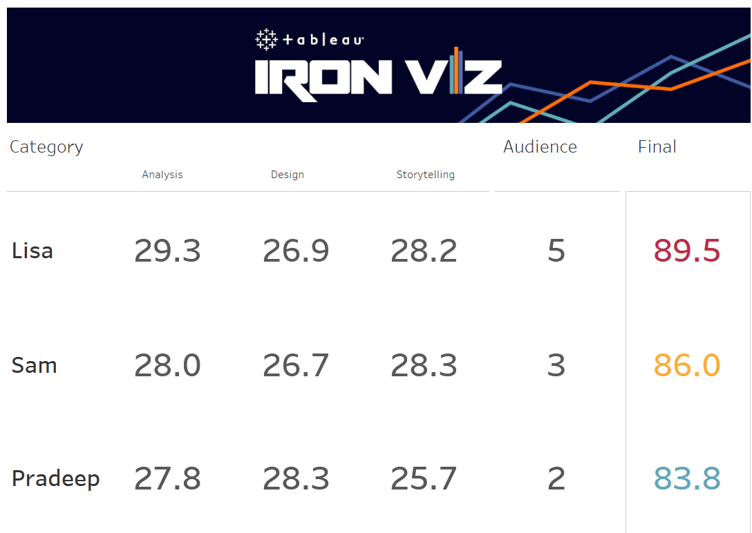
The formidable contenders needed to impress a world-class panel of viz savvy leaders, composed of last year’s Iron Viz Champion Christian Felix, Tableau VP of research and design Dr. Jock Mackinlay, and Tableau Public Director Taha Ebrahimi. The judges evaluated the vizzes based on three criteria: design, analysis, and storytelling. The judges' score made up 90% of each contestant's total score, while the audience weighed in with the remaining 10% of the votes via text. Let’s take a deep dive into the powerful data music stories our finalists told.
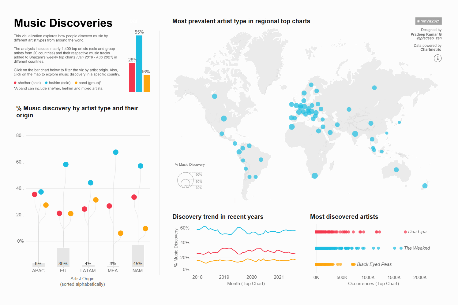
Music Discoveries
Pradeep Kumar G began by building out his preferences file. Passionate about colors, he created a default custom palate and used optimization techniques to ensure he got the image he wanted. His analysis includes nearly 1,400 top artists from 20 countries and explores music discovery behaviors across the globe by artist type. Christian Felix described the result as a “dashboard for anybody that drives engagement by allowing the user to find him or herself in it, whether it is to see their individual country’s consumption or by their identifying pronoun.”
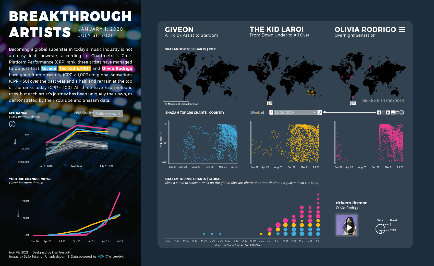
Breakthrough Artists
Lisa Trescott chose to use a logarithmic scale to compare the rank of artists. She gave herself an interesting challenge of not always being able to see what she was making because a lot of her marks were in white. With the theme of Breakthrough Artists, Lisa narrowed her focus to three who stood out as pulling themselves from obscurity—Giveon, The Kid Laroi, and Olivia Rodrigo—to the upper echelon of the ranks, each with their own unique journey. The judges all agreed that her combination of vibrant charts, animation and narrative crafting was powerful.
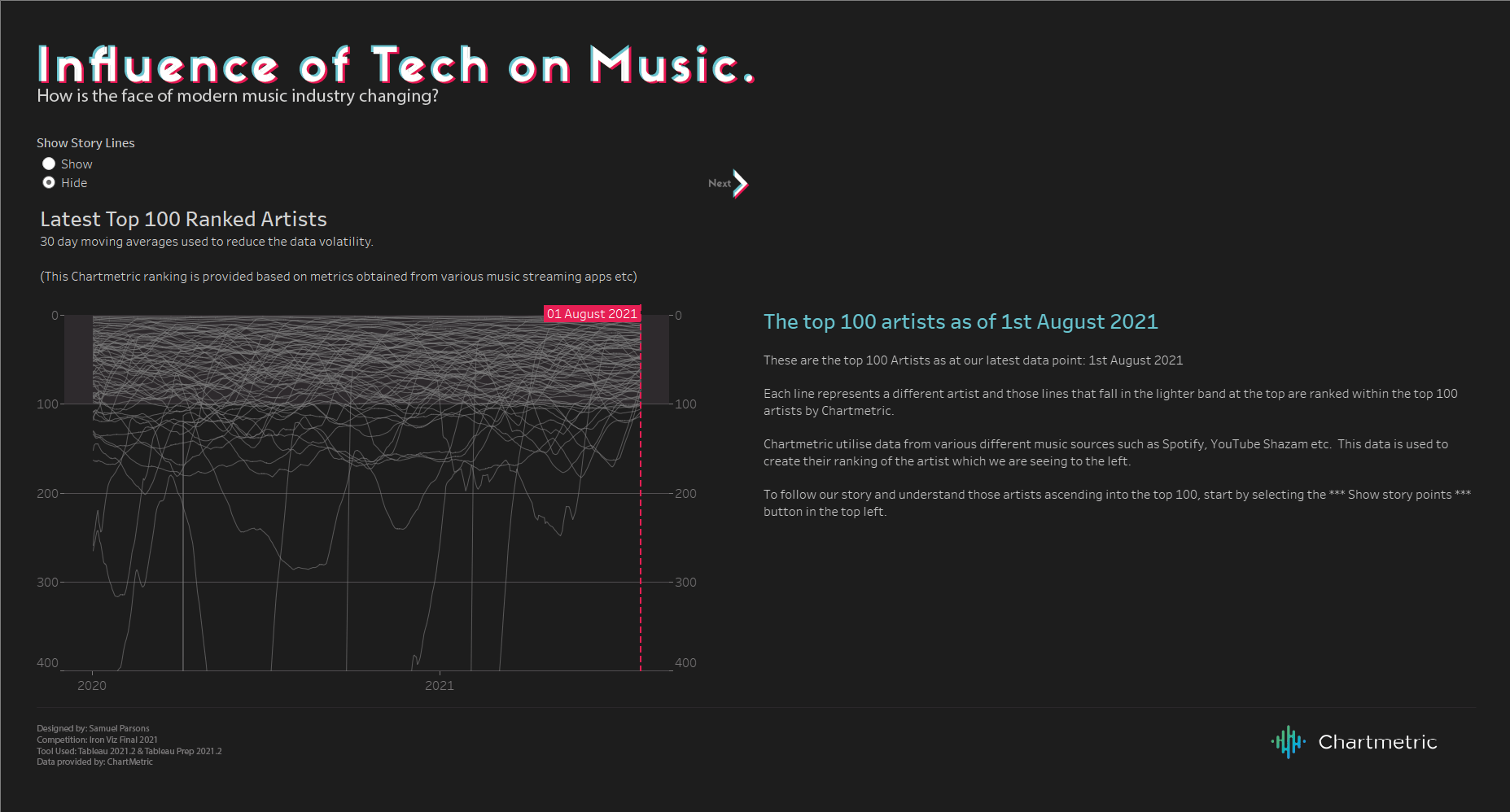
Influence of Tech on Music
Sam Parsons built his visualization to analyze how new artists are establishing themselves in the top 100 rankings and how tech directly impacts their fortunes. He used Hide and Show Containers—a great new feature from the Tableau 21.2 release—allowing him to hide and show any element in the dashboard so he could slowly reveal them over time. His data story demonstrates the power of Tik Tok over the music industry—following a song’s path from social video post to becoming a viral sensation. The judges commented it was a great example of interactivity and liked Sam’s use of layout containers to unfold a very guided story.
And the winner is…
What an outstanding performance and dazzling display of data from all the contestants! The work produced was incredible this year. Each of the Iron Viz finalists had a different approach, but all three wowed the crowd. One viz simply out-edged the competition. Congratulations to Lisa Trescott and her charity, PolicyLink. In addition to her husband, Lisa thanked her Sous Vizzer, Esther Aller, for her great feedback. She also thanked the Tableau Community Data Fam, who continue to inspire every day, with a special shout-out to Sarah Bartlett because her blog post encouraged Lisa to take the leap and enter the competition.
See a breakdown of each contestant’s score below:
What's next?
If you want to get the inside scoop from all three finalists, check out If Data Could Talk in early December for episodes that deep dive into each visualization. And more exciting news, we are happy to announce our second Iron Viz Student edition. If you’re a student interested in showing off your data chops, go here to learn more.
Don’t want the inspiration to end? Iron Viz is a chance for incredible vizzers who spend their days on Tableau Public to give the world a behind-the-scenes look at their magic. So go on—get inspired by over 3 million interactive data visualizations created by more than 1 million people globally. From music to sports and politics, there's a viz to explore for almost any topic. And a new storytelling masterpiece is featured daily on Viz of the Day. Sign up to have a healthy dose of 'viz-spiration' delivered to your inbox.
This officially ends 2021 Iron Viz. It proved to be another memorable competition. Congratulations to all who participated, and again, well done, Lisa. You rocked it!
関連ストーリー

Meet Iron Viz 2024 Finalist Jessica Moon
 2024/04/15
DataFam Roundup: April 8–12, 2024
 2024/04/12

Meet Iron Viz 2024 Finalist Pata Gogová
2024/04/08
Subscribe to our blog
Tableau の最新情報をメールでお知らせします