Iron Viz at #TC18 took us all over the globe with weather data


Another year of Tableau Conference means another edition of the ultimate data showdown—the Iron Viz competition. Hosts Jewel Loree and Andy Cotgreave donned extravagant attire for the occasion. You could feel the energy from the thousands of fans in attendance, cheering and waving glow sticks in anticipation of witnessing world-class data visualizations created live onstage in just 20 minutes.
This year’s noble contenders, Ludovic Tavernier, Corey Jones, and Timothy Vermeiren, earned their place onstage by winning one of three Tableau Public feeder competitions throughout 2018. For the championship, The Weather Company, an IBM Business, provided three years’ worth of weather data—from 3,000+ locations representing cities of TC18 attendees—combining to more than four million rows! In a new twist this year, contestants were tasked to use Tableau Prep to clean and add additional data.

Joining 2017 Iron Viz Champion Tristan Guillevin on the judging panel were three Tableau experts: chief marketing officer Elissa Fink, VP of research and design Dr. Jock Mackinlay, and senior director in product development Ellie Fields. Judges evaluated contestants based on three criteria: analysis, design, and strength of story. Additional points were awarded based on audience Twitter votes.
Let’s meet our contestants and dive into the powerful stories they told with their incredible vizzes.
Ludovic Tavernier compared weather memories

Ludovic’s viz was an interactive piece of art. He compared rain, wind, and temperature between two cities using a radial layout. He could quickly identify days of weather anomalies as he started comparing data from Miami, Jacksonville, and Paris. Then Ludovic demonstrated how different weather conditions are with various cities around the world, finishing with New Orleans.
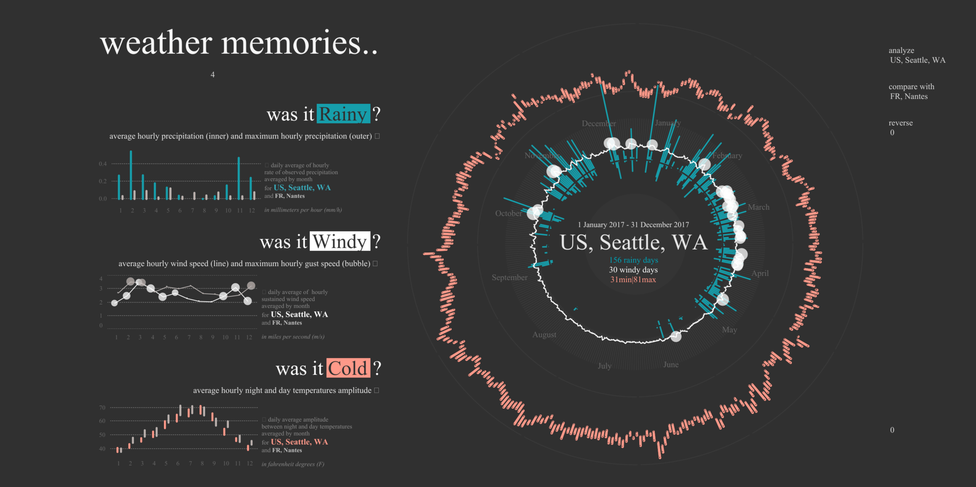
Judge Jock Mackinlay appreciated the circular design as the nature of the data was cyclical, and asked how Ludovic was able to create multiple circular layers. Ludovic replied, “I duplicated the data to use this layer, and it’s just basic trigonometry.” This competition was Ludovic’s first time using Tableau Prep. As his Sous Vizzer Geraldine “Gigi” Zanolli explained, Ludovic used more than 20 calculations and made it a really a powerful flow.
Corey Jones asked, "Where is the grass greener?"

Corey’s visualization put the end user at the center of the story by creating a “personalized output of where the grass is greener.” He even incorporated Set Actions into the viz by giving the user the ability to generate average weather conditions from a selection of multiple points on a map! As with Ludovic, this competition was the first time Corey used Tableau Prep—but you would never guess that looking at his flow. As sous vizzer Kent Marten explained, “He augmented the data with three external data sources, including one that looks at happiness by country.”
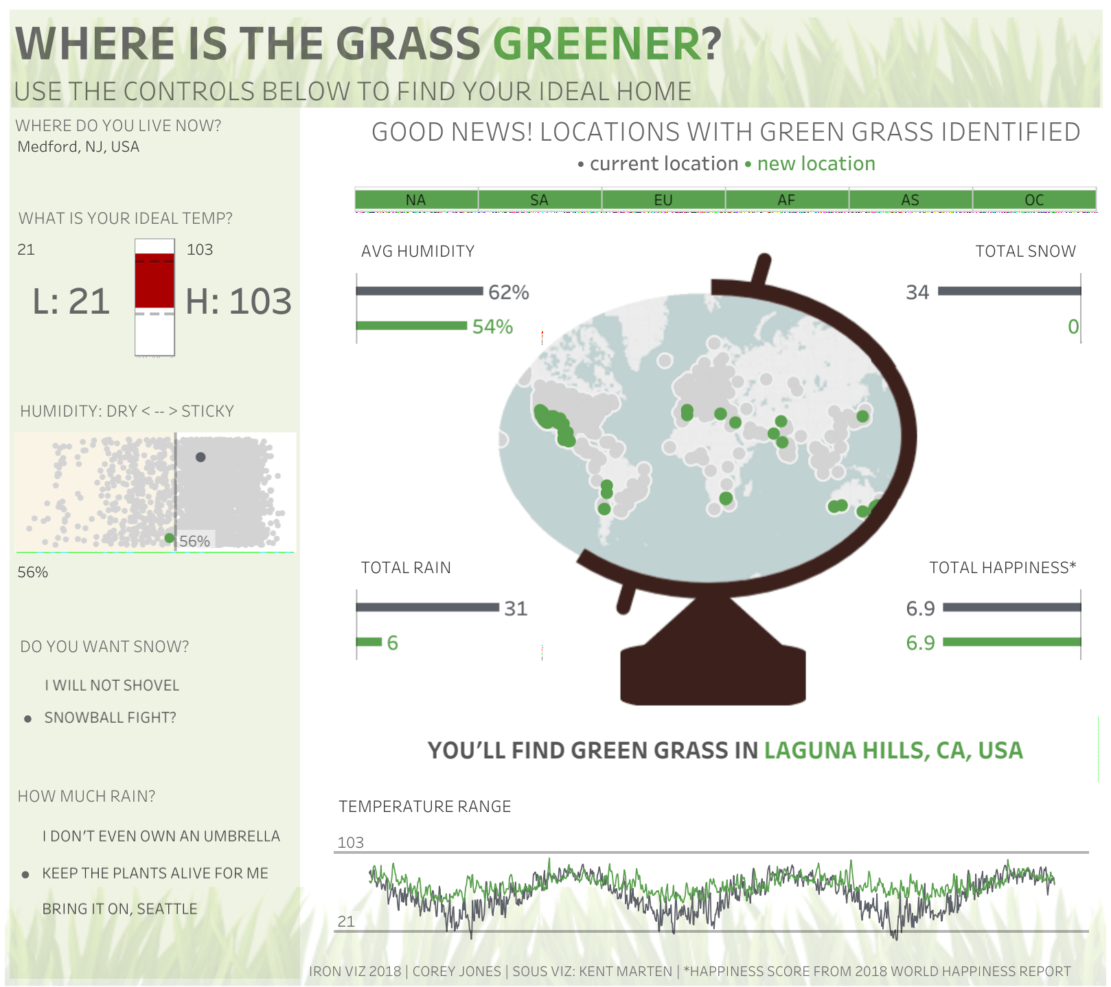
Judges Tristan and Elissa probed at Corey’s design choice to make a globe on his dashboard. Corey emphasized the importance of captivating the end user: "The ability to spin the globe and really engage your audience, I think carries a lot of value... I always say a dashboard's not useful if no one uses it, so I want to find a way to get people to engage with the dashboard."
Timothy Vermeiren showed us how daily life is relative to location

As Timothy was vizzing away, two-time sous vizzer David Freifeld explained, “He’ll be able to tell a story around how weather impacts our daily lives, while connecting the people around the globe.” To accomplish this, Timothy visualized the relationship between global positioning and weather conditions. A unique component of Timothy’s dashboard was his use of the Pages feature in Tableau Desktop. He visualized daylight hours relative to latitudes of different cities and countries around the world, dispelling some anticipated correlations.
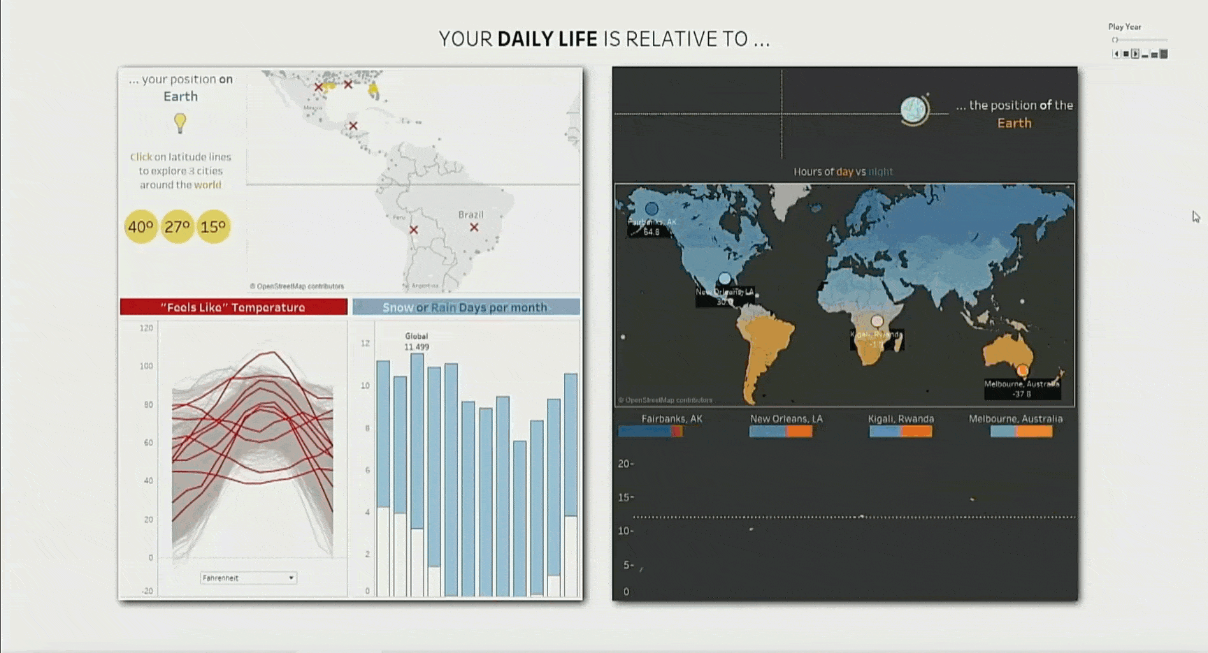
The judges asked Timothy about his ambition to tell two integrated stories. Focusing more locally on the left side of his viz (your position on the earth) and more globally on the right (the position of the earth), his dual storytelling was tied together by the overall narrative of how weather affects our day-to-day existence.
We’re all impacted—“weather” we notice or not
While the judges deliberated and tallied Twitter votes, Tableau evangelist Ben Jones interviewed some members of the audience including Mark Gildersleeve, VP and head of business solutions for the Watson Media and Weather group within IBM. Mark shared, "Weather just makes great stories and all three teams really captured it—awesome." He was impressed by how the contestants captured the personal, emotional impact of weather while emphasizing it as a global phenomenon.
Weather affects us all every day—sometimes in ways we're not even aware of—and represents one of the largest unknowns when it comes to business impact. IBM’s The Weather Company offers a managed collection of extensive weather datasets along with powerful machine learning capabilities that, when combined with Tableau’s analytics platform, can help you better understand weather’s influence on your business. If you’d like to get started using weather data, you can request trial access today.
Congratulations to our winner, Timothy!
Andy retrieved the envelope from the judges and Jewel prepared her confetti cannon. It was close, but Timothy’s viz out-edged the competition! More than 400 hours dedicated to Iron Viz feeder contests helped him get to this victory, but Timothy also attributed success to the support of his colleagues, friends, and fiancée. "I also want to thank all of us in the community who make things like this with Tableau possible—initiatives like Makeover Monday, Workout Wednesday, Sports Viz Sunday are like the fuel for us to participate in what is Iron Viz. So thanks to all of you as well!"

If you missed out on the action, watch the recording to catch all the glitz, glam, and data puns. If this year’s Iron Viz championship has left you feeling inspired, check out some of the amazing work by Tableau authors around the world by subscribing to the Tableau Public Viz of the Day.
関連ストーリー

Visualizing Women's Impact to History Through Data Visualization
 2024/03/18

Behind the Viz: Adrian Zinovei Helps You Design Your Next Dashboard
2024/03/01

Charting the Heart: Data Visualizations on Love
 2024/02/14
Subscribe to our blog
Tableau の最新情報をメールでお知らせします