How to Highlight a Dimension in 3 Simple Steps


Note: The following is a guest post by former Iron Viz champ Ryan Sleeper.
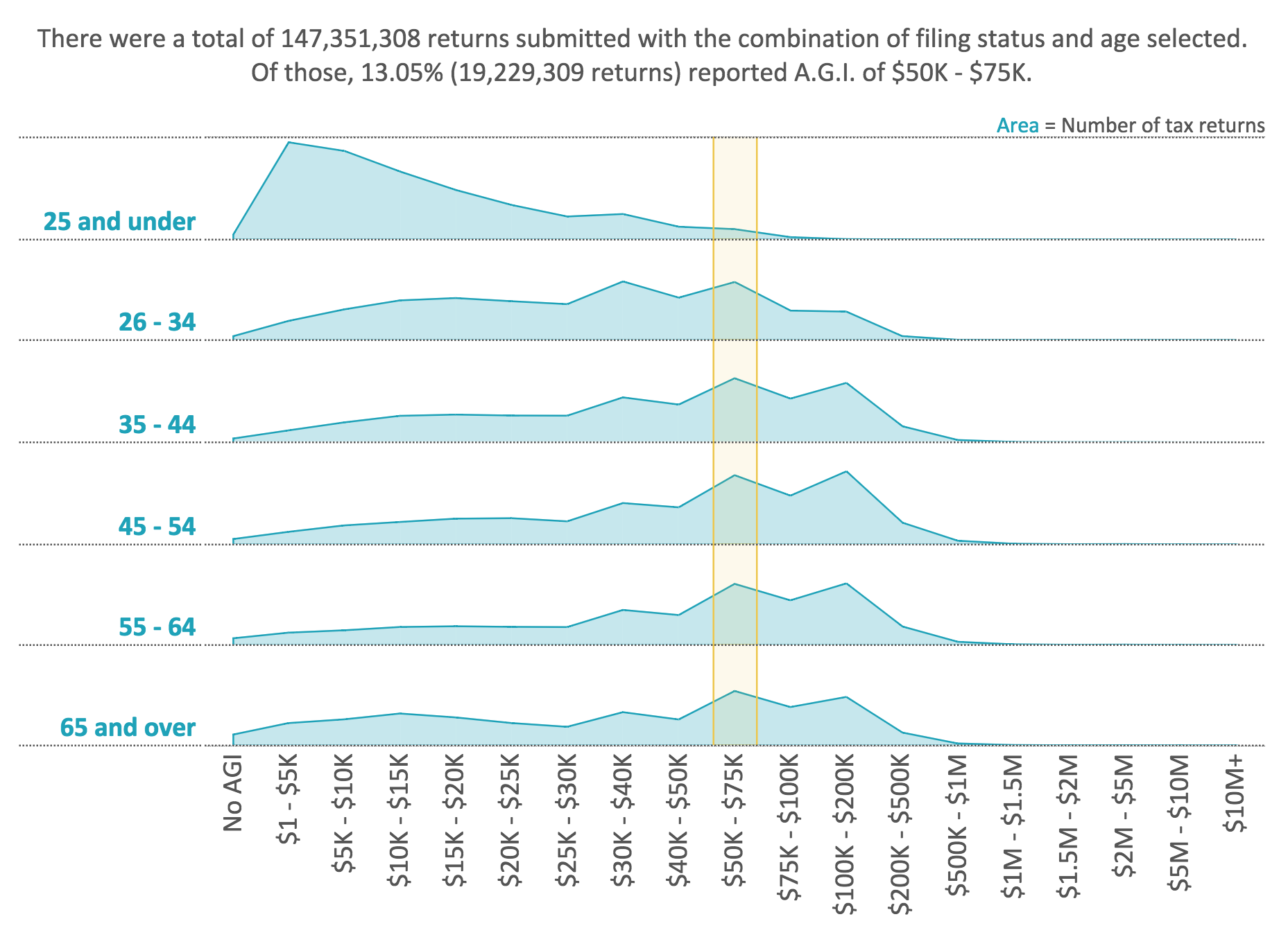
In my viz, US Income by Age and Marital Status (embedded below), I wanted my end users to be able to choose their personal combination of age, marital status, and income—then have the chart not only filter down to their demographic information, but highlight their income in context of their other selections.
I thought this would be as easy as right-clicking on the axis for income, a field that is a bin dimension in my viz (i.e. used to make a histogram), and choosing “add reference line." I would then make a reference band to get the nice yellow highlight effect you see pictured.
This is when I found out you can only add reference lines to measures or date dimensions.
This post shares a workaround for adding a “reference line” to a dimension.
How to Add a Reference Line to a Dimension
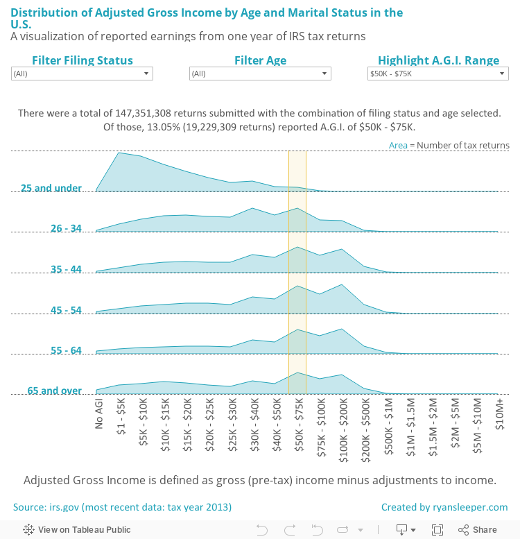
Let’s start by taking a look at the full interactive version of the visualization. Feel free to plug in your own combination of age, marital status, and income to get a feel for the functionality (no selections are recorded):
The first two filters, filing status and age, are simply quick filters that filter the entire viz to the end user’s selection. The viz also works when the end user does not change these filters, in the case that they want to see how their income compares across the entire population of tax returns.
The trick comes in with the income filter, which is actually a parameter. This parameter, combined with a calculated field on a dual-axis combination chart, is what produces the highlight effect. Here’s how it’s done.
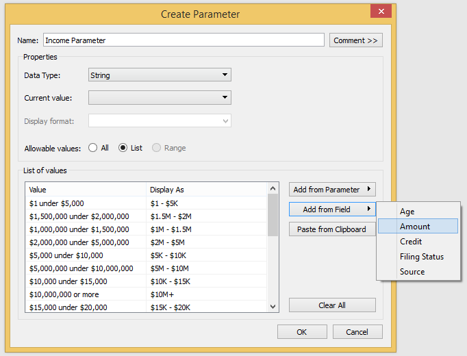
Step 1: Create a Parameter for the Dimension You Want to Highlight
Create a parameter with a data type of string and allowable values of list. Parameters are very sensitive in that the values have to match the underlying data exactly, including casing, to work how you want. As a shortcut, you can add the members of your dimension to the allowable values list by choosing "add from field” when creating your parameter. Here is how my income parameter looks:
Step 2: Create a Calculated Field with Your Dimension Parameter
The second step is to create a calculated field that will eventually be used as the measure on a dual-axis combination chart. The formula is:
IF [Dimension I Want to Highlight] = [Dimension Parameter] THEN 1.5 ELSE NULL END
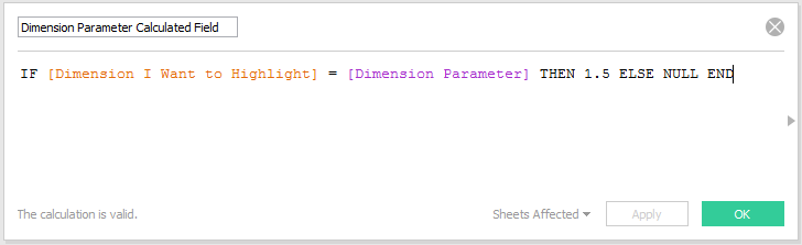
This calculated field is simply saying, “If the dimension member equals the current value selected in the parameter, then show the number 1.5; otherwise don’t show anything." The 1.5 is kind of arbitrary because this approach will work as long as the axis for this new measure is fixed to be a smaller number than the number in your calculated field.
Step 3: Create a Dual-Axis Combination Chart
Assuming you’ve created a chart that you want to add this highlight to, put the newly-created calculated field on the opposite axis to create a dual-axis chart (learn how to create a dual-axis combo chart in Tableau).
In my case, the original chart was a histogram with a mark type of area. When I put the new calculated field on the opposite axis, it inherits the same mark type as the original chart by default. Here is how my view looks at this point (note that I have also selected to show parameter control which makes it appear in the top right corner):
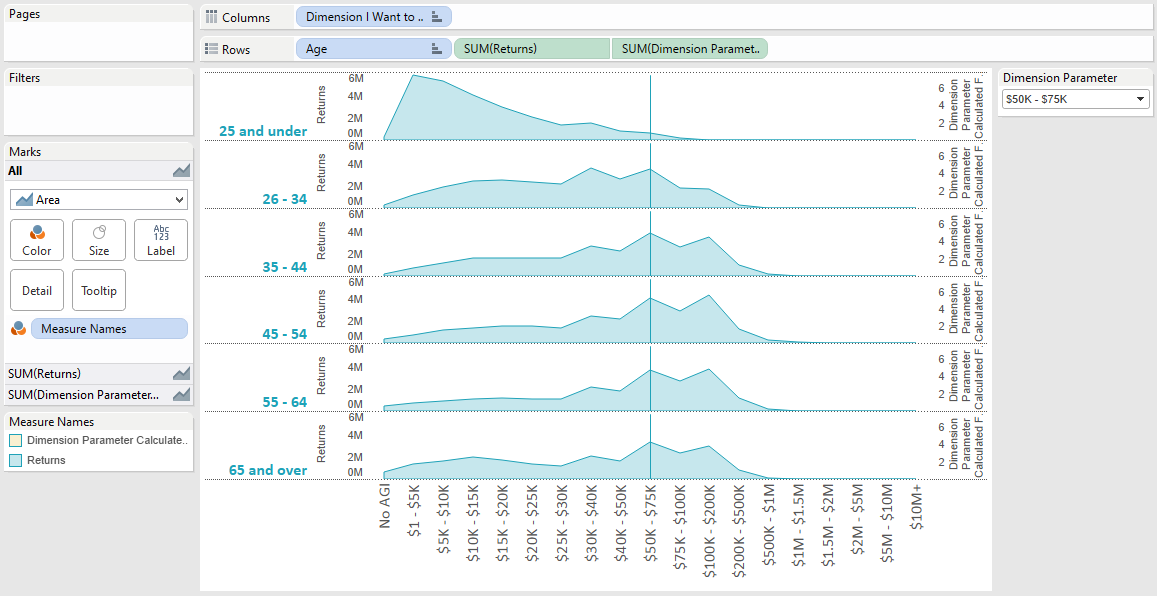
From here, there is just a little cleanup to make a nice highlight/reference band effect:
Fix the axis of the right axis by right-clicking on the axis and choosing "edit axis." For the best results, fix the axis at a number smaller than the number in your newly created calculated field (mine is fixed at 1, which is less than 1.5).
Change the mark type of the second axis to bar, which will create the band look.
Change the format of the bars to the size and color that you want. I recommend adding borders and transparency.
Hide the headers for your second axis by right-clicking on the axis and unchecking “show header."
My final product looks like this:
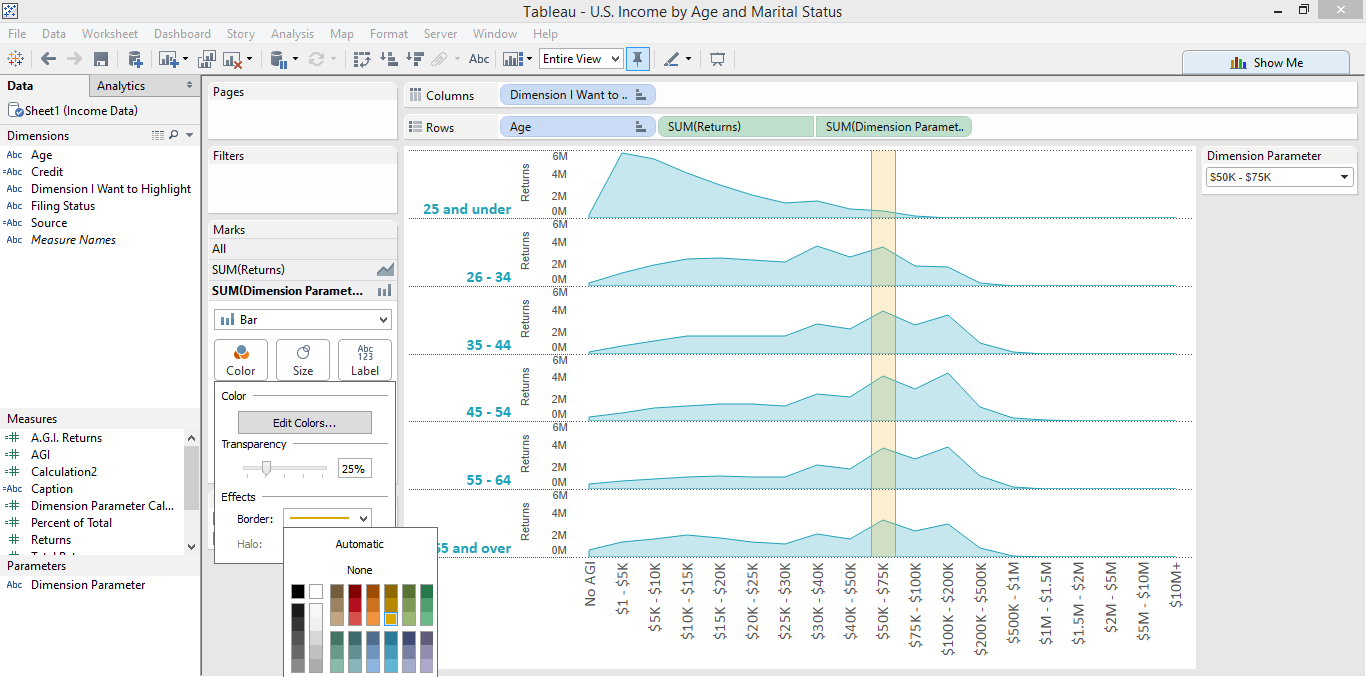
Now if the name of the dimension member matches the parameter selection, you will see a nice highlight of that choice on the x-axis—a reference band on a dimension in just three steps!
For more tips, tricks, and works by Ryan Sleeper, visit his Tableau public page and read his blog posts on Evolytics.com.
Subscribe to our blog
Tableau の最新情報をメールでお知らせします