What is the Human Face of Big Data?


It’s also a series of mission control events in Singapore, New York, London and San Francisco. Tableau folks will be in each of these locations, acting as “Data DJs” showing visualizations on the stories in the book. For example, Smollen profiles safecast.org, a project to map radiation levels in Japan:
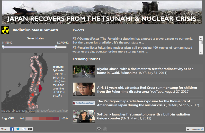
Soon after reactors at the Fukushima Daiichi Nuclear Power Plant began to melt down, a group of three techie friends—one Japanese, living in Boston; one Dutch, living in Japan; and one American, living in LA—started looking for information about the radiation exposure in Japan. They could not find any so they took it upon themselves to help solve the problem. Within a week, they launched the safecast.org website, where people could upload radiation levels and map them. Here we see a marriage of statistical data about radiation levels and very human discussions of the impacts and issues around it.
Working with EMC, which mined tweets from the Twitter firehose, a crack team of Tableau data geeks went to work. Here’s Brett Sheppard’s visualization combining the Safecase radiation measurements with conversations about radiation on Twitter.
Other data geeks responsible for the 15 visualizations featured in this project were
- Workhorses Daniel Hom and Lori Williams, who visualized 5 stories each
- Andy Cotgreave, who analyzed the mPedigree story and also provided valuable feedback on other stories
- Michael Kovner, parachuting in from the Tableau Product Consultant team, visualized Major League Baseball while simultaneously closing quarter-end business.
Dan Jewett, who turned us on to this great project, also deserves a mention. You can see all the visualizations for the Human Face of Big Data project here.
Look for Elissa Fink (@elissafink) at Mission Control in Singapore, Andy Cotgreave (@acotgreave) in London, Michael Heffner and Phillip Edgar at Oracle Open World in San Francisco, and yours truly (@eleanorpd) in New York. We’ll be looking for big data’s impact on our daily lives. Follow us or @faceofbigdata on twitter to get real-time updates.
Subscribe to our blog
Tableau の最新情報をメールでお知らせします