Behind the Viz: Ryan Soares explores how stay-at-home orders have affected community mobility trends


Get to know your fellow Tableau Public authors with Behind the Viz, a blog series where we explore the people and processes behind our featured vizzes.
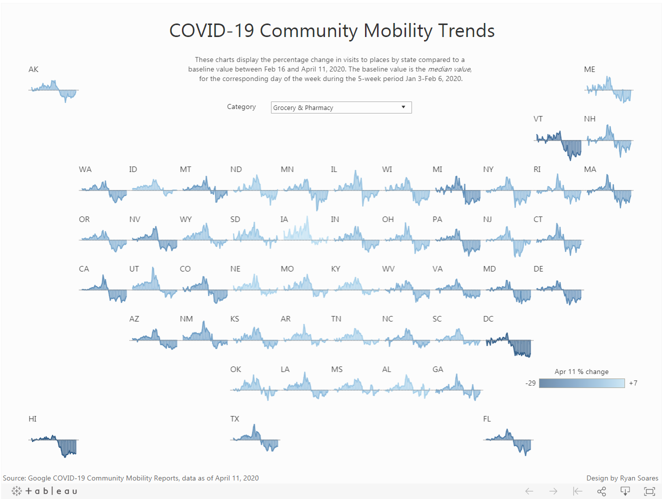
Over 15,000 Coronavirus (COVID-19) data visualizations have been published to Tableau Public. In fact, #COVID19 is now the second most popular hashtag on Tableau Public. While many people are visualizing case data by state or country, Ryan Soares decided to approach the topic of Coronavirus (COVID-19) from a different angle—by looking at community mobility trends across the United States and how they’ve changed over time. The trends are broken down by location and show the difference in visits to workplaces, grocery stores, parks, and more. Ryan’s Community Mobility Trends viz was recently selected for Viz of the Day (VOTD) and featured in the COVID-19 Gallery.
Ryan is in his final year at the University of Waterloo and Wilfrid Laurier University studying Business Administration and Computer Science. He was first introduced to Tableau in 2018 while interning for the Royal Bank of Canada (RBC), and he’s been creating vizzes as a hobby ever since. Ryan enjoys visualizing sports data and uses Tableau Public to share his work with the #DataFam. He recently won the Data VizArt Student Challenge, a data visualization competition for Canadian students. We sat down with Ryan virtually to learn about the process behind creating his recent Viz of the Day.
How long have you been using Tableau Public?
I published my first viz to Tableau Public in 2018. I was looking for ways to improve my data skills during my internship so I decided to participate in #MakeoverMonday. By sharing my work publicly, I was able to get valuable feedback from the community. After I created my first #MakeoverMonday viz, I started taking part in other community-led initiatives like #SportsVizSunday. Now, vizzing is one of my favorite pastimes. I create vizzes about any topic that I find interesting (usually I pick sports).
Why did you decide to visualize Coronavirus (COVID-19) data?
I saw a lot of visualizations surrounding cases and deaths but wanted to focus on something other than the epidemiology of COVID-19. This data set initially caught my eye because it demonstrated how people around the world and in our communities have responded to the pandemic. I also wanted to learn whether trends in mobility aligned with the various policies and restrictions put in place by governments.
Gyms, retail stores, & even parks have closed, but are people really staying home? In this Tableau, Ryan Soares uses Google's Community Mobility Reports to look at mobility trends by state. Do you have a Coronavirus (COVID-19) viz you'd like to share? https://t.co/qSpu8xxzka
— Marc Benioff (@Benioff) April 8, 2020
What was the hardest decision you made when creating this viz?
The biggest challenge I faced was deciding which geographic level to focus on. The data used was aggregated by different regions, including county, state/province, and country. There were interesting data stories to tell at each geographic level, which made it an even more difficult decision. At first, I created a viz that looked at trends by country, but later on, I revisited the data. I thought back to Matt Chambers’s blog post on creating a tile map and used it as a guide for creating this viz looking at mobility trends by state.
What advice can you offer students who are just getting started with data visualization?
As a student, you can get Tableau Desktop for free, so definitely take advantage of that. There's also a ton of free resources out there that you can learn from—The Tableau Student Guide by Maria Brock is a great place to start. When it comes to creating visualizations, I find it easiest to choose a topic you’re knowledgeable and passionate about. When you care about the story you’re telling, it makes the process more enjoyable and usually results in a better viz. Lastly, don’t hesitate to share your work publicly on Tableau Public or Twitter. It’s a great way to get feedback and build a portfolio that showcases your work.
How has Tableau helped you stay busy while at home?
With some extra free time, I’ve been able to devote more time to creating vizzes and testing out new ideas. Recently, I’ve gotten a lot of inspiration from vizzes created by the Tableau Community. I’ve also volunteered to assist CovidIQ and HowsMyFlattening with their data visualization efforts; these groups are using COVID-19 data to help decision-makers and communities during the pandemic.

Don’t forget to follow Ryan on Tableau Public to keep up with this latest work! Are you a student? Take your data skills to the next level—request a free Tableau license and get access to the entire Tableau eLearning suite.
For trusted Coronavirus (COVID-19) data and resources, please visit our COVID-19 Data Hub.
Storie correlate

Meet Iron Viz 2024 Finalist Jessica Moon
 15 Aprile, 2024

Meet Iron Viz 2024 Finalist Pata Gogová
8 Aprile, 2024

Student to BI Analyst, How Tableau Can Lead to a Successful Data Career
 20 Marzo, 2024
Subscribe to our blog
Ricevi via e-mail gli aggiornamenti di Tableau.