How to Find Patterns and Anomalies Using Spatial Data Distributions


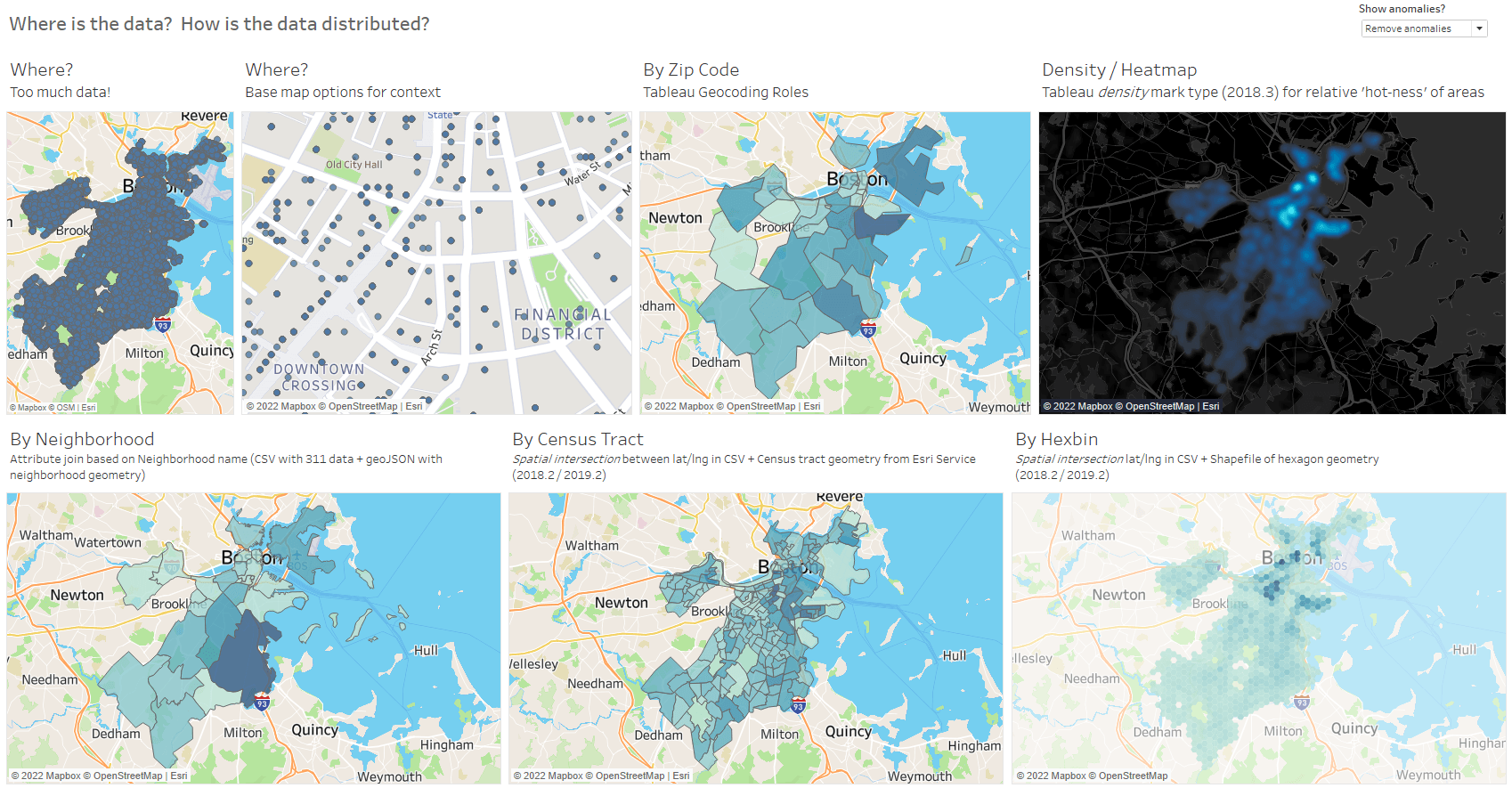
Looking at the location of data points on a map is the fundamental element in understanding spatial data. If you don’t know where it is, you don’t have a map! There are a lot of ways to explore spatial data distributions in Tableau. Let’s explore how they differ in helping us find patterns in our data—and how they can help us find problems in the underlying data set.
About the data: 311 service requests
I used a data set of 311 service requests from the open data portal for the city of Boston, Massachusetts for this post. Citizens can submit non-emergency 311 requests to enlist city service support, such as fixing potholes or cleaning up graffiti.
- latitude and longitude to map requests at specific point locations,
- ZIP codes to map to polygons with geocoding using Tableau’s built-in geographic roles
- other attributes (such as neighborhood name, police district, city council district, etc.) to match up with external spatial files for mapping
Let’s examine how we can use these attributes to uncover patterns—and anomalies—in our data.
Show me all the data
I always start by dropping all the data onto a map to see what I can see. Is there anything interesting in the distribution? Clusters with more data? Areas with sparse data?
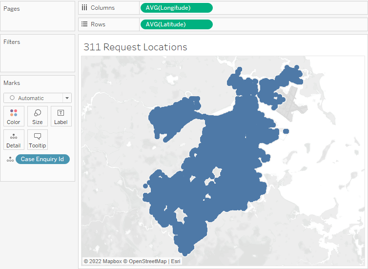
To look at all the data points for this data set, just add latitude and longitude, along with the Case Enquiry ID (a unique identifier), into the worksheet. As quick as that, we have a map. But, it’s hard to see patterns because there’s so much data! In fact, it’s about 230,000 data points—which look like a big blue blob. We’ll need to explore a bit more to uncover any patterns…
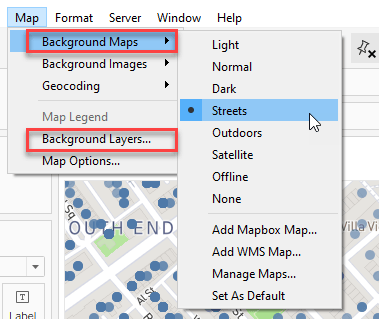
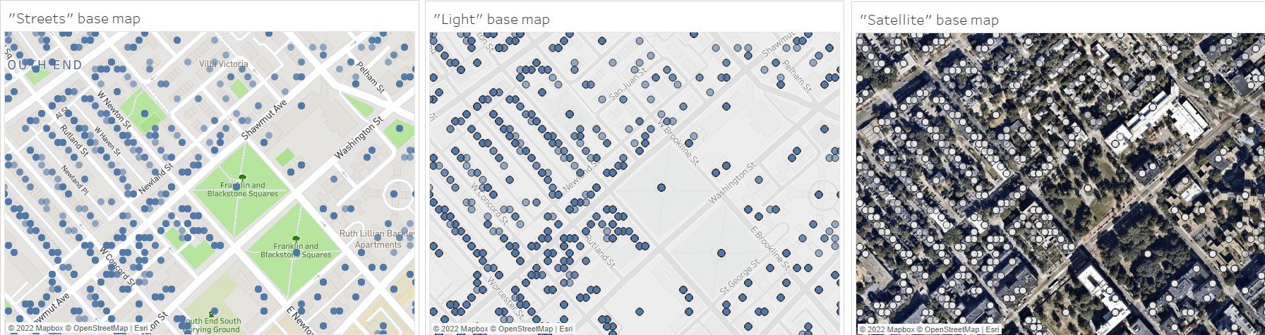
We can zoom in to see more detail and understand localized patterns. Adjust the built-in base maps in Tableau to customize the map’s context and understand the local situation for our data: use one of the built-in map Background Map styles or customize the layers (streets, points of interest, city names, etc.).
Here are a few examples of the built-in base map styles in Tableau:
Aggregate the data
If the raw data doesn’t provide a clear view (like the big blue blob above), or if you have specific groupings of data that are important for your analytic questions (such as, how many requests came in for each ZIP code?), you’ll want to look at aggregation. Tableau loves aggregation, so it’s easy to group point locations to make more simplified versions of your map for analysis.
However, before you decide you understand the true patterns in your data, aggregate your data in multiple ways. Why?
- Most regions of interest (state, ZIP code, police district, etc.) are different shapes and sizes. If you’re counting up points inside them, remember that larger areas generally contain more points—and a map that simply shows that big places have more stuff isn’t very interesting.
- Data is rarely clean. You may encounter incorrect attributes (like a mistyped ZIP code) or errors in location.
Let’s explore aggregation methods with this data set to see this in action.
The 311 data includes a ZIP code attribute, which makes it easy to map in Tableau using the built-in geographic roles. Just drop the Location ZIP Code attribute on the map and drop the Count of records on color. Done!
Hmm… not quite. Look out for these common gotchas:
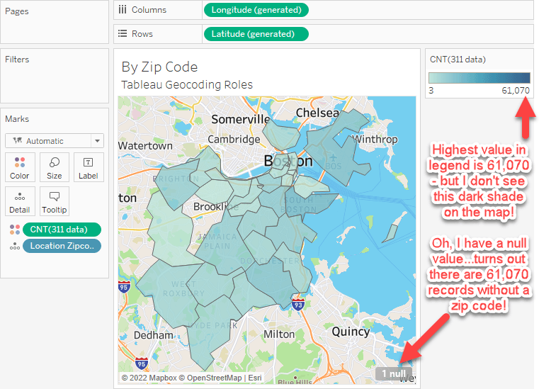
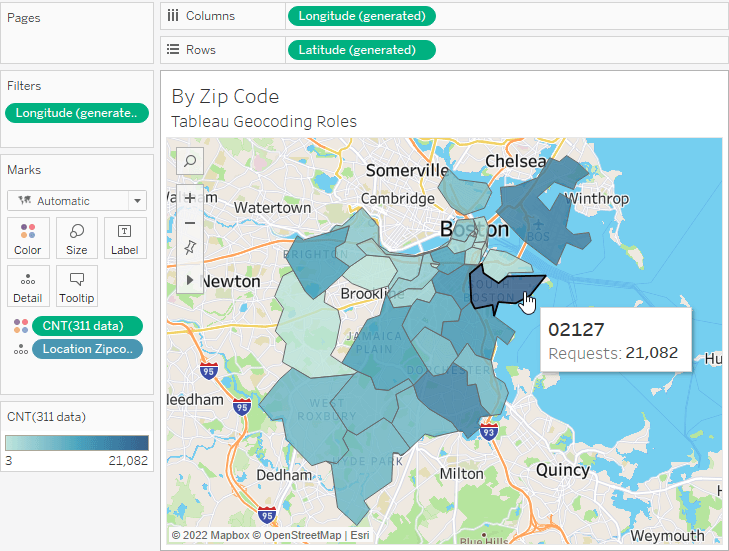
Always check for null values and confirm that your map and legend match up, or it will be hard to visually see the true pattern! In this example, once we filter out the null records, we see a truer picture of how the data is distributed by ZIP code:
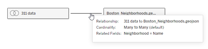
But, what if your data doesn’t align with one of the built-in Tableau Geocoding Roles? Easily add other spatial data to define your areas of interest by setting up a join based on an attribute or by geography.
To see our 311 points aggregated into neighborhoods, we can use a spatial file from the Boston Open Data portal for neighborhoods and set up a join or relationship based on the neighborhood name.
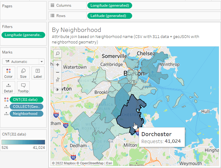
Now we can quickly drop the neighborhood geometry onto a map and use the Count of records on color to see that the Dorchester neighborhood has the most 311 requests (41,024). This also looks like the largest neighborhood in the city, so we might expect it to have a high count because, if you recall, bigger things tend to hold more stuff.
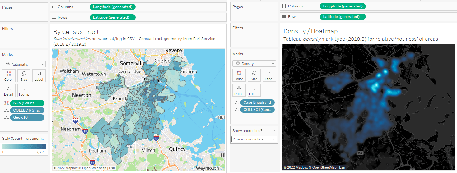
If there isn’t a nice attribute that we can match up by name, we can always use a spatial intersection join to match up the points in our data set to locations in another data set, just like this:
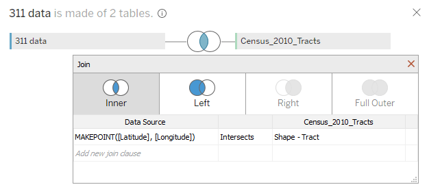
Here, I match our 311 records to a set of spatial data for US Census Tracts from the Census Cartographic Boundary Files. I use the MakePoint() calculation with the latitude and longitude from the 311 data source to create a point geometry to find the intersections between these points and the US Census Tract polygons.
But, wait, something weird happens when I map the data! This looks nothing like the earlier distribution.
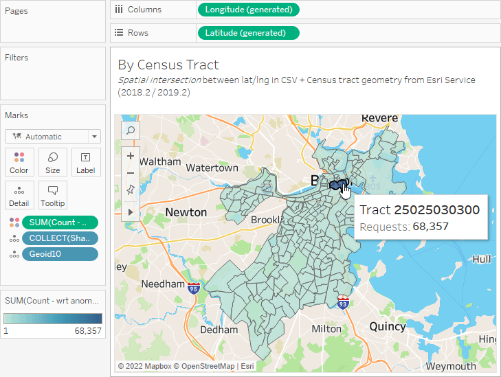
What’s going on? In the earlier maps we looked for matches of named locations, and in this map we see a spatial match for location. This tells us that there are a ton of points that fall inside one specific ZIP code…which might be an anomaly in our data.
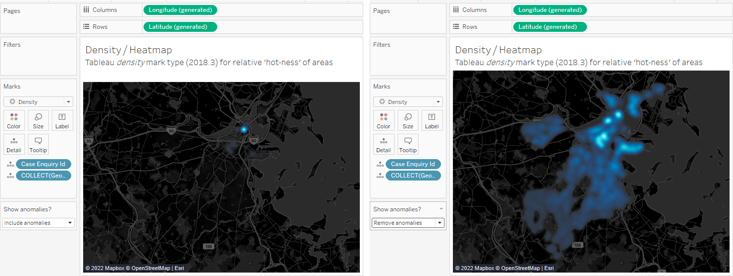
Another way to look for glitches in our data is using the density mark type to see relative counts of points in a “heat map” view. Here are two versions of the same map: The map on the left matches the map with Census tracts above—one very hot spot with tons of data. The map on the right shows the data distribution with a set of anomalous data points removed.
The single “hot spot” on the density map and in the Census map seemed strange. When I zoomed to that hot spot, I saw one point, but when selecting it I realized it was really ~66,000 points stacked on top of each other! That’s odd.
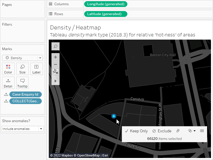
My guess: This is the default location given to points that don’t otherwise have a defined latitude and longitude. When we remove those points, the data is more realistically distributed. Without looking at multiple map types, we may never have found this issue in our data.
The takeaway: To truly understand distributions in your data, build multiple spatial data maps. You’ll more deeply explore the patterns and find the hidden glitches that may be lurking in your data!
For a closer look at the data and maps referenced in this post, check out the corresponding Tableau Public workbook.
Storie correlate

How to Use the Intersects() Calculation in Tableau
 27 Marzo, 2023
A Guide to Mapping and Geographical Analysis in Tableau
 25 Ottobre, 2022
5 tips for mobile-first dashboard design in Tableau
 3 Dicembre, 2019
Tableau Visionary Ryan Sleeper shares his tips for creating mobile-first dashboards in Tableau, including how to: determine if you should consider a mobile-first design, scroll multiple sheets at once and eliminate default scroll bars completely, leverage tooltips, and more.
Subscribe to our blog
Ricevi via e-mail gli aggiornamenti di Tableau.