Feeding America: Addressing systemic racism’s impact on food insecurity through data viz


In 2019, 35 million people—10.9% of the US population—experienced food insecurity. This hardship was not borne equitably: in the United States, a person’s likelihood of experiencing food insecurity varies dramatically depending on their race or ethnicity. More accurately: a person’s likelihood of experiencing food insecurity varies dramatically based on their experiences with systemic racism. Our data has shown, year over year, that people of color in the US are disproportionately likely to face difficulty in accessing adequate and healthy food for their families.
National Food Insecurity Estimates by Race or Ethnicity, 2019

COVID-19 has only exacerbated racial disparities in hunger.
In the midst of the pandemic that has reversed years of declining rates of food insecurity, Feeding America®—the largest hunger-relief organization in the US—understood the importance of keeping racial equity at the center of our response. As we tracked data on COVID-19 cases and deaths, we saw the same racial disparities emerge that we have historically seen in our data on food insecurity. We knew, also, that the economic fallout from COVID-19—ranging from job losses to heightened caregiving needs—were disproportionately burdening families of color.
We were able to move swiftly to mobilize resources for communities most vulnerable during the pandemic: in the past year, Feeding America has directed more than $100 million in grants to network food banks to increase food access for the most vulnerable populations, with a focus on communities of color and rural communities; launched the Food Security Equity Impact Fund; and established a set of Equity, Diversity and Inclusion (EDI) commitments.
To fulfill this work, we needed data, and we needed a lot of it, fast. What started out as Excel sheets and early prototypes being shared across the organization has grown into a powerful data visualization tool designed to support our work for racial equity at Feeding America, the efforts of food banks in our network, and the knowledge building of anti-hunger advocates and data learners across the country.
Identifying Racism in the Drivers of Food Insecurity is a racial data disaggregation tool that examines state-, food bank service area-, and county-level data for five drivers of food insecurity: poverty, unemployment, median income, homeownership, and disability status. While food insecurity is disaggregated by race and ethnicity at the national level, we don’t yet have local level breakdowns. By disaggregating by key drivers, we can begin to overcome this gap in data access while creating greater visibility into the way systemic racism affects the root causes of hunger.
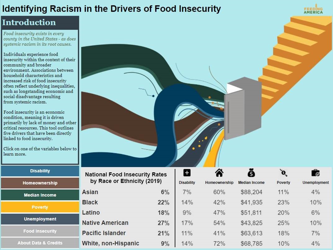
Introduction Page for Identifying Racism in the Drivers of Food Insecurity
These five variables were selected based on existing literature on the demographic factors that correlate with food insecurity and by the availability of each variable at the state, county and congressional district level. These are not the only variables shown to have a relationship with food insecurity rates, but we are limited by data availability at each geographic level. For more information, please refer to the Map the Meal Gap Technical Appendix.
Using the dashboard to understand racial disparities in the drivers of food insecurity
We want to walk you through a couple views of the dashboard that demonstrate the value of nuanced, disaggregated data. To further understand the racial disparities in key drivers of food insecurity, we opted to use bubble charts to visualize multiple layers of information at once.
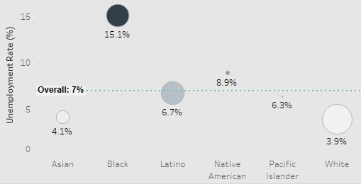
Unemployment Rate by Race/Ethnicity for Cook County, Illinois, where Chicago is located.
This one chart allows us to communicate two important pieces of information without overwhelming the visualization.
Disparity in outcomes: The location of the bubbles on the Y-axis shows how far above or below the unemployment rate for a specific racial or ethnic group is from the overall unemployment rate in Cook County. It also allows the user to compare that level of disparity or (non-disparity) between the six identity groups in one visualization.
Proportion of the population: The size of the bubbles indicates the proportion of the population that identifies as each race or ethnicity. This allows the user to better understand how well represented each identity is in the overall population.
These two metrics layered together, result in the ability to understand the depth and breadth of disparity in the key drivers. It combines insights about the depth of disparity between the disaggregated rate and the overall rate with the magnitude of how many people could be impacted by the disparity.
The above example visualizes disparities in an urban county that is the home to Chicago, Illinois. Without disaggregating county-level data, specific identity groups are at risk of having their experience omitted. Take another example below, which focuses on racial disparities in median household income in our nation’s capital. If we did not disaggregate data by race, one may mistakenly believe there are no concerns in Washington, DC, with a median income of $86,420 that is nearly 40 percent above the national median income of $62,843. Breaking down median income by race and ethnicity uncovers the bleak racial disparities that exist. The bubble charts allow the tool to convey that Black and white individuals are nearly equally represented in DC in terms of population size but have extremely disparate household incomes.

Median Household Income by Race/Ethnicity for Washington, DC.
Embedding equity, diversity, and inclusion in the process—not just the outcome
One of the primary objectives in creating this dashboard was to better understand the depth of racial disparities in and geographic variation of the key drivers of food insecurity. We knew having disaggregated insights into the drivers of food insecurity could drive organizational strategy around Feeding America’s resource allocation, program development, advocacy efforts, and staff education. It could have a similar impact on the operations at network food banks.
We hope that the Identifying Racism in the Key Drivers of Food Insecurity dashboard gives food banks, Feeding America, and the general public the ability to access this data in an easy-to-use format that is engaging and informative.
Including a diverse set of stakeholders in the ideation and development of this dashboard was crucial. Over the past months of creating this dashboard, we met with members of Feeding America’s Employee Resource Groups (affinity-based identity groups) to consult on data inclusion and language use. Two insights that came out of these discussions was the inclusion of the Asian American and Pacific Islander population and using the term Latino throughout the dashboard. Additionally, we shared with food banks early prototypes of this work and incorporated their feedback in the dashboard’s evolution. We also turned to our peers in research and data analytics for guidance around best practices in Applying Racial Equity Awareness in Data Visualization.
While often, data analytics at Feeding America is leveraged to quickly respond to urgent needs, sometimes it is important to slow down to make sure we are creating a strong foundation—built from the inclusion of many voices—to support racial equity work. Because, as hard as it is for these data analysts to admit, data is only one piece of the puzzle. The real catalyst for Equity, Diversity, and Inclusion (EDI) work is where data insights meet and amplify those with lived experiences and place-based expertise. We hope this dashboard, in the hands of food banks across the country, can ignite that spark.
Data in action
This is only the beginning. With the publishing of Identifying Racism in the Key Drivers of Food Insecurity, we look forward to learning from our food bank partners about the community impact this dashboard supports. We hope to continue sharing those learnings with you through future spotlights on the work of food banks on the ground working to end hunger and combat racial inequity in its key drivers.
We envision continuing to build upon this work: disaggregating more variables by race and ethnicity (more key drivers, consequences of food insecurity, and solutions to it) and disaggregating by other facets of identity that are disproportionately impacted by food insecurity (e.g. children in the household, gender, age).
At the end of the day, engaging EDI in our work is a process of learning and relearning. We are very excited to embark on this journey with our Feeding America colleagues, network food banks, the people we serve, and you—data users with a passion for ensuring equitable access to nutritious food for all.
Storie correlate

Using data to drive conversations about climate change
 28 Aprile, 2022

Leveraging data to improve forestry practices worldwide

Doing Good Data Means Doing No Harm
 13 Dicembre, 2021
Subscribe to our blog
Ricevi via e-mail gli aggiornamenti di Tableau.