Thirteen things to visualize about COVID-19 besides case loads


Editors note: Andy runs a consultancy, Hillcrest Advisory, to help organizations communicate data effectively and transform numbers into impact. Follow him on Medium. This post originally appeared in Nightingale, a publication by the Data Visualization Society.
Remember a few weeks ago, when measures such as smoking or obesity rates, cardiovascular disease prevalence, and opioid deaths were essential ways we defined health? Those seem like such distant concepts now that we’re so fixated on COVID-19 and its growing case loads in countries around the world.
There’s no doubt that COVID-19 case loads will continue to capture our attention, likely for months (or, dare I say it, years). And many entities, including Datawrapper, are doing a tremendous job of tracking these core measures of COVID-19 prevalence.

But that doesn’t mean that we need to focus exclusively on case loads, or number of deaths, related to the coronavirus. The ways in which COVID-19 affects all of us will be far-reaching. Prodded by Kristin Henry, a computer scientist specializing in science and data visualization, members of the Data Visualization Society joined forces earlier this week to catalog what else related to COVID-19 would be worthwhile for researchers and policymakers worldwide to measure related to COVID-19. Ideas included the following:
- The toll the virus may be taking on our emotional well being. Measuring over time how concerned people are about COVID-19 is one simple approach, but we also can monitor emotional and mental health outcomes, such as suicide rates and inpatient hospitalizations for mental health episodes.
- Lifestyle changes people are making — including those recommended as a result of social distancing.
- The impact the virus may be having on whether we’re seeking out routine health care — and if we’re not getting such health care, what will be the long-term consequences of this.
- Jobs/industries most likely to be impacted by COVID-19, from tourism to real estate to sports to the gig economy. The New York Times, for example, visualized workers who face the greatest coronavirus risk, and data in the U.S. are already beginning to show the effect the virus is having on unemployment claims.

New York Times visualization showing occupations that face the greatest risk from COVID-19.
- Educational impact of lost school days: How do we assess student achievement during this period when schools are closed? Are there higher priorities for kids on which we should focus?
- Mike Connery, a Data Visualization Society member, mentioned utility usage variations for electrical, gas, water, and sewer systems now that homes are surely utilizing a bigger share of resources than they once did. How will this shift impact efficiency, cost, and reliability?
- Similarly, freelance designer Ben Oldenburg wonders “…to what degree the internet infrastructure will be resilient to the increase in data for things like videoconferencing on top of what will already be high streaming traffic.”
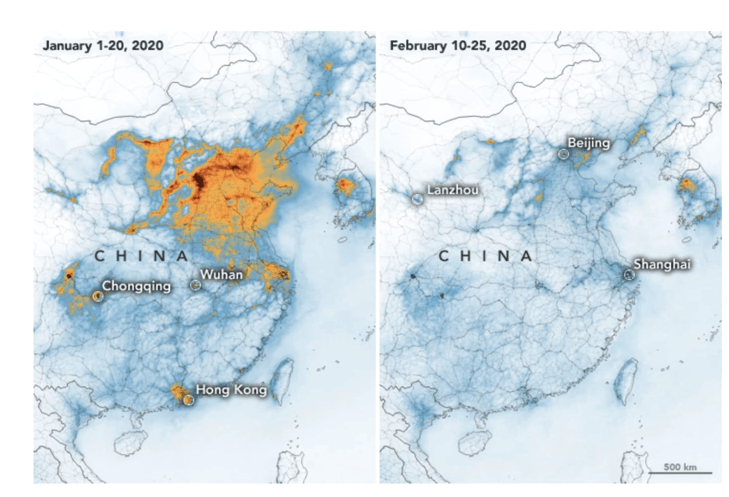
- Unintended positive effects on air pollution and other environmental factors. CNBC, for example, reported on how NASA images showed significant decreases in air pollution over China.
Another approach might be to look at things like CO2 emissions. This won't give you cases, but will indicate changes in population activities.
— Henry, Kristin (@KristinHenry) March 2, 2020
- Change in traffic patterns. If some of us get more used to working from home, for example, could congestion on the highways ease up over the long term?
- The degree to which COVID-19 will affect what we eat (e.g., more comfort food for these anxious times, a shift towards foods with longer shelf-life, etc.) — and how we eat (e.g., less likely to dine out, more likely to grow our own food).
- Justin Arenstein, who is a leader with open data and civic tech in Africa, noted the need to examine individual’s long-term mobility — how they move through their world from, say, home to work — and the linkages we’ve collectively forged between communities and countries.
- Kristin Henry suggested we analyze data on whether local support systems, such as food banks, are able to step up to provide mass assistance to the elderly, ill, or those who face economic hardship.
- And she also advised looking into supplies of products like toilet paper, where shortages can signal a panic.
The good news is that there are teams actively working on ways to catalog and direct enthusiastic analysts and viz practitioners to other relevant data in order to understand what’s happening in the world during this period of social distancing. By diverting some of our energy (or new-found obsession, however you choose to look at it) away from the case load data towards these other domains, we’ll no doubt be able to put our data analytic and visualization talents to productive use.
These are just the start of many ideas around how we’ll use data to understand one of the most unique and challenging periods of this century. Intense social distancing efforts — resulting in shelter in place recommendations in a growing number of locations — will undoubtedly have a wide array of effects that we haven’t thought of. You can join the conversation on the DVS slack or by adding your ideas in the comments below.
To see more information and visualizations on data and the coronavirus outbreak, visit Tableau’s COVID-19 Data Hub. This resource is constantly developing along with the situation, and we’ll be highlighting more stories the weeks to come.
Storie correlate

After a year of COVID-19 charts, eight data communication lessons learned
 19 Aprile, 2021
4 reasons why embedded analytics is your path to a new revenue stream in the COVID-19 era
This blog post covers four reasons why organizations should consider embedded analytics.
What we can learn from the public sector’s response to COVID-19
 21 Maggio, 2020
A broad consensus is that COVID-19 will drive digital transformation in the public sector. During the 2020 Government Summit, speakers from Veteran Health Administration, Southwest Texas Regional Advisory Council, and FEMA discuss new processes, new technologies and innovations, and most importantly, a new mindset on decision making in the midst of crisis.
Subscribe to our blog
Ricevi via e-mail gli aggiornamenti di Tableau.