Designing a great dashboard extension


So, you’ve built a Tableau dashboard extension? Awesome! But what’s the user experience like interacting with it? Is it easy to use? Is it aesthetically pleasing? Is it effective? Follow this guide to ensure that your extension provides a user-friendly experience and is delightful! If you’re just getting started on building an extension, you can learn more here.
Offer a great user experience with your extension
After you have your extension running, it is important to ensure it has great usability. User experience is important in making sure your extension is well adopted and that the user has an easy time learning to use it. This will enhance the value of your extension, and have people coming back to use it again and again. You can use these considerations as a checklist:
- Have simple controls and user interface (UI) patterns. The content in your extension should clearly indicate to the user how to interact with it. For example, dialogues should not contain information which is irrelevant or unnecessary. Any extra piece of information you add will deter the user from reaching their primary goal. It is important to make sure your designs utilize controls and patterns that are easy to learn. This is where UI patterns come in handy, because they are drawn from best practices within UI design. They are reusable solutions to commonly occurring problems. Take a look at Tableau’s specs controls and UI patterns for some examples to use.
- Provide appropriate feedback and error messages. Your extension should always keep users informed about what is going on in real time. For example, if the dashboard zone your extension is in is being loaded and it is going to take longer than usual, including an activity indicator to make the user aware of what is happening is ideal. Otherwise, the user may be wondering if the system is actively doing anything or if there’s an error. If there is an error, the message should be expressed in plain language and describe the problem, as well as suggest how to fix the error.
- Ensure the responsiveness of your extension’s layout. Make sure your extension’s container contents and controls will resize and display properly. Containers can be manually resized by the user, so make sure to use common responsive web design practices, like breakpoints and percent-based widths. Read more about guidelines for layout to make sure your styles are consistent with other extensions in the gallery.
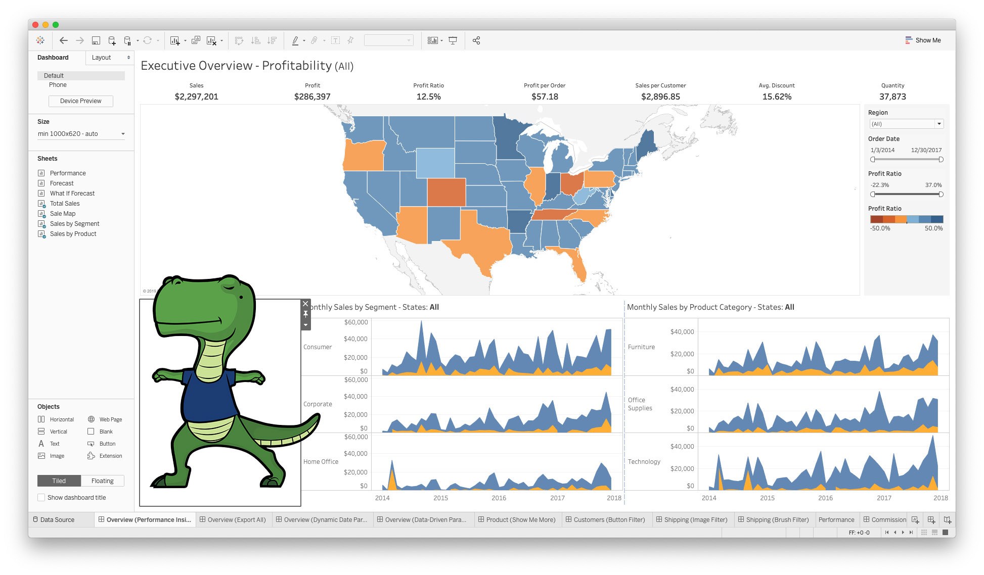
- Make your extension beautiful with minimal design. Color is important to use with purpose and clarity. Use it minimally and only to highlight functionality in your extension. Using effective colors will communicate to the user what to focus on. You can also take a look at Tableau’s standard system of colors to use for your extension. As for font and typography, there should be a clear hierarchy of content distinguished by using different font sizes, weight, color and spacing. With this, the user is guided to which pieces of content to look at or act on first. Take a look at our recommended list of fonts for some guidance. You can use Tableau’s style guide to make your extension look native to Tableau, however you may want to brand your extension to visually distinguish it as yours instead. Here is a guide to how you can effectively brand your extension.
- Link to help and documentation. For extensions that are more complex to set up or use, having a place for users to go to get additional help is a plus. Also, it can provide a place for the user to learn more about you or your company.
- Lastly, do some usability testing before sharing. Do some quick tests with people who are not familiar with your extension. Observe how they use your extension and if they run into any problems. This includes bugs, but also watch for if the person interacts with something differently than how you expected them to and note where they get stuck. This can reveal a lot about the usability of your extension in a short amount of time.
Design is important and often left out by developers. Spending the time to work through the design will allow you to build a truly great user experience and keep customers in love with your extension. Now with all these guidelines, I hope you have found some useful tips! If you have any more advice on how to design a great extension, feel free to tweet them out with the hashtag #datadev!

Get involved in the Tableau Developer Community
We provide many resources and tools to help you refine and extend the Tableau platform. Join the Tableau Developer Program to stay on top of API updates, training, hackathons, and more!
Storie correlate

Visualizing Women's Impact to History Through Data Visualization
 18 Marzo, 2024

Behind the Viz: Adrian Zinovei Helps You Design Your Next Dashboard
1 Marzo, 2024

Charting the Heart: Data Visualizations on Love
 14 Febbraio, 2024
Subscribe to our blog
Ricevi via e-mail gli aggiornamenti di Tableau.