Cows in Africa + Data Discovery = Bronze
After 15 months at Tableau, I was long overdue to become officially certified on our product. When it came time for the last step in the certification process, publishing original work to Tableau Public, I wanted to put myself – and Tableau – to the test. Customers tell me all the time about their amazing experiences discovering new things in record time. Could I do it, too?


After 15 months at Tableau, I was long overdue to become officially certified on our product. When it came time for the last step in the certification process, publishing original work to Tableau Public, I wanted to put myself – and Tableau – to the test. Customers tell me all the time about their amazing experiences discovering new things in record time. Could I do it, too?
Before I let you in on how my data discovery experience panned out, let me share some salient details about me:
- I am not a programmer. If you papered my office with SQL queries I would not know that they were SQL queries.
- I am not a Tableau expert. I see a lot of impressive work in Tableau, but I liken myself to a food critic versus a chef. I know when I see something compelling, but have not yet proven that I could do the work myself.
- Until June 22, I knew nothing about the cattle population in Africa.
Spoiler Alert!
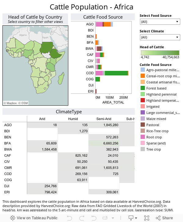
Ultimately, I earned my Bronze Certification in part by creating this dashboard about the cattle population in Africa. After you've sated your interest about the relationships between food sources, climate types, and African countries on cattle populations, read on to see how this was created - in 2.5 hours.
My step-by-step quest for bronze
In order to give myself the full challenge of exploring a new data set and finding some cool stuff, I decided to find a new-to-me data set and see how long it would to create something compelling. Here’s how it went down:
7:05am – Visit www.HarvestChoice.org to find an interesting dataset. (They’re a Tableau customer and they have amazing data.)
7:11 – Settle on “Cattle Population in Africa” and download it to Excel. (At this moment I know nothing about the cattle population in Africa.)
7:13 – I’ve connected to the .xls and am seeing fields in Talbleau like AEZ5_CLAS, FS_NAME, and AN05_CATT. These mean nothing to me. I start dragging them out one-by-one to see what’s in them. I learn along the way that AEZ5_CLAS, for example, represents climate types.
7:19 – A quick Wikipedia search confirms that the “ISO3” field contains country codes. I now know a map of Africa automatically generated Tableau is in my future. WOOT!
7:29 – I’ve sorted out what all the data fields represent. Time for the fun stuff.
7:41 – I’m done tinkering with my area map showing cattle population by country. Ready to explore another angle about the data.
7:45 - I decide to dig into the food source for all these cows.
7:58 – Done creating that, so now I make a dashboard. I suspect there’s more to data I can explore, but this helps me figure out what’s I should add.
8:06 – Settle on climate type. What’s it like where all these cows live? I use Tableau’s ShowMe to figure out to represent this meaningfully. Settle on a highlight table.
8:10 – As I build this, I’m bothered by the null values. Do I need them? I drill into the underlying data in Tableau and decide I can exclude them. After all, a cow can’t eat “null” or live in a “null” climate, right?
8:15 – Realize I have not saved. I do this now.
8:28 – I add my climate analysis to my dashboard. Feeling pretty psyched. If you’ve got questions about cows in Africa, I’ve got some insights for you.
8:32 – Hit a snag. Thought I was done, but something’s wrong with how I’ve implemented my filters.
9:01 – Have finally sorted out which step I was missing.
9:02 – I’m so close, but I can’t stop thinking that I’m not the only person who doesn’t know that SLE stands for Sierra Leone. There’s got to be a way to get the country names included. JACKPOT! Wikipedia strikes again.
9:08 – I’ve copied the list of country codes + country names from Wikipedia and created an .xls. I’ve connected to this second data set in Tableau. Whammo! Blended data. I’m feeling proud at this moment.
9:10 – Added country names to the tooltip.
9:18 – DANG realized too much data for public. 269,818 rows which is over the 100k limit. Hrumph.
9:31 – I’ve sorted out how to adjust the file so I hit the row limit. (NOTE: If my goal had been to publish this for internal use, the data set size wouldn’t have mattered.)
9:36 – I’m done. Labels have been tweaked, source information added, and size is optimized.
Shortly after, I published my work to Tableau Public.
I earned my coveted bronze certification. I learned about the cattle population in Africa. I proved to myself that I could go from having nothing to something cool in a little over two hours.
But most importantly, I had fun. I felt accomplished and proud. I experienced that spark of magic that so many Tableau customers have described over the past 15 months. It felt great.
If you're interested in a similar exercise, I recommend checking out other data from HarvestChoice. There's a whole world of data discovery waiting to happen for goats, pigs, poultry, and sheep - and that only scratches the surface of the impressive information they make available.
Subscribe to our blog
Ricevi via e-mail gli aggiornamenti di Tableau.