Your Tableau Public Vizzes Have Reached One Billion Views!


Seven years ago, I was sitting in a newsroom when my professor/editor asked me to make my boring data story a bit more interactive. And by interactive, he meant adding a picture of a graph. I felt like that was selling the idea of "interactive" just a little bit short.
One year later, I discovered a nifty little tool that let me build some sort of interactive data dashboard. I later learned to call it a “viz.” It wasn’t my best. In fact, looking back, it was pretty awful, but hey, it was my first.

When I thought of what interactive meant, this was it. It wasn’t just displaying information in graphical form; it was the ability to change what’s in front of me, to ask my own questions.
Sure, we can see banks failed the obvious years of the global financial crisis, but which states were hit the hardest? Is it a surprise that Florida shows so many failed banks? What if we normalized the number of bank failures by population (a missed opportunity on that author’s part, ahem).
That’s the fun of interactive data analysis: You get to ask the next question.
It’s been six years since I discovered Tableau Public, and since then, people have done crazy things. Crazy things. And these are just a few examples.
As we ring in 2017, I’m honored to announce that this community has crossed another milestone: More than 300,000 of you have authored nearly 800,000 vizzes which have been viewed more than one billion times. One billion! That means your vizzes have been loaded more than one billion times. That means many of you—hundreds of thousands of you, in fact—are telling data stories, and even more folks are consuming them, interacting with your work and answering more questions.
To this day, what has stuck with me the most isn’t that people actually work with data, which really shouldn’t be a surprise. Everyone has questions and needs data to find out the answers: Is it really true that it rains more in Seattle than any other city in the US? Which country has the most number of mobile phones per capita? How tall is Harrison Ford? (Speaking of which, who’s measuring people’s heights?)
No, what has surprised me is how people share the insights they discover—that there are actually many ways to tell a data story. That if you give someone a giant table of data, they might come up with new and innovative ways to present those insights.
There are the takes on traditional business dashboards which are tried-and-true for a reason.

Then there are the ones that show that data is also for fun and is everywhere you look.

Sometimes it’s the creative ways authors ask you to insert yourself into the data. I’ll quote Chad Skelton at Tapestry 2016: We can hold up a mirror to society at the same time as our readers [who] are checking themselves out.

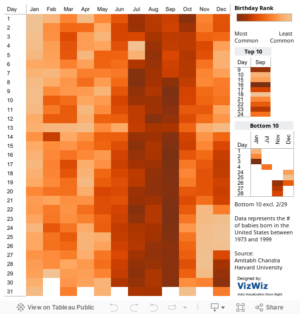
Sometimes simplicity is best as it lets the data do the talking.
There's also the weekly #MakeoverMonday project for which people come up with drastically different ways to present the same data.
We’ve come a long way since the days of Florence Nightingale, Charles Minard, or John Snow. Today, data visualization is used by everyone, from individuals to large news organizations, to tackle a variety of questions, from human trafficking to selfies. Yup. Seflies.
Which leads me to my favorite form: long-form storytelling, a form that asks the author to make a statement, and invites the reader to really dive in and question it. Here’s a great example from Inga Ting at the Sydney Morning Herald.

Read the full piece here.
These are some of my favorites, although with thousands upon thousands of vizzes to choose from, I’ve left out quite a few.
What are your favorites? Share them with us in the comments below or via Twitter using the hashtag #NextBillionViews. We can’t wait to see what the community makes next, and where data analysis and storytelling go from here.
Cheers, to the #NextBillionViews.
Autres sujets pertinents

Meet Iron Viz 2024 Finalist Jessica Moon
 15 avril, 2024

Meet Iron Viz 2024 Finalist Pata Gogová
8 avril, 2024

Student to BI Analyst, How Tableau Can Lead to a Successful Data Career
 20 mars, 2024
Abonnez-vous à notre blog
Recevez toute l'actualité de Tableau.