Combating racial inequity with data: A progress report and look ahead


Since the launch of the Racial Equity Data Hub in February 2021, the Tableau Foundation and its partners have empowered a connected community of advocates committed to helping everyone see and understand the intersection of race and equity in America. As the year draws to a close, we are grateful for the partners and their partners for building awareness, delivering impact, and changing systems. From building economic power and creating equitable educational opportunities for all students, to advancing equitable justice and building political power, they are making strides daily. Their work is proof that data can be a superpower in the fight against racism, and has highlighted the intersectionality of race and these large social issues.
Four ways data is making a difference
To end inequalities, biases, violence, and disenfranchisement, we must first see where they are present. In 2021, data was a critical tool in the fight for justice and equity in the United States. The work of four Tableau partners stands out.
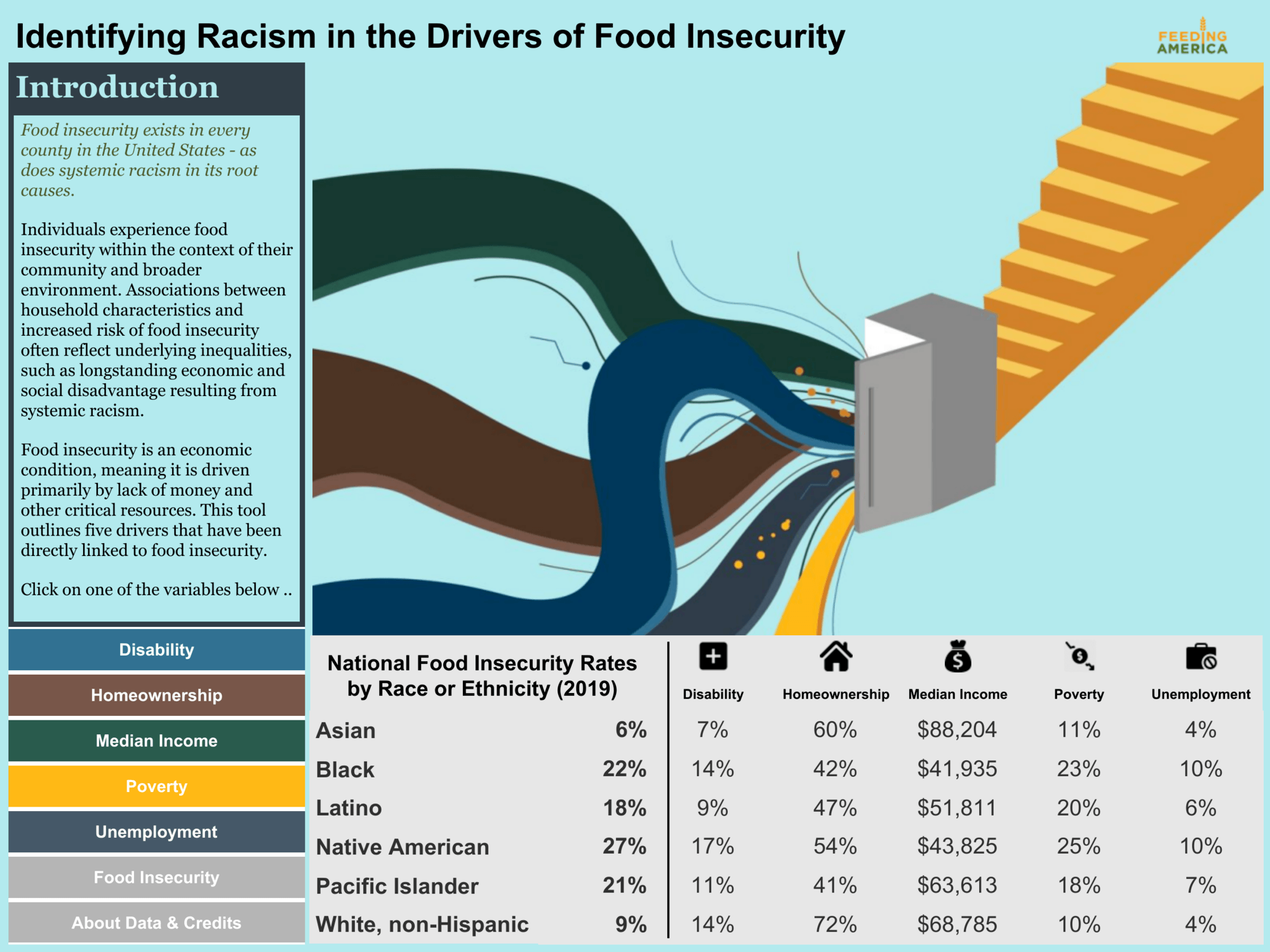
Feeding America’s Food Insecurity dashboard was met with excitement and an eagerness to engage with the data from their network of 200 food banks. Creating an opportunity to learn from the data and determine next steps, the viz has generated conversation around the topic of systemic racism in their work, and the feedback they receive will be used to make improvements.
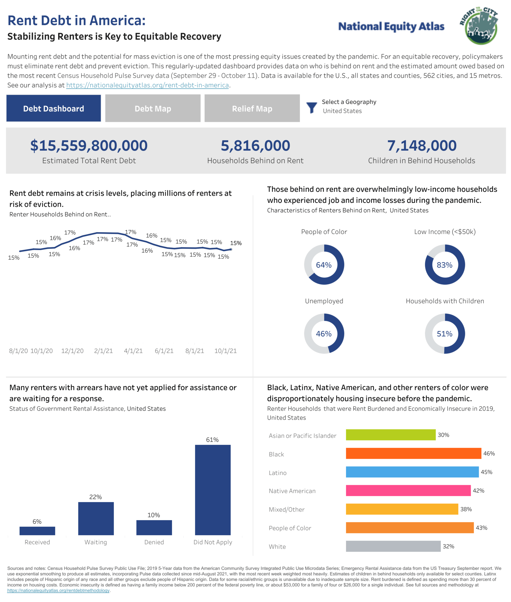
PolicyLink’s Rent Debt in America dashboard, launched in April 2021, clearly visualizes how the pandemic is connected to mass evictions and has influenced policy decisions. It has been visited more than 24,000 times, and in June the State of California enacted a $5.1 billion rent debt forgiveness package to cover 100% of rent debt that low-income residents accumulated during the pandemic lockdowns.
The dashboard continues to fuel community advocacy for debt cancellation and rent assistance. Recently, California-based Raise the Roof coalition cited PolicyLink’s work in their presentation to the Contra Costa County Board of Supervisors, while Housing4Hoosiers provided recommendations to Indiana’s Emergency Rental Assistance program using the data. Prosperity Indiana used this dashboard to develop their own dashboard to track their state’s use of Emergency Rental Assistance funds and to keep advocates in the Hoosier Housing Needs Coalition up to date.

The Southern Economic Advancement Project and Fair Count created a dashboard to advance equitable access to vaccines in Georgia, facilitating more than 7,000 vaccination appointments and reaching hundreds of thousands of citizens with information on accessing the vaccine. It has also since been used as a model by the Louisiana Department of Health to increase vaccination outcomes and reduce vaccination hesitancy.

Urban Institute’s Do No Harm Guide, launched in June 2021, recognizes racism hides in data, and elevates an understanding of inclusive analysis. Guided by the fundamental principle that data points represent real people, we collaborated with Urban to create the Guide. Its adoption and impact have grown steadily since the launch, with nearly 20,000 downloads since launch. The authors, Jonathan Schwabish and Alice Feng, spoke at more than two dozen conferences around the U.S. to organizations, including the U.S. Census Bureau, who are interested in applying the guide's principles of collecting and presenting data through a more diverse, equitable, and inclusive lens. And in December Salesforce launched the Do No Harm Guide Trailhead training course for its 55,000 employees.
Building a data resource to help people see and understand the intersection of race and equity in America
The examples above represent a much larger body of work, driven by our partners and hosted on the Hub, that helps communities fight racism and support more equitable education, economic power, justice, political power, and public health in America. Among the other highlights:
Equitable Education
- Equal Opportunity Schools’ data-driven framework is advancing inclusion in schools by providing schools and districts data to build equity and anti-racism into their classrooms.
- The Civil Rights Data Collection: Policing in our schools dashboard provides insight into the over-policing of Black students
- Technology Gap Map is helping close this gap by visualizing the non-deviced and under-deviced households across our country.
Economic Power
- Did you know that racism in your city has a shape? Learn how hypersegregation forms the Black Butterfly and White L.
- Feeding America identified racism in the drivers of food insecurity.
- PolicyLink: Rent Debt in America is providing data on who is behind on rent to inform equitable recovery from the COVID-19 pandemic.
- National Alliance to End Homelessness is also focused on this societal issue. Their data on the demographics of homelessness across the United States examines the role of race in predicting one's chance of experiencing homelessness.
- PolicyLink's Bay Area Atlas looks at how the Black population is doing with a focus on these key areas: college readiness, police use of force, median earnings, diversity of elected officials.
- PolicyLink also analyzed Black Prosperity in America to understand the disparities in the Black-White wage gap—and why educational attainment or upskilling alone won't solve it.
Autres sujets pertinents

Using data to drive conversations about climate change
 28 avril, 2022

Leveraging data to improve forestry practices worldwide

Doing Good Data Means Doing No Harm
 13 décembre, 2021
Abonnez-vous à notre blog
Recevez toute l'actualité de Tableau.