How to combine PostGIS and Tableau to unleash more spatial goodness in your analysis


Hi, I’m Steve. I lead up Developer Relations at Crunchy Data and in this post, I am going to show you how to use PostgreSQL and its gold-standard spatial extension, PostGIS, in combination with Tableau. Tableau is an awesome analytical platform and its integration with PostGIS provides two key benefits. The first you can work with spatial data directly from the source, without requiring pre-processing, using a live or extract connection. The second, you can leverage the spatial capabilities of PostGIS to expand what is possible with Tableau. Let's dig in.
PostgreSQL is the hottest relational database management system (RDBM) technology that just happens to be 30 years old. While giving you all the power and data cleanliness of relational databases, it also has advanced capabilities like Full-Text Search, JSON storage, query, retrieval, and the ability to perform advanced spatial analysis, which happens to be our topic today. PostGIS is the extension for PostgreSQL that provides both simple and advanced geospatial capabilities.
To follow along with today's exercise, you can either use a Docker container from Crunchy Data, which has the spatial extension already enabled OR you can download and install PostgreSQL with PostGIS from the community download. The data we are using today can also be downloaded from GitHub. Today we will be working with U.S. county boundaries and U.S. storm events captured by U.S. Weather Service.
Set up your data source
- Connect Tableau to PostgreSQL: For the purposes of this post, I am going to assume you have loaded the data into your database and know how to connect Tableau to PostgreSQL. For a refresher, learn how to connect Tableau to PostgreSQL here.
- Make your first data source: Next, drag the county_geometry table (1) into the data source area.
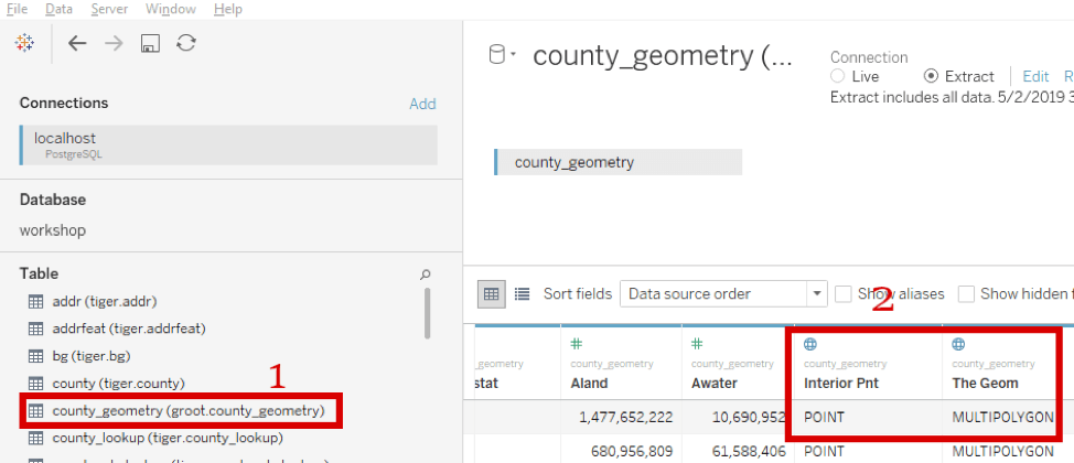
You will see in area #2 that Tableau already understood the spatial columns inside the table, Interior_pnt and the_Geom. As per standard behavior, Tableau replaced the _ character in the column names with a space character. You may want to extract and save the data to make the rendering to go faster.
And with that we are ready to make our first map!
Create a simple Tableau map with PostgreSQL data
Making a map in Tableau is easy. We can add the spatial column to a blank worksheet and Tableau will automatically create a map.
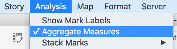
For our first example we are going to look at the area of water in each county. To visualize this, we will make a choropleth map where we change the fill color of the polygon based on the water area. This is a classic geospatial technique for rapidly visualizing patterns in our data. You will need to disaggregate the polygons by adding one of the identifying dimensions, like County name or County FIPS code. You can also turn off aggregate measures so that you can interact with each polygon individually. In this example, let’s turn off aggregate measures by going to the Analysis menu and uncheck Aggregate Measures.
Now drag The Geom Measure onto the Detail shelf and after that, voila, you have a map for all the counties in the United States!
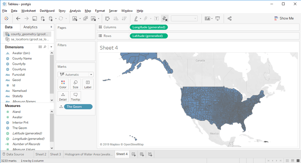
Wondering where the background map is coming from? There’s a great Tableau blog post about Tableau’s vector tiles.
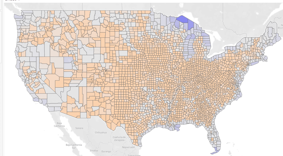
Let’s go ahead and color the polygons by the area of water in the county. Drag the water area (“Awater”) column onto the Color shelf and you should see the whole map change color, but most of the county polygons are the same color.
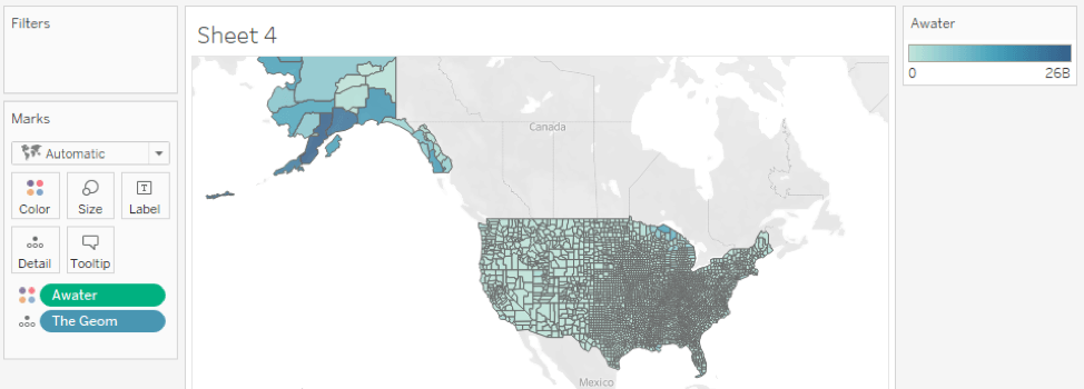
If you look at the legend on the right you can see that the range of a water is from 0 to > 26,000,000,000. If we look at the histogram for “awater” we also see that it has a severely right-skewed distribution (note the X axis is log scaled).
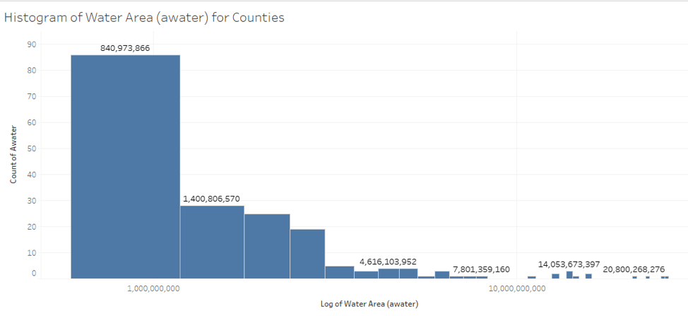
To accommodate this skew, we can create a custom color ramp that moves the center of the color ramp to something significantly smaller than the average. Now we have a nice map that shows all the counties that border on the oceans and great lakes, as well as the ones that contain many lakes and rivers. So far this is pretty standard mapping in Tableau. Let’s move on to some more interesting use cases with PostGIS and Tableau.
Leverage Spatial SQL to gain sophisticated insights
With a PostgreSQL connection we have the ability to create a data source that is actually a SQL query. To illustrate a simple, but powerful example, let’s visualize the distance of every county from the geographic center of all 50 United States. The coordinates for this point are: 44.967244 Latitude and -103.771555 Longitude.
Add a new data source to your Tableau workbook that points to the same database. This time, rather than dragging over a table, drag the New Custom SQL Option over to the data area.
![]()
This action will bring up a box to drop in your SQL. Now I get to teach you some spatial SQL. Paste the code and while you are waiting for it to run, come back here and read more to understand the query. The code will take a little while to run because it is calculating the distance between every single county and the center point. This requires a full table scan and can’t take advantage of any spatial indices we have created. I HIGHLY recommend you extract this data.
SELECT id, county_name as name, ST_Distance('POINT(-103.771555 44.967244)'::geography, the_geom) as distance, the_geom as boundary FROM county_geometry
The ST_Distance function is where all the action is happening. This PostGIS function calculates the distance between two spatial objects. First we take the center point of the U.S. and make it into a character string 'POINT(-103.771555 44.967244)'. Then we cast that string to a geography type (a spatial entity). The :: operator in PostgreSQL is shorthand for casting one data type to another.
Now that we have one point, we calculate the distance between the center point and the polygon. Under the hood, PostGIS will calculate the distance between the point and the closest point of the polygon. Because we are using a PostGIS geography type, our resulting distance is in meters.
Now our resulting data source has the county_name, distance, and the original polygon boundaries. I found it useful to rename the data source to “Center Distance”.
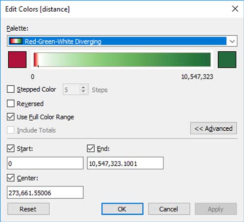
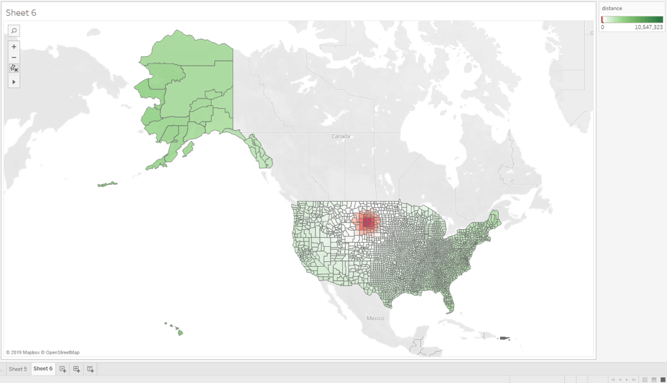
Go ahead and create a new Worksheet. Like before, turn off aggregation, drag the boundary measure onto the Detail shelf, and finally, drag the distance measure onto the Color shelf. Again, because of the large range of values, we end up with not much visible color differentiation on the map. But if we use a custom color ramp for the coloring of the polygons...
We end up with a really nice map showing the center of the U.S. with subtle coloring to show how distance changes. Adjust the colors as you see fit.
Think about how complicated it would be to make this visualization in Tableau without the use of PostGIS. First, you would be writing a lot of custom calculations on the data. But not only that, you would have to download the full table from the database into the Tableau client before doing the calculations. So not only do you have the complexity of writing all those custom calculations, you also have to wait for all the data to come over the wire before seeing your results.
Execute Advanced Spatial Queries with PostGIS and Tableau
For the last example, we are going to solve a specific business problem. Let’s assume we work for an NGO or government agency responsible for disaster relief. We have a question: “which counties in Maine are the best for pre-staging emergency equipment?”
To answer this question, we buffer 12.5 KM (about 8 miles) off a storm event’s center point and then select all the counties that intersect that buffered circle. We will then use a grouping query to do a count of the storms circles per county. To do this query we are going to use a PostgreSQL Common Table Expression (CTE). CTEs allow us to write subqueries with much cleaner syntax.
To build the query, first we write the query that does the buffer and intersection:
select geo.statefp, geo.county_name, geo.the_geom as boundary, se.locationid from county_geometry as geo, se_locations as se where geo.statefp = '23' and ST_intersects(geo.the_geom, ST_Buffer(se.the_geom, 12500.0));
Then we do the aggregation on that query:
with all_counties as (

           select geo.statefp, geo.county_name, geo.the_geom as boundary, se.locationid from county_geometry as geo, se_locations as se where  geo.statefp = '23' and ST_intersects(geo.the_geom, ST_Buffer(se.the_geom, 12500.0))   )

   select statefp, county_name, count(*), boundary from all_counties group by statefp, county_name, boundary
Again, paste this into a Custom SQL Dataset. I named mine "Best storm counties." This query will take a while to execute even for one county because we have create a circle polygon for each storm event location, then check for intersection with each of the polygons in the county, and finally sum how many times each county had an intersection.
Turn off aggregation, drag boundary to detail, drag count to color, and if you want to see the county names, you can drag that to tool tips or labels. You should see something like this:
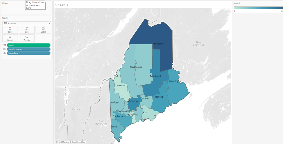
It looks like Aroostook and Kennebec would probably be our best choices (Penebscot actually has one more incident than Kennebec, but if we put something up north, then better to put a second one farther south).
Again, spatial SQL helped us answer quite a complicated question. And if you wanted to generalize this to allow business leaders to change the state, such as TX or WA, Tableau makes it easy to add a parameter to the SQL query.
Learn more
I hope this post today showed you all the power that comes from combining PostGIS with Tableau. You can ask very sophisticated spatial analytic questions with the ease of Tableau.
If you want to get more hands-on with PostgreSQL and PostGIS without installing anything on your machine, use the free tutorials available on the Crunchy Data Learning Site. And for more fun, check out the Tableau Community Forums to learn how to generate routes dynamically with PostgreSQL + pgRouting.
Thanks for reading and I look forward to seeing some of the great spatial visualizations that you'll produce in Tableau!
Autres sujets pertinents

How Team USA uses data to build a digital HQ
 8 février, 2022
Tendances data qui marqueront l'année 2022
 3 février, 2022

Healthcare Analytics Hub Starter Kit: Get the data you need faster
 18 octobre, 2019
The purpose of the Healthcare Analytics Hub Starter Kit is to provide a sample of what your healthcare app could look like. It’s not a complete solution; instead, it’s focused on what’s possible. Please contact your Tableau Account Manager to get started today!
Abonnez-vous à notre blog
Recevez toute l'actualité de Tableau.