Effective data visualizations share this magical hidden structure


Editor’s note: This is the first post in a series about visual design with data. Read the second here, third here, fourth here, fifth here, and sixth here.
What if I told you that every effective data communication has the same hidden shape, the identical underlying structure?
What if I further told you that once you learn how to recognize this shape, you’ll discover how simple it is to see, and how powerful it is to use?
And what if I told you that anyone could learn to communicate effectively, simply by leveraging the power of this structure?
Sounds like clickbait, huh? That's got to be too good to be true! But the fact that you’re here, dear reader, is testament to just how much we all want to believe that it’s true. We’re attracted to recipes. Step by step instructions. Rules that tell us to do this, and definitely not to do that!
The good news is, there really is a hidden shape to data communication. Unfortunately, it’s not a one-size-always-fits-all recipe of definitive do’s and don’ts. But understanding this shape can transform the effectiveness of your data communication, whether it’s in the form of an in-person presentation or a data visualization, interactive or static. That magic shape is the triangle.

Elements of the information communication triangle
The triangle, as proposed by Doug Lipman, helps to explain the dynamics of storytelling events, for stories that are performed in front of a live audience. Lipman’s storytelling triangle was based on three elements:
- the storyteller
- the story
- and the audience
Each of these elements is placed at one point of a triangle. The sides of the triangle represent relationships between two of these elements. Success, for a storyteller, is in how the relationship between the story and the audience pans out—but because of the inherent nature triangles, the storyteller is not a part of the relationship between audience and story. The storyteller can only understand and influence the audience and the story, separately, and only indirectly attempt to shape that audience/story relationship.
A similar triangle is the basis for our model of effective information communication.
As designers, analysts, writers, artists, and data storytellers, we can only be truly effective by changing our mindsets about what our goals are: that is, we must move beyond defining our output as a product, and towards defining it as the exchange of information. That also means shifting our definition of success to move past optimizing charts, to instead focus on the knowledge transferred.
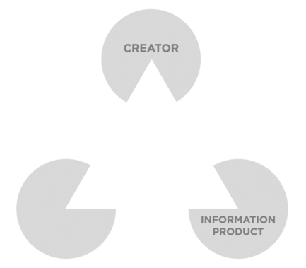
The elements of the information communication triangle are:
- the creator (i.e., you!)
- the information product you create to present your findings (dashboard/application/report/presentation/whatever)
- and the audience
Vertices of the Triangle: Defining the elements
You, the Creator
Why are we using the term “creator” to define you and your role, rather than “designer” or “analyst” or something like that? Well, because your job encompasses all of those things, plus artist and editor and storyteller and writer and lots of other “-ists” and “-ers.”
In all likelihood, you are a multi-hyphenate who, we humbly suggest, would be better served defining themselves by the information experiences they create, rather than by the specific media through which they create them. Information, and the communication of that information, is media-agnostic.
The Information Product
You, the creator, gather the data.
You, the creator, analyze that data.
And if everything goes well, you, the creator, find something interesting and important during that analysis. You might call it insights, or findings, or even story. No matter how you describe it, it’s the information—the raw data transformed by mathematics and meaning—that we then seek to communicate in visual form. This is the “information product.”
The Audience
The information product doesn’t exist just for the sake of existing, of course. It is a means to an end—its raison d’etre (ultimate purpose) is to have an effect on an audience (or a “consumer,” if you must put everything in transactional terms). That effect, or effects, could be persuasion, elucidation, education, motivation...but in any sense, it will be a form of communication.
Funny term, that: communication. It’s got “commune” right there in the root. It’s a shared experience, a coming together. It requires more than one party.
If our goal is truly to communicate some amazing truth(s) that we’ve found, then that goal is only achieved when that information is communicated to others.
And thinking about our triangle again:
- we have a relationship with our audience
- we have a relationship with our information product
- but our SUCCESS is ALL about how our audience relates to our information product—in our absence
Sides of the Triangle: How they’re connected
The Creator & the Information Product
The information product is not strictly a data product, because it is not a product of the data alone.
It is a product of the data plus you.
It’s important to acknowledge that! No data, or product derived from that data, is purely objective. Even with the most rigorous analysis and statistical methods applied, your previous knowledge, experiences, and interests will shape the questions you decide to focus on.
Alongside acknowledging our impact as creators, it’s just as important to embrace it. Find and use your own unique voice, and don’t shy away from making that an integral part of the information product.
The Audience & the Information Product
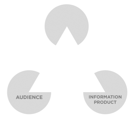
Moving along to the other side of the triangle, we find that direct line going from audience to information product—the relationship that we, the creators, don’t get to directly participate in.
Just think of your favorite movie. No matter how much you love it, the scenes that stood out to you are bound to be at least somewhat different than those that stood out to other fans. The same is true for any information product—especially visual products. People will notice, or focus on, different elements. And just like you, your audience’s previous knowledge, experiences, and interests will shape how deeply they interact and connect with your work.
It might sound counterintuitive, this is absolutely key to creating engaging products with a powerful and lasting impact:
Accept that you, in fact, have no actual control over what the information will ultimately mean to your audience, or how they will react to it.
You can’t force someone to think that something is important, or fascinating, or even funny. And if you try, it’s likely to backfire. Most people are pretty good at sensing if you’re trying too hard to convince them.
Of course, this also doesn’t mean that you can ignore your audience. Remember, our goal is to communicate something to our information consumers. Which brings us to the last leg of our triangle.
The Creator & the Audience
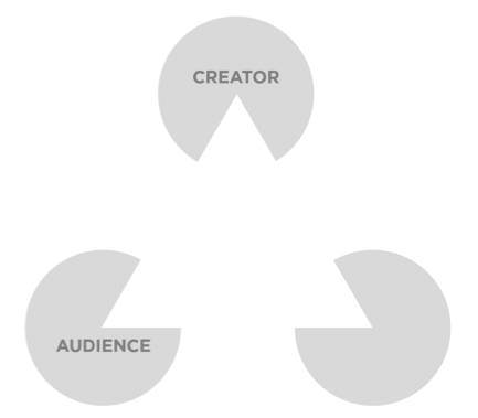
Going back to our movie analogy: raise your hand if you’ve ever seen a movie, or a television show, or a play, while sitting next to someone involved in the creation of that work.
Having direct access to creators, if you’re the audience, is extremely rare; this is true in the other direction as well, of course. You, the creator, are simply not going to have the chance to sit with the audience and consumers of your work each and every time they experience it.
So how do you have a direct relationship with the consumers of your creations? By design!
It starts with finding something interesting in the data that you want to communicate, and then figuring out why it’s interesting to you, why you care about it. In essence, this is about figuring out how you connect with the data.
But how will you convince others that they should care?
First, you need to figure out who you will be communicating with. Once you know that, you can figure out how to build a meaningful connection with them. You can’t control how your audience will connect with your viz, but you can design your viz in a way that makes it easier for your audience to find personal meaning in it.
This principle is so central to our model for creating effective information experiences that it’s worth repeating:
Your design choices should make it as easy as possible for your audience to find personal meaning in your information products.
This can be done in a multitude of ways that enable people to recognize something in your viz. Sometimes that will be a previous experience that they can relate to. Other times, it will be a concept that they have previous knowledge of. It can also be accomplished by revealing your own voice. There is something disarming and irresistible in explaining how your findings challenged your own previous beliefs, or transformed your knowledge, or even touched your heart.
The Whole of the Triangle: Measuring success
The triangle itself is a fitting metaphor. The delta symbol is used in science and mathematics to symbolize change. If we define what we do as crafting visual communication for sharing information and transferring knowledge, then the ultimate measure of success is creating a changed understanding.
When we measure success this way, it also has the benefit of shifting our perspective towards people. Instead of focusing on the product, we’re focusing on the impact that product has on the people who used it.
It also forces us:
- to think about design as something that is so much more than just how pretty it is.
- to move beyond a hyperfocus on micro-optimization of individual charts.
- to shift away from best practice and moving towards effective practice: relying less on dogmatic, binary rules for choosing charts, and more on guiding principles for helping humans learn.
- and to see that what we create and what our audience consumes is much, much more than data visualizations.
We create information experiences.
Part of the information experience is seeing and understanding the data that is presented in charts.
But it also includes how easy it is to learn how to interact with different elements on the page, and how clear it is where to look first and what to explore next.
It encompasses the entire experience of a person from the moment they first become aware of your information product, to the moment they decide to actively engage with it, to the moment they decide they’re done with it.
It includes the information they learned, the actions they completed to get that information, and their feelings and thoughts about that information.
And, it includes their memories of the information, their ability to recall it, any actions they were inspired to take or to eschew as a result of that experience, and the knowledge gleaned from that information—the lasting effect of the entire experience on an audience.
For us, the creators, the change—the delta—we must make internally is to leave behind our focus on the product as the goal, and instead to focus on the audience’s experience with the information as the goal, delivered through our products.
Be on the lookout for our next blog post as we discuss each of the four essential elements of a successful information experience.
References
Lipman, Doug. Improving Your Storytelling: Beyond the Basics for All who Tell Stories in Work Or Play. August house, 1999.
Autres sujets pertinents

Visualizing Women's Impact to History Through Data Visualization
 18 mars, 2024

Behind the Viz: Adrian Zinovei Helps You Design Your Next Dashboard
1 mars, 2024

Charting the Heart: Data Visualizations on Love
 14 février, 2024
Abonnez-vous à notre blog
Recevez toute l'actualité de Tableau.