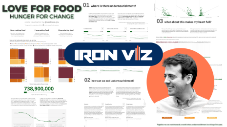
Iron Viz 2019 sliced and diced food data to a flavorful finish
Andy Cotgreave shares the highlights from Iron Viz at Tableau Conference 2019.


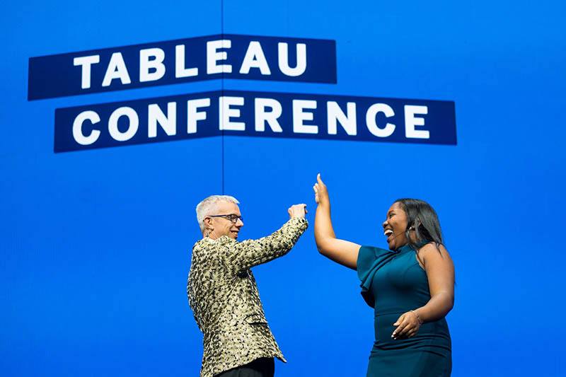
It wouldn't be Tableau Conference without the fiercest data competition of them all: Iron Viz. The visualization showdown took the three winners—or "the cream of the crop"—of Tableau Public, global-qualifier competitions and put them in a pressure cooker of a live vizzing event. In front of a massive live audience with thousands more watching online, the Iron Viz contenders were given 20 minutes to cook up a showstopping viz to tantalize, sizzle, and reign supreme.
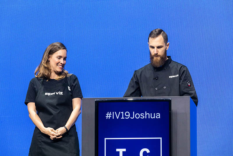
The energy and anticipation of all the fans in attendance boiled over backstage where Keshia Rose (Tableau Product Manager and dazzling co-host) and I prepared to bring out this year's contestants. Although Keshia and I were dressed to the nines in our most sparkly attire, there was no way we could outshine the Iron Viz finalists: Lindsey Poulter, Joshua Smith, and Hesham Eissa.

For the first time ever, we announced the food-focused data set before the event. Joshua, Hesham, and Lindsey were given a meaty, eight million rows of data from Pitney Bowes’ World Points of Interest & Demographics Data, gathered from restaurants and food stores around the world. Colin Mattison, Solution Consultant from Pitney Bowes, joined the competition, lauding the contenders for “making this data come to life” and whetting everyone’s appetites.
The formidable contenders needed to impress the panel of judges, comprised of 2018 Iron Viz champion Timothy Vermeiren, Tableau Vice President of Product Development Ellie Fields, Tableau Technical Fellow Jock Mackinlay, and Tableau Zen Master Chantilly Jaggernauth. The judges evaluated the vizzes based three criteria: design, analysis, and storytelling. The Judges' Score made up 90% of each contestant's total score, with the remaining 10% from Twitter votes—which is the Audience Score. For more information on how the total score is calculated, check out this blog.
It's thyme (time) to dig into the mouth-watering vizzes Hesham, Lindsay, and Joshua served up in this year's Iron Viz championship.
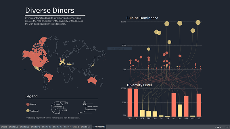
Hesham Eissa served up transparent sheets in his viz
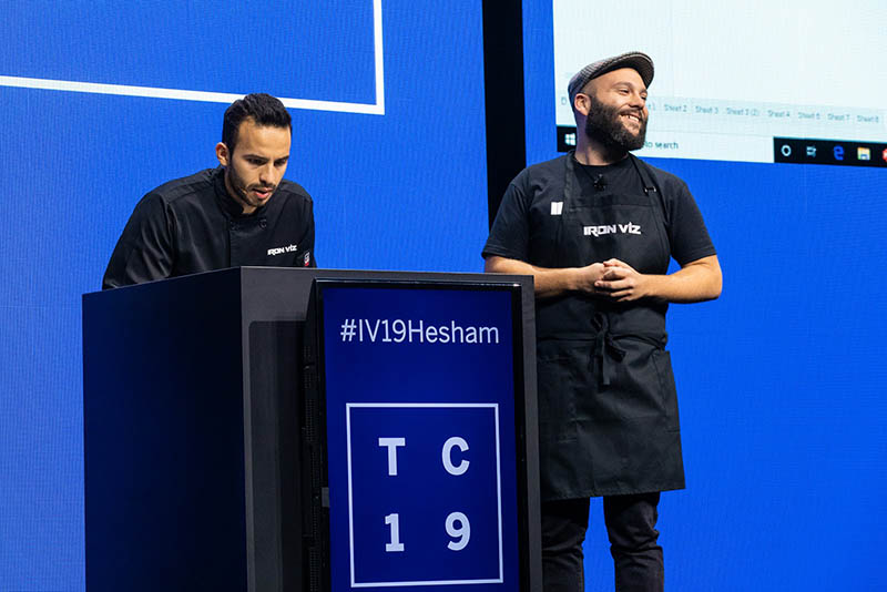
Hesham Eissa took the food data set and made maps within maps and transparent sheets to display the diversity of cuisines around the world. The visualization dove into the cultural identities expressed through which cuisines dominated over others in each country, grouping color to emphasize the diversity of cuisines. While presenting his viz, Hesham called out interesting details about the diversity of restaurants in Canada, where 99% of restaurants are from other countries, and how most European countries tend to have traditional cuisine dominate. One of two outlier countries in the data set, Japan, showed both a strong cultural identity, but also a nearly even dominance with Chinese cuisine.
By using all floating dashboards, he was able to create a dual axis with connected lines in his visualization—intriguing judge Jock Mackinlay. When quizzed by judge Ellie Fields on why he chose to sort cuisines alphabetically, Hesham explained his reasoning behind the choice: that there were more cuisines than countries. This also affected his decision to intentionally use lines to show which cuisines relate to which countries.
Sous vizzer, Ivan Coelho, aptly described how Hesham took us on a journey, while simultaneously entertaining viewers.
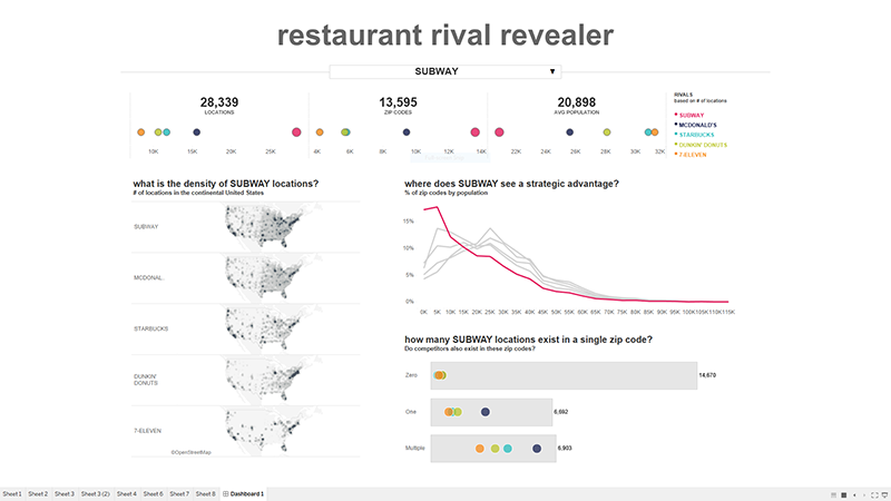
Lindsey Poulter treated us to a viz with hidden containers
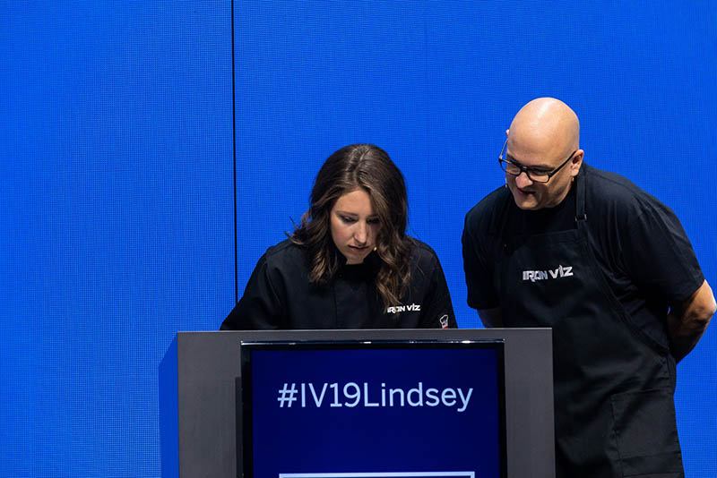
Using the Tableau Conference color palette in her business dashboard, Lindsey Poulter’s viz compared rival restaurant locations across zip codes and the average population in each zip code, inviting interactivity to find applicable insights. Taking well-known chains like Subway, Starbucks, among others, Lindsey examined the data to uncover each brand’s location strategy. For example, she revealed that Subway is geographically diverse across the United States, but strategically focusing on areas with smaller populations. This was contrasted with Starbucks, a brand that set up shops in areas with populations of approximately 20,000 to 30,000.
Judge Chantilly Jaggernauth asked about why Lindsey consistently used color in most of the graphs, but not in the maps to the left. She shared that she wanted to avoid making these maps the focus. Judge Timothy Vermeiren commented on the effectiveness of Lindsey’s business application, asking why she chose to go this route. We learned that these types of applications are what Lindsey really enjoys building, but in digging through the data, the number of Subway locations, compared to other brands, stuck out to her. This caused her to ask how brands could use this type of data set to inform their business strategy and where they want to expand—making it clear to Lindsey that she wanted to create business dashboard.
Mark Bradbourne, Lindsey’s sous vizzer, commended her use of recent features like parameter actions and the show/hide dashboard containers for the custom dropdown. Mark described the business dashboard as “clear, concise” and 100% on brand for Lindsey.
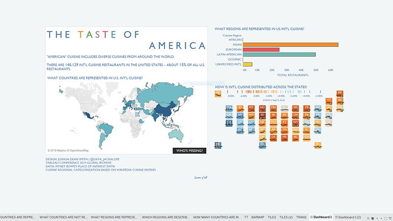
Joshua Smith whipped up a viz with navigation buttons
Joshua Smith’s viz focused on a personal story—a story of how one dinner with a friend drastically changed how he saw the world and the data in it. He called it, “stories of breaking bread and breaking boundaries.”
Joshua shared a map of the world showing the prevalence of restaurants characterized as “international cuisine” in the United States, showing how each state compares to the national average for each type of cuisine. Joshua used the new navigation buttons feature to create a powerful story. The crowd went wild as they saw the map light up to showcase how each state “saw the world” through food. But the kicker was when Joshua revealed a second dashboard with a dark background—one that revealed the missing cuisines and gaps in the data. Governments often use SIC codes to categorize countries, but 148 countries are missing, including many in Africa, with 49 of 54 African nations not showing up in the data.
Judge Ellie Fields asked Joshua to explain his use of space, specifically referring to the size of the world map in comparison to the tile map. Joshua replied that he wanted the world to be the focus, addressing how food identity in the US is shaped by the rest of the world. Judge Chantilly Jaggernauth dug deeper into Joshua's choice of color, to which he replied that he stuck to the default color palette for speed and because he trusts the researched and tested palette.
Sous vizzer, Lauren DeBey, described Joshua as a poet who crafted poems with this visualization. She said that Joshua showed us not only what is on our tables, also what is not on our tables.
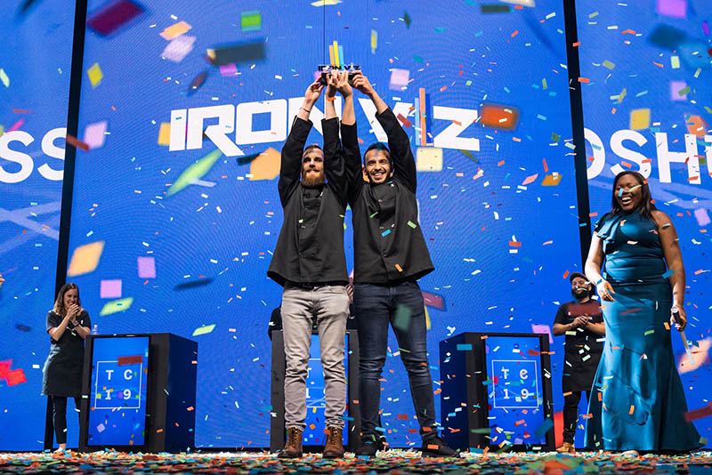
Congratulations to our winners, Joshua and Hesham!
The Iron Viz finalists displayed phenomenal vizzing that wowed everyone, demonstrating the fact that data can be interpreted in myriad ways to tell complex stories. Each contender had their own unique approach, applying techniques with strategy and intention—which is always a best practice.
As Keshia set down her lightsaber and prepared the confetti cannon, the tension in the hall was palpable: everyone was anxiously awaiting the results from the scoring auditor. Taha Ebrahimi, director of Tableau Public, spoke with community members about the extraordinary ways Lindsey, Hesham, and Joshua displayed their design, storytelling, and analytics skills in each of their appetizing visualizations. As the scoring auditor handed me the golden envelope, what came next was unexpected: the results revealed a tie. Both Hesham Eissa and Joshua Smith were named co-winners of Iron Viz 2019.
Despite only learning Tableau eight months ago ago, co-champion Hesham attributed his success to The Data School, his mentor, Jack De Courcy Robinson, and Mina Ozgen*, and his employer. Co-champion Joshua said that the win was “surreal, unreal” and thanked his wife, son, parents, and the Tableau #datafam.
If you didn’t see the sizzling action of Iron Viz as it unfolded, Watch the recording to enjoy the sparkly outfits, skillful vizzing, and plentiful puns. Feeling inspired by the impressive finalists? View more extraordinary visualizations by Tableau authors by subscribing to Tableau Public Viz of the Day.
*Previously, this blog incorrectly stated that Hesham Eissa's mentor is Meera Umasankar. His mentor is Jack De Courcy Robinson.
Autres sujets pertinents
Meet Iron Viz 2024 Finalist Chris Westlake
 22 avril, 2024
DataFam Roundup: April 15–19, 2024
 19 avril, 2024

Meet Iron Viz 2024 Finalist Jessica Moon
15 avril, 2024
Abonnez-vous à notre blog
Recevez toute l'actualité de Tableau.