Tableau takes on the Makeover Monday Live challenge!


If you’ve been following our blog, you know a thing or two about Makeover Monday. However, for those who are new to Makeover Monday let me explain it in two words: It’s awesome.
Makeover Monday is a weekly social data project, hosted by Andy Kriebel and Eva Murray, with a goal to inspire the data viz community to learn from each other and improve their data skills. Each Sunday, the team posts a link to a chart and data set. Your challenge is to create a better version of the visualization in your own creative way—to either find a way to tell the data story more effectively or to discover something new in the data. There is no right or wrong way to participate.
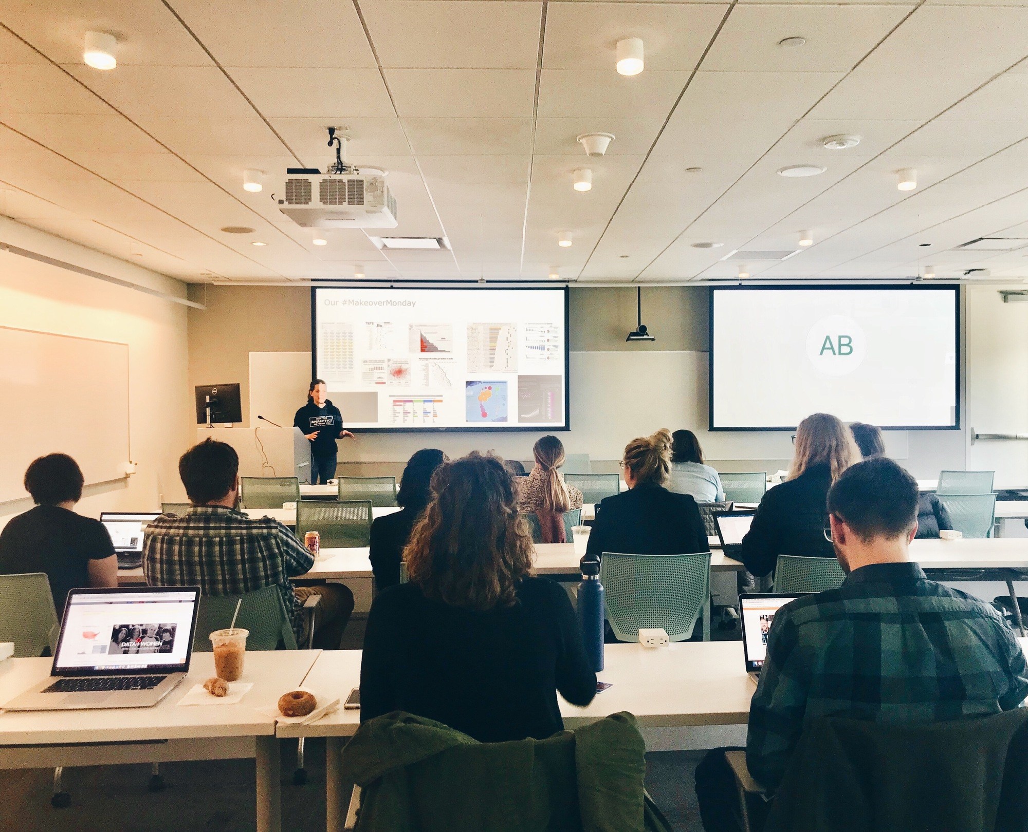
Hundreds of different people participate and share their creation on Twitter with the hashtag #MakeoverMonday. Last week, with it being International Women’s Day, our office decided to run a Makeover Monday Live based on the timely data set from Equal Measures 2030, a private sector-led partnership that connects data and evidence with advocacy and action. The data set was comprised of survey responses from 109 policymakers from five countries around the subject of gender equality. Lucky for us, part of the Makeover Monday duo, Eva Murray, was in Seattle to lead the charge. We also had an employee-run event in our Singapore office.
After the time was up, I heard a lot of people say, “Wow, that was hard but fun!” and I couldn’t agree more—it was challenging but very rewarding. Sarah Nell, a Services Product Manager at Tableau put it best when she said, “I’ve been following Makeover Monday for awhile and I’m always inspired by the energy of the Tableau community. It was really awesome to participate in the exercise and experience its impact firsthand..”
We want to say thank you to Eva Murray for her time and guidance. It was a fun Friday to say the least! Here’s a roundup of our favorite vizzes:
1. Do policy makers know about women's issues?
Sarah Nell gets creative with custom icons to see how each country responded to each topic.

2. Diving into specific topics
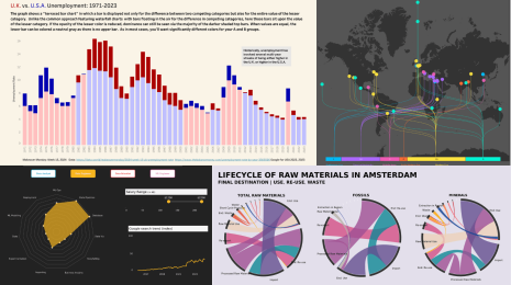
Brendan Donahue analyzes how each country responded to the survey and whether or not gender equality was overestimated or underestimated.

3. Correlation between confidence and accuracy
Alexandra Conner decided to look into a specific attribute, focusing specifically at how confidence relates to answer accuracy.

4. What do policymakers know about women and girl issues?
Madhav Kannan looks at how accurately countries voted. The visual on the bottom right represents each response and showcases how each respondent reacted across all topics.

5. Collaboration with Equal Measures 2030
KJ Kim on the Tableau Public team collaborated with Equal Measures 2030 to see what policymakers know and how they know it.

Want to get involved? Stay tuned to the Makeover Monday website. They release a new data set every week. And make sure to join the conversation on Twitter.
For more on #VisualizeDiversity, participate in our Women’s Month social campaign.
Autres sujets pertinents

Meet Iron Viz 2024 Finalist Jessica Moon
 15 avril, 2024
DataFam Roundup: April 8–12, 2024
 12 avril, 2024

Meet Iron Viz 2024 Finalist Pata Gogová
8 avril, 2024
Abonnez-vous à notre blog
Recevez toute l'actualité de Tableau.