Explore the viz that reigned supreme at Iron Viz 2017


“Welcome to the most exciting event in the world of competitive vizzing! This…is Iron Viz.”
Sporting sequined gown and dinner jacket, Tableau hosts Jewel Loree and Louis Archer opened the 2017 Iron Viz competition with the Las Vegas glam it deserved.
Months of competition led to this moment, after the contestants, Joshua Milligan, Tristan Guillevin, and Jacob Olsufka, earned their spots by winning feeder contests throughout 2017.
The packed house of eager, expectant vizzers cheered in anticipation as they awaited this years’ challenge—battle housing data.
Contestants were tasked with creating a compelling data story using Zillow housing data, which Chris Toomey, Senior Data Engineer at Zillow deemed “the most detailed and accurate picture of the U.S. housing market from past to present, with millions of rows of data, lots of detail, and lots of metrics across time and geography.”
Judge and 2016 Iron Viz champion, Curtis Harris, expressed his nervous empathy for the contestants, offering them some helpful advice: create a dashboard that the audience can immediately understand.
Joining Curtis on the judging panel were three Tableau experts, including Chief Marketing Officer, Elissa Fink, VP of Research and Design, Dr. Jock Mackinlay, and Sr. Director in Product Development, Ellie Fields. Judges evaluate contestants based on three criteria: best data visualization practices, visual design, and strength of story. Additional points are awarded based on the audiences’ Twitter votes.
Accompanied by sous vizzers for moral support, advice, brow mopping, and a little bit of friendly taunting, the three contestants had 20 minutes to show off their prowess.
Three vizzes began to take shape as the clocked ticked from 20:00 minutes down to zero.

Joshua Milligan: Individual State Stories of the Housing Crisis (as told by the Zillow Home Value Index)
Josh’s colorful viz, Individual State Stories of the Housing Crisis, features a hexagonal map to show each state equally, regardless of size, and uses color to convey high-level data. Viewers can see how the state compares to the national trend, and then click to interact with the data—seeing data at both the state and city level.
Josh explained his goal to showcase the data within its historical context. The initial focus that anchors the viz is the black trend line that shows the bubble, decline, and recovery. Each state’s trend line draws you visually to the right-hand side of the dashboard, which gives a snapshot of the selected state.
“I really wish I had bought a house in Hawaii in 1998,” joked Josh.

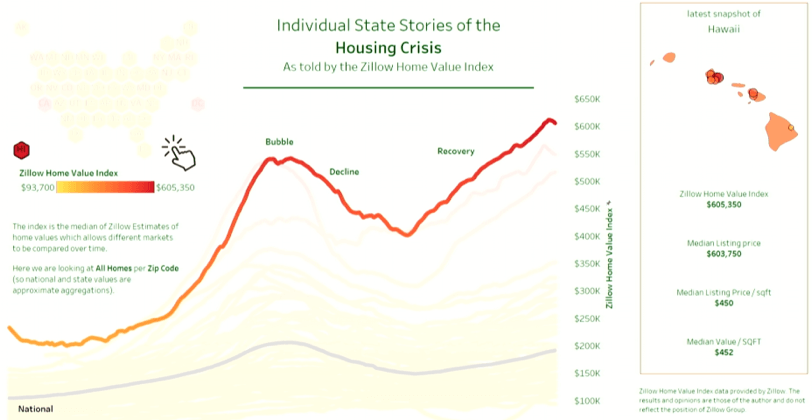
The judges appreciated the clear story in the viz, asking follow-up questions about data and design. Judge Ellie asked why Josh showed the absolute values versus change in the Zillow Home Value Index for the hex map. Josh explained, “Looking at the absolute values is something I can relate to. I know what I sold a house for, I know what I bought a house for…when I look at other states, it helps me to see how this compares to my experience.”
When asked about using automatic dashboard sizing, Josh answered, “I knew it was going to be shown on these giant monitors and I wanted it to pop out to the entire size.”
Tristan Guillevin: The Housing Market Rollercoaster
Next was Tristan, with The Housing Market Rollercoaster. Tristan’s dashboard tells the story of the U.S. housing market over the past 15 years, from the bubble, to the crisis, to the recovery.
The left zone provides the context, the middle zone shows how the market changed through time for each state, and the right zone shows where each state and their cities values are now.
To whoops and cheers from the crowd, Tristan used page animation in the map and bar chart to show how the housing values increased or decreased over time. For an added “wow” factor, viewers can select a state and see housing values per city. And as an added bonus, if you click on a city bar, you can open a link to browse houses on Zillow.
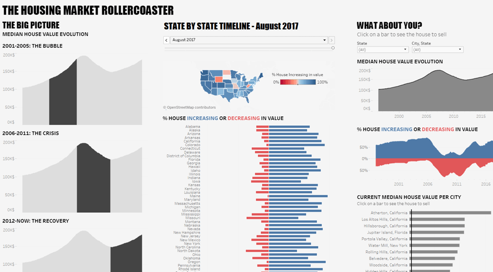
Elissa summed up the judges reactions with an enthusiastic “awesome!” Judge Ellie noted that the animation added “bling” and the middle section was “the clear star of the viz.”
Judge Curtis remarked, “Great work! Did you consider the red and blue might convey a political color scheme?” Tristan responded, “It reminds me of the French flag,” to more applause. Curtis appreciated how the right section of the dashboard let viewers ask their own questions about the data that is relevant to them.
Jacob Olsufka: The Crash and Rise of the U.S. Housing Market
Finally, Jacob showcased his viz, The Crash and Rise of the U.S. Housing Market. Jacob chose to focus on the timeline of increasing and decreasing housing values. He also showed inflection points when markets flipped positive or negative.
The page animation and color in the bar chart and U.S. map of metropolitan areas highlighted when market values shifted and changed. The mirror images of trends in the right side of the dashboard show the significance of increases and decreases for different cities.
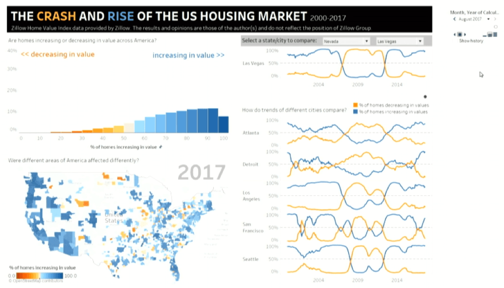
Curtis praised Jacob for his beautiful design. Ellie noted, “intersections are really interesting things and I like how this panel calls that out.” Jock added, “We really like symmetry, so from the storytelling point of view, it really pulls you in.”
Elissa was curious about Jacob’s choice to show change at the city level over the state level. Jacob explained that he chose to show pockets of MSA (metropolitan statistical area) data within each state to fit how the data was structured.
We have a winner!
As the judges tallied their votes, Ben Jones, Director of Outreach Programs at Tableau, chatted with several audience members. Past (and first) Iron Viz champion, Steve Wexler, shared how it would be a tough call and in this circumstance, he was happy to be an audience member instead of a judge.

MCs Louis and Jewell opened the golden envelope from the judges panel. With a prize of $2,000 and a badge of eternal glory, Tristan Guillevin was announced the new Iron Viz champion!

Tristan graciously accepted with a shout out to his girlfriend in France who stayed up into the wee hours of the morning to watch the Iron Viz live stream.
Not only did Tristan win Iron Viz 2017, in his spare time, he created and maintains a viz about Iron Viz winners on Tableau Public.
Interested in becoming an Iron Vizzer? Follow Tableau Public’s Twitter and blog for announcements. Competitions run throughout the year to source the next champion.
Watch Iron Viz 2017 and other great sessions on-demand
If you missed the live Iron Viz 2017 show, you can relive the experience by watching the recording on-demand through the Tableau Conference Live site.
Autres sujets pertinents

Visualizing Women's Impact to History Through Data Visualization
 18 mars, 2024

Behind the Viz: Adrian Zinovei Helps You Design Your Next Dashboard
1 mars, 2024

Charting the Heart: Data Visualizations on Love
 14 février, 2024
Abonnez-vous à notre blog
Recevez toute l'actualité de Tableau.