Global Crop Production


Last spring, when I was still enshrouded in the cocoon of academia, I took a course in my Earth Systems department called Feeding Nine Billion. During this course we learned all about the global food economy, from the inputs required to produce food outputs, to the international food trade, to the difference between corn and maize (trick question!).
I graduated soon after finishing the course, but my interest in the global food system did not end with college. Ever since I have been on the Tableau Public team, I have been looking for an opportunity to return to this topic; unfortunately, the global food system is a very large and complex thing, and all the datasets that i had found to analyze it were well over Tableau Public's 1,000,000 row limit. Fortunately for me and all the other big dataset researchers out there, we recently removed this limit, raising it to 10,000,000 rows. Now I could go ahead and analyze data about the global food market and visualize it and share it on the web.
The Data
To find data on the global food system, I went straight to the source, the Food and Agriculture Organization of the United Nations - FAOSTAT. This website provides access to all sorts of clean and reliable datasets and its interface is easy to navigate. For the purposes of my project, I wanted to get data on the production of all the different crop types that FAO tracks, for all the countries in the world. I was able to do this by filtering to the information I wanted on FAOSTAT's Data Dowload tab:
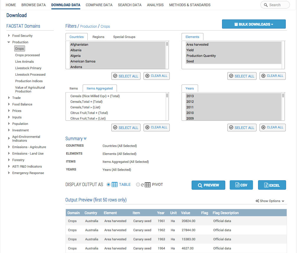
This query spit out a large csv file (375 MB) that contained an exhaustive list of crop production for all the nations of the world from 1961-2014 - over 5 million rows in excel. With my dataset prepped, I was ready to start my visualization in Tableau Public.
The Visualization
I wanted to provide the viewer of my visualization the chance to interact with this large dataset, to drill down and filter along whichever dimension they were most interested in. In other words, I wanted to create an exploratory dashboard. I believe that exploratory dashboards work best when they initally engage the viewer at the highest possible zoom-level before offering the opportunity to drill down and zoom in. Thus, I started with a world map, showing at the highest level of aggregation, where my data is coming from. Below the map I have added three quick filters: to adjust the data range of the data, to specify which crops the charts will show, to filter which metric used to quantify the data. Below the filters are two bar charts, showing country specific and crop specific data. The bar charts and the shading on the world map are all dynamically updated by the viewer's selections on the quick filters, allowing for a drill down ability into the dataset along the unique interests of each viewer.
Below you may see my dashboard and judge for yourself how effectively I have managed to create an exploratory environment with which to interact with this large and important dataset.

Articles sur des sujets connexes

Meet Iron Viz 2024 Finalist Jessica Moon
 avril 15, 2024

Meet Iron Viz 2024 Finalist Pata Gogová
avril 8, 2024

Student to BI Analyst, How Tableau Can Lead to a Successful Data Career
 mars 20, 2024
Abonnez-vous à notre blog
Obtenez les dernières nouvelles de Tableau dans votre boîte de réception.