Tableau and Sports Journalism


This is the second blog post in our Sports Month series. Matt Montgomery is a sports journalist at the Milwaukee Journal Sentinel
"Become an expert in a particular area, rather than just be a generalist who can write a little bit about a lot of stuff,”- Dave Cameron, managing editor of FanGraphs.com.
As a sports journalist at Milwaukee Journal Sentinel, it’s a challenge to stand out in a group of talented individuals. I know that if I want to become an expert in a particular area, as Cameron suggests, I need to carve out new or underdeveloped territory.
I can write about statistics and probabilities with a reasonable amount of expertise. Plus, I learned the value of visual storytelling through working in television production for a handful of years. I figured I could create a niche by getting two birds stoned at once: Apply my writing about statistics and probabilities to visual storytelling.
I knew why I wanted to focus on merging those two ideas: It’s valuable to know which statistics should be used to answer specific questions. Additionally, numbers are better shown than stated. However, it wasn’t exactly clear how I would be able to combine those two ideas.
Enter stage left: Data Visualization
After seeing a few sports journalists apply data visualizations to their work, I knew I wanted to explore this topic further.
My researching led to Tableau Public because their software was free to download and I could save my work along the way. Also, I could access countless instructional videos and understand how other Tableau Public users created their visualizations by downloading dashboards.
I taught myself as much as I could about the software so I could make visualizations that applied to my writing.
I wanted to hit a home run with my first article on July 17, 2014, so I spent nearly a month building and modifying the visualization shown here and writing this article about the Milwaukee Brewers' 2014 Playoff Odds.
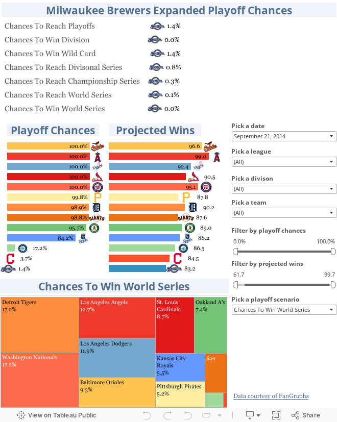
I wrote about the Brewers’ playoff odds because, at the time, they were outperforming their preseason projections and had a reasonable shot (45.5%) of making the postseason.
I knew I could easily access good data -- FanGraphs’ playoff projections are updated daily and incorporate two of the better projection systems publicly available – and I could show those numbers in a useful way.
I anticipated that readers would find value in having those projections visualized and analyzed. I wasn’t wrong as that article turned into a weekly series which continued until the Brewers were eliminated from the playoffs in late September.
During that series, I learned the power of building Tableau Public dashboards to interact specifically on mobile devices. For example, clicking on drop down menus and scrolling through sheets on dashboards are much trickier on a mobile device, so it’s best to remove them from the dashboard. As a result, nearly all of my articles have a desktop and mobile version of that visualization.
With the use of statistics, probabilities and Tableau Public, I’ve been able to accomplish my most basic goal: Stand out in a community of talented journalists by creating my own niche.
Articles sur des sujets connexes

Meet Iron Viz 2024 Finalist Jessica Moon
 avril 15, 2024

Meet Iron Viz 2024 Finalist Pata Gogová
avril 8, 2024

Student to BI Analyst, How Tableau Can Lead to a Successful Data Career
 mars 20, 2024
Abonnez-vous à notre blog
Obtenez les dernières nouvelles de Tableau dans votre boîte de réception.