After a year of COVID-19 charts, eight data communication lessons learned


Editor’s Note: This article includes excerpts from a three-part series by Andy Cotgreave: Part 1 an examination of a year’s worth of COVID-19 charts; Part 2 looking at charts as the pandemic accelerated its impact; and Part 3 rounding out key charts and lessons learned about data communication.
COVID-19 has transformed the world in the last 12 months. Communicating data has been a central part of the pandemic. I want to reflect on what I think are some of the most important lessons we can take from this period. There have been multiple moments where data was the centre of the story. I’ve chosen eight examples from the last year that each reveal one key lesson anyone trying to foster a better data culture should adopt.
Let’s look closely at them and their relevant insights around communicating with data:
- Don’t wait for perfect data to start your analysis
- Take insights to the audience and iterate design
- Know that data can change behavior
- Consider proxy data because complex metrics need slow introductions
- Make data personal and transparent
- Data-informed conversation requires data literacy skills
- Don’t try reducing complex data to a single KPI
- Don’t be afraid to seek out data
1. Don’t wait for perfect data to start your analysis
Johns Hopkins University COVID-19 dashboard
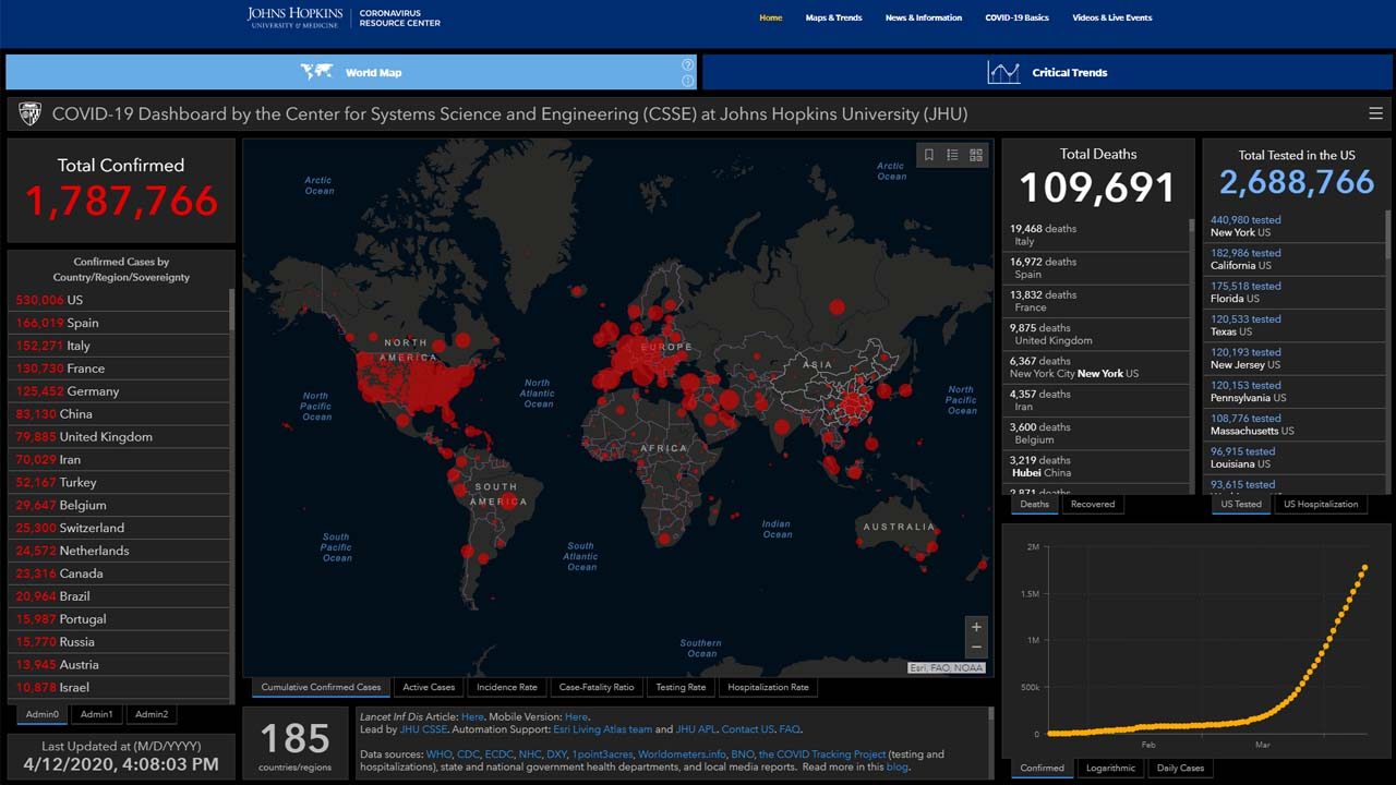
The JHU dashboard as it looked in early 2020.
Johns Hopkins University first published their Covid dashboard on January 22, 2020. The goal was to provide a user-friendly tool for the public, researchers, and policy makers. Data collection was haphazard and slightly unreliable: updates were manual and came from Twitter, emails, and news sites. At this point, though, any data was better than no data.
Over time, data collection was improved and automated. Dashboards are never finished; they need to evolve as data improves and questions change. Initially, the JHU dashboard was a blunt, inaccurate instrument, but visitor numbers (200 million per day in January 2020) indicated how the impending pandemic would be data-driven.
2. Take insights to the audience and iterate design
John Burn-Murdoch’s tweets
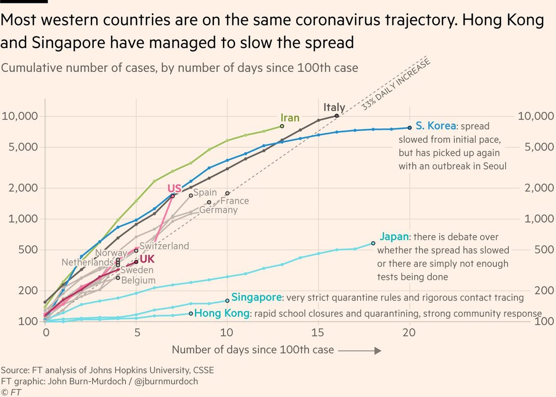
As the pandemic progressed, it was natural for people to compare their country to another. Johns Hopkins’ static views didn’t provide the narrative that a nervous global public wanted. John-Burn Murdoch’s brainwave was to take charts directly to a global audience through Twitter and share updated daily views for six consecutive weeks. When he needed to iterate, he did.
On Twitter, he found an audience that engaged, queried, and debated over the data. His daily updates generated thousands of comments and exceptional engagement levels. John introduced visualization choices that people hadn’t previously encountered: anchoring the x-axis to a milestone (days since x cases) rather than it being a normal timeline, and using a log scale on the y-axis. Log scales are important for tracking exponential growth, as we learned, but also made sense aesthetically, as John explains in this interview with Jason Forrest.
My takeaways from these charts...
- Data-informed conversations are powerful: By March, the narrative was focused on comparing country to country. At that time, most European countries were comparing themselves to Italy, which had the most serious outbreak. John’s tweets received thousands of replies—a sign of a healthy, engaging data conversation.
- Iterate to find the best articulation of data: John’s final tweet, on April 25, 2020, was very different from the first. His charts evolved and a healthy, data-driven culture thrives on iteration. Each tweak brought new nuance to the story and greater understanding for different audiences, and John responded. Imagine charts in your own organization: wouldn’t they be better if they evolved to reflect the way you analyze and new data?
3. Know that data can change behavior
Flatten the Curve, Washington Post
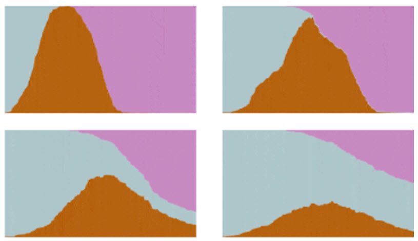
The data visualization field has often struggled with the challenging question, “Sure, charts are great, but can you show me an example where data visualization changed behavior?” We’ve previously relied on historic examples to prove change (Florence Nightingale, for example), but now we have contemporary examples showing that data changes behavior.
“Flatten the curve,” an abstract representation of outcomes from different levels of lockdown, drove the biggest behavior changes asked in most of our lifetimes—especially in North America and Europe, which really had no living experience of highly contagious diseases. Concepts of social distancing, exponential growth, and lockdowns, so familiar now, were unknown at the start of 2020. “Flatten the curve” charts clearly demonstrated why change was necessary, and the Washington Post example alongside Harry Stevens’ article was particularly powerful because it used engaging animations to communicate critical details to the public.
I interviewed Harry Stevens for If Data Could Talk and asked how he came up with his ideas, and why this chart was so successful.
4. Consider proxy data because complex metrics need slow introductions
The Economist’s excess mortality charts
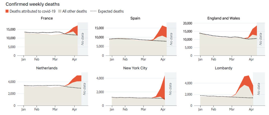
By last April, we knew that accurately counting COVID-19 deaths was problematic. Undercounting risked downplaying the situation and made comparing countries difficult. We turned to “excess mortality” as a way to identify the problem. This measure compares actual deaths to long-term average deaths in a given period.
The Economist covered this on April 4, 2020 and set up a long-term monitoring page on April 16. The lessons I took from the change of metrics and charts are:
- When it’s not possible to track something directly, look for other (proxy) indicators. Excess death charts appeared when the world sought more accurate information on the pandemic’s severity. Many nations couldn’t accurately report COVID-19 figures, but had reliable death statistics. By finding other data sets that could offer insight from a tangential view, it was possible to measure excess mortality brought on by the pandemic.
- A new metric requires a detailed explanation. The Economist’s early iterations of excess death charts (above) were complex, with a detailed explanation. When Ed Conway introduced similar charts on Sky News, it took five minutes to explain all of the contributing numbers (e.g., expected deaths, deaths attributed to COVID-19, etc.). If you have to introduce new types of data to an audience, commit time to help them understand it.
- With familiarity, complex charts can be simplified. The Economist’s page evolved to show a simpler highlight-table with much-higher information density. Once data is familiar to an audience, it is possible to simplify your view in order to focus on the key metrics.
5. Make data personal and transparent
Local government dashboards
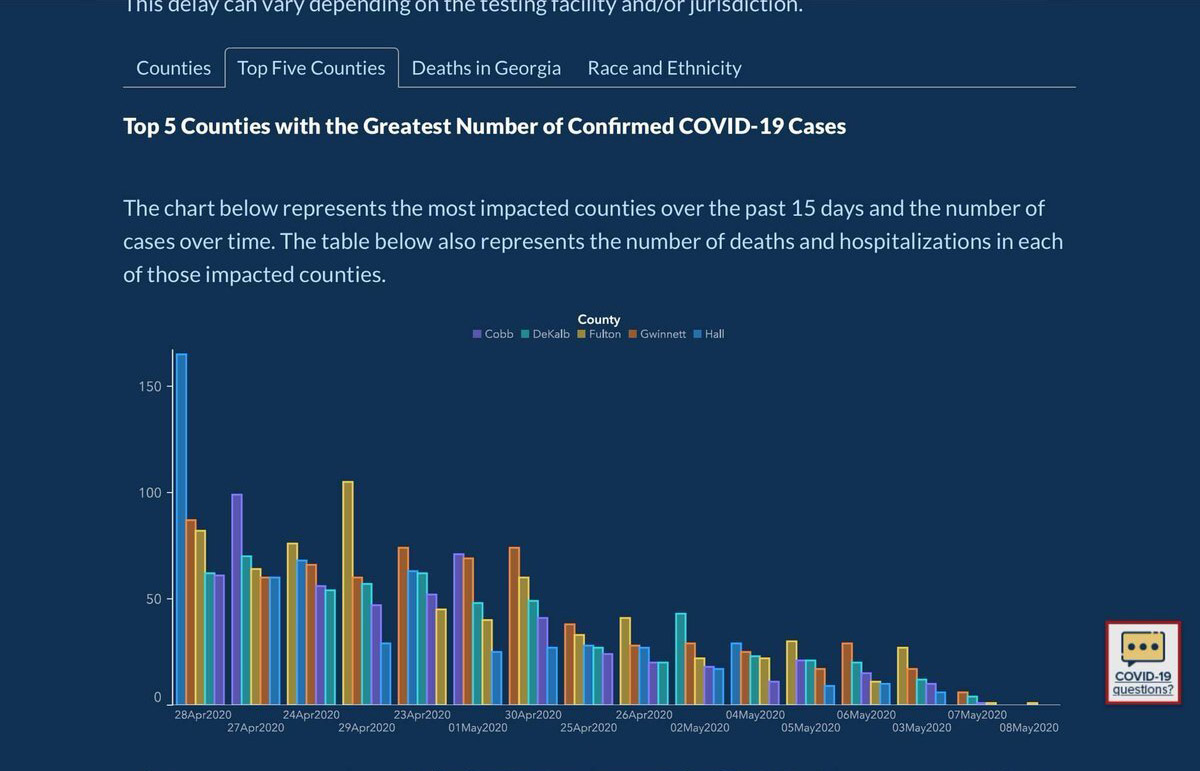
As the pandemic continued in 2020, people transitioned from wondering what’s happening nationally to what’s happening locally. What action must I take to help my community and how can I stay safe? These were top-of-mind questions. At this point, global and national KPIs were more meaningless; people needed data relevant to their activity.
Simultaneously, the nitty gritty of how policies were being decided became more important, and arguments about transparency grew. Georgia’s COVID-19 dashboard faced some controversy with allegations of misleading data, poor design choices, contradicting numbers, and problems with transparency. This report in The Atlantic explained the issue and highlighted that trust in data can only be achieved with data transparency.
On the flipside, there were successful examples of personalized, trusted data in the Covid Tracking Project, ProPublica and El Paso School District charts.
6. Data-informed conversation requires data literacy skills
Former President Donald Trump’s Axios interview
In an interview with Jonathan Swan of Axios, former President Donald Trump used printed charts to argue that COVID-19 was not as bad as the media reported. This exchange revealed two fundamental data literacy failures. First, Trump misunderstood the underlying COVID-19 data. Second, he misinterpreted the charts. As a result, the conversation was not very informative and it emphasized the importance of data literacy as foundational knowledge.
You, your colleagues, you bosses, and your team should all have a greater grasp of data, and how it is used to form insights. If, through intent or through ignorance, we misinterpret what our data is showing, we cannot progress to making better decisions in the future.
7. Don’t try reducing complex data to a single KPI
Jake Berry’s “fundraising thermometer”

Criticizing a lack of a path out of the national lockdown, UK Conservative MP Jake Berry demanded his government provide clear data on progress against the spread of COVID-19. So far so good, until he suggested a fundraising, thermometer-style display as the solution. Really? Reduce a highly complicated, fast-moving situation to a single number? There is no single number that could possibly capture the nuance, however appealing the desire for one. I challenge you to think: what single number could be used in this format to help the public see a route out of COVID-19 restrictions? I asked Jake the same question, but received no response. Fortunately, the UK government’s latest “data-not-dates” approach looks at multiple values to decide on easing restrictions.
To learn why Berry’s call was naïve, and how business data can fall into the same trap, I highly recommend The Tyranny of Metrics, by Jerry Muller. Also, I wrote more on this topic in Computer Weekly.
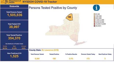
8. Don’t be afraid to seek out data
Covid Tracking Project
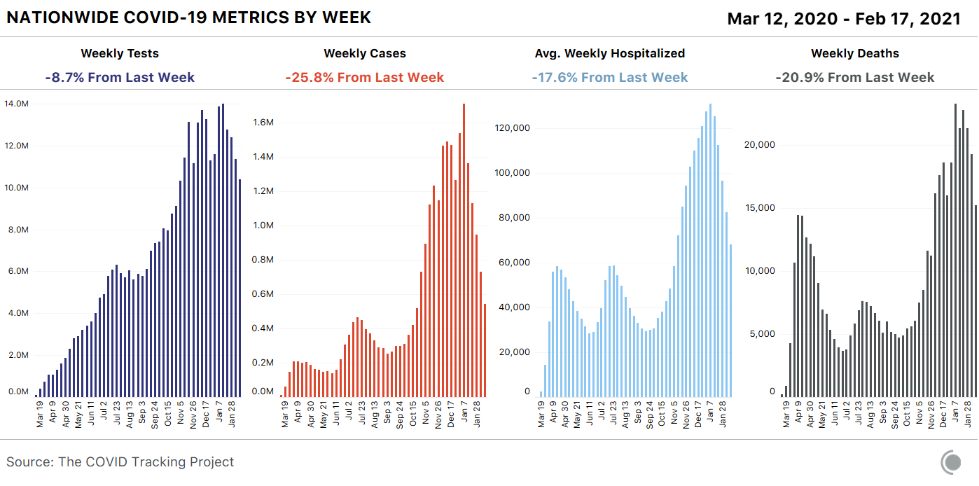
As previously noted, the start of the pandemic revealed a lack of data. Rather than wait for official data sets to improve, journalists at The Atlantic curated their own COVID-19 data, which grew into the Covid Tracking Project. Its data is used by national and local bodies across the US, and their API gets nearly two million hits daily. The impact has been enormous and helped thousands understand the pandemic’s impact. The data even became the Covid data set of President Biden’s Transition Team after being denied access to official data used by The White House.
To learn more about the Covid Tracking Project, check out my If Data Could Talk with Peter Walker.
____________
Now, with important perspective, we better understand the value and influence of these charts and examples, and we can also consider how to apply lessons learned for the future. I’d love to hear what lessons you think data communicators learned from a year’s worth of COVID-19 charts or how these examples may inspire your future data communication. Do they trigger other important lessons? Comment below with your thoughts, or share them with me on Twitter.
To also hear from other experts about what they view were the biggest data lessons learned since the pandemic started, check out this three-part series “Data in the time of COVID-19: What have we learned.”
- Part 1: The human face of data
- Part 2: Understanding context and the limitations of data
- Part 3: The value of data collaboration
Articles sur des sujets connexes

4 reasons why embedded analytics is your path to a new revenue stream in the COVID-19 era
This blog post covers four reasons why organizations should consider embedded analytics.
What we can learn from the public sector’s response to COVID-19
 mai 21, 2020
A broad consensus is that COVID-19 will drive digital transformation in the public sector. During the 2020 Government Summit, speakers from Veteran Health Administration, Southwest Texas Regional Advisory Council, and FEMA discuss new processes, new technologies and innovations, and most importantly, a new mindset on decision making in the midst of crisis.

Kaiser Family Foundation: How understanding health system data can inform our response to COVID-19
 mai 18, 2020
We spoke with Rabah Kamal, a senior policy analyst at KFF who leads work on the Health System Tracker. In this blog, Rabah discusses what data they’re analyzing to understand COVID-19, the complexities and limits of that data, and how data can foster collaboration on solutions as the pandemic progresses.
Abonnez-vous à notre blog
Obtenez les dernières nouvelles de Tableau dans votre boîte de réception.