Customer Experience, Service, and Support Dashboards
Examples to accelerate your next analysis
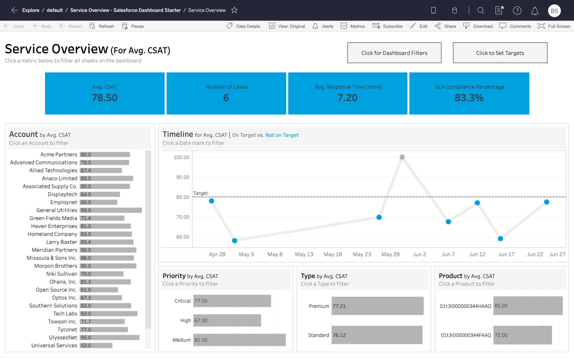
Set targets for critical service metrics
With Tableau's Service Overview Dashboard Starter for Salesforce Service Cloud, it's possible to explore key metrics and trends such as Avg CSAT, Avg Response Time, and SLA Compliance across the business. From here, it's easy to create alerts if metrics fall below targets, set subscriptions to keep everyone on the same page, and collaborate across teams with commenting.
Interact with the dashboard
Track customer service cases by status and rep
Tableau's Case Tracking Dashboard Starter for Salesforce Service Cloud visualizes your cases by status, prioritization and performance metrics, while allowing you to drill down into individual cases in the CRM. This dashboard is ideally suited to help customer service managers understand performance on previous cases and coach reps on where they can improve.
Interact with the dashboard
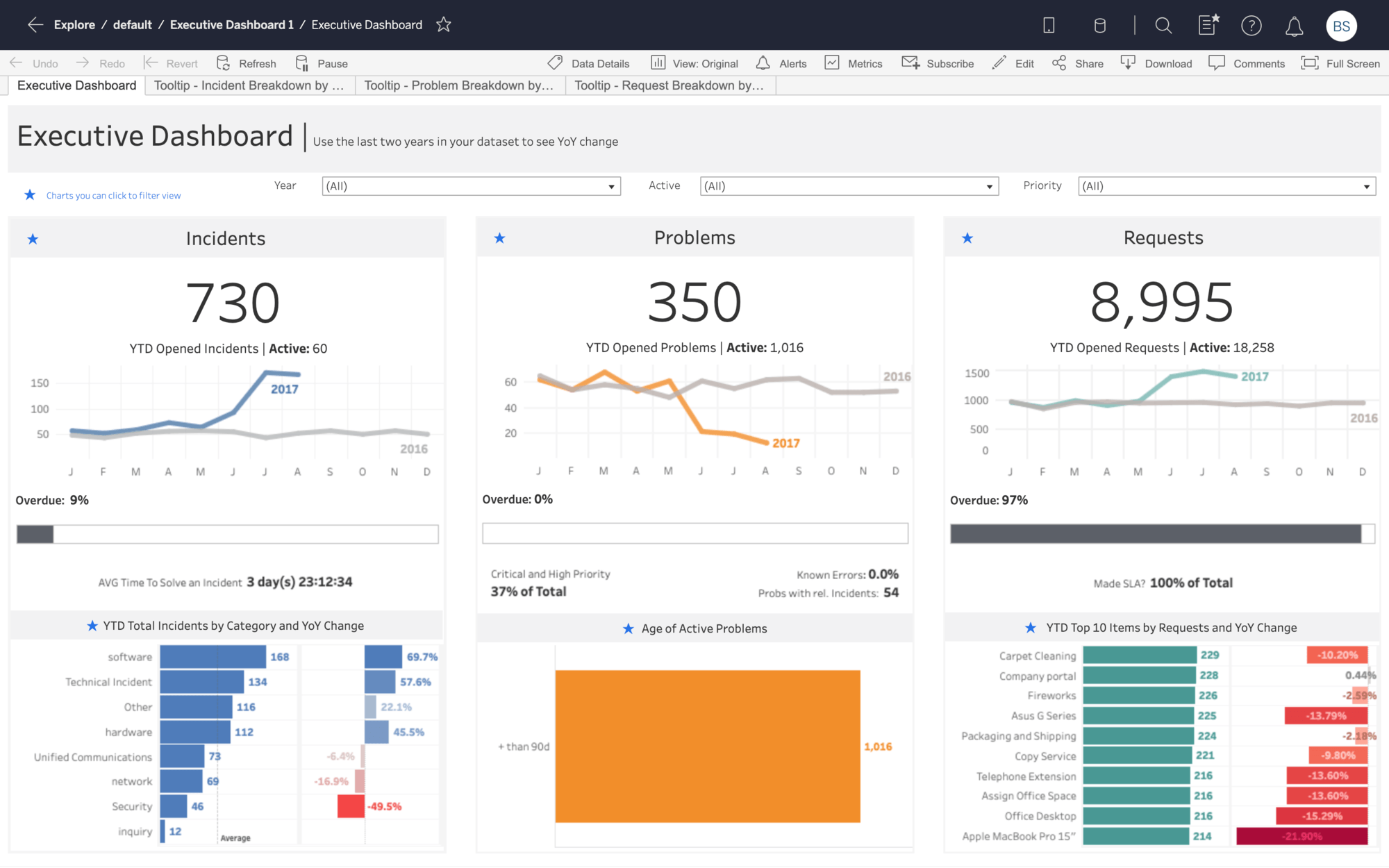
See current trends in the broader context
This Dashboard Starter for ServiceNow provides an overview of all incidents, problems, and requests. With key metrics such as year-over-year trends, overdue rates, average time-to-solve, and SLA percentages, you can quickly assess the overall health of a support area.
Interact with the dashboard
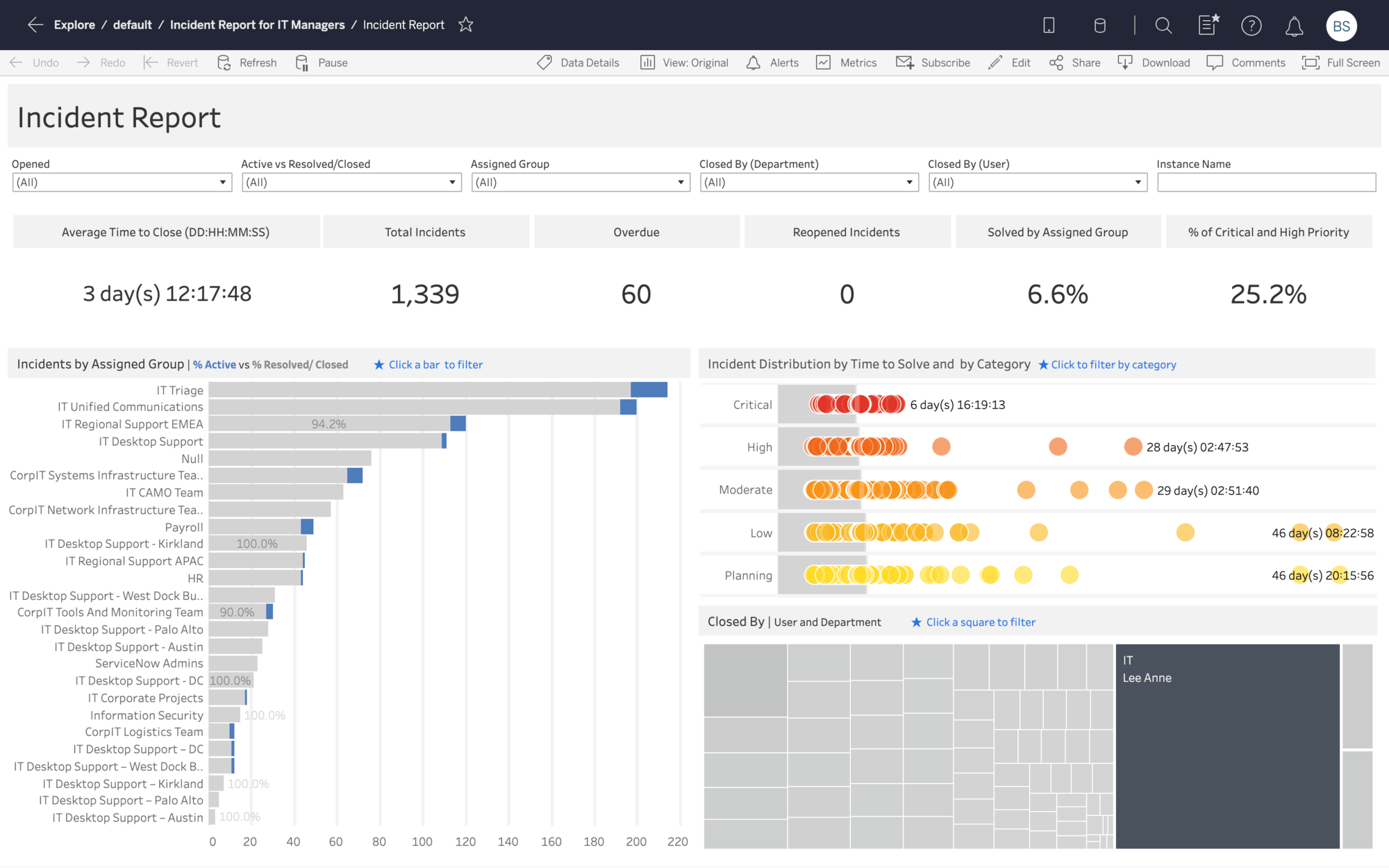
Prioritize critical incidents for inspection and follow up
The Incident Report Dashboard Starter for ServiceNow provides an overview of all incidents opened in a month. Quickly identify trends and outliers with breakdowns by assignment group, priority, time-to-solve, and closing users and departments.
Interact with the dashboard
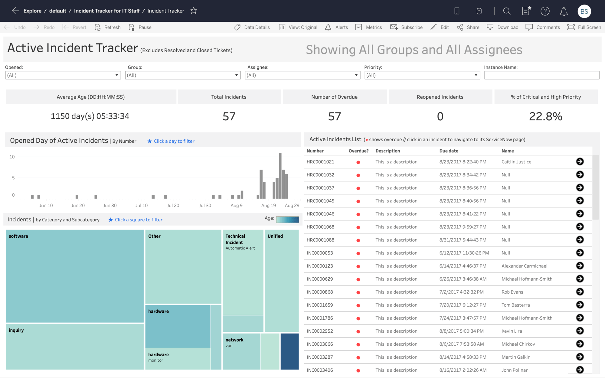
Assign resources to ongoing incidents
The Active Incident Tracker Dashboard Starter for ServiceNow lets you track and prioritize assigned incidents. Shows the distribution of all active incidents by time opened and category, and provides a full list with description, due date, and assignee. Click any row in the list to open the detailed incident page in ServiceNow.
Interact with the dashboard
Assess the impact of service problems
The Problem Tracker Dashboard Starter for ServiceNow lets you track active problems and prioritize your efforts. Break down problems by opened and last-updated dates, and reveal priorities by showing trends and distributions. To assess the impact of each problem, you can open a list of attached incidents.
Interact with the Dashboard
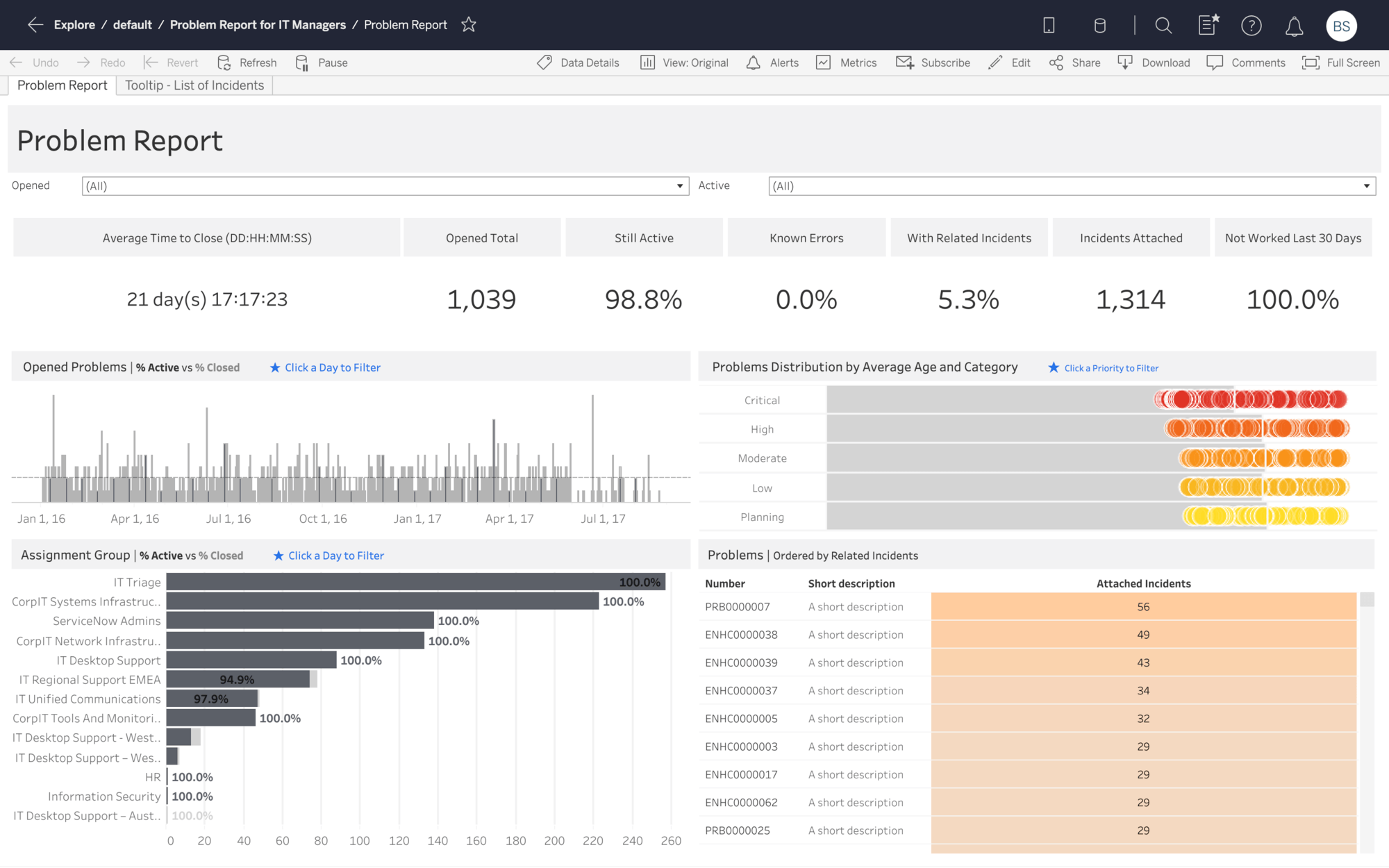
Identify problematic areas during prior month
Provides an overview of all problems opened in a month. Shows the distribution of problems by open time, assignment group, priority, and age, helping you identify problematic areas. To understand impact, you can see problems with the most attached incidents and view a detailed description of each one.
Interact with the Dashboard
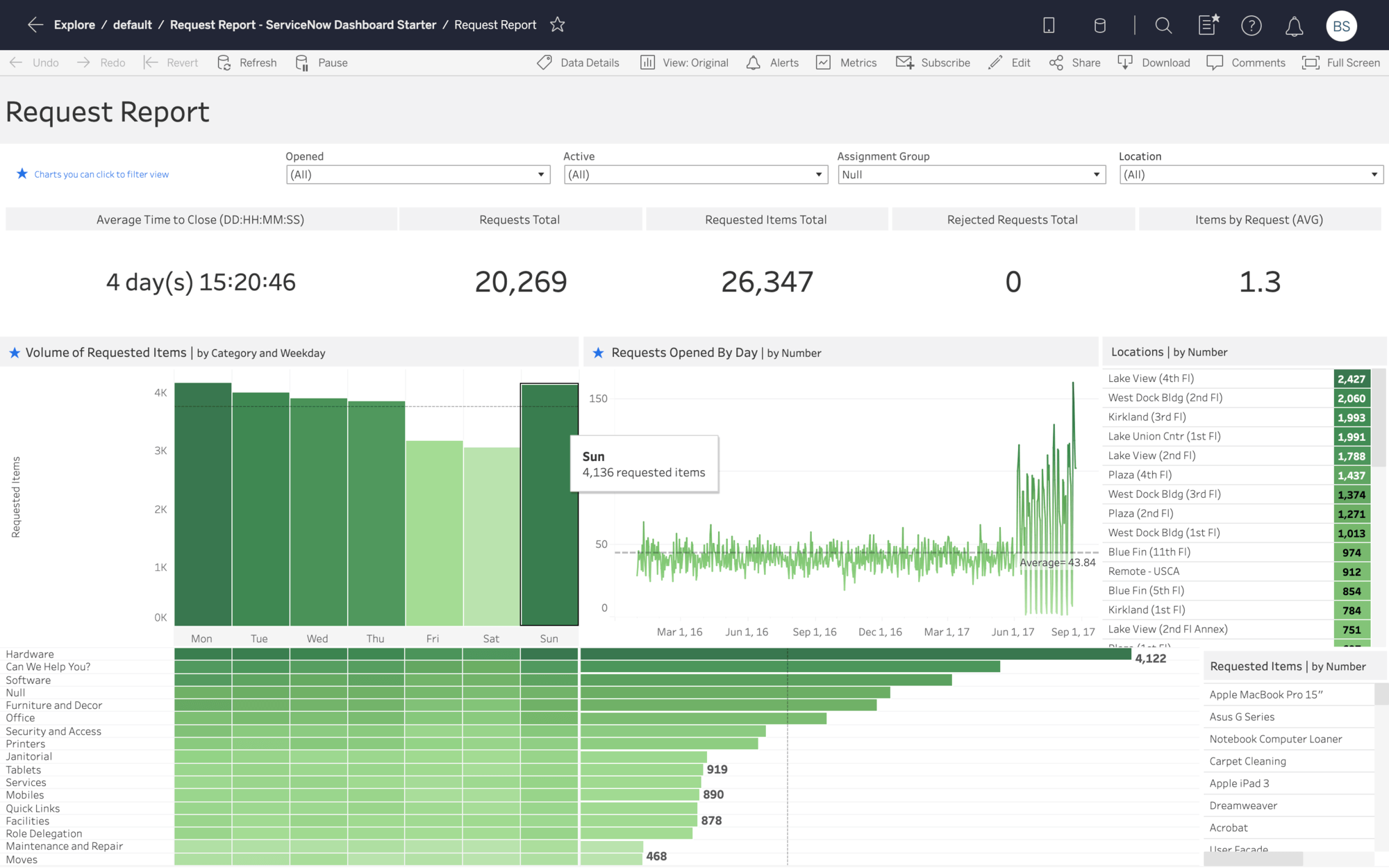
View trends in requests by time and category
Tableau's Request Report Dashboard Starter for ServiceNow gives you an overview of all requests opened in a month. It shows the distribution of requests by weekday, category, and opened date to highlight patterns. You can also discover top requested locations and items using ranked lists.
Interact with the dashboard

Identify call drivers with voice analytics
With this call driver dashboard from VoiceBase, you can track what customers are saying on your calls and identify why they are calling into your service centers. Tableau's extension enable you to drill-down and play a call to get granular details.
Interact with the dashboard
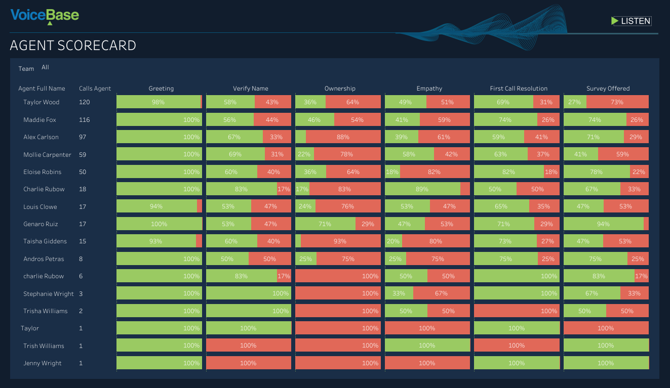
Coach reps by analyzing calls with agent scorecard
With this agent scorecard dashboard from VoiceBase, you can understand how your reps are responding to customer calls using voice analytics. Identify areas to improve with metrics like call ownership.
Interact with the dashboard
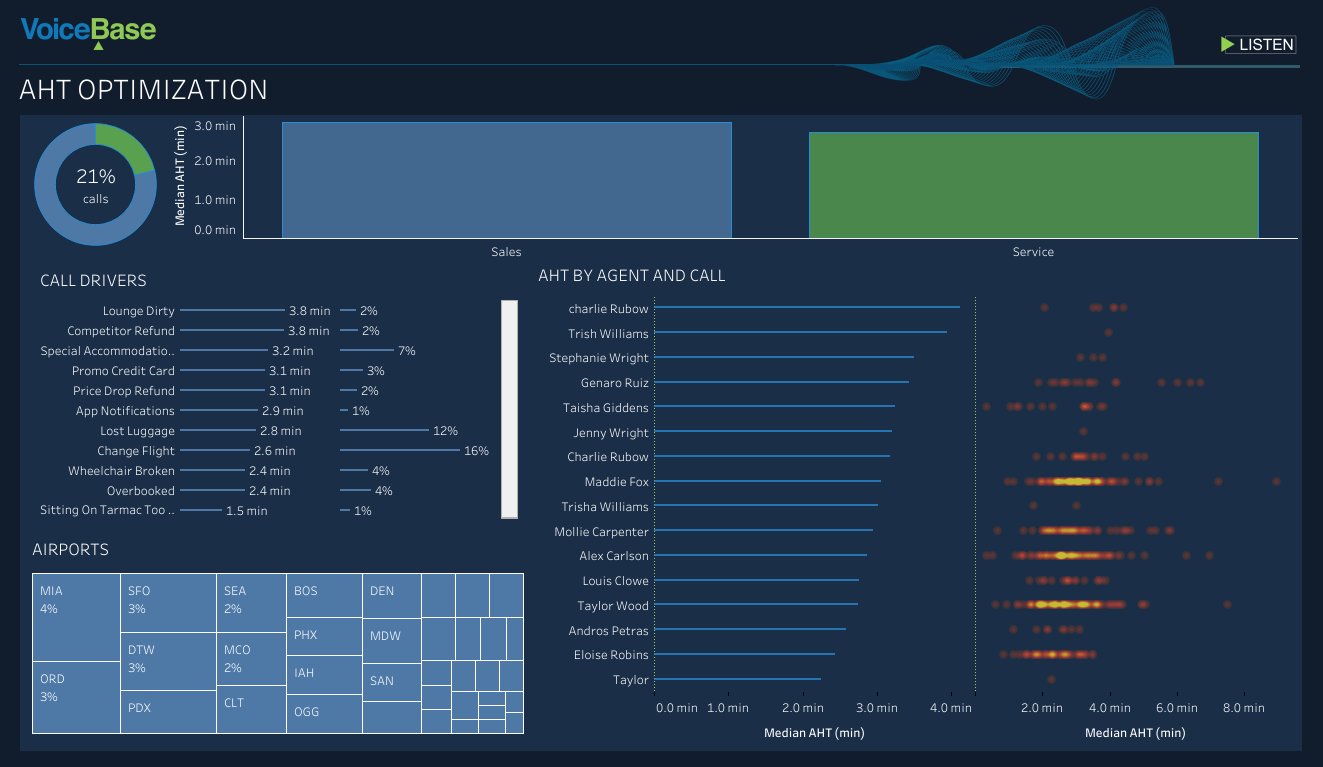
Expose relationships between call drivers and handle time
This Average Handle Time Dashboard from VoiceBase shows what call drivers and reps have the longest handle time. This can be used to learn what works best to speed up service and share best practices internally.
Interact with the dashboard
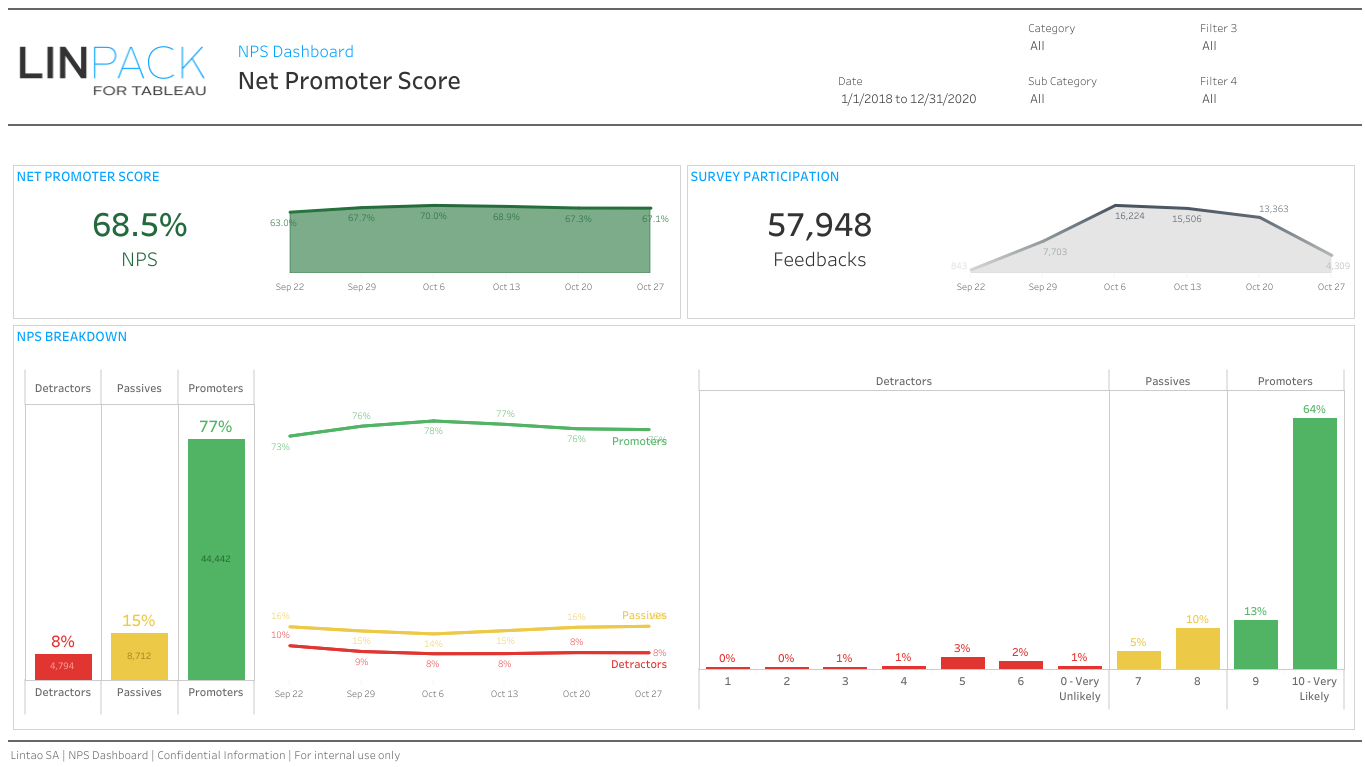
Put your net promoter scores in perspective
LinPack's Net Promoter Score Dashboard shows key trends and distribution for NPS. Filters enable anyone to get the exact right view they need of their scores.
Interact with the dashboard
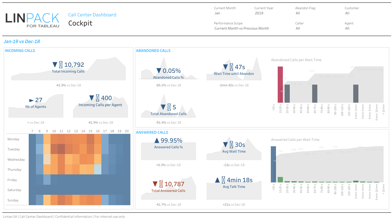
Manage your call center with a cockpit
LinPack's Call Center Cockpit Dashboard puts your service team's call metrics in one place.
Interact with the dashboard
Más recursos

Historia de cliente
Allergan receta un tratamiento con Tableau para los males de datos

Historia de cliente
OptumHealth comprende a sus clientes
icon--whitepaper">


icon--online-classes">
Seminario web a pedido
Growing an Organization With Data-Driven Decisions in Tableau
icon--online-classes">
Seminario web a pedido