Back to school: New Data Visualization Curriculum for students


This fall, Tableau is kicking off the 2017/2018 school year with a new data visualization curriculum for students. Tableau partnered with Jeffrey Shaffer, an adjunct professor at the University of Cincinnati, to create a packaged data visualization course for use by instructors around the world in the Tableau for Teaching program. The syllabus, developed over the past six years in undergraduate and graduate classrooms, is primarily focused on data visualization for business, but also covers a broad range of topics with specific lectures on color, dashboard design, typography, and mapping data. Students will learn the fundamentals and best practices of data visualization analysis, and take a deep dive into how the mind perceives and interprets visual information.
The course is presented in 10 modules, with heavier lecture content in the first half of the course and project-based work in the second half. The course culminates with two data visualization projects.
"Companies are looking to hire students who not only have a technical skill set, but who are also able to present their insights clearly. Data visualization skills continue to be in high demand with employers for this reason," says Jeffrey Shaffer, Vice President of Information Technology and Analytics at Recovery Decision Science and Unifund, Adjunct Professor at the University of Cincinnati.
Jeffrey Shaffer is also one of Tableau’s Zen Masters, and was the winner of the 2014 Tableau Quantified Self Visualization Contest, which led him to compete in the 2014 Tableau Iron Viz Contest. His website, DataPlusScience.com, was on the shortlist for the 2016 Kantar Information is Beautiful Awards for Data Visualization Websites and he is the co-author of The Big Book of Dashboards.
“Having data analytics skills makes students more marketable as they enter into the workforce and progress in their careers. Instructors need to build a foundation of visualization best practices into their classes so students can effectively analyze data and present their insights clearly in a way that will engage their audience," says Jeffrey.
Here’s an overview of the new course syllabus:
Course outline
Module 1 - Introduction to Data Visualization and Visual Perception
Module 2 - Fundamentals of Visualization, Data Modeling and Compare and Contrast
Module 3 - Data Visualization Best Practice and Not-So-Best Practices
Module 4 - The Use of Color in Data Visualization and Dashboard Design
Module 5 - Typography and Data Visualization Design
Module 6 - Exam and Infographics
Module 7 - Interactive Data Visualization
Module 8 - Mapping Data
Module 9 - Owning Your Data Story
Module 10 - Final Project Presentations
If you’re a teacher or professor, at any education level, and are interested in learning more about this new data visualization curriculum, join us for a webinar on August 24th to hear the details from the creator, Jeffrey Shaffer.
Also, don’t forget to check out our Tableau for Teaching program where you can request free teaching resources, including Tableau licenses and additional ready-made curriculum materials.
Historias relacionadas
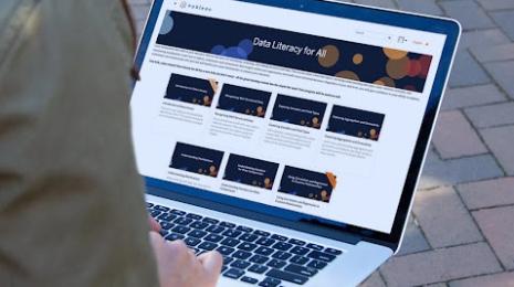
Data Literacy for All: Free data skills training for individuals and organizations
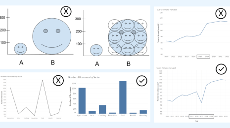
How to Spot Misleading Charts, a Checklist
 15 Noviembre, 2023
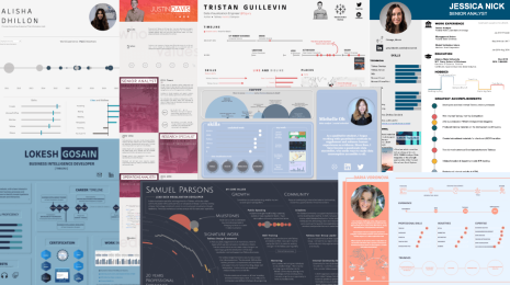
Diferénciese de los demás candidatos con un currículum interactivo hecho en Tableau
 8 Diciembre, 2022
Los reclutadores dedican solo 6 segundos a revisar cada currículum. Demuestre sus habilidades de visualización de datos creando una visualización y haciéndola interactiva en Tableau y destáquese entre los candidatos.
Suscribirse a nuestro blog
Obtén las últimas actualizaciones de Tableau en tu bandeja de entrada.