How to add an animated GIF to your Tableau viz (and make it rain)


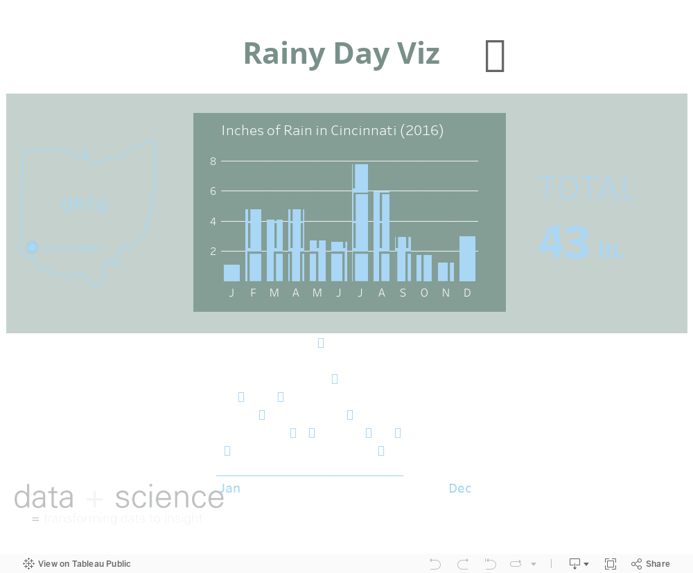
Animated GIFs can add a fun element to your Tableau viz. Check out my Rainy Day Viz above as an example. How did I make the viz? Follow the steps below to create and style a Tableau viz using an animated GIF.
1. Use an animated GIF as a background image
2. Text boxes can be transparent
The chart background and map backgrounds can't be transparent on a dashboard, but text objects can be transparent. This allows the text to show up on top of animated GIF but without a background color. Right-click and select "format text object" and set the shading to "none."
![]()
3. Use Unicode characters in text boxes with a transparent background
One of the benefits of using Unicode characters is that it's in a text box, which means it can have a transparent background. (Learn more about using Unicode characters here.) In this viz, I am using the umbrella character with shading of the text object set to "none."

4. Use a blank text box with shading
The light background box on top of the animated GIF is a blank text box. Simply add a text box with a blank space to the dashboard (floating) and set the shading to 50% or to the desired level. Make sure to place it behind the other floating objects by setting the float order to the back.
![]()
5. Use PNG files with transparent backgrounds
The map is a PNG file that is an image with a transparent background. When placed on a dashboard, this has the same effect as transparent text.
![]()
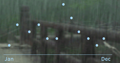
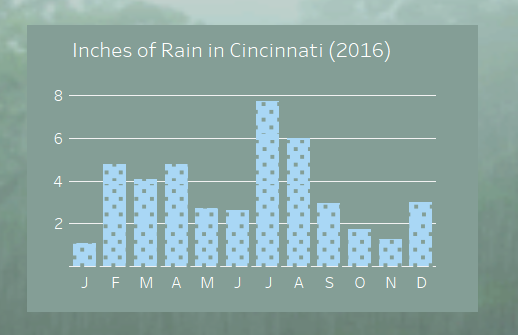
6. Use text box for chart with Unicode characters
This isn't ideal, but since a text box can be transparent, it can be used to show data without the background color of a chart area. Unicode characters can be used to make a bar chart, as shown here. In this viz, I mocked up a small dot plot.
7. Create a calculated field to plot the map
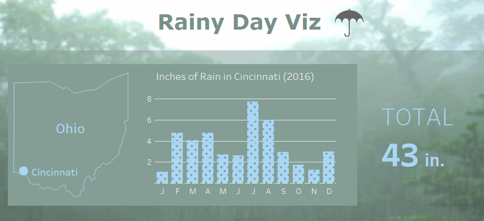
The first map I created was in Tableau, but I didn't have any geographic data. I just want to plot a map of Ohio with a dot on Cincinnati. I created two calculated fields—one for State, which had "Ohio" in the formula, and one for City, which had "Cincinnati" in the formula. Then I set the geographic field to City and State respectively so that Tableau would generate a longitude and latitude. The rest was just map formatting (more on that here). It's a dual-axis map with a shaded map for the State and a dot map for the city.
8. Use a tool to create an animated text GIF
There are a number of tools online for creating animated text GIFs. I used textanim.com. This tool has a box to enter your own custom text and set various settings for color, size, and animation options. Once you have the animated text designed, then you can download as an animated GIF file.

9. Use a container for the chart title and the chart
When placing a chart on a dashboard using a floating tile, the title of the chart has a small break from the chart area. The two areas can be shaded separated, but if they're the same color, then there is a small break in between. If you want the chart title to appear in the chart area as a single clean box, then simply place them in a floating container. Then you can format the background of the container and the title and chart area will appear in the container.
Without a container:
With a container:
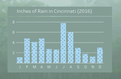
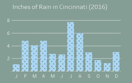
10. Use Unicode characters to created textured charts
Tableau doesn't offer a Marks card for the preattentive attribute of texture. In this viz, I used a text box with Unicode characters and placed it over top of the bar charts. Because of the gridlines, I ended up using four text boxes so that the dots didn't show over the lines. But if the lines weren't there, then it could be one text box. Note: One downside is that the tooltip from the bar chart won't work if it's covered with text boxes.
I hope you find these tips helpful. If you have any questions feel free to email me at Jeff@DataPlusScience.com.
Historias relacionadas

Visualizing Women's Impact to History Through Data Visualization
 18 Marzo, 2024

Behind the Viz: Adrian Zinovei Helps You Design Your Next Dashboard
1 Marzo, 2024

Charting the Heart: Data Visualizations on Love
 14 Febrero, 2024
Suscribirse a nuestro blog
Obtén las últimas actualizaciones de Tableau en tu bandeja de entrada.