
US Election 2020: Data + Insights
Data is the language of elections. Join the conversation.


SurveyMonkey and Tableau have teamed up in an exclusive partnership with Axios to provide broad access to the public opinion data driving one of the most-watched elections of our lifetimes. The companies have combined SurveyMonkey’s vast market research technology, Tableau’s world class visual analytics solutions, and Axios’ SmartBrevity reporting to provide in-depth expert analysis and open the door for everyone—from business leaders to activists to first-time voters—to explore national sentiment in the lead up to the 2020 U.S. Presidential election.

SurveyMonkey-Tableau 2020 U.S. Election Polling
Click on the image above to explore the viz.
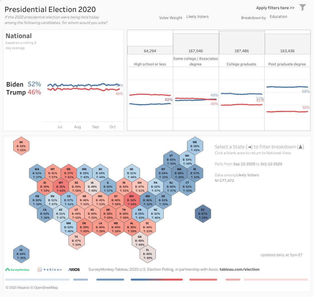
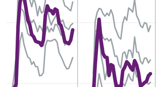
Candidate preference map
Asking respondents: "If the 2020 presidential election were being held today among the following candidates, for whom would you vote?"
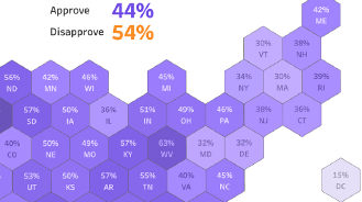
Job performance approval
Asking respondents about their perceptions of how different parts of the government have responded to the COVID-19 crisis.
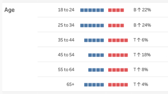
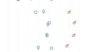
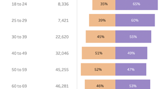
Candidate preference demographics
Explore support for Biden or Trump among different groups of voters.
COVID-19 Worries
Tracking the percentage of people who are worried or very worried about the disease, its impact on their families, and the broader country.
Survey demographics
We’ll survey more than a million people nationwide by Election Day. Here’s who they are.
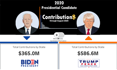
Campaign Contributions and Expenditures
Tableau Community member Patrick Sarsfield brings monthly U.S. Federal Elections Commission filings to life through this compelling dashboard. Explore where the candidates are raising money and how they’re spending it in the run-up to election day.
Explore the vizCurated resources for working with election data
Visualization best practices
In 2019, Tableau’s evangelism director UK general election from Andy Cotgreave followed the best and worst data viz from national media coverage of the campaign. Take a look back and pick up some pointers on how to best viz election data.
Working with survey data
Survey data is notoriously tricky to work with, and well-structured data is the key to finding insights in the analysis. Learn a few tips and tricks for reshaping survey data for easier analysis in Tableau.
Understanding past US elections through data
A look back at 2016
2016 was a defining year for the U.S.—and election data. Find some of the best vizzes from the last election cycle in this gallery

Election trends since 1920
Looking for patterns in how the U.S. has voted in historical elections? This visualization can give you insights

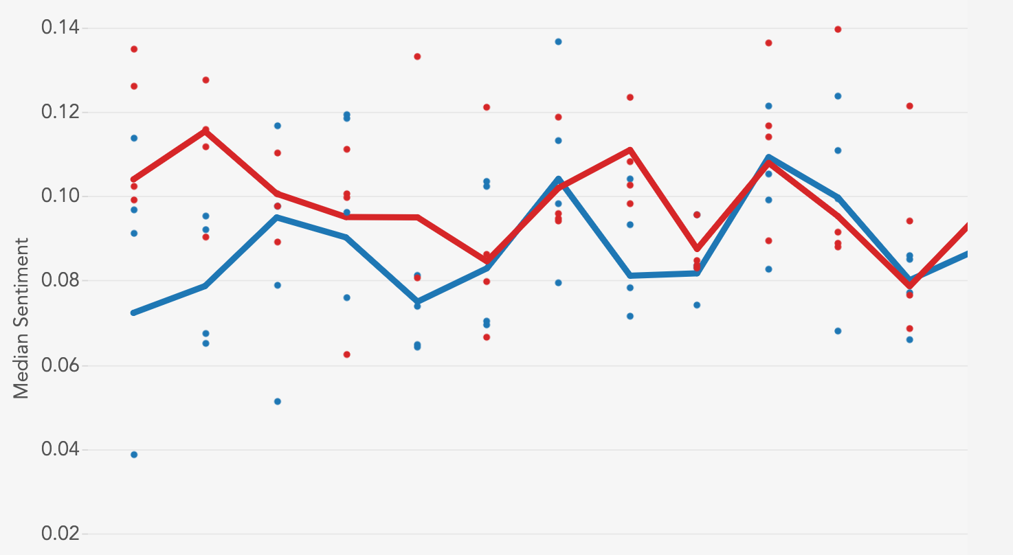
Opinion poll ups and downs
In the lead-up to an election, the data on public opinion can change—a lot. This 2016 viz shows how much the numbers can fluctuate
About the partnership

To learn more about SurveyMonkey's technology, check out the enterprise solutions powering the partnership, including the company's market research panel and data integrations.
You can also read about SurveyMonkey’s polling expertise on the company blog.
Axios is a digital media company launched in 2017. Axios—named after the Greek word for “worthy”—helps you become smarter, faster with news and information across politics, tech, business, media, science and the world. To follow Axios coverage, readers can subscribe to newsletters and download the mobile app.
