Measuring Sugar and Caffeine in Drinks


Tired of that stale coffee in the office pantry? You're in luck! I've got a viz to help you find an alternate pick-me-up for that vital caffeine and/or sugar kick when you are heading back to work after lunch.
While we wait for your votes on the Food-Fight Viz Contest, we are showcasing several vizzes that the Tableau Public team has been working on. And I decided that a viz on caffeinated beverages still counts for #FoodTipsMonth. After all, who needs to eat when you can get 100 calories from sipping on an energy drink?*
It’s a fun little viz that did not take too long to put together. But I encountered a few tricky issues along the way. I thought I’ll share my solutions to these here in case you encounter similar issues in your data visualization projects.
1. Merging Several Data Tables
The data was easy enough to find. A quick web search led me to caffeineinformer.com, a website that lists the caffeine content for some 700 different drink types. The table of data can be easily copied over to Excel.
In a separate table, the site also lists the sugar content of the drinks. Since I wanted to do use both metrics in my viz, I knew I would have to join the two tables. That way, I could get the column with the calorie content as well as the column with the amount of sugar in my data table.
While they provided one long table with all the drinks for each of those ingredients, I was more interested in the sub-tables which break down the drinks by type (coffee, tea, energy drinks, etc.). Because I wanted to use that information in my viz—I colored the marks by drink type—I downloaded the tables for the individual categories instead.
Luckily, with the new Union feature in Tableau, it is easy to stich the data back to together into one long table. When you do that, Tableau gives you a new column with the name of the spreadsheet where the rows are from. I made sure I named my spreadsheets in Excel according to the categories they represent (coffee, tea, energy drinkgs etc.), so that that new column now gives me the drink type.
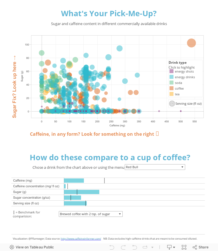
I performed these unions for the caffeine data as well as for the sugar data, then I joined the two results together. This is what is looks like in the data source pane:
Unions and a join
If you would like to learn more about how to merge different data sets, stay tuned for next month’s blog theme, which will be all about data cleaning and data preparation. We'll host live webinars to outline the various data-prep techniques (joins, unions, pivots, etc.). The first one will be held on 5 May, at 9:30 a.m. GMT. Click here to register. And stay tuned for repeat sessions in different time zones.
2. Filter Action & Drop-Down Menu
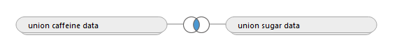
I knew I wanted to show the data in a scatter plot so you can spot the drinks that provide sugar, those that provide caffeine, and those that do both. But I quickly realized that with close to 700 drinks, the chart looks a bit cluttered. Hence I needed a secondary chart that shows the data for individual drinks.
Now it’s easy enough to connect the two charts using a so-called dashboard action using the the first chart to filter the second. The fastest way to get there is to toggle on the tiny little filter symbol on the first chart. (If you’d like a little more control over those dashboard actions, go into the “dashboard menu”.)
Use chart as filter
So now people can click on any bubble in the scatter plot and see the metrics for that drink in the bar charts below.
However, with the scatter plot this cluttered, it is not possible to select every dot. Also there are too many dots to easily find a specific drink that you might be looking for. Thus a drop-down menu filter would be useful to have as well. What many people don’t know is that you can easily display the drop-down filter that is associated with your dashboard action. That way, you can either use the scatter plot or the drop-down menu to select a drink. Also the menu is synced with the dashboard action so that it shows the selected item when you click on a mark in the first chart.
To get this drop-down filter, simply go into the menu of the second chart, find “filters,” and look for the one that is associated with your dashboard action—the one with the word “action” in front of it. (In my case, I had the different bars in different sheets, so I also had to make sure that the filter applies to all sheets that use the data source.)
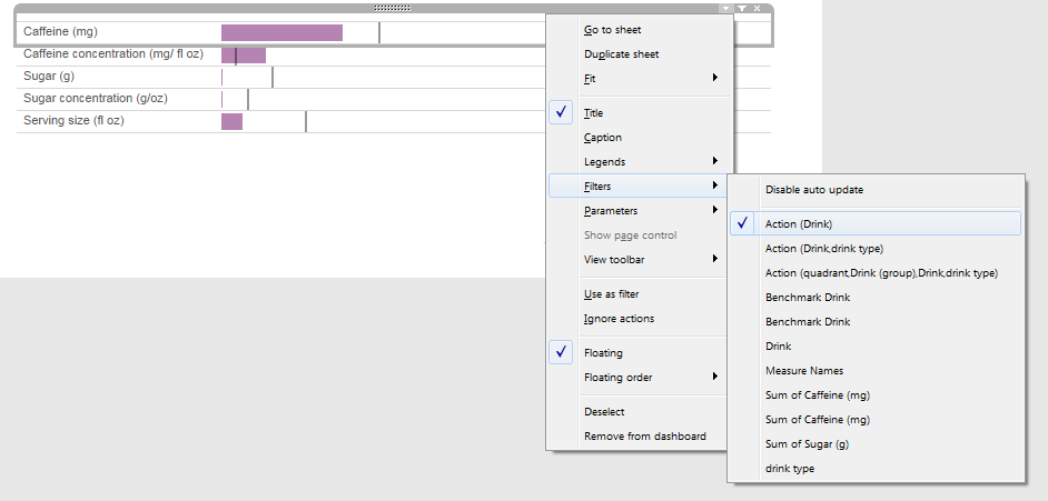
Filter associated with dashboard action
I have recently seen this trick used to great effect in a viz by UNICEF. There, you can either click on a country in the map to display detailed information in the chart below, or you can use the drop-down menu to look for a specific country. This is very handy when you are interested in those tiny city states that don’t feature prominently on a world map.
3. Selecting a Benchmark for Comparison
Now that we have a way to select individual drinks, we can use the bar charts to look at information about them. But then next question I had was, “What does it all mean”? I am not a nutritionist, so I really had no idea whether 50 mg of caffeine is something that would keep me up all night or a mere cosmetic dose.
So I needed a way to compare different drinks to something that I knew, such as a cup of coffee with two teaspoons of sugar. There are different ways to accomplish that, but I decided to go for the classic bullet chart: a bar with a reference line that shows the benchmark value.
While conceptually easy, I struggled at first to implement this. The tricky thing here is that when you use the filter action to focus on one drink, Tableau filters out all other rows and there is no information left to display the reference line. I ended up adding a second data source that has the relevant information for the drinks that I wanted to use as potential benchmarks. I then added a second drop-down menu filter that lets one chose that benchmark.
My number-one tip for visualizing data is to always ask yourself: What are we comparing? In the majority of cases, information on its own (such as the amount of caffeine) is meaningless. We always need a benchmark to compare it to. This is truer the further the metric is from day-to-day experiences: grams of sugar are easier to picture mentally than mg of caffeine per fl oz (not to mention that imperial units are completely alien to me).
I hope the viz and this write up managed to wet your appetite for more Tableau Pubblic vizzes. Be sure to check out the contest entries. And maybe you'd like to try cooking up your own viz, food-related or otherwise. If you do, don’t forget to share it with us (@tableaupublic).
_________
*To be taken with a pinch of salt. This blog is not endorsing unhealthy lifestyle choices. Don’t overdose on caffeine, and watch those calories.
Historias relacionadas

Meet Iron Viz 2024 Finalist Jessica Moon
 15 Abril, 2024

Meet Iron Viz 2024 Finalist Pata Gogová
8 Abril, 2024

Student to BI Analyst, How Tableau Can Lead to a Successful Data Career
 20 Marzo, 2024
Suscribirse a nuestro blog
Obtenga las últimas actualizaciones de Tableau en su bandeja de entrada.