How data has helped fight health crises of the past


COVID-19 stands out as the largest and most widespread disease outbreak we’ve had to confront. In a matter of months, many people began thinking about case data on a daily basis, and the ideas of contact tracing and curve flattening became commonplace topics of conversation. Even though the discussions around data and disease outbreaks might feel new to many, what we’re talking about now is the result of a long history of innovation in data and public health—the idea of flattening the curve, in fact, was critical to combatting the 1918 influenza outbreak, and what we learned from that epidemic is influencing our understanding of COVID-19 today.
Let’s look back into history to see how outbreaks in the past gave rise to practices that still inform how we manage and understand diseases today.
Collecting baseline population data
The act of collecting population level data—births, deaths, cause of death—is so baked into the way our society functions on the whole, and especially during a pandemic, that it’s almost hard to believe there was a time when it was not done.
But we know that for many cultures, starting to collect and analyze this data was an intentional process. A well-known example comes from London, where a businessman named John Graunt—who is now credited as the first epidemiologist—decided to start collecting and distributing information on births, deaths, and causes of deaths during the outbreaks of the plague in the 1600s.
These Bills of Mortality, which were released weekly, provided something we now know is critical to understanding population health: a baseline. Graunt analyzed years of data to determine average birth and death rates, and was able to then able to tabulate the data to see when the plague was spiking.
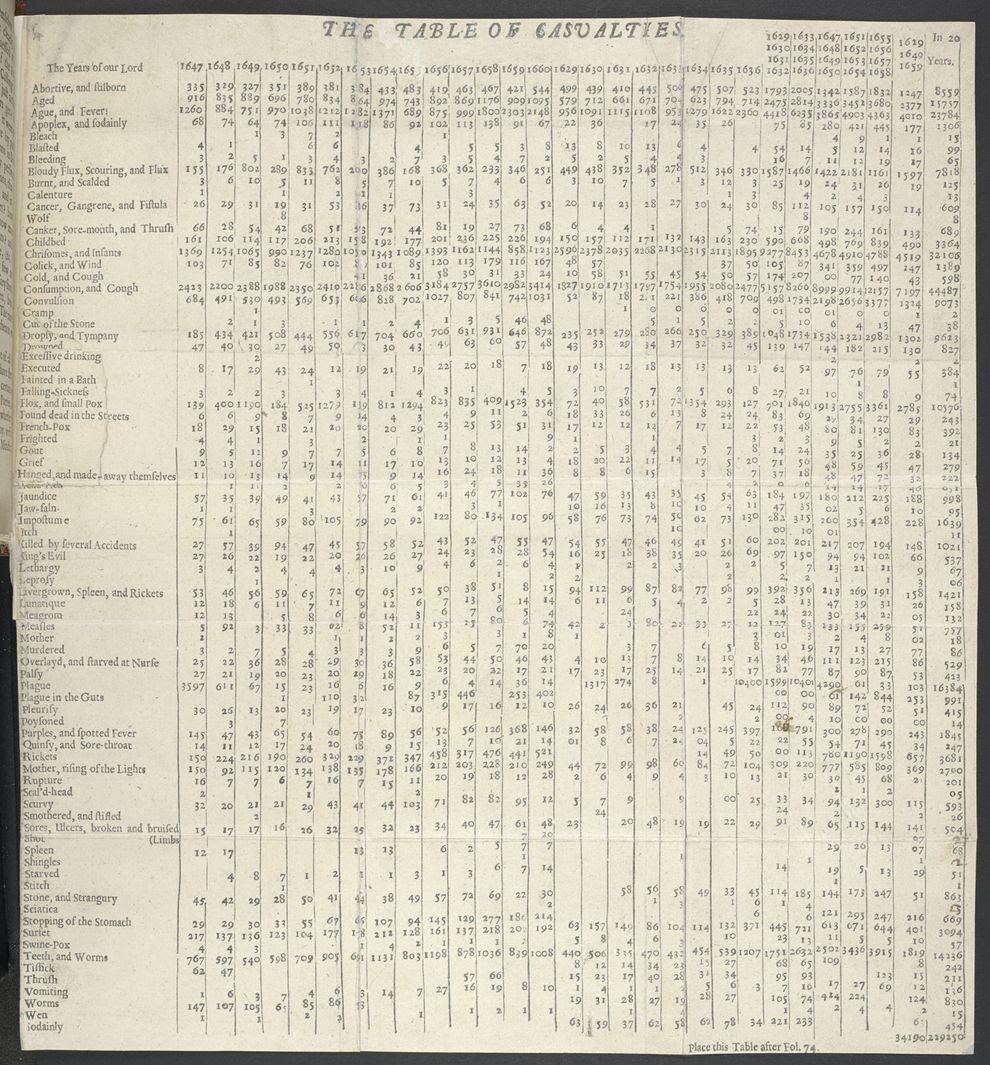
This effort to collect and understand population-based information clearly forms the backbone to our modern understanding of public health. Now in the U.S., for instance, the National Association for Public Health Statistics and Information Systems is dedicated to collecting and sharing vital records from states to inform the national understanding of population health. A baseline is critical to being able to see disruptions. During COVID-19, an understanding of these baseline statistics has enabled researchers to determine the number of deaths above expected levels, which is informing their assessment of how severe the pandemic is.
Mapping to understand outbreaks
In the context of a pandemic, data also needs to be put on the map. We need to know where deaths that could be attributable to disease are occurring, because that information helps public health leaders to see transmission hotspots and intervene. We’re seeing this play out during COVID-19, but the importance of mapping outbreaks has a long history.
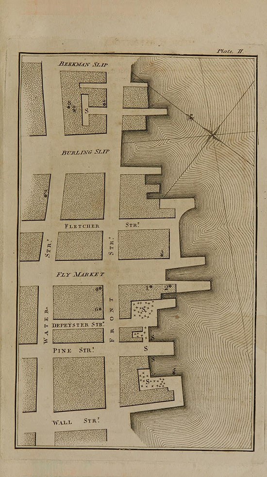
In the late 1700s, yellow fever was ravaging American cities. As places like Philadelphia lost 10% of their population, experts were scrambling to figure out the origins of the disease and how it was spreading. Some believed it was transmitted by a specific contagion or virus, like the bubonic plague. Others believed it was caused by local environmental factors—dirty water, filthy air. To test this second theory, a physician in New York named Valentine Seaman created a map of the location of patient deaths in a hotspot in the city. He also created another map that showed waste sites of “putrid effluvia,” and placed side-by-side, it was easy to see that spikes in death correlated with proximity to these noxious sites. (It’s important to note, though, that while Seaman was correct in his theory of proximity, he overlooked the true disease vector—it wasn’t the foul air itself that was causing the disease, but the mosquitoes that the air attracted).
Another well-known example of mapping brings us back to England, some 200 years after Graunt analyzed the Bills of Mortality. In the 1850s, there was a cholera outbreak in the city of London. A doctor named John Snow, who had developed a theory that the disease was spread by contaminated water, was able to prove out his idea by mapping known cases. He noticed a high concentration of cases around a specific water pump on Broad street—there were around 500 instances of cholera in 10 days within 250 yards of the pump. Snow tracked down the victims and asked if they had used the pump, and was able to establish a strong connection between the water source and the disease.
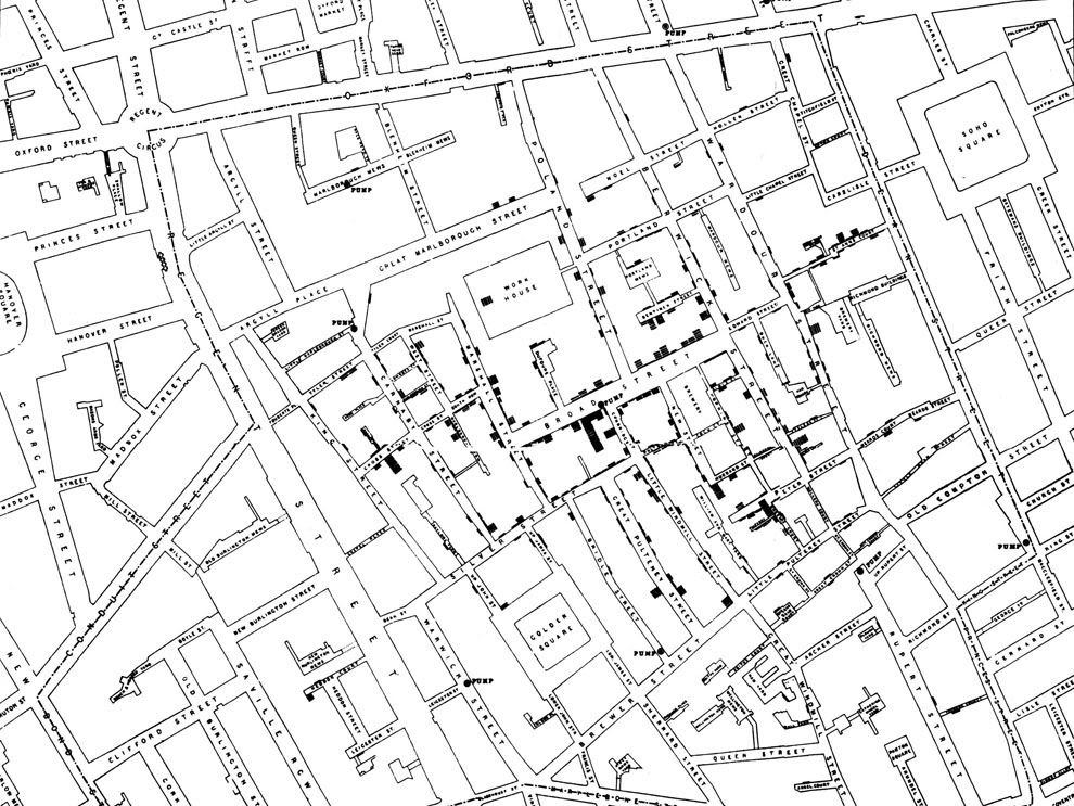
This intersection of case data and location data is incredibly vital to understanding diseases that originate from a specific environmental source—contaminated water, or a mosquito infestation. Mapping remains central to combating diseases like malaria, and while the technology and data collection tools are much more advanced, the principle is exactly the same at the core.
But what about diseases like COVID-19, that we know spread from people to people? Mapping is still critical, but there’s another essential layer to the process of collecting data to limit the spread of these diseases.
Contact tracing to contain outbreaks
That other essential layer is contact tracing: the process of identifying everyone who may have come into contact with an infected person to try to limit the spread of a disease. Contact tracing is being used during the response COVID-19, and it’s a critical tool for combatting any infectious disease.
Dating back centuries ago, contact tracing (before it was formally named as such) was used to identify the spread of transmissible diseases like syphilis and the plague. Early physicians realized that at the core of many disease outbreaks was often a single infected person. In the 1500s, for instance, the Italian anatomist Gabriele Falloppio tracked the spread of syphilis from the Americas to Europe by consulting contemporary journals and accounts.
More recently, contact tracing proved essential in eradicating smallpox. The epidemiologist Dr. Larry Brilliant worked with a team in India to track down every case of smallpox, and every possible contact to that case, until there were no more (his 2006 TED talk on the subject is an excellent overview of this critical technique). The success of contact tracing depends on the rigor of the data collection and analysis behind it. Thorough record-keeping is critical—physicians and public health officials need to be able to see exactly when a case comes up in order to be able to respond to it, and they also have to be able to track when their efforts to stop transmission are successful.
Data visualization as a call to action
During COVID-19, we’ve seen how critical data use, from collecting baseline case numbers to contact tracing, is in the fight against a deadly disease. But data work can’t happen in a vacuum. The people collecting and analyzing the data need to translate it out to the public in a way that’s clear and actionable—and even beyond that, makes people respond emotionally to the situation at hand. (For a good example of this, consider The New York Times’ chart showing unemployment numbers due to COVID-19, where the latest bar extended far beyond the space typically allowed for an illustration).
Nobody understood the power of data visualization to transform numbers into a call to action better than Florence Nightingale. Widely regarded as the founder of modern nursing, Nightingale was also a prolific statistician and data visualization expert. Her charts—most notably the rose-style visualizations like the one below—were both a way to display data, but also an effective tool in calling for improvements to medical practices.
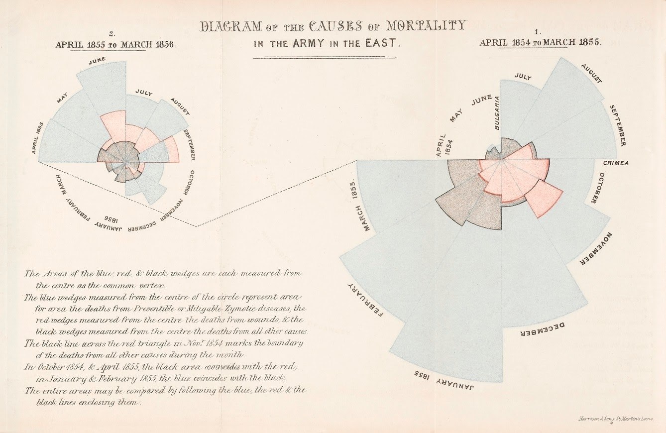
In this diagram, for instance, Nightingale shows that far more soldiers were dying during the Crimean war from preventable diseases (shown in blue above) than on the battlefield (represented in the black sections). Nightingale was actively pushing for interventions like improved sanitation in hospitals to prevent the spread of disease, and her visualizations powerfully proved how many lives could be saved by implementing public health practices we now consider common-sense. Nightingale’s work of using data visualization to advocate for best practices in public health still echoes today: We can see her influence now during COVID-19 in data-driven simulations around the importance of social-distancing, mask-wearing, and more common-sense measures.
Old ideas, new technologies
Data for public health and combatting outbreaks has a long history. While the tools experts have now to collect and analyze data are much more advanced and swifter, the principles behind how they’re used are very much the same.
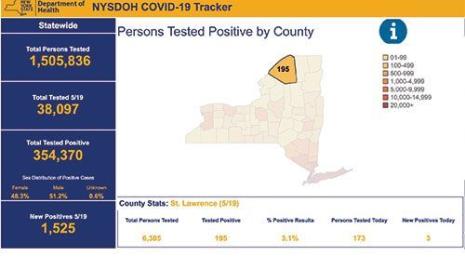
During COVID-19, we’re seeing the foundational elements of collecting population data at play in the charts many of us look at every day, like Tableau’s Coronavirus Global Data Tracker. Having a broad sense of the number of cases and deaths amid the overall population is critical for understanding the severity of a disease. We’re also seeing mapping used to identify coronavirus outbreaks. Projects like Harvard and Boston Children’s Hospital’s COVID Near You use crowdsourced data to enable people to self-report cases and visualize where hotspots might be developing. And countries like New Zealand, which are showing signs of success in combating COVID-19, have done so through rigorous data collection and contact tracing programs.
While COVID-19 is a unique challenge in many respects, the core tools that public health experts have to address it are longstanding and well-proven: data collection, mapping, and tracking.
Historias relacionadas

After a year of COVID-19 charts, eight data communication lessons learned
 19 Abril, 2021
4 reasons why embedded analytics is your path to a new revenue stream in the COVID-19 era
This blog post covers four reasons why organizations should consider embedded analytics.
What we can learn from the public sector’s response to COVID-19
 21 Mayo, 2020
A broad consensus is that COVID-19 will drive digital transformation in the public sector. During the 2020 Government Summit, speakers from Veteran Health Administration, Southwest Texas Regional Advisory Council, and FEMA discuss new processes, new technologies and innovations, and most importantly, a new mindset on decision making in the midst of crisis.
Suscribirse a nuestro blog
Obtenga las últimas actualizaciones de Tableau en su bandeja de entrada.