2020 #VizInReview: The year in Viz of the Days


Let’s be real, 2020 has been one incredibly wild ride that no one expected. Despite it all, one thing remained steadfast: the Tableau Public global community of data enthusiasts’ commitment to bringing impactful (and often mindblowing) data insights to life. To mark the end of 2020, we’re taking a look back at some of the most amazing visualizations created by the #DataFam this year.
We looked back at highlights from this year’s featured visualizations.
Our “Viz of the Day” gallery represents the many ways our community uses Tableau Public to visualize the data topics they’re most passionate about. Each day, the Tableau Public team selects and features a “Viz of the Day” (VOTD) based on a variety of criteria. A viz might tell a clear and compelling story. Perhaps it is visually stunning or includes an innovative chart type. Or, the viz might result from one of the community’s social data projects or competitions. Whatever the reason, each featured viz shares a common trait—demonstrating the realm of possibility when using data to express oneself.
There were over 200 visualizations featured as “Viz of the Day” in 2020. The Tableau Public team reviewed each one and hand-picked our favorite from each month. We’ve strived to highlight a diversity of visualizations with different chart-types on a wide range of topics from authors across the globe. Read about each one, then click on the thumbnail to see each creation in its full glory. See a viz that you love? Don’t forget to let that author know by logging in and “favoriting” it.
JANUARY

The 2019 Global Multidimensional Poverty Index by Lali Jularbal
The Multidimensional Poverty Index (MPI) takes an in-depth look at how people experience three dimensions of poverty—Health, Education, and Living Standards—in 101 developing countries. Lali Jularbal visualizes the developing country’s rankings by MPI, Intensity, Headcount, and poverty dimensions. Favorite this viz
FEBRUARY

Racial Integration in U.S. Schools by Candra McCrae
Desegregation orders were implemented by the Supreme Court to help eliminate segregation in schools across the United States. However, according to a recent Gallup Poll, 57% of U.S. adults believe school segregation is still a moderate or severe problem. In this visualization, Candra McRae looks at the history of racial integration in U.S. schools and explores ideas that could help reduce segregation. Favorite this viz
MARCH
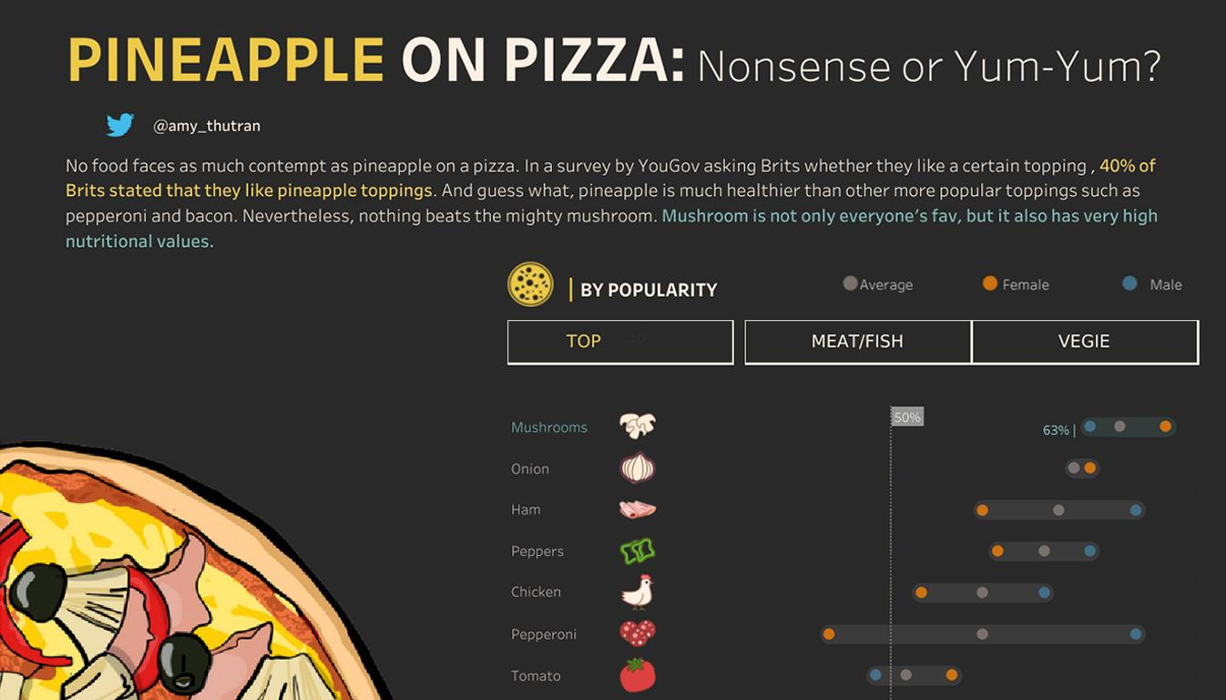
Popular Pizza Toppings by Amy Tran
Whether or not pineapple belongs on a pizza was arguably one of the most controversial debate topics in 2020. Dig into this #MakeoverMonday visualization by Amy Tran to learn about the most popular pizza toppings in Britain. Did your favorite topping make the list? Favorite this viz
APRIL

The World's Dependence on the Travel Industry by Chantilly Jaggernauth
The travel and tourism industry accounted for more than 10% of the world’s Gross Domestic Product (GDP) in 2019. Explore this visualization by Chantilly Jaggernauth to see the amount of GDP generated by travel and tourism, including hotels, airlines, travel agencies, and more, in various countries across the globe. Favorite this viz
MAY

Teladoc Health, Inc. by Praveen P Jose
Many countries around the world are still struggling to control the spread of coronavirus (COVID-19). As a result, telemedicine has become more popular than ever before. In this visualization, Praveen P Jose looks at the stock price of leading telemedicine provider Teladoc over the last five years. Favorite this viz
JUNE

Exonerations in America by JR Copreros
Over 2,500 wrongful convictions have been reversed in the U.S. since 1989. Using data from the National Registry of Exonerations, JR Copreros visualizes exonerations by race, state, type of crime, and more, revealing systemic flaws in the criminal justice system. Favorite this viz
JULY

Economic Empowerment of Women by Yobanny Samano
According to the World Bank, the Women, Business and the Law (WBL) Index, composed of eight indicators, "tracks how the law affects women at various stages in their lives, from the basics of transportation to the challenges of starting a job and getting a pension." In this #MakeoverMonday visualization, Yobanny Samano looks at the WBL index scores for 190 countries. Favorite this viz
AUGUST

Constellations Born of Mythology by Satoshi Ganeko
How did constellations get their names? Many of them are named after figures in Greek and Roman mythology. Brush up on your stargazing skills and explore this #IronQuest visualization by Satoshi Ganeko to learn about each one. Favorite this viz
SEPTEMBER

The Day Lebanon Changed by Soha Elghany and Fred Najjar
On August 4, 2020, a large amount of ammonium nitrate stored at the port city of Beirut exploded, killing over 200 people and causing billions of dollars in damage. Soha Elghany and Fred Najjar collaborated to create this visualization, which shows the impact of one of the most powerful non-nuclear explosions in history. Favorite this viz
OCTOBER

The Air We Breathe by Christian Felix
According to the latest data from the World Health Organization (WHO), 97% of cities in low- and middle-income countries with more than 100,000 inhabitants do not meet WHO air quality guidelines. In this visualization, #IronViz Champion Christian Felix explores the correlation between breathing air inequality and wealth inequality. Favorite this viz
NOVEMBER

The Most Popular Dog Breeds by Anjushree B V
In 2019, the Pembroke Welsh Corgi made it onto the Top 10 Most Popular Dog Breeds list for the first time. Check out this visualization by Anjushree B V to learn how each dog breed's popularity has changed over time. Favorite this viz
DECEMBER

Giant Pandas Overseas by Wendy Shijia
Did you know that China rents out its pandas? Today, over 60 giant pandas, native to south-central China, can be found worldwide. Dive into this visualization by Wendy Shijia to learn when each panda living abroad will be returned to its home country. Favorite this viz
And that’s a wrap!
Cheers to an incredible year, made possible by Tableau Public users like you. Be sure to subscribe to “Viz of the Day” to get more visualizations like these—another year’s worth of awe-inspiring community-created data inspiration awaits. Craving more viz-spiration? Check out these resources commemorating Tableau Public’s 10th anniversary:
Historias relacionadas

Meet Iron Viz 2024 Finalist Jessica Moon
 15 Abril, 2024

Meet Iron Viz 2024 Finalist Pata Gogová
8 Abril, 2024

Student to BI Analyst, How Tableau Can Lead to a Successful Data Career
 20 Marzo, 2024
Suscribirse a nuestro blog
Obtenga las últimas actualizaciones de Tableau en su bandeja de entrada.