Use cases for Explain Data—your analytics exoskeleton


Have you ever seen an outlier in your data and had a feeling of dread? You may be having a great data-centric collaboration with your colleagues and you notice something out of the norm and the current dashboard might not provide the full context. The dread comes because either you know you’ll have to skip lunch and work late to crawl through all the related data or because you're the one responsible for taking actions based on the data and you don't have time to wait on someone to come back to you with deeper analysis.
I’ve recently encountered a new Tableau feature that gives me—the analyst—a sort of superpower. That feature is Explain Data, which reminds me of an exoskeleton of sorts. It enhances the capabilities of the person using it by expediting the analysis process to provide explanations that quickly cut through the noise.
Over the course of the last few months, I’ve been playing with the beta version of Tableau 2019.3, which includes Explain Data. In that time, I’ve found that Explain Data helps me take care of the busy work by interrogating my data sources and all the related dimensions so that I can quickly apply my subject matter expertise and critical thinking to identify any actions I need to take. I always think it’s easier to understand a new feature when you see it in action. Let’s dig into a few use cases I’ve discovered in my role as a BI consultant.
Use Case 1: Uncovering the rise in academic enrollment
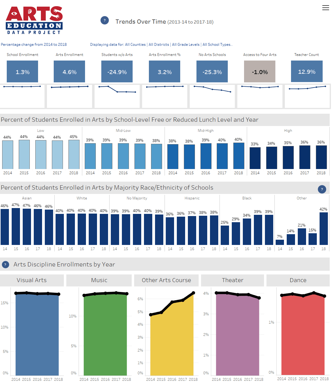
Throughout the United States there has been a lack of clarity for decades regarding the actual status and condition of arts education programs in K-12 public schools. The Arts Education Data Project exists to acquire and integrate data from disparate data sources, so schools and policy makers have a means of benchmarking and to optimize existing programs. In support of this goal, it is important to understand the details behind longitudinal changes. For example, if participation in a particular arts discipline is going up, what possible factors may have contributed to that increase? Is it something that should be further promoted? How can we learn from it? With limited resources to research answers to these questions, it is important to be able to quickly and efficiently understand all of the longitudinal data and related dimensionality to gain insights into the most important driving factors. Enter Explain Data.
The following dashboard illustrates longitudinal data for the state of California. At the bottom of this dashboard we see enrollment in the “Other Arts Course” discipline is on the rise but it is not clear what is driving this trend.
By using Explain Data on the most recent mark in this sheet we can see the courses that compose this discipline and their enrollment trends.
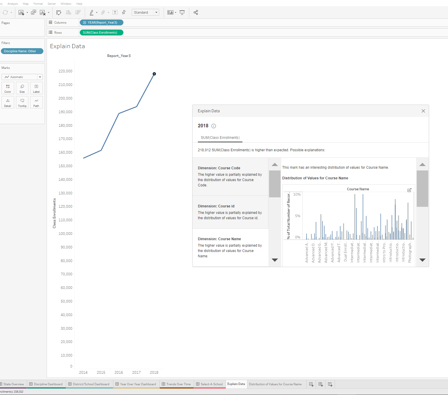
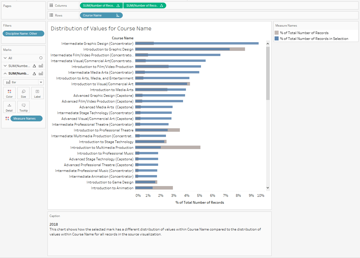
In this instance, the visualization generated by Explain Data lacks some clarity, but the beauty is that it is seamlessly integrated with Tableau, so we can pop out the visualization to explore further in its own standalone sheet. From here, we can add a sort and now we have useful insight that the course “Intermediate Graphic Design” is the single largest contributor to the increased enrollment.
Use Case 2: Understanding outliers in speech sentiment data
Historically speech analytics has been thought of as being confined to the contact center and limited to superficial metrics like number of calls and length of calls. But with modern transcription technology and open architecture solutions, the true voice of the customer can be understood and integrated with other enterprise data. This is made possible by Tableau Technology Partner, VoiceBase. When the audio file from the contact center recording is processed an enriched transcription is produced that includes data beyond the words that are spoken to include things like categorization of what was discussed and the sentiment of each person. Was the customer angry when they called, and ended the conversation on a positive note? The list goes on. This opens doors for potential applications across the enterprise. Although this presents exciting opportunities to leverage data in new and innovative ways, it also presents more and new data to see and understand.
The dashboard below provides insights into why people are calling a contact center. This information provides organic feedback that is applicable on a number of fronts. It can be as basic as managing contact center staffing to understanding how more proactive solutions can be provided to better serve customers. The data source for the following visualizations is “Thrive Air,” a fictitious airline akin to Tableau’s Superstore.
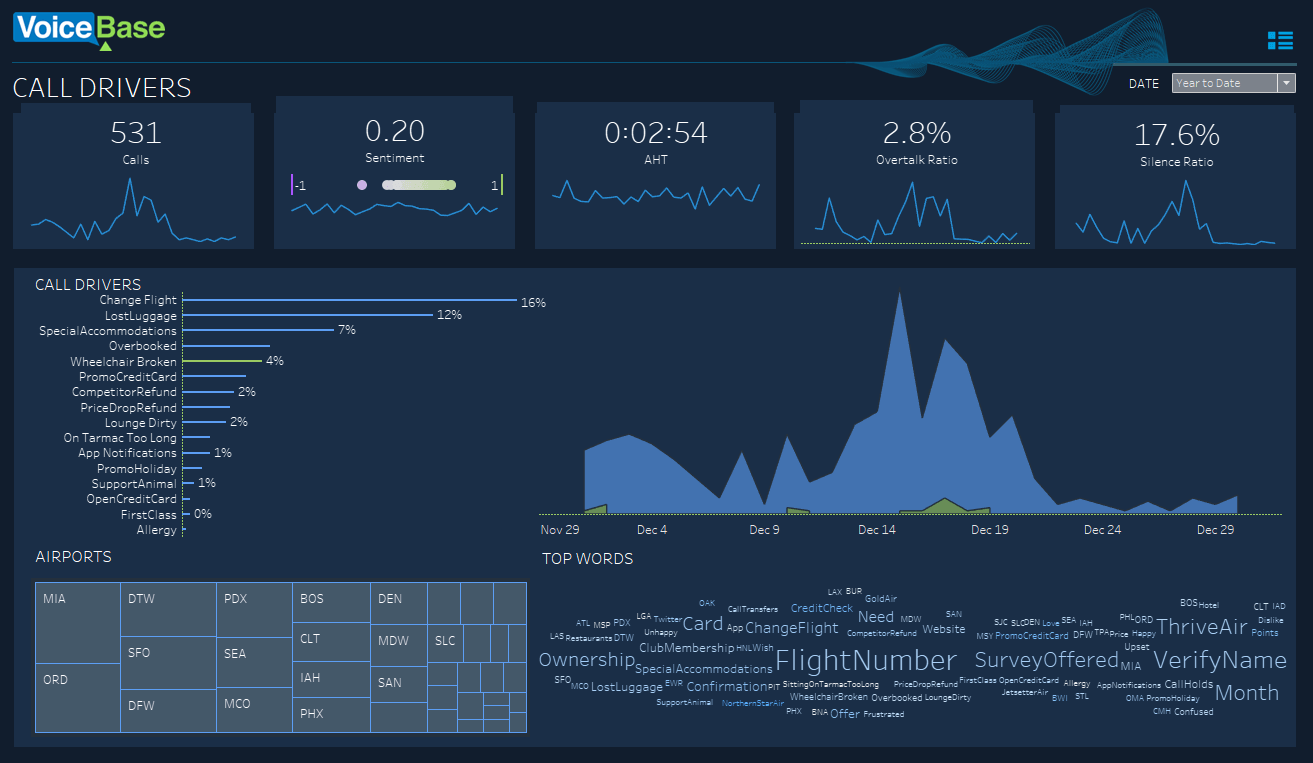
Digging into sentiment we quickly see that lost luggage is problematic. What might be causing this low sentiment on behalf of both the caller and the agent in the call center?
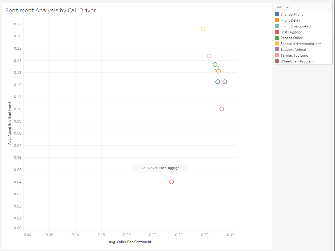
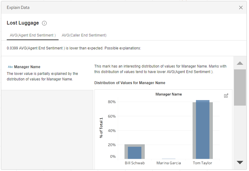
Running Explain Data on the mark of this outlier interrogates all the other related data available in the corresponding data source, including dimensions that are not included in this dashboard. From here, we can see that one of our call center managers, Tom Taylor, has an opportunity to better train his staff on how to resolve lost luggage calls.
Enhance your analytic capabilities with Explain Data
As you can see, Explain Data enhances your analytics process by assisting you in your analytics journey.
Explain Data could change workflows in a similar way that Tableau Desktop originally did. Tableau Desktop enabled access and exploration of data to more people without waiting on the classic report factory. With Tableau Desktop, the user might not have to write code. Likewise Explain Data will enable new segments of users to dig into their data. With Explain Data, the user might be able to answer “why” questions about their data without even having to drag and drop a pill.
To learn more, try the interactive demo and sign up for the on-demand Explain Data webinar. Explain Data is free with Tableau Desktop 2019.3.
Historias relacionadas
Who is Einstein Copilot for Tableau for?
 10 Abril, 2024

Securely Access and Analyze All of Your Data with Data Connect for Tableau Cloud
Tableau Prep Conductor Supports Custom Schedules
 15 Marzo, 2024
Suscribirse a nuestro blog
Obtenga las últimas actualizaciones de Tableau en su bandeja de entrada.