How to make effective bivariate choropleth maps with Tableau
Maps are a great type of viz for exploring how your data changes across space. In Tableau, it’s easy to make a map to explore any attribute in your dataset—but what about the occasion where you want to compare multiple attributes with the visualization?


Maps are a great type of viz for exploring how your data changes across space. In Tableau, it’s easy to make a map to explore any attribute in your dataset—but what about the occasion where you want to compare multiple attributes with the visualization? You can try linking multiple maps on a dashboard or augment them with custom tooltips like in this example: 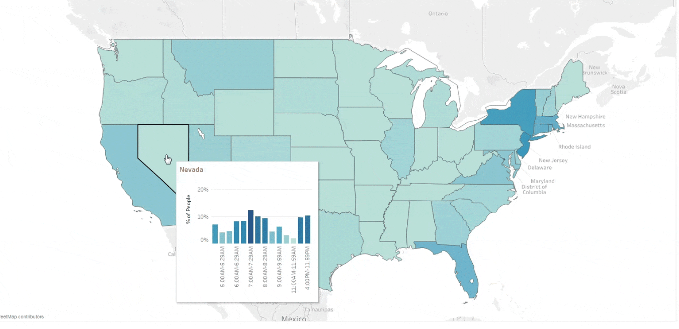 However, there are times when you’ll want a more direct way to compare two attributes on the same map. This is where bivariate choropleth maps come in handy! While they are more challenging to read than a viz with one attribute, Tableau’s interactivity adds a highly effective experience for exploring multiple attributes that are related.
What is a bivariate choropleth map?
A typical choropleth (or filled symbol) map in Tableau only shows one value for every polygon. A bivariate choropleth map instead has color encoding for every polygon that represents two different, but related values. This allows readers to more easily evaluate how two attributes change with relationship to one other. For instance, if we explored the relationship between obesity rates and level of food insecurity in U.S. counties, we could make two maps and put them side-by-side on a dashboard. To find relationships between the attributes, the reader would need to take a mental snapshot of the pattern in one map, and compare it with the pattern they see in the other map. It’s a game of moving your eyes back and forth and mentally comparing maps, like in the example below. 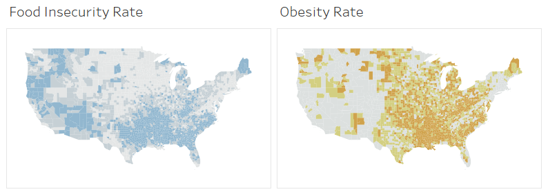 With a bivariate choropleth map, you explore the obesity and food insecurity rates at the same time, combining both attributes and using colors to quickly spot areas where both attributes are high (the dark brownish-blue shade), where both are low (the lightest grey shade), or where one is high and the other is low (the bright blue or bright orange shades).
 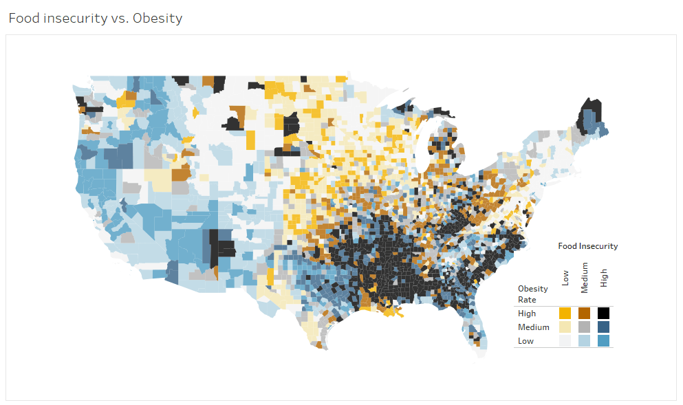 By adding interactivity to the legend, it becomes easier to interpret the data visually and partition to a single group (e.g. high obesity and low food security), or a whole category (e.g. all counties with high obesity rates). I’ll show you, step-by-step, how to design bivariate choropleth maps and create interactive legends.
How to design effective bivariate choropleth maps in Tableau
We’ll dig into this using the obesity and food insecurity example mentioned. While I’ll only use this map as an example, at the end of the post, I’ll highlight other types of bivariate maps with examples that you can download and follow. Step 1. Simplify and classify your data The most important place to start is simplifying your data. Because a bivariate map shows all combinations of two attributes, it quickly becomes visually complex. For instance, a map with two binary attributes has four distinct colors (2x2), and a map with three categories for each attribute has nine distinct colors (3x3), and so on. If you think about the classic suggestion of 7 +/- 2 as being the number of objects we can hold in working memory, it’s easier to see why maps with more than nine color combinations are trickier to interpret—they have too many categories to remember. For most numeric data, I suggest creating no more than three data groups. How you create them will depend on the two attributes for your map and what makes sense for comparisons between them. A good rule of thumb is that if you can make valid comparisons between the maps when side-by-side, you can compare them when they are on a bivariate map. In the example comparing food insecurity and obesity rates for U.S. counties, the attributes are broken into three groups—each represents one-third of the dataset (a.k.a. a three-class quantile classification). This allows for direct comparison since the group breaks have the same meaning: ‘High’ is always top 33 percent of counties. 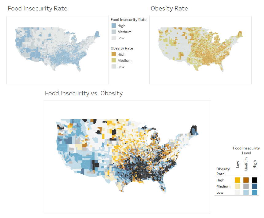 To simplify the data in three groups that I’m using in these maps, I manually calculated the quantile breaks for each attribute and entered them into calculated fields like this:
  Step 2. Combine attributes into a single dimension Once attributes are converted into a Dimension with three (or so) groups, creating the bivariate map comes next. For some attributes, it may work to simply use both attributes on the color shelf, but I find it is easier and more flexible to create a new field with a single, unique entry for each combination of attributes. This is what I did with the Obesity and Food Insecurity map. By creating a calculated field, I defined which values are grouped together and have full control over the colors assigned to each combination of values. For the food insecurity vs. obesity viz seen earlier, the calculated field to combine the two attributes looks as follows:
  Since we started with three categories of high, medium, and low for food insecurity and obesity, the outcome is nine distinct, new attributes. If we color encode using the new calculated field, we get a fairly useless map because Tableau is treating each of the nine categories as a unique category and assigning the Tableau 10-color scheme, which isn’t optimized for this special type of mapped data.
  To obtain a good bivariate choropleth map, you must clean up the color scheme to make it easier to interpret than the map above with default colors. Step 3. Modify the colors for better understanding Selecting the right color scheme is difficult. The goal is to have two distinct color ramps for each attribute and for the combination of the two-color ramps to look distinct for every category on the map. My goal is generally to have nine distinct colors that a map reader can identify and give a unique description to each of the colors used (e.g., the descriptions of ‘bright orange’ or ‘medium grey’ each match to only one color in the legend).
  If you aren’t as interested in extensive learning about color science, or feel you’re making random color choices, I recommend the suggestions provided in Dr. Cynthia Brewer’s Color Use Guidelines for Mapping and Visualization. She suggests color schemes for six different combinations of attributes in bivariate maps. I’ve re-made them in Tableau and put them on Tableau Public to make the schemes easier to find. For the map comparing obesity rates and food insecurity, the data is sequential for both attributes, so I chose to use the blue-orange color scheme recommended by Dr. Brewer:
  To assign these color schemes to a dataset, we just need to update the color for each category using the Edit Color dialog. I use the Pick Screen Color tool and set the color by clicking on an existing legend.
  Step 4. Add an interactive legend Because bivariate choropleth maps are more difficult to interpret than a single attribute map, it is helpful to give readers easy ways to analyze the data to highlight patterns of interest. You can do this by deleting the default legend and adding a clearer, interactive legend. First, create a legend as a chart on a separate worksheet. Place the two categorized attributes in rows and columns, set the mark type to ‘square’ so that the viz has little ‘color chips’ showing up in the legend chart, and color encode using the combined attribute. Then, you adjust the size of the marks and the spacing of the rows and columns to create a useful legend.
  Step 5. Finish the map by adding dashboard actions When the legend is combined with a map on a dashboard, you can add some highlighting actions and when the reader clicks on a category or color in the legend those regions on the map are highlighted. Again, this makes it easier to interpret and helps readers see and understand the spatial patterns for two attributes simultaneously.
What about other types of bivariate maps?
In this post, we focused on one map that combined two sequential attributes (obesity and food insecurity), but bivariate choropleth maps work with several data types. I’ve added other examples to a gallery on Tableau Public for exploration:
- This example showcases the relationship between dominant crop type by county and number of acres planted. This is a categorical map with a numeric attribute showing different levels of importance for each category. The counties with more acres planted are darker and fewer acres planted are lighter so they fade into the background.
- This map reveals the relationship between population density and population change. It uses a sequential color scheme for population density and a diverging color scheme for population change – because the population can increase or decrease.
- This map explores the relationship between median family income estimates and the margin of error. Median family income is a sequential attribute and the margin of error is used as a binary attribute. The map allows readers to set a threshold for how much error they are willing to accept. The ‘uncertain’ data are then colored with a less saturated shade so they ‘grey’ out a bit in the background.
- This viz shows the relationship between election polling results and uncertainty. The election results are a diverging dataset (more or less favorable for two candidates) and the uncertainty attribute is sequential. This uses a ‘value suppressing uncertainty palette’ created by Michael Correll on the Tableau Research team (read more about it here).
 Be sure to let me know about the useful bivariate maps that you’re making! To learn more about using maps in Tableau, check out other posts in our series, Data Map Discovery: “10 ways to add value to your dashboards with maps,” “How to answer your data questions with a map in Tableau,” and “How to use spatial binning for complex point distribution maps.”
Historias relacionadas

Visualizing Women's Impact to History Through Data Visualization
 18 Marzo, 2024

Behind the Viz: Adrian Zinovei Helps You Design Your Next Dashboard
1 Marzo, 2024

Charting the Heart: Data Visualizations on Love
 14 Febrero, 2024
Suscribirse a nuestro blog
Obtenga las últimas actualizaciones de Tableau en su bandeja de entrada.