Guest Post: The Future of Data Visualization


This is a guest post from Drew Skau, a visualization architect of Visual.ly.
Like everything else, the future of data visualization is hard to predict -- but some recent developments can help us see where the field is going. There is also some structure in the field that points to what will change and what will likely stay the same.
Here are three trends that are shaping data visualization today -- and will continue to do so in the foreseeable future.
Data is everywhere - and readily accessible
The open data movement is finally beginning to have some real impact. Governments are beginning to open up and give people access to the data they have rights to. Some corporations are realizing they don’t need to keep closed doors on all of their data, especially if they are doing the right thing anyway. The number of places to find open data on the web is growing rapidly, and shows no signs of slowing.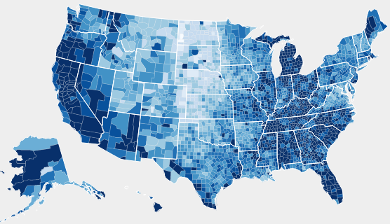
A D3 visualization of unemployment in the US from Nathan Yau, data via the BLS
Technology determines how we develop and consume visualizations
The devices we use to view data visualizations have changed drastically with the advent of tablets, smartphones and other portable computing devices. Screens are still screens, but resolutions are changing, and direct manipulation through touch interfaces can give a feeling of being more connected with data.
Other technologies in the visualization chain are constantly evolving, as well. There has been a recent push on the web toward noSQL databases, and graph databases are up and coming, especially with the growing popularity of social data. These database technologies change the way we understand the relationships in the data, and they change the types of relationships that are easy to find and show.
Interactive visualizations are easier to develop
The pervasiveness of data visualization has been given a huge boost with the introduction of D3 and the advent of responsible web browser development. Using open web standards, without third party plugins, D3 makes it possible to use data to drive the appearance and structure of web-based documents. This brings the potential for very accessible interactive visualizations to be easily developed by web developers.
These trends set the stage for some pretty impressive changes in data visualization -- yet some things will not change. For example:
The chart types that exist are not going to change much. The most frequently used chart types do a good job at supporting common tasks and representing common data relationships.
Visualization interaction techniques are set
The introduction of multi-touch interfaces provides new ways of triggering these interactions, however the interactions themselves are based on the data and tasks. The data and tasks are not likely to change much, so the interactions will also remain the same.
The quantity of data in visualizations is not going to change
There are fundamental limits on how much data each visualization type can support. We will always rely on statistical analysis and aggregation to reduce the quantity of numbers down to something that fits into visualizations.
So, what will change?
Data visualization will become ubiquitous
The ubiquity of visualization is one of the major driving forces behind the changes that are to come. As the data collection rate accelerates, visualization has to become more common for us to be able to get information and insight out of the data. The resulting increase in data visualization will improve people’s visualization literacy.
The variety of commonly used chart types will increase
With the increase in visualization literacy, people will be more comfortable looking at things like parallel coordinates and treemaps. There are extremely complex relationships in some data, and eventually the complexity of these relationships will become the limiting factor, not the literacy of the viewers.
Everyone will be able to create or develop visualizations
As visualizations become more ubiquitous, other people will begin creating them as well. D3 allows web developers to create interactive visualizations. Google Docs, ManyEyes, Tableau Public, and many other charting tools have very good selections of visualization types, allowing non-developers access to more complex visualizations. As visualization becomes more mainstream, people will have more motivation and confidence in creating their own visualizations.
Data visualization will become more significant in our society and government
We measure so much of our world, it is time to start using those measurements. As more decisions can become data driven, decision makers will need ways to extract the important information from the data. Expect visualizations to provide this. These visualizations need to be as public as the data that drives them.
More data art will lead to better aesthetics in functional visualizations
The connection between art and data visualization has always been strong, but as visualization becomes a larger part of culture as a whole, more data art will result. This will also lead to the aesthetics of functional visualizations becoming more refined. Throughout history, as people become accustomed to a new invention or device, its aesthetics are tweaked and refined to match the style of the times. The same is true of data visualization: as it becomes commonplace, good aesthetics will become one of the features that differentiate competing products.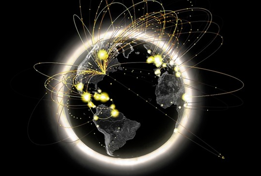
Image: Aaron Koblin
As the significance and aesthetic quality of visualization increases, it will become more important to understand the impacts of aesthetic adjustments. Visualizations use metaphors to help people understand what they are seeing. The aesthetic interventions (chart junk) on charts can help to convey these metaphors, as well as suggest an overall mood or emotion for a visualization. All of these things have an impact on how the information in the visualization is perceived. Understanding the impact of these interventions is critical so they can be used responsibly and effectively.
It is difficult to predict an exact picture of what data visualization will look like in the future, however there are directions and sub-sections that will definitely grow. One thing is very clear: Data visualization’s role in our lives is only going to get bigger.
Drew Skau is a visualization architect at Visual.ly. He is currently pursuing a PhD of Computer Science in Visualization at UNCC.
Suscribirse a nuestro blog
Obtenga las últimas actualizaciones de Tableau en su bandeja de entrada.