Retail Predictions and Comparisons in Tableau


In my work with automotive retail centers I have learned that there is an enormous need for a combination of comparative data and predictive data to continually help dealers move cars, keep customers coming back for service, and solidify loyalty to the manufacturer. However, the key to this data is putting it to use.
Once the data has been compiled, common industry practice is to simply send around text tables and Excel charts with the data. I have been in dozens of meetings where these are merely tossed aside, because they are so hard to understand and digest. So why bother collecting the data at all? The key is to turn large datasets into visual stories to take data from the sideshow to the main event.
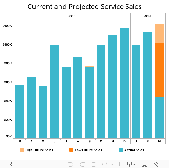
For example, given the rate of sales last month and current sales this month, what will the total sales look like at the end of the month? It is a best practice to give a range of future sales rather than a single hard figure, to allow for uncertainty. Predicted values for a "best case" and "worst case" can be combined with current sales for the previous 12 months to create a visualization like the one you see here. The blue bars represent sales to date, with the top of the dark orange representing the "worst case" sales figure, and the top of the light orange bar representing the "best case". The method of stacking and contrasting colors reinforces a month end total, but distinguishes the predicted values as different to consumers of the visualization.
The auto industry isn’t the only place where comparisons and predictions are useful! The tools I just described could be applied to almost any industry or any dataset. An interactive story about data is compelling in the way a simple chart or spreadsheet will never be.
David Spezia is a Solution Architect with the Tableau Professional Services team. He helps customers across a variety of industries achieve their goals and hone their analytical skills. He can be reached by email at dspezia@tableau.com.
Suscribirse a nuestro blog
Obtenga las últimas actualizaciones de Tableau en su bandeja de entrada.