Lessons from visualizing systemic racism in Baltimore


In Baltimore, racism has a shape.
Through the middle of the city, a land tract in the shape of an L contains the white neighborhoods where amenities and advantages—from bikeshare stations to bank branches—cluster. On either side of the White L, the Black neighborhoods extend in the shape of a butterfly. There, the manifestation of decades of intentional and structural disadvantage are evident: lower quality grocery stores, highways built through neighborhoods, and behind the homes and schools, a history of redlining and chronic disinvestment.
Dr. Lawrence Brown, a racial equity consultant with the Black Butterfly Academy and incoming Community Research Scholar in the new Center for Urban Health Equity at Morgan State University who studies the impact of historical trauma on community health, first mapped Baltimore’s racial disparities onto its geography in the form of the White L and the Black Butterfly. His book, published this year and catalyzed by the 2015 protests after the killing of Freddie Gray by police in Baltimore, delves into the historical and ongoing decisions around policies, practices, systems, and budgets that both create and uphold racism and structural disadvantage.
In Baltimore, the stark differences between the White L and the Black Butterfly can be felt block to block, neighborhood to neighborhood. But data visualization can bring the scope of the disparities into a cohesive view.
I am a Tableau consultant at Action Analytics, a Bay Area-based firm, but I grew up in Maryland and attended school in Baltimore. A friend of mine there introduced me to Dr. Brown’s work, which shines a clear light on the causes and implications of the segregation present in the city today.
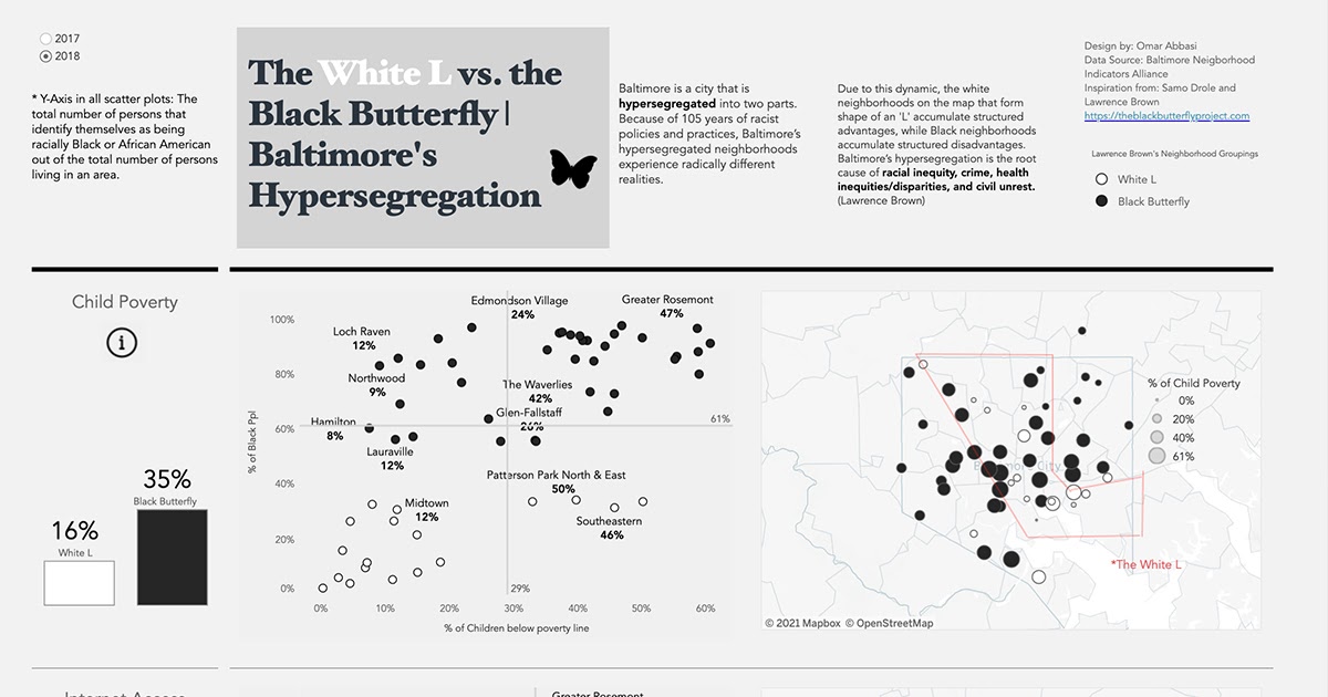
Using Tableau, I was able to visualize some of the key disparities that form the Black Butterfly/White L in Baltimore. While Baltimore, as Dr. Brown told me when we talked about his work, is “the home of American urban apartheid”—it was the first U.S. city to implement racially restrictive zoning ordinances—nearly every major U.S. city shows evidence of past and present racial segregation. Dr. Brown points to research from Douglas Massey, director of Princeton University’s Office of Population Research, that highlights other hypersegregated cities in the country.
I want to share these dashboards and insights from Dr. Brown to encourage exploration of this type of data in other cities. As Dr. Brown says, “Seeing this data presented in the dashboards—even to me—was striking and surprising, but also uplifting because people can clearly see just how wide the disparities are between neighborhoods. And that can motivate action and change.”
Be selective with your metrics
While racial disparities in Baltimore are reflected in a number of indicators, for the purposes of creating a dashboard that opens up a conversation and a window into the city I chose the following five: commute time, child poverty, internet access, investment in small businesses, and unemployment. Based on my own exploratory analysis and Dr. Brown’s research, these metrics clearly indicate racial disparities, and also span a wide range of experiences of urban life to show how widespread and entrenched racism is in Baltimore. These can be powerful metrics to explore when looking at the conditions in any city, state, or country.
Be mindful with your design
I opted to use black and white literally to distinguish and highlight the sharp separation between Black and White neighborhoods in Baltimore. In presenting the data, I chose to use three distinct charts: A bar graph, a scatterplot, and a map. The bar graph opens up the view into the metric by providing a high-level comparison; the scatter plot compares disparities at the neighborhood level and allows the viewer to easily see how disparities play out along racial lines; and the map grounds the data in the geography of the city. It’s important to consider how different charts and data presentations can widen the viewers’ understanding of the situation, and how you might use Tableau to bring these different views to light.
Apply an ethical lens to your work
Presenting the data in a way that is ethical and does not perpetuate harm to vulnerable communities and people is essential. The Urban Institute, with the support of Tableau Foundation, recently released the Do No Harm Guide to offer best practices for working with data on inequities (Urban Institute has also visualized data on the Black Butterfly). The guide covers everything from responsible approaches to data collection and research, to ethical design and visualization practices.
Sourcing feedback from mentors or subject matter experts can help avoid perpetuating harm as well. I accessed data from the Baltimore Neighborhood Indicators Alliance, a nonprofit in Baltimore that provides data to advance equity, and worked closely with mentors from my school and the Tableau Foundation Racial Equity Data Hub advisory board for feedback on the data process and the dashboard.
If you are curious to learn more about the geography of racism in your city or community, I would recommend beginning the process by learning from local organizations and researchers, like Dr. Brown, who are invested in advancing equity. And if you decide to develop a dashboard to share the data and research, make sure to source feedback along the way and consult the Do No Harm Guide to ensure you’re vizzing in a way that advances equity and understanding.
Subscribe to our blog
Get the latest Tableau updates in your inbox.