Oh, What Lovely Mobile-Friendly Vizzes You've Made!


Ever since we introduced device designer as part of Tableau Public 10, you’ve been building fantastic vizzes that look good on any device.
We've seen so many vizzes that look great on our mobile phones (and yes, I admit it, I spend a disgustingly huge amount of time checking out vizzes on my phone. Be it via Twitter or my Tableau Public activity feed, chances are I'll be looking at them on my phone!). Here are just some of those well-designed vizzes.
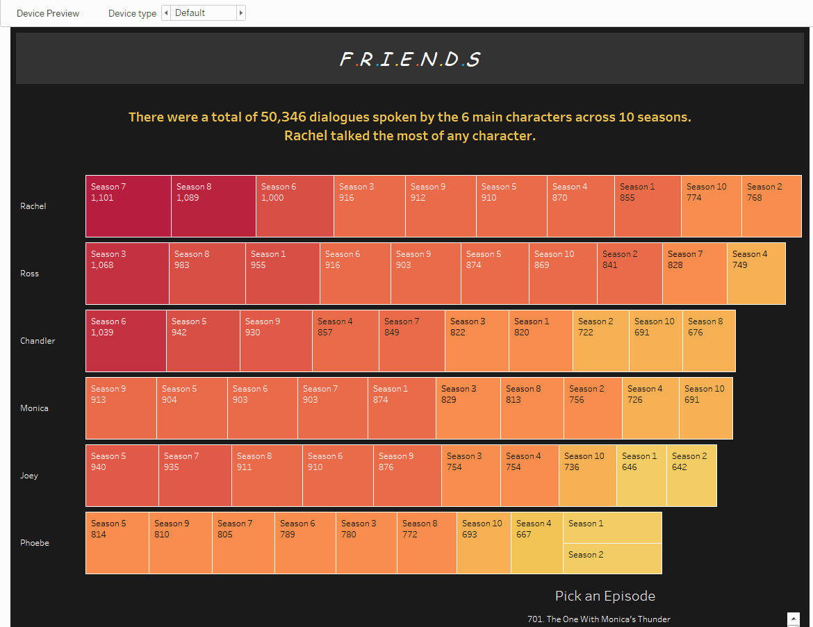
'Friends' - Suraj Shah
Maybe it's because we're all secret "Friends" fans at heart, but we really like how this viz looks on our mobile phones. For the phone view, Suraj has not only rearranged the elements of the viz, he's also removed the vizzes providing supporting context (the word cloud and what Rachel said in that season 7 episode). This means that the mobile view of this viz doesn't feel overcrowded while still telling the same story.
Check out the viz here.
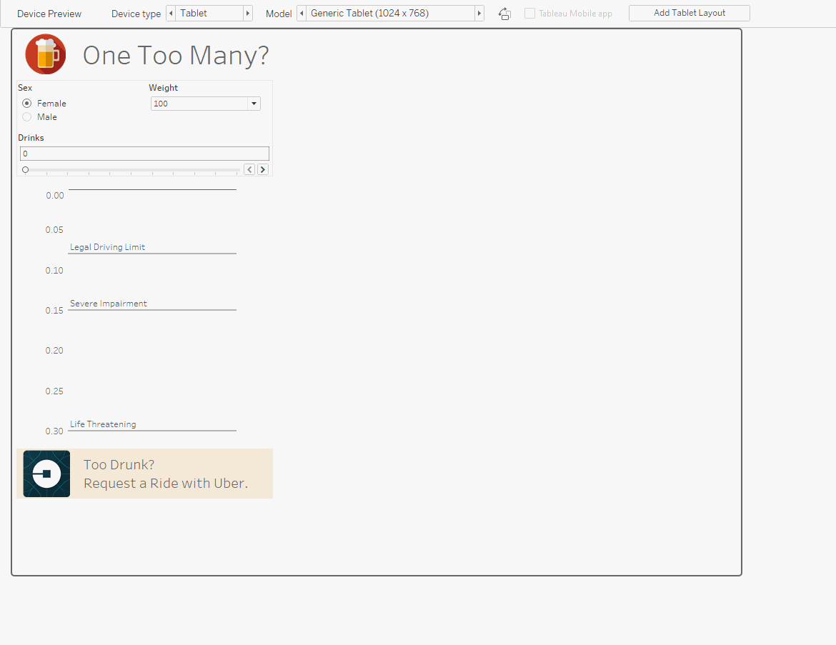
BAC Calculator - Thomas O'Hara
We love how Thomas further optimises this simple viz for phones by removing the title and header image as well as the bottom image and URL. These small changes really let the main point of this viz—to calculate whether you've likely drunk too much to drive.
Check out the viz here.
Les Vins AOC/AOP en France - Jonathan Trajkovic
Want your images to resize without shrinking on phone layouts? Use Jonathan Trajkovic's technique for his header wind-glass picture, and don't fit the image. "Fit image" will proportionally shrink your image, and on mobile devices it can look tiny.
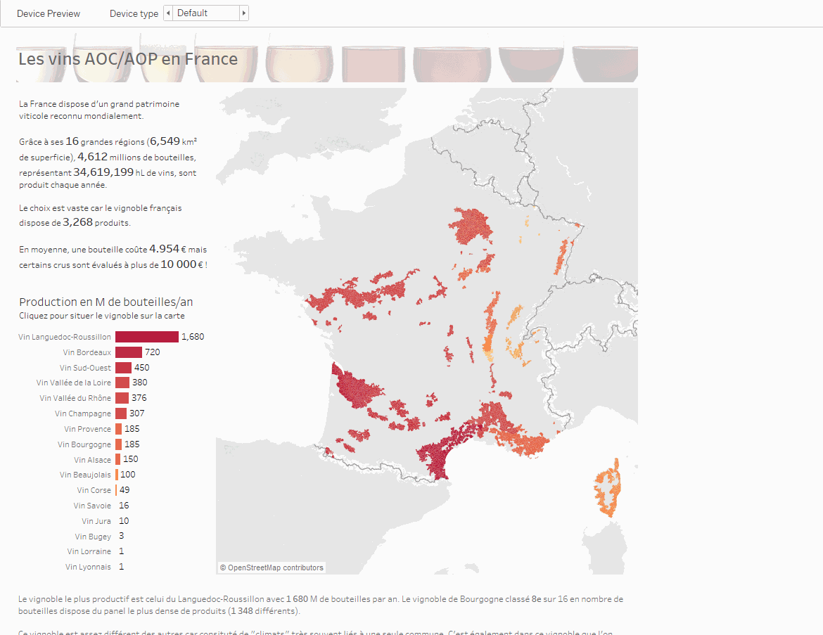
Hello, blank canvas, my old friend.
Check out the viz here.
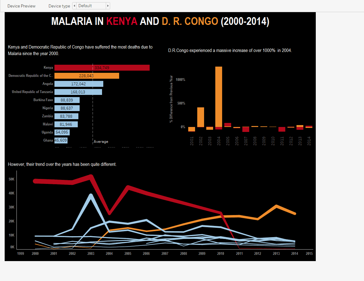
Malaria 2000-2014 - Borja Leiva
We really like Borja Leiva's bold use of colours and simple rearranging of this viz to make it work well for scrolling on a mobile device. This is a great example of how designing for mobile doen't have to take ages.
Check out the viz here.
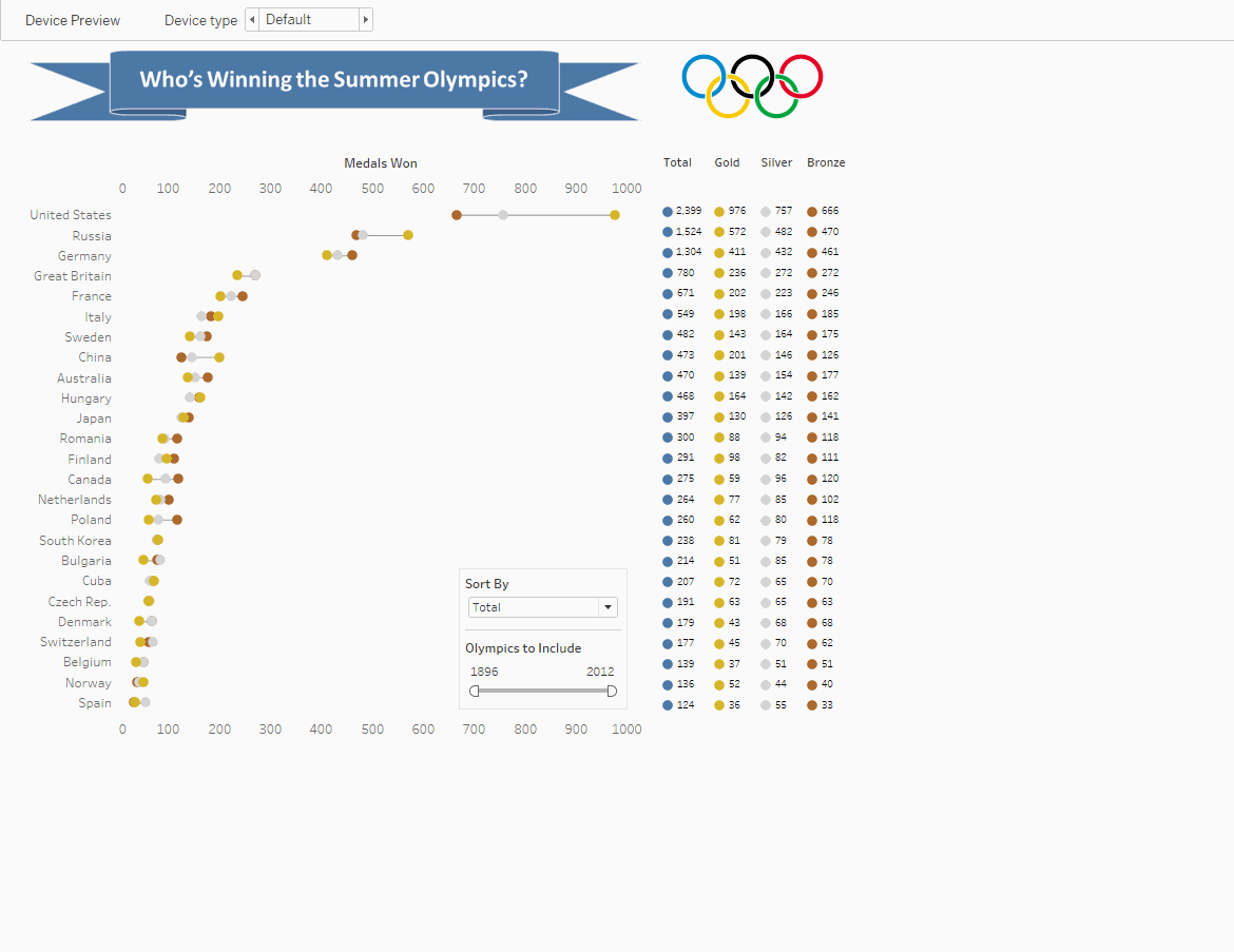
Olympic Medals - Andy Kriebel
Andy has done a great job narrowing the focus on the mobile version of his Medals Won visualization. By removing the chart that shows the total number of medals, he's made sure his mobile view is uncluttered. We also like how he's moved the position of the Olympic rings so the title isn't crowded.
Check out the viz here.
We love seeing the amazing vizzes that Tableau Public community makes. Share your fantastic mobile-friendly vizzes with the community and use by tweeting them to @tableaupublic or sharing them on our our Facebook page.
Related stories

Meet Iron Viz 2024 Finalist Jessica Moon
 15 April, 2024

Meet Iron Viz 2024 Finalist Pata Gogová
8 April, 2024

Student to BI Analyst, How Tableau Can Lead to a Successful Data Career
 20 March, 2024
Subscribe to our blog
Get the latest Tableau updates in your inbox.