5 Tableau tips from the Gartner BI Bake-Off


Throughout the pandemic, Tableau has partnered with experts and organizations to help people around the world see and understand global COVID-19 data. With 400 million views and counting, our COVID-19 Data Hub has helped governments and organizations inform and guide decision-making.
So when our team got the data set for this year’s Gartner BI Bake-Off—COVID vaccine data—we were prepared. I proudly represented Team Tableau at the virtual BI Bake-Off to face off against other analytics platforms. Check out our five #TableauTips on how we used data storytelling, machine learning, natural language processing, and more to show off the power of the Tableau platform.
1. Let AI do the heavy lifting
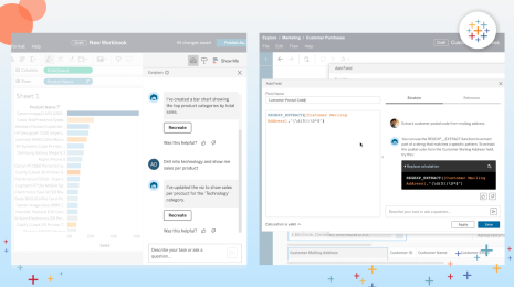
After joining Salesforce, we expanded our platform to include Tableau CRM (formerly Einstein Analytics) and exciting functionality. Einstein Discovery in Tableau uses machine learning (ML) to create models and deliver predictions and recommendations within the analytics workflow. The best part? No code or algorithms needed.
For this exercise, we used Einstein to explore how to minimize new COVID-19 cases in unvaccinated people. Einstein sifted through the data, discovered patterns, and surfaced recommendations in natural language. Thanks to AI, we learned in just a few clicks that age, hospital bed availability, and poverty are common correlated factors for spikes in COVID infections.
2. Explore many different views for data storytelling
Tableau allows you to quickly experiment with many different views, helping you to find the best way to tell a story with data. You don't have to be a designer to use Tableau—you just have to be curious and want to investigate your data.
For example, we wanted to analyze recent COVID cases and vaccinations per million in Europe. We first mapped the data, but I wasn’t happy with how it showed the data by geographical location. Instead of starting over, I used the Show Me feature to instantly change the view to a bar chart which emphasized the aggregated measures of cases and vaccinations by country, telling a better story of how countries compare by the numbers.
3. Use Tableau Prep to quickly combine and clean data
Data preparation doesn’t have to be painful or time-consuming. Tableau Prep offers automatic data prep recommendations that allow you to combine, shape, and clean your data faster and easier.
As we analyzed COVID data, I kept coming back to this question: How do personal behaviors compare to government measures? To answer that question, I wanted to compare responses to personal behavior questions, such as frequency of masking, handwashing, and social distancing, from a YouGov survey of 30 countries against the stringency index, which measures lockdown efforts by country. With Prep Builder, I connected to 30 individual data files in a few clicks, selected the fields relevant to my query from nearly 400 available, cleaned the data and improved its quality, got insights quickly, and deployed the results where I wanted. For example, country name was missing from my data, so I used an automatic split to pull the values out of the file names. I also easily replaced text survey responses with numerical values, without calculations or code, and used automatic ranking to aggregate survey responses and assign overall ranking by country.
I was interested to see that Canada, the country that ranked highest in frequency on the personal behavior survey questions, was also very high on stringency. It makes sense to me that stricter government measures led to more personal hygiene messaging, which led to more people adopting social distancing, proper hand washing and sanitizing, and avoiding contact with symptomatic people into their routines.
4. Share data from your desk or on the go
There are so many ways to be notified of updates in Tableau so that you don’t miss critical insights: managed (and secure) subscriptions, comments tagging, mobile notifications, and more. For the BI Bake-Off, we used the example of a fictional national health administrator who wanted to be notified when California hit its daily vaccination goal. We set up an event-based notification for the administrator to view wherever they are, and then easily share that milestone with their team.
You can personalize notification options without changing the underlying data model and set security permissions at the content- and row-levels.
5. Visually analyze data to explore, test, and discover the unexpected
We approached the data behind the global race to deliver vaccinations with the hypothesis that wealthy countries were faring best in the pandemic. However, visually analyzing the data revealed that wasn’t the full story.
We started with a bar chart showing the top vaccination rates per 100 people by country, and a corresponding line graph showing cases and deaths. We observed that once vaccines were widely available, deaths, cases, and positivity rates initially decreased, but then went back up.
Switching to a jitter plot, we looked at countries by gross national income per capita to compare Canada, a wealthy country with high vaccine availability, with Kenya, a country on the other end of the spectrum. Surprisingly, despite having nearly twice the population of Canada and 24 times more density, Kenya’s COVID death rate was significantly lower. Why? Layering in the stringency index allowed us to see that Kenya responded to the pandemic more quickly and aggressively with positive effects.
That’s what I love about Tableau. You can start with a hypothesis, visually explore your data, discover something unexpected, and then communicate that story in a compelling, intuitive way that anyone can understand.
It takes a data village. Shout out to everyone from Team Tableau—from solution engineering and product to leadership, marketing, and community—for coming together to show how Tableau makes it easier and faster for people to explore and prepare data, and discover powerful insights. Each and every one of you made this event a huge success!
Explore our COVID-19 Data Hub to see and understand the latest pandemic data and trends. Stay up to date with essential resources and actionable information, from daily dashboards to real-world solutions.
Related stories
Who is Einstein Copilot for Tableau for?
 10 April, 2024

Securely Access and Analyze All of Your Data with Data Connect for Tableau Cloud
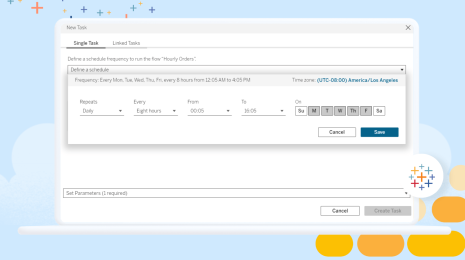
Tableau Prep Conductor Supports Custom Schedules
 15 March, 2024
Subscribe to our blog
Get the latest Tableau updates in your inbox.