Crowdsourced COVID-19 vaccine data helps those with serious medical conditions


Since late 2020, COVID-19 vaccination programs have been rolling out across the globe. While we know that vaccination is essential for returning to normalcy, many people feel unsure or hesitant to get the vaccine. This is especially true for people with serious medical conditions who are struggling to find relevant information about how the vaccine might fit within their unique health journeys.
We learned more about the challenges facing these patients in a conversation with Richard Tsai, SVP of Marketing at Inspire, and Christian Felix, Staff Programmer Analyst at Ventana Medical Systems and Tableau Ambassador. We discussed how new data tools from Inspire—an online community of more than two million patients and caregivers— are helping people learn about others’ experiences with the vaccine, how the team at Inspire moved from an idea to a publicly available dashboard in a little over two months, and how the Tableau Community added value along the way.
Tableau: Tell us about why you built this dashboard. What questions is it answering for people? What problem does it help solve?
Richard Tsai: In the past few months, we started seeing people across the Inspire community share their concerns about the vaccine. There is not a lot of information available around how different COVID-19 vaccines could interact with people with secondary and other comorbid medical conditions. Not that many doctors actually even practice some of these ultra rare disease specialties, so you can imagine how difficult it has become for these patients to understand how the COVID-19 vaccine fits within their health journey.
At Inspire, we wanted to do something to help. And in late December and beginning of January 2021, we began discussing the idea of designing a longitudinal study where we could crowdsource data that we could then visualize and bring back to our users. The dashboard becomes a tool for people to understand their peers’ experiences around vaccination, from their perception of the vaccine through its administration and the symptoms they report having after getting the vaccine. People can use the global filter to narrow the survey responses by demographics, by health conditions, and by opinions and behaviors.
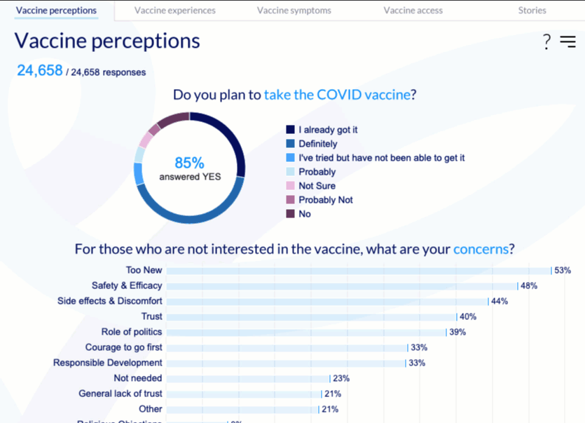
Tableau: You’re touching on something really powerful— that disaggregation can help humanize COVID-19 data. Exploring data at a disaggregated level gives us the detail we need to understand the broader picture and helps us recognize that every data point is not just a number but a person with real, lived experience and a story.
Richard Tsai: We wanted to give a voice to these patients with serious health conditions. So as part of the survey, we invited respondents to tell their stories. People sent us these touching responses in hopes of helping others who might have similar struggles. So when it came to creating the dashboard, I didn’t want to visualize their responses in aggregate. These are real people who’ve written about their experiences, and have given us permission to share what they’ve written. And they deserve to have their story told in their words.
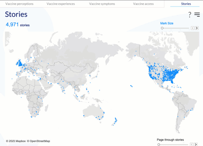
Christian Felix: And it’s so interesting to see how you’ve visualized their responses in all its rawness. It really gives them a voice. There’s so much emotion behind the data points on that map that adds another layer of depth and value to the dashboard.
Tableau: All this depth is made even more impressive considering that you kicked off this project in mid-January. What did it take to assemble your team?
Richard Tsai: I'm on the executive leadership team, and even before the pandemic we had been looking for ways to democratize data and bring insights from our platform back to the Inspire community. After identifying the opportunity around vaccination, I knew that to really add value we needed to build something fast. Once I got buy-in from executive leadership, I put together a matrixed team across product, partnerships, marketing, research/medical, engineers, communications, and designers. We focused on seven different workstreams covering everything from designing the survey in partnership with our HealthJourney Medical Board Member Dr. Stuart Goldberg through product integration and marketing launch.
One area that we needed more capabilities around was visualizing the data. Having used Tableau in the past, I led this workstream myself in addition to leading the larger team. And I knew about the Tableau Community, so I started doing my research and looked for someone who was passionate about the cross-section of healthcare and visualization and could help answer some of my questions. That’s how I came across Christian. I was really amazed by his Tableau Public portfolio and I reached out. We had a good conversation, and he gave some great feedback right off the bat. His guidance and expertise was such an asset.
Tableau: It sounds like you identified a gap on your team, and you thought to seek out help from a member of the Tableau Community. So Christian, from your perspective, what were those initial meetings like with Richard? What spurred you to lend some of your expertise?
Christian Felix: I work in healthcare, and a lot of the passion projects I publish to Tableau Public are covering that space. Once Richard started explaining the project and what he was trying to build, I knew I wanted to get involved. The path to normalcy looks much different for vulnerable populations, and this resource that Richard was creating and making available just seemed so valuable and so rich from a public health standpoint.
Tableau: And you made sure we knew about it, too!
Christian Felix: Absolutely. I really wanted to make sure you were aware of it, both as an awesome opportunity to amplify this important work and also for Tableau to add another resource to the COVID-19 Data Hub.
Tableau: So what’s next for Inspire? For this dashboard? Are there areas you’d still like to explore?
Richard Tsai: There are three kinds of areas we're thinking about next. The most first and foremost is continuing efforts to ensure this research is longitudinal. We will be launching more pulse surveys for those people who have taken the survey to track whether their perceptions of the vaccine change and, for those people who got the vaccine, any additional side effects beyond the first seven days and 14 days post-vaccine. We will also be adding additional COVID-19 long hauler data that we haven’t added to the dashboard yet.
Second, we actually want to bring this kind of data visualization experience natively to Inspire. We believe there's a role that data visualization plays in how we understand and communicate their health journey, and this project has been a prelude of sorts to our product development process.
And lastly, we want to explore more ways to share our data to help the medical community accelerate life-changing discoveries and improve outcomes for patients. We want to find people like Christian, data visualization experts and others in the Tableau Community and beyond who can help us uncover even more brilliant insights. I want to be able to find ways to share more Inspire’s data with them, as well as our over one hundred exclusive nonprofit advocacy partners who are just waiting for us to share that data with them.
_________________
At Tableau we believe that when people are united by data, anything is possible. Visit the Tableau Community Hub to learn more and find ways to get involved. If you have a resource for the Tableau Community, you can share it with us here. And to share feedback or ideas with Richard Tsai and the Inspire team, you can reach him at Richard@inspire.com or the team at team@inspire.com.
Related stories

After a year of COVID-19 charts, eight data communication lessons learned
 19 April, 2021

4 reasons why embedded analytics is your path to a new revenue stream in the COVID-19 era
This blog post covers four reasons why organizations should consider embedded analytics.
What we can learn from the public sector’s response to COVID-19
 21 May, 2020
A broad consensus is that COVID-19 will drive digital transformation in the public sector. During the 2020 Government Summit, speakers from Veteran Health Administration, Southwest Texas Regional Advisory Council, and FEMA discuss new processes, new technologies and innovations, and most importantly, a new mindset on decision making in the midst of crisis.
Subscribe to our blog
Get the latest Tableau updates in your inbox.