Best of the Tableau Web: February 2021


Hello everybody! It’s time for another monthly look at the most exciting Tableau-related blogs and videos produced by our community in the last month. February was a special month, because we also launched our new Tableau Community Hub—a space dedicated to elevating and celebrating the people, programs, and inspirational work of the community. On the hub you can discover community programs and events, making it easier to figure out how and where you want to engage. Our existing community and those yet to join have so much to share, and the hub is a great platform for your stories, expertise and insights to reach more people. And Best of the Tableau Web is, of course, part of it!
This month, I want to highlight three posts that point to some of the big challenges we face as data communicators: balancing form against function, and how those choices affect accessibility.
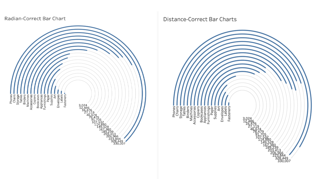 Luke Stanke, Circular Bar Charts: Why you should make them but never share them
Luke Stanke’s post, “Circular Bar Charts: Why you should make them but never share them,” explains the challenge. For clicks and eyeballs, a highly stylized visual (e.g., a circular one) might be the best solution, but for accurate insight, it’s best to stick to the standard charts you can find in Tableau’s Show Me feature. Both paths are valid, depending on your circumstances. Being very conscious about when you need accuracy or eyeballs will help here. For those wanting a beautiful celebration of all things circular, I highly recommend Manuel Lima’s “The Book of Circles.”
Pierre Hansquine, Bar Charts: The Good, the Bad, and the Ugly
Having absorbed Luke’s opinions, one might assume that bar charts are best. Largely, I’d agree. But have you considered the arguments proposed by Pierre Hansquine in his post “Bar Charts: The Good, the Bad, and the Ugly”? Pierre reveals the big danger of aggregating data, which we do every time we use Tableau, without stopping to consider what the disaggregated data may hide.
Chris DeMartini, A Tableau accessibility journey
Whether you follow the route of seeking eyeballs or accuracy, do you consider if your chart is accessible? Chris DeMartini began a fascinating series, “A Tableau accessibility journey,” where he puts his visuals through screen readers. The results in the first post are fascinating: In auditing his work, one example fails in 7 out of 10 accessibility categories. As the series develops, Chris will focus on fixing existing dashboards to increase success rate, and make his work more accessible.
With that, enjoy Best of the Tableau Web with tips, tricks, inspiration and more produced by the Tableau community. For updates throughout the month, follow me on Twitter and LinkedIn, and check out the list of blogs I follow for Best of the Tableau Web. If you don’t see yours on the list, I invite you to add it here.
Tips and Tricks
Charles Laporte, Biztory blog: How can I use Tableau Desktop to prepare my data?
Jason Yeo, The Data School Australia: How to get rid of those axis lines on Tableau
Jeffrey Shaffer, Data + Science: Four Quadrant Charts in Tableau
Gwilym Lockwood, Vizzee Rascal: How to force proportional axes in Tableau
Andy Kriebel, VizWiz: How to Assign Highlight Colors to Palette and How to Create a Trellis Chart in Seven Steps
Alicia Bembenek, Tessellation: A Beginners Tableau Tutorial: How to Get Started
Formatting, Design, Storytelling
Judit Bekker, Data Muggle: Using photos: a love & hate relationship
Luke Stanke, Tessellation: Circular Bar Charts: Why You Should Make Them But Never Share Them
Simon Rowe, Data Viz Journey: The Great Fire of London
Lindsay Betzendahl, Viz Zen Data: Dashboards for C-Suite Executives: What you need to consider in your design
Inspiration
Vicky Lockett, InterWorks: Webinar Replay: Tableau Dashboard Templates: The Pros and Cons
Pierre Hansquine, Biztory blog: Bar Charts: The Good, the Bad, and the Ugly
Adam Mico: Tableau Community Initiative Deep Dive: VizConnect
Sean Miller, HipsterVizNinja: This Week in #VOTD (S01 E05)
Neil Richards, Questions in Data Viz: Why do I use flowers to visualise data?
Adam McCann, DuelingData: Layers in Tableau 2020.4
Chris DeMartini, DataBlick: A Tableau Accessibility Journey - Part I
Kevin Flerlage, The Flerlage Twins: The Datafam Finder
Judit Bekker, Data Muggle: Mind-blowing fonts in movies
Server
Eric Parker, OneNumber: Shortcut to Create a PDF, PNG or CSV of Published Tableau Views
Calculations
Maggy Muellner, PlayfairData: How to Do Currency Conversion in Tableau with Google Sheets
Spencer Baucke: Dynamic Rows & Columns in Tableau
Andy Kriebel, VizWiz: Understanding Table Calcs vs LODs: Explained with a Slope Graph
Ken Flerlage, The Flerlage Twins: A Beginner’s Guide to IF Statements in Tableau
Related stories

Meet Iron Viz 2024 Finalist Jessica Moon
 15 April, 2024
DataFam Roundup: April 8–12, 2024
 12 April, 2024

Meet Iron Viz 2024 Finalist Pata Gogová
8 April, 2024
Subscribe to our blog
Get the latest Tableau updates in your inbox.