Bring your personality and skills to life: Stand out with an interactive resume


Your resume is your first line of defense on the quest for a new job or career. However, before posting it to LinkedIn or hitting send, it’s important you do everything possible to make your personality and skills stand out. Even if your experience is impressive, a subpar generic resume can sink your chances of getting an interview. But if you learn to combine good design practice, the YOU factor, and carefully chosen aspects of your experience into creating a compelling interactive resume, you’ll set yourself apart from the competition.
Typically, resumes contain all the usual suspects: education, a timeline of jobs, maybe some technical skills, and likely your contact information. An element that many lack, even the interactive ones I've seen, is the personal aspect. Another misstep—not giving adequate time to consider the design of your resume. Think about the layout, what each section will hold, colors, purpose, interactivity, and creativity. It's worth changing your perspective on how you think about creating resumes, and I'm here to tell you the approach I took when I updated mine.
You have to start somewhere
I'm not entirely new to the Tableau resume build considering I've done a total of three. My first attempt contained a Gantt chart of my education and jobs, lots of interactive hovering to see my skills, and action filters to show text about each job’s responsibilities. In retrospect, it was awful. In part, that’s because I hadn’t thought about its purpose. The resume was highly interactive, which wasn’t useful for my intended audience. It showed my skills but had no evidence of who I was and if I’d fit in on a team.
My second one, which I developed in early 2018, was more or less just a timeline of my education and jobs. It was the result of an interesting resume done in Illustrator that caught my attention, created by Amy Cesal.
So, why did this resume catch my eye? If you Google "Tableau resumes" or search on Tableau Public, 99% of them will appear to be the same flavor of vanilla. That is to say—there are a lot of similarities: Gantt chart, an image in the top left, skills, a bunch of unnecessary icons, and a dull color scheme.
No offense if this sounds like yours. That's why you are likely reading this—to improve your resume or start one! If that's your plan, then you are in the right spot.
So back to Amy's resume. I found many of the resumes on Tableau Public at the time uninspiring and too similar, so hers gave me a fresh idea for how to create one. My recreation certainly wasn't the best resume (it's still basically just a timeline), but it got me on the path to rethinking how to approach a resume in Tableau.
The lesson—start somewhere. Your first resume doesn't have to be your last. Iteration makes the world go round, as I always say. Write that down.
Step 1: Conceptualizing the design
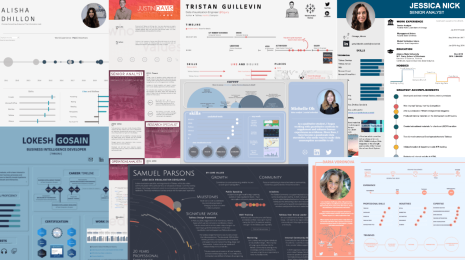
I tell people all the time (including in my Tableau Fringe Festival talk) that I usually search for inspiration before I create a visualization. To create my most recent resume, I started by Googling "resume infographic," followed by "about me infographic," and "professional infographic," and so on until I had a collection of ideas for how to structure a biographic-like resume that wasn't the usual Tableau version. It's important to search outside of the medium we are working in as that is often the place that artists, authors, and analysts find inspiration.
Below are a few concepts I found that helped jumpstart my creative juices.
Left Image: A CV with a color palette that immediately drew me in. I took the image and ran it through Tableau Magic's color palette generator (bookmark this —I use it all the time!). The result—an excellent color scheme for my resume.
Top Right: This resume had a layout and font style I liked. As a result, I went in search of a font similar and found one called Watermelon Script.
Bottom Right: I started building before I found this last image, but it helped pull my resume all together in the end. When I saw the third image, I immediately loved the shape in the corner, so I went into PowerPoint and created that same shape.
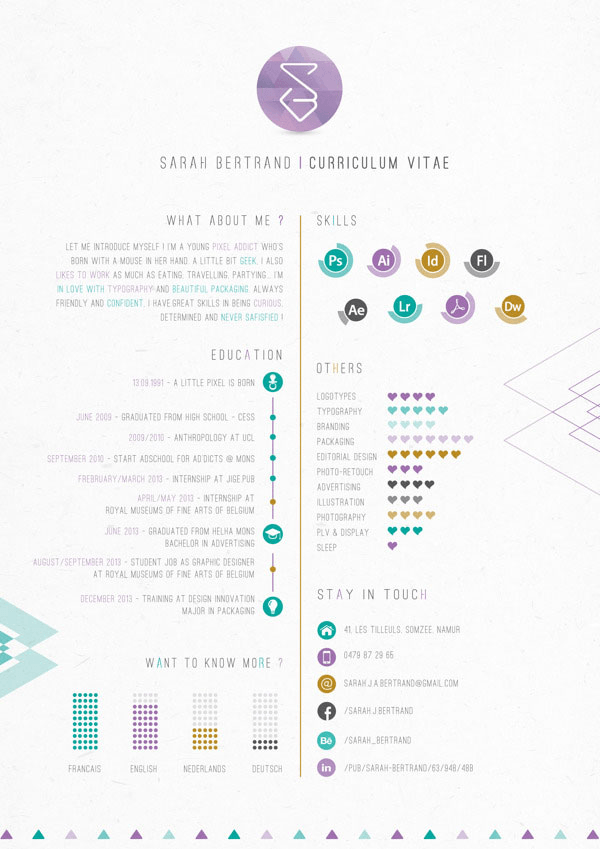
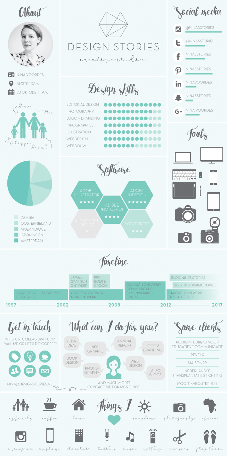
The elements of design are essential to consider first because they bring the YOU component to your resume. If you think about what you like first, then you inevitably bring yourself into your work. That should be key to any resume.
Step 2 - Determining the WHAT
At this point, I had a color scheme, a font, a shape, and general layout idea, including a dashboard size. (I strongly recommend that you create your dashboard as a letter landscape or letter portrait for optimal printing.)
After framing out my dashboard (this is a 'design-first' approach I take in my builds), I had to work out the harder part of this process—the graphical representation of my experience and skills.
This step is where you determine what you want to highlight in your biographic resume. In my case, I was creating this as a biography for my new company to use on their website. It needed to stand on its own, have some interactive features, show who I am as an individual, and highlight my professional skills (charts, design, organization, Tableau). A big ask, but by listing that out, I had a framework to start building.
At first, these were the areas I identified:
- A short section about who I am and my contact information. I wanted some fun details to ensure folks got a sense of me not just what I can do or what I've done.
- My previous jobs/roles. Because I'm in my late 30s, no one cares when I went to school or when I had jobs. They might care how long I worked at each employer and what positions I held. So I skipped the typical timeline. These are key things to consider as you think about your resume.
- My visualization skills. I later scrapped this idea and changed it to highlights of my work. I found that quantifying skills is really hit or miss. As someone who has read resumes, I know it's subjective. So I decided to skip this concept as it didn't add the value I wanted to my resume.
- My favorite chart types. Adding this was an idea from my boss, which she requested when I was creating her biography viz.
- Education. I always think employers want to see this, but it's less about when and how long. Consider whether to highlight this (or not) based on your degree, it's relevance, and if it’s something you find valuable to discuss. If so, highlight it, if not, then just put it in the bottom left, like I did as it's one of the last places someone will be looking.
- Links to my work. Instead of quantifying skills, I listed the work I've done. In the static version, someone can see counts and know I'm busy. But the interactive version has links to view blogs, articles, listen to podcasts, and view presentations.
Step 3 - Structuring the data
I knew I needed data on my previous jobs, education, presentations and links, and favorite chart types. I find that creating data for these resumes isn't hard. You just need to plan out what you want to show in a chart and how, so I'd suggest sketching it out first. It will help you determine how to structure your data.
For jobs and education, I created a table with the following columns: Company, Title, Type (Education vs. Employment), Type Detail (such as Undergraduate, Clinical, Quality Management—big categories), Location, Date Started, Date Ended, Data Skills Required (Y/N), and Notes.
For the presentation data, I just created a similar data set with each aspect that I may want to visualize and included the links.
For the favorite chart type graphs, I used real data (one was on the hotness of chili peppers since I love them) and some funny personal data. Since the point was the chart types, I could have used mock data, but I wanted some Easter eggs, as they call it for anyone who looked carefully at the interactive versions.
Rule #1: Don't overthink the data. There’s no need for a "wow" factor in regards to crazy calculations or charts. Employers have a short window to look at your resume. If it's complicated or includes a chart type they have never seen, they will not take the time to review all the details you put into it.
You want people to be immediately drawn in by your resume. Are they going to care how hard it was to build? Probably not. You want it to be memorable, different, unique, and a reflection of you.
Step 4 - Prototyping
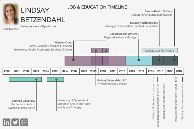
Let's be clear; my resume didn't come together in one fell swoop. It took a lot of iteration. The first draft looked like this below.
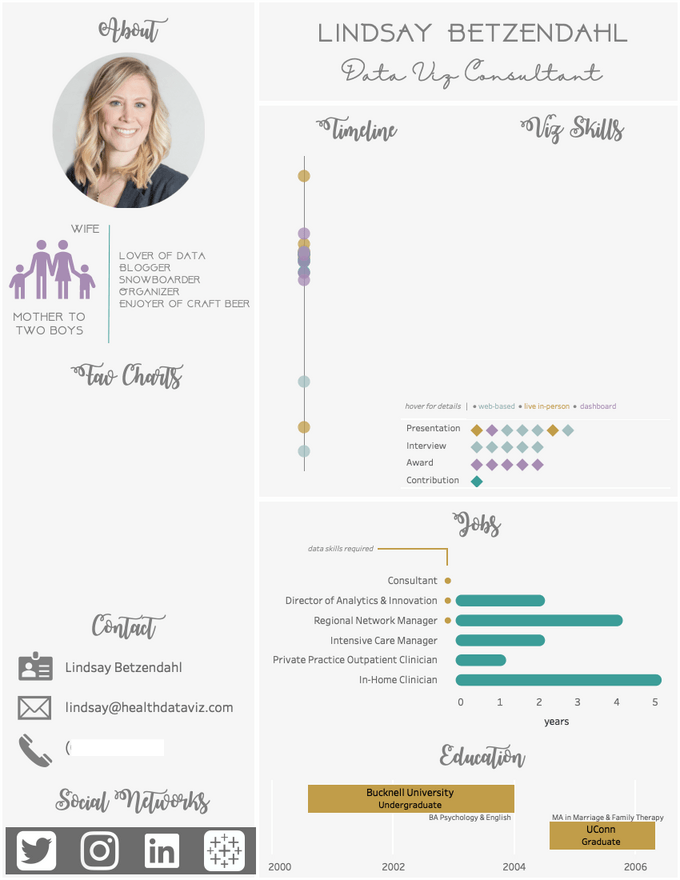
As with any dashboard or project—iterate, iterate, and iterate again. No dashboard is perfect on the first try, in my opinion. I decided to scrap the job and educational timelines, because, honestly, no employer cares when I went to school anymore. I also chose not to show where I worked, but the data is in the tooltip. You may want to show where you worked explicitly. These are things to consider: who is your intended audience, how do you expect them to view your resume, what is their level of expertise with data visualization, and what is most important to highlight about yourself.
I also rethought where each chart should be placed and reevaluated their importance. This is critical. Remember the sequence of visual perception: top left, top right, bottom left, bottom right—a Z pattern.
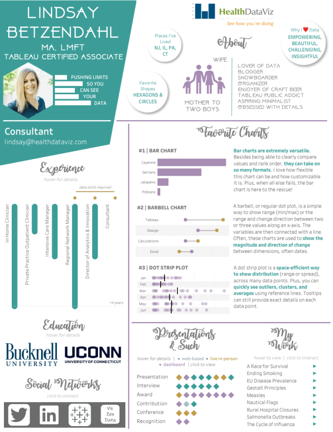
After a lot of designing and restructuring the visualization, my final viz looks like this, which you can interact with on Tableau Public. Let me quickly walk you through my design choices and how you can use this process to help design your own!
Sections & evaluating importance
About
Initially, I had this down the side, but after further thought, I realized I wanted the personal section to be the first someone would read. For me, it was important for people to read this biographical resume and feel like they know me—what makes me interesting, what I like, and why might you want me to work with you. Additionally, I wanted to give it more space because I chose to use some custom images I made in PowerPoint. Creating images to enhance a visualization is something I do a lot, so I wanted that creativity to be present and noticed. You may want to add in little things that you like to do in your vizzes because it gives you something to talk about.
Experience
There was no way I was doing a Gantt chart here. Also, at this point in my career, people didn’t need to see a timeline. What was important was to show the various job types I've had, how long I worked in each, and how the recent ones were data-focused. Plus, it allowed me to use a simple bar chart, but in a fun and unusual way. I find there are no "rules" to your biography or resume. Let it be you!
Education
As I mentioned above, I didn't think at this stage in my career that I needed to highlight my education as much as perhaps if I were starting out looking for a job. Instead, I used the logos of the schools I attended and floated a transparent sheet with transparent shapes over it. This allows the reader to get some details about my education if they choose, but it's not "in your face."
Favorite Charts
At first, I didn't allocate a lot of room for this section, but since I currently work for a company that focuses on best practices for dashboard design and chart types, this became an area that I wanted to give adequate attention. Additionally, it was an opportunity to provide a little context to my thought processes and show a personal side within a professional topic.
While I could have put in images of my favorite chart types, I decided to create the data for them. For example, the bar chart is data on the heat index for four common peppers I eat. If you know me at all, you may know that I love hot peppers—like REALLY love them. I felt that this detail could be a great conversation started when an employer asks about my resume. It allows an opportunity for someone to begin to know me.
Presentations & Such, My Work, and Social Networks
The last two sections are small and at the bottom. While I want people to check out my work, I also realize that this is something someone is going to need to dedicate some time to, so it made sense to have it at the bottom. The tooltip within each diamond of the presentation section shows the details and a link if available. The "My Work" section has a few highlighted visualizations. Upon hovering, an image of the viz will show up, and if you click the arrow, you will go directly to the visualization on Tableau Public. Lastly, are the social networks with links to each.
TL;DR
- Choose a layout, color scheme, images, and shapes that speak to you.
- Decide your objective for the resume/biography and who is your audience and their skill level with data visualization.
- Determine the possible sections (about, jobs, education, skills, etc.). How will you convey who you are and what you bring to the table?
- Decide the importance of each possible section and organize them accordingly.
- Lastly, ensure your resume reflects YOU. Taking parts and ideas from other resumes is fine, but be sure that in some way it's unique to you, or at least you feel that it reflects who you are and not someone else.
- Remember, if you feel like you are making it too complicated, then you probably are. Ask for feedback from others, take a step back, or browse other places outside of Tableau for inspiration.
Related stories
Data Literacy for All: Free data skills training for individuals and organizations
How to Spot Misleading Charts, a Checklist
 15 November, 2023
Stand out in your job search with an interactive Tableau CV
 8 December, 2022
Recruiters spend just 6 seconds skimming through each CV. Show off your data visualisation skills and stand out in the application process by visualising and making it interactive in Tableau.
Subscribe to our blog
Get the latest Tableau updates in your inbox.