How to make the perfect bar chart widths when changing date
Bar chart widths can become a headache when swapping date levels from, say, a specific year to a certain month. You may have tried some common techniques like changing the date to Discrete, but the width is still not right.


Bar chart widths can become a headache when swapping date levels from, say, a specific year to a certain month. You may have tried some common techniques like changing the date to Discrete, but the width is still not right.
You can avoid this headache and achieve the beautiful, pixel-perfect bar charts we all love with these simple instructions.
Step 1: Create the date-level calcs
You will need to create date-level calcs, so begin by selecting the parameter of your date level.
To give you an example, we used a string list parameter with our different date level choices including year, quarter, month, week and day (shown above).
You will notice the parameter values on the left are in lower case. This saves time, since you will be using the parameter with a Datetrunc instead of having to write a CASE statement or an IF/THEN statement.
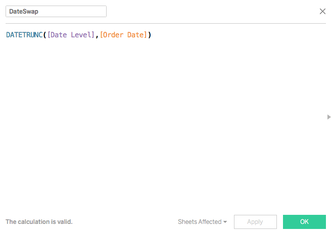
Now, create a calculation and name it (in this case, it’s been named DateSwap). The calculation should be the following formula.
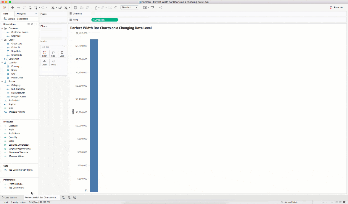
Step 2: Plot the chart
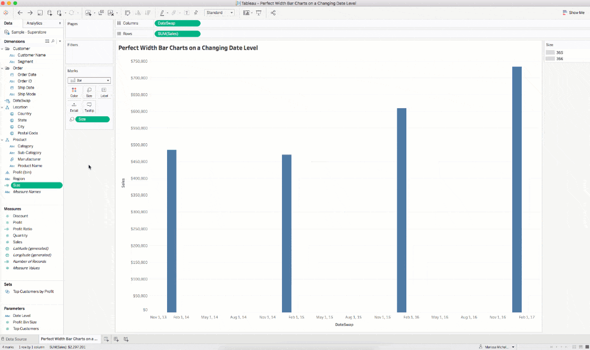
In this step, you will plot the DateSwap field on the columns shelf and select Exact date. This will plot the marks in the correct places. Now change the Mark type to Bar.
You’ll see something like this:
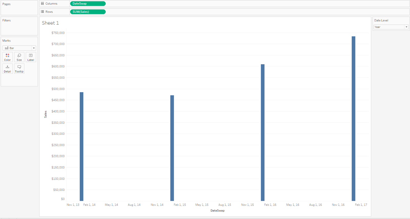
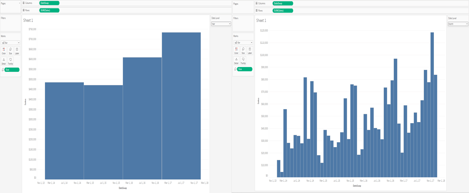
Since this viz has the Parameter currently set to Year, and the Date field is configured to be exact date, the result is four bars plotted on a much larger axis. However, the viz is still far from beautiful.
To make the bar widths look better, you’ll need to either drag the size selector all the way to the right, or change the size mark to Fixed (shown below). But there is still another step to perfect your bar widths.
Step 3: Create pixel-perfect bar width
Thanks to the Data + Tableau + Me website, we have the secret to get the perfect bar widths. Once you complete Step 2 and set the size mark to fixed, drag a parameter onto the size mark to make the units dynamic. This technique works for the calc/field as well.
When we tried this out for ourselves, we had the X-axis as each day across the range of our data. As we change date levels, we plot the bar chart on the 1st day of the date level. For instance, the year would be January 1st, the month would be the 1st of the month, the week would be the 1st day of the week and so on.
However, not all years have the same number of days, just like not all months have the same number of days. So, we adjusted the calc to tell us how many days are in each unit as the date level changes.
The new calculation is as follows:
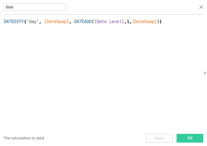
The calc above finds the number of days in any year, quarter, month, etc. by taking the date difference in days from the date in question, and the next unit in line.
Here, the [DateSwap] changes our dates to the level configured in the parameter [DateLevel], and calculates the difference in days to give the correct number of days in a particular year, quarter or month (week and day also apply, however those values are static).
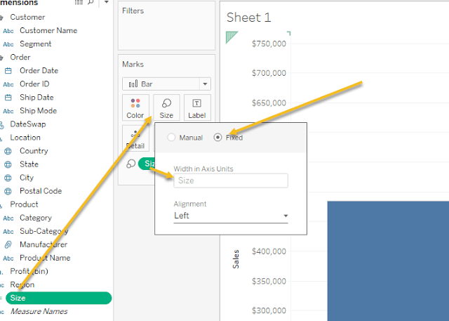
Once we have that calc, our job is really simple. Change the size mark to Fixed, and drag the size calc onto the mark.
In order for this to work, after you have put the Size calculation on the view, right-click and set it to a continuous dimension.
And that's it!
You can expand on this however fits your needs. You can put parameters on there for marginal histograms or whatever other calcs you need. Just make sure it's continuous!
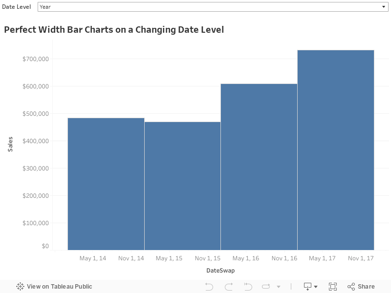
Now you can change date levels and have pixel-perfect width bar charts along the way! Play around with the dashboard below.
Related stories

Visualizing Women's Impact to History Through Data Visualization
 18 March, 2024

Behind the Viz: Adrian Zinovei Helps You Design Your Next Dashboard
1 March, 2024

Charting the Heart: Data Visualizations on Love
 14 February, 2024
Subscribe to our blog
Get the latest Tableau updates in your inbox.