Seven majors that surprisingly use data and Tableau


This piece is part of the Back-to-School series on the Tableau blog. Students around the world are returning to school with the hopes of learning new skills that will help them find success in their future careers. Learn more about the skill that tops that list—Tableau.
It’s no surprise that Tableau is being taught in data science and business analytics programs at universities around the world to prepare students for data scientist and analyst roles. But, as we know, data lives everywhere. Instructors are answering the call and preparing their students by teaching visual analytics with Tableau in subject areas across campuses.
Here are seven subject areas where students are using Tableau to see and better understand data.
1. Law
Warren Agin, Adjunct Professor, teaches a graduate level course called Legal Analytics: Applying Data and Analytic Thought to Legal Programs at Boston College School of Law. This course is designed to introduce law students to the concepts behind using data to solve legal problems. For example, examining how courts use data to decide whether to keep criminal defendants in jail pending their trials and using visualizations to help guide a hypothetical merger negotiation. Warren uses Tableau to show students how to examine and understand data, and to visualize relationships within the data as part of the process of building predictive analytics. During the course, students examine the Survey of Consumer Finances to discover relationships between various measures and understand income equality issues.
2. Journalism
Dr. Daniel Angus teaches an undergraduate course called Data Journalism in the School of Communication and Arts at the University of Queensland. In his class, he breaks visualization down into two categories: visual storytelling and visual forensics. Visual storytelling focuses on how journalists can communicate their stories using visualizations from leading newspapers and Tableau. Visual forensics focuses on how journalists can use visualizations to help reveal interesting trends and insight for their own eyes before deciding on how to communicate these insights.
“Using Tableau in the course gives students confidence in their ability to construct quite complex visualizations. Prior to using the software, many saw these kinds of visualizations as out of their reach, and something that only IT-savvy people create. The software gave them an easy entry point, and many then went on to create more complex visualizations for their final submissions,” Said Dr. Angus.
Dr. Haiyan Jia teaches two undergraduate courses – Editing, Critical Thinking and Data Journalism and Visual Communication and Data Visualization – in the Department of Journalism and Communication at Lehigh University. In each of the courses, half of the semester is dedicated to understanding how to use data in news discovery, presentations and storytelling. Some of the course projects include Lehigh University Food Options, A 21st-Century Problem, and Mental Health at Lehigh University.
3. Urban Studies and Planning
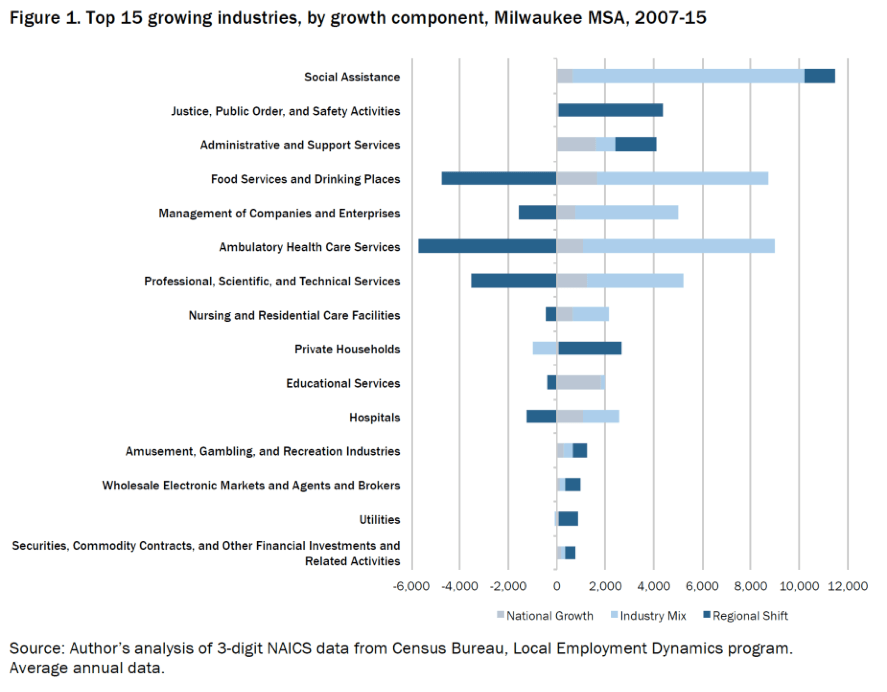
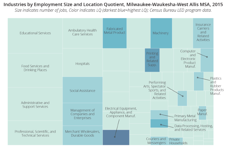
Greg Schrock teaches a course called Regional Economic Analysis within the College of Urban and Public Affairs at Portland State University. It is a graduate level course for Master of Urban and Regional Planning students focused on Economic Development. In this class, students use Tableau to visualize regional, industrial employment specializations and their growth. Here are a few examples of visualizations that his students created:
4. Marketing
Angel Evan teaches a Continuing Studies course called Data-Driven Marketing at Stanford University, which teaches marketers how to use data to make better decisions. It focuses on the types of data that marketers are confronted with the most: social media, mobile applications, paid media, website analytics, and customer profiling. By the end of the course, students have learned how to collect, analyze, interpret, and visualize data as part of their ongoing, decision-making process.
Brian Walsh teaches an undergraduate class called Customer Analytics within the College of Business at University of Rhode Island. This class introduces students to a variety of concepts and approaches that allow firms to distinguish between profitable and unprofitable customers and programs, and then how to ensure there are strategies in place to measure and improve upon profitability. The class is a combination of concepts and data exercises to reinforce the topic.
Professor Jose Mendoza has been using Tableau for over a year now in marketing courses at both the undergraduate and graduate level in the Jack Welch College of Business at Sacred Heart University. Graduate students transition from presenting data to telling stories with data, while undergraduate students use Tableau to perform tasks such as sales forecasting, consumer segmentation, profitability analysis and geographic data visualization.
5. Healthcare
Barbara Hewitt teaches a graduate-level course called Healthcare Informatics in the Health Information Management program in the College of Health Professions at Texas State University. The course covers topics including information infrastructure, data needs, implementing healthcare information systems, decision-making, privacy and security, consumer informatics and emerging technologies. Students use Tableau to analyze real hospital data and then suggest changes to facilities.
Frank Wang teaches a Population Health Management course that is part of the Master of Science in Health Informatics program at Sacred Heart University. They use Tableau to analyze publicly available healthcare data from sources such as the U.S. Census Bureau, the Centers for Disease Control and Prevention, the Connecticut Department of Public Health, the Organization for Economic Co-operation and Development, and the Centers for Medicare and Medicaid Services.
6. Geography
Keith Clarke teaches an undergraduate course called Cartographic Design and Geovisualization in the Department of Geography at the University of California at Santa Barbara. This class uses open-source software to develop students’ abilities to create and refine quality maps and graphics for use in their work. Cartography topics such as the human visual system, color theory, text handling, and other active research areas are covered. Here are a few student examples: Denver, Colorado Crime 2011-2016, Wine Grape Vineyards of California 2015, and Top 10 Busiest International Air Routes from NYC, Miami, LA.
7. Hospitality Management
Karen Xie teaches an undergraduate course called Hospitality Technology & Analytics at the Kritz Knoebel School of Hospitality Management within Daniels College of Business at the University of Denver. This course surveys diverse aspects of technologies that are making the hospitality industry thrive and includes an introduction to data analytics and visualization for business intelligence. There is incredible demand in the hospitality industry for individuals that can synthesize meaningful narratives from data to transform customer service initiatives. Students use Tableau to visualize and analyze large-scale, but also granular data-sets sourced from hospitality technologies to tell an appealing story that informs business decisions. Students are expected to: (1) demonstrate understanding of how hospitality managers use business analytics to formulate and solve hospitality business problems, and to support decision-making; and (2) apply the processes needed to develop, report and analyze hospitality data.
It doesn’t stop here. We’ve also seen Tableau being taught in courses such as Psychology, Game Design, Criminal Justice, Sports Management and Agriculture. We’d love to hear about the course where you learned and used Tableau. Share details in the comments below. And if you don’t yet have a free student license, request yours today!
Related stories
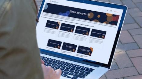
Data Literacy for All: Free data skills training for individuals and organizations
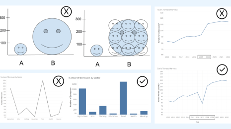
How to Spot Misleading Charts, a Checklist
 15 November, 2023
Stand out in your job search with an interactive Tableau CV
 8 December, 2022
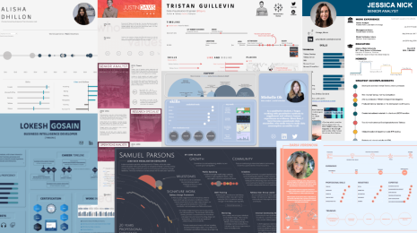
Recruiters spend just 6 seconds skimming through each CV. Show off your data visualisation skills and stand out in the application process by visualising and making it interactive in Tableau.
Subscribe to our blog
Get the latest Tableau updates in your inbox.