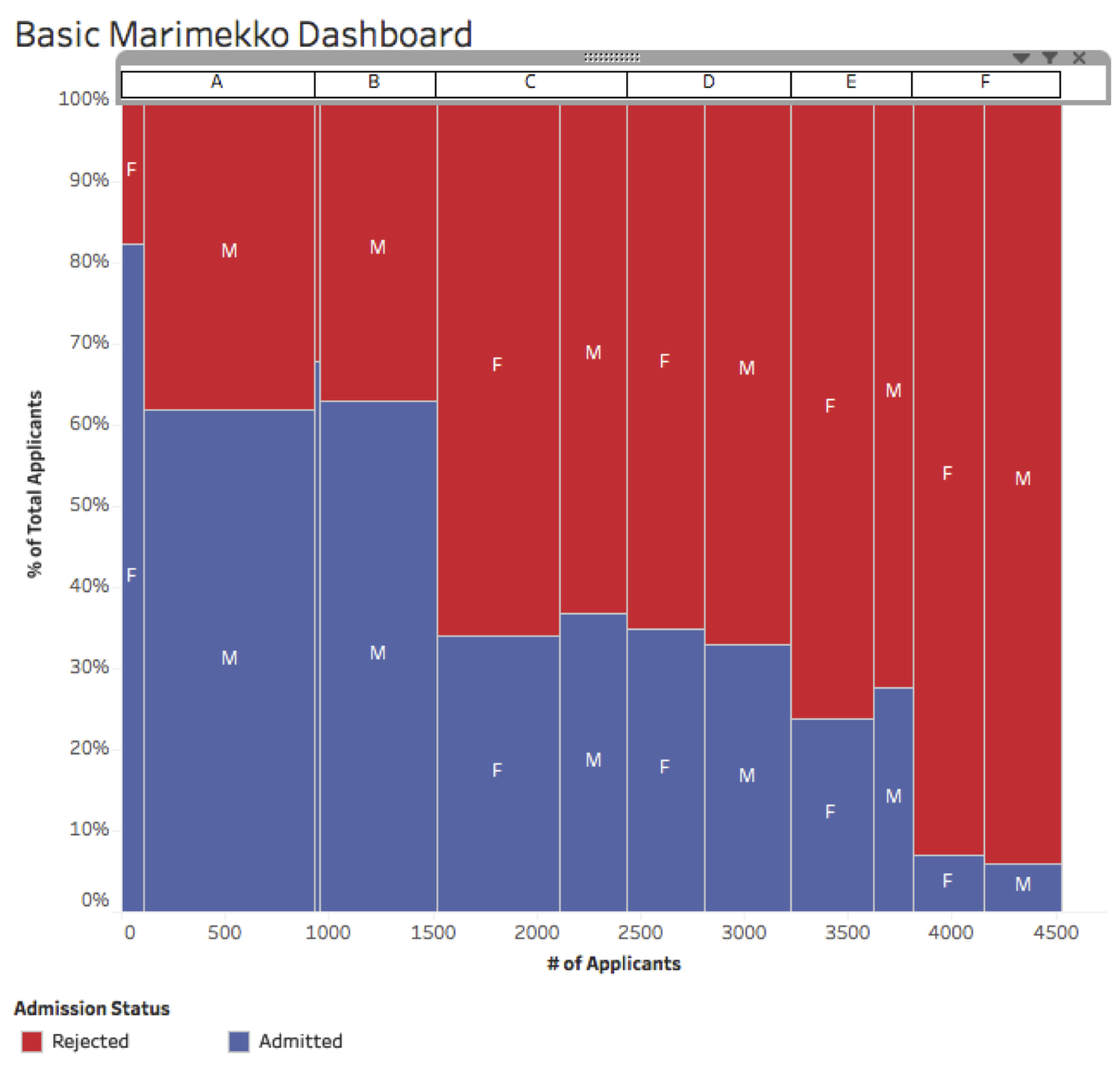
How to build a Marimekko chart in Tableau
Now that you know what a Marimekko chart is and when it’s most useful, it’s now time to learn how to build it in Tableau.


Building out the calculations
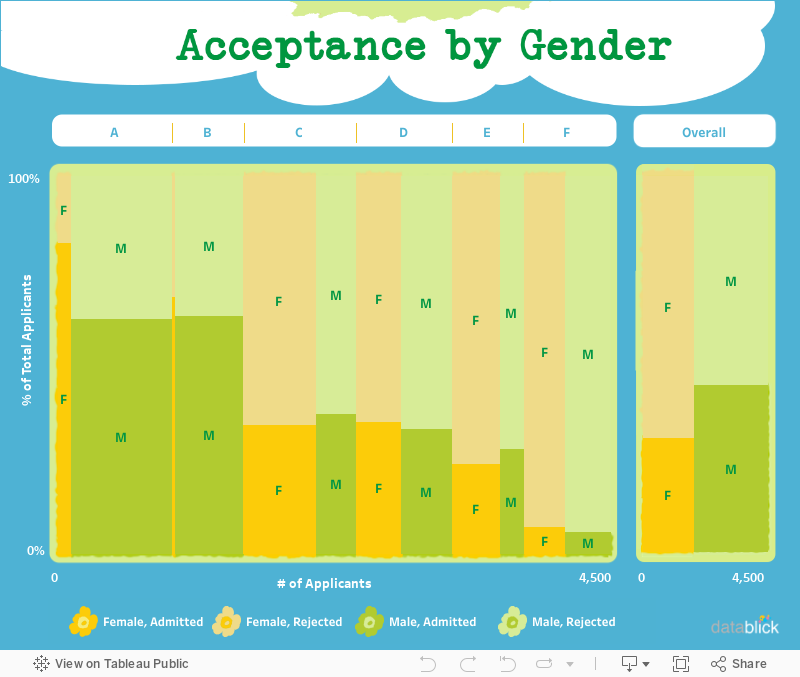
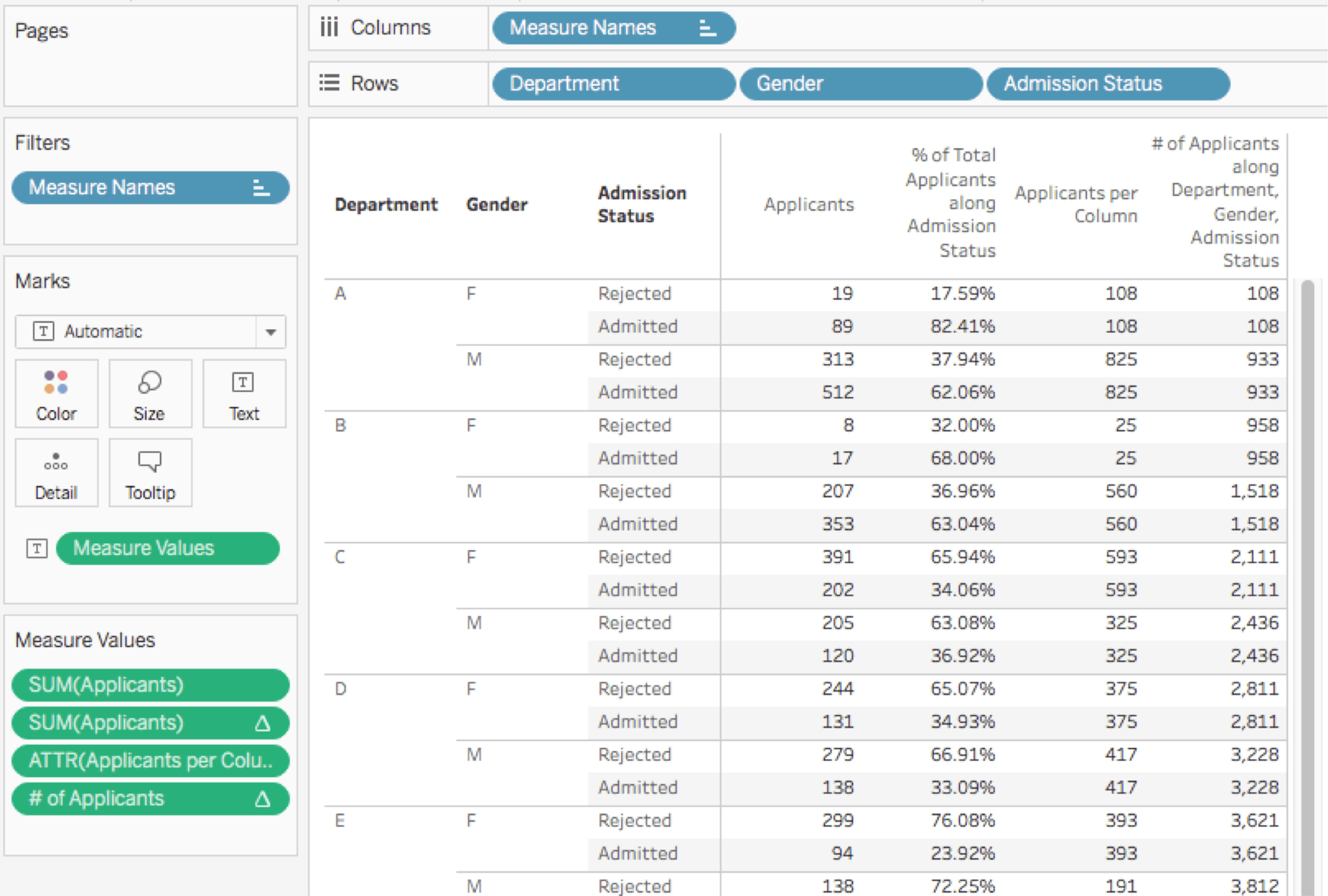
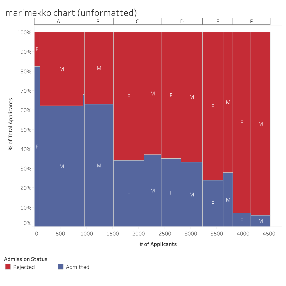
Marimekko charts in Tableau do require some effort. We need to think about what values each mark needs to be plotted in the right place with the right size and colour. With that in mind, let’s start by looking at the data. The data for the six departments is taken from the R UCB Admissions sample data set:

This is a tall data set with three dimensions – Department, Gender and Admission Status – so we’ll need to use some more advanced calculations to deal with the fine grain of the data. Here are the steps to build the above Marimekko chart:
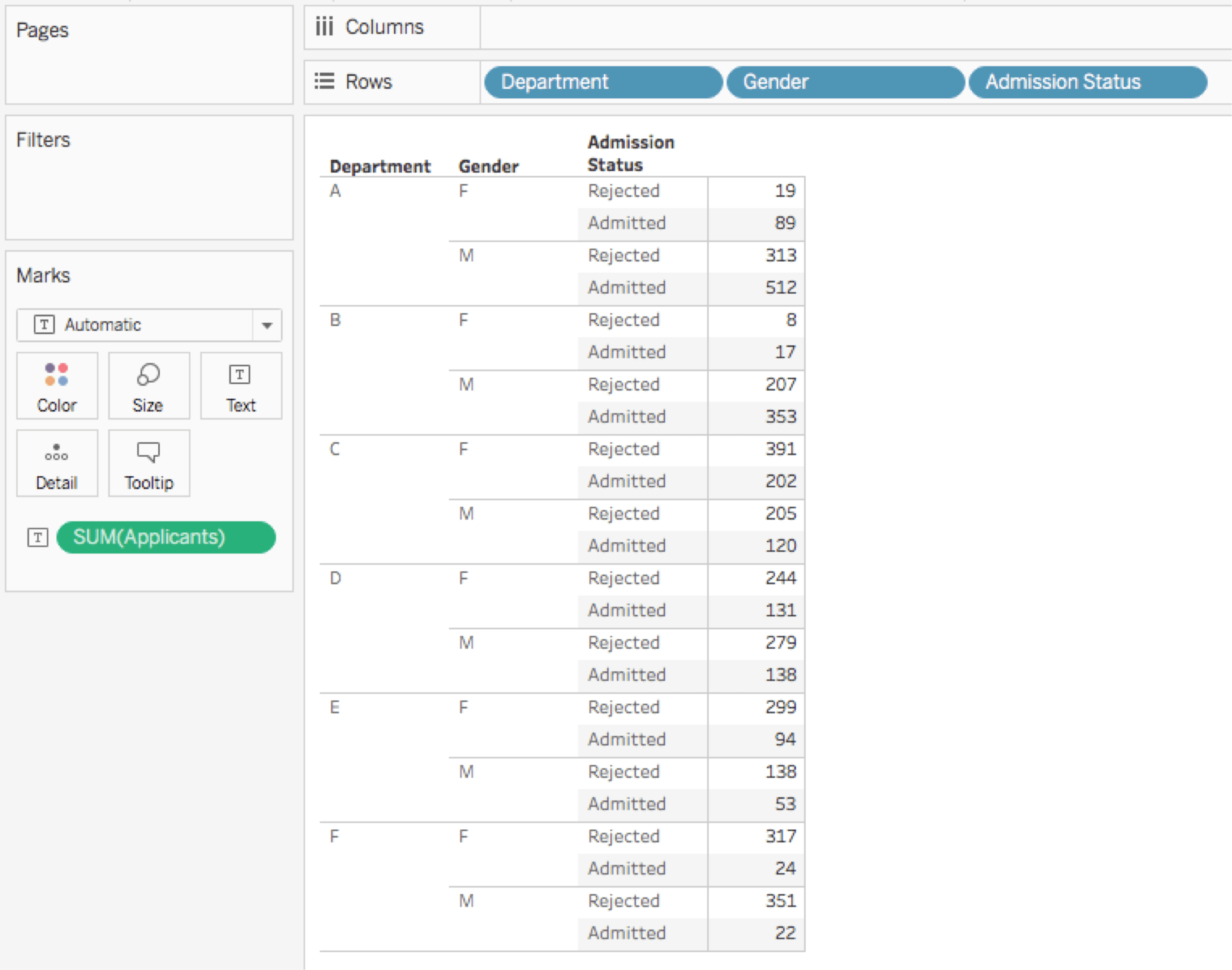
1. Start with a cross-tab to help validate values. Place the x-axis dimension(s) that will drive the level of detail as discrete pills on rows. Then add to its right the discrete pill that will be used for the Colour shelf:
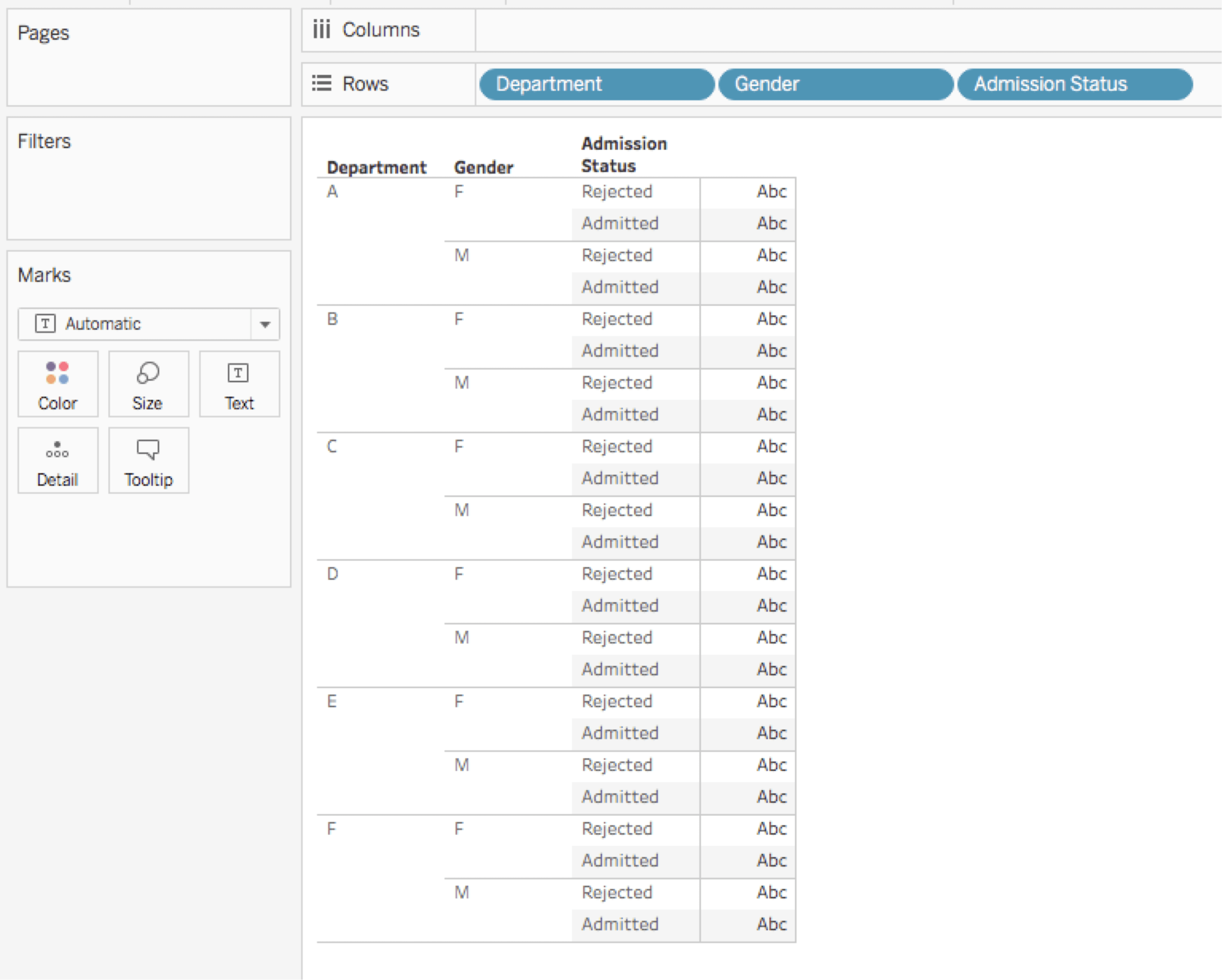
2. Add the initial measure of interest, in this case SUM(Applicants) to the Text shelf.
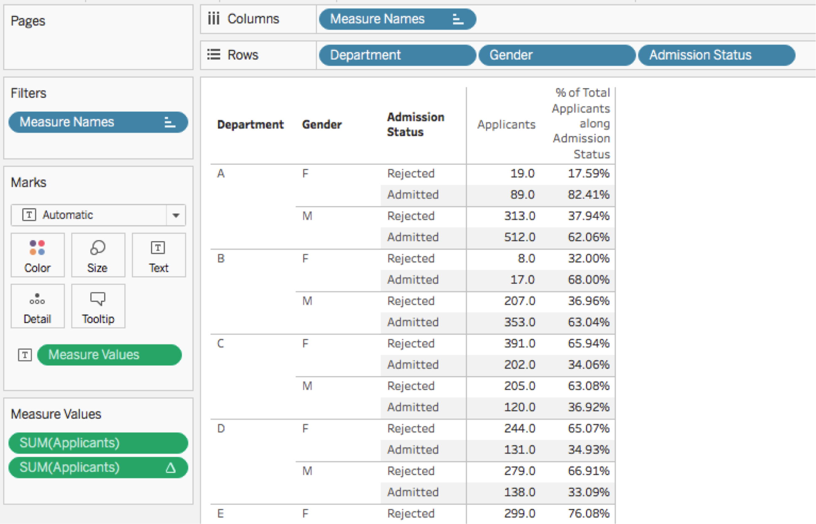
3. Create the y-axis measure using the percentage-of-total quick table calculation. In this case, we’re using the Applicants measure with a compute-using option on Admission Status.
4. Double-click on Measure values in the Measures window. Tableau will create a Measure names/values cross-tab and show the Measure values card.
5. Drag the initial measure of interest (Applicants in this case) from the Measures window to the Measure values card.
6. Now we’ll generate the size (width) of each Marimekko column. In this case, we’ll use make a calculated field using a level of detail (LOD) expression, because it saves us from the complications of table calculations.
The formula for the Applicants per Column measure is {EXCLUDE [Admission Status]: SUM([Applicants])}. This way, it will sum up all the applicants for each combination of department and gender, and the result will be the column width that we need. Drag this to the Measure values card.

7. Now we need to create the x-axis position of each column. To do so, we need to answer two questions. First, are we going to have this measure determine the left or right edge of the column? In this case, we’ll use the right edge because it’s easier to calculate.
Second, how do we get the same value for each mark (created by the Admission Status dimension) in each column (created by the Department and Gender dimensions)? Now, it would seem that all we need to do is generate a running total of the applicants per column measure.
However, for Tableau’s running-total quick table calculation, there’s no compute-using setting that will work reliably no matter the data structure (particularly when it comes to sparse data). So we have to build our own.
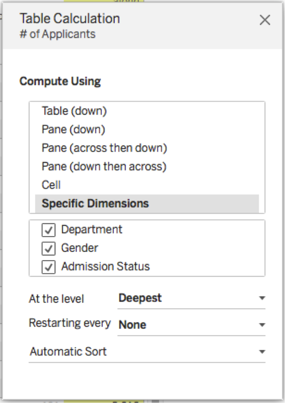
There are a few ways we could do this. I think the following calculation is the easiest to use since it gets the desired results in a single calculation. Here’s the number-of-applicants formula. The calculation has a compute-using on specific dimensions: Department, Gender, and Admission Status (in that order):
IF FIRST()==0 THEN
MIN([Applicants per Column])
ELSEIF MIN([Department]) != LOOKUP(MIN([Department]),-1) THEN
PREVIOUS_VALUE(0) + MIN([Applicants per Column])
ELSEIF MIN([Gender]) != LOOKUP(MIN([Gender]),-1) THEN
PREVIOUS_VALUE(0) + MIN([Applicants per Column])
ELSE
PREVIOUS_VALUE(0)
END
Here’s how it looks in the workout view:
This formula of the # of Applicants field is a bit complicated. Here’s how it works:
a. If it’s the first address (aka row in the partition) then return the Applicants per Column.
b. If there’s a change in the Department or Gender from the prior address (i.e. we’re in a new column), then return the sum of the prior value of this measure (from the prior address) plus the current Applicants per Column. This increments the running sum for each new Department or Gender.
c. If there’s no change in the Department or Gender, then return the prior value of this measure (from the prior address). This carries forward the running sum across the Admission Status without incrementing the running sum so all Admission Statuses in the same column will have the same value.
Note that when adding the pill to the view and setting up the addressing on specific dimensions, Tableau 10 automatically picks up the order of the dimensions on Rows that we defined in step 2:
This is a new default behaviour in Tableau 10. In prior versions, the order in the equivalent dialogue was alphabetical, and sometimes that led to incorrect addressing. Thanks, Tableau!
Now, with this validated visually, we can build the Marimekko chart view.
8. Duplicate the workout worksheet.
9. Change Measure values from Text to the Level of detail shelf. The values in the view will be replaced by ABCs.
10. Remove Measure names from Columns. Tableau will now draw overprinted ABCs.
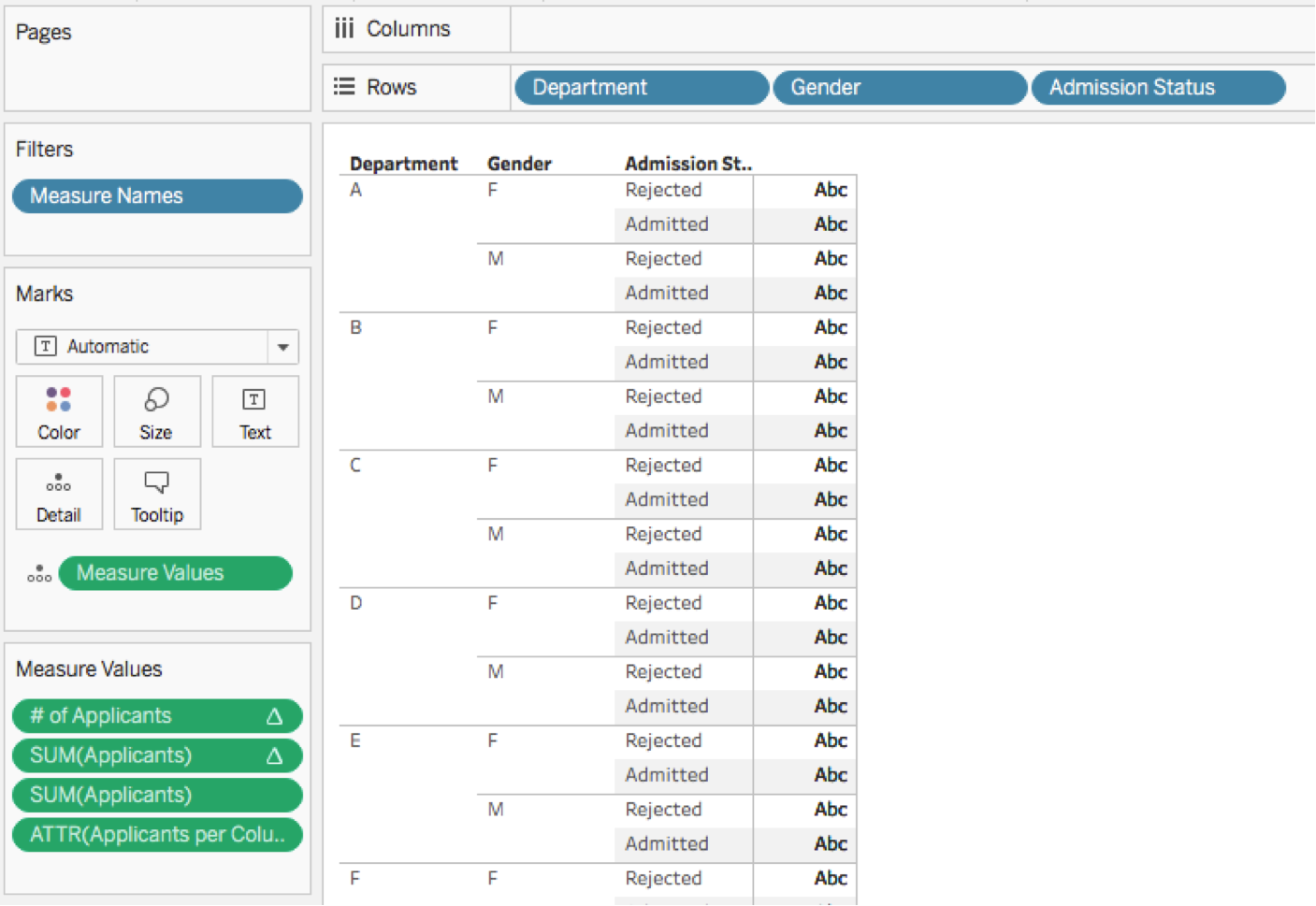
11. Move Department, Gender, and Admission Status to the Level of detail shelf (in that order). Tableau will change the view to show a set of square marks.
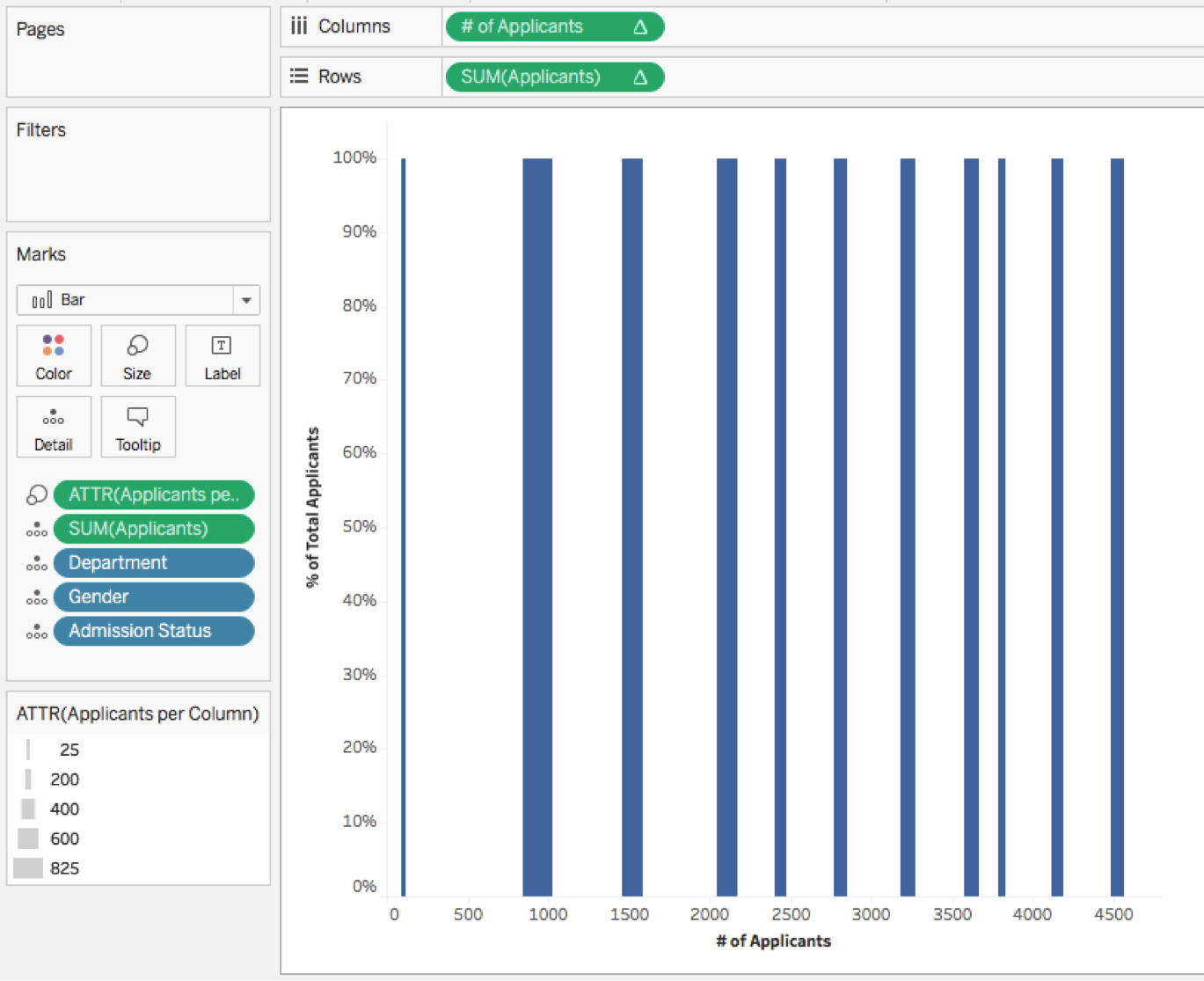
12. Move the SUM(Applicants) percentage-of-total quick table calculation pill from Measure values to Rows. The view will now have a single stacked bar.

13. Move the # of Applicants measure from Measure values to Columns. Tableau will create a scatter plot.
14. Change the Marks type to Bar. You will now have lots of bars:

15. Move the ATTR(Applicants per Column) measure from Measure Values to the Size shelf. Besides applying the size and creating a legend, Tableau will automatically remove Measure values and put the SUM(Applicants) measure on the level of detail.
16. Click on the Size shelf and change the setting to “fixed”, with alignment set to right.

This new fixed control in Tableau 10 is telling Tableau to use the values from the pill on the Size shelf to set the width of each bar segment. The alignment set to right is telling Tableau each each bar segment will extend from the right edge of the segment, where the segments are positioned based on continuous pill (the # of applicants table calculation in this case) on Columns.
You should now see an uncoloured Marimekko plot:

If your Marimekko doesn’t have all the bars stacked vertically and horizontally at this point, then refer to these troubleshooting tips before proceeding.
17. Set Admission Status to be on the Colour shelf.
18. Set Gender to Label.

19. Edit the tooltips and turn off “include command buttons”. (For this kind of view, we don’t want users accidentally filtering data and breaking the chart.)
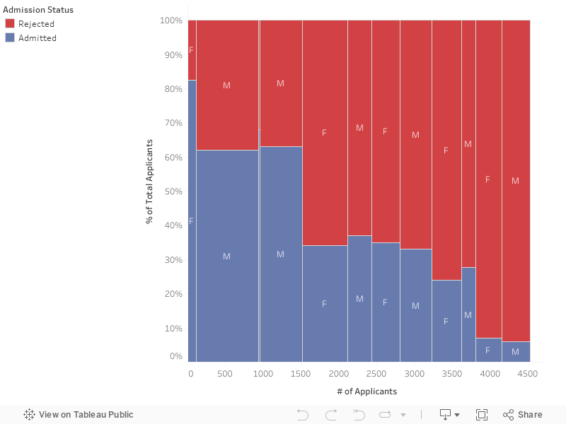
Adding headers to your Marimekko chart
Since the horizontal axis of the Marimekko is drawn with a continuous pill (the # of applicants) there aren’t headers to break out the different departments. Therefore, we need to add a header to make it easier to read. We can do this manually using two worksheets on a dashboard with highlight actions or with some automation using an additional calculation and a dual axis.
I’ll demonstrate the manual approach here because I think it yields better interactivity. This method uses a stacked-bar chart to get the effect of a header with the marks in the bar formatted to look like headers and highlight actions.
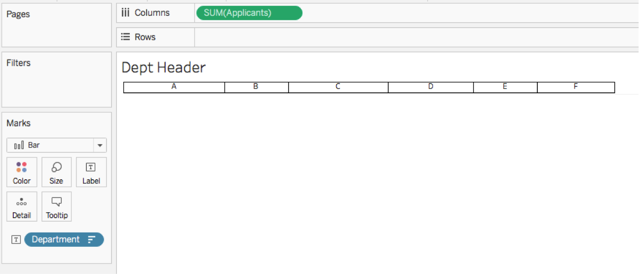
1. Create a new worksheet.
2. Drag the starting measure (Applicants here) to Columns. Tableau will create a horizontal bar chart.
3. Drag the header dimension (Department here) to Label. Tableau will create a stacked bar chart with the header as a label.
4. Make sure that the header dimension has the opposite sort as in your Marimekko chart.
5. Edit the tooltips and turn off “include command buttons”.
6. Set the formatting to look like a header. Here’s a simple example:
7. Create a new dashboard with a fixed size.
8. Place the Marimekko worksheet on the dashboard as a tiled or floating object, whichever you prefer.
9. Resize the Marimekko title (such as by adding some new lines) so there’s some room between the title and the sheet.
10. Add the header worksheet as a floating sheet to the dashboard and change it to “fit width” and turn off the title.
11. Now for the fiddly bit: You’ll need to size and align the header sheet so it’s properly placed over the columns of the Marimekko chart:
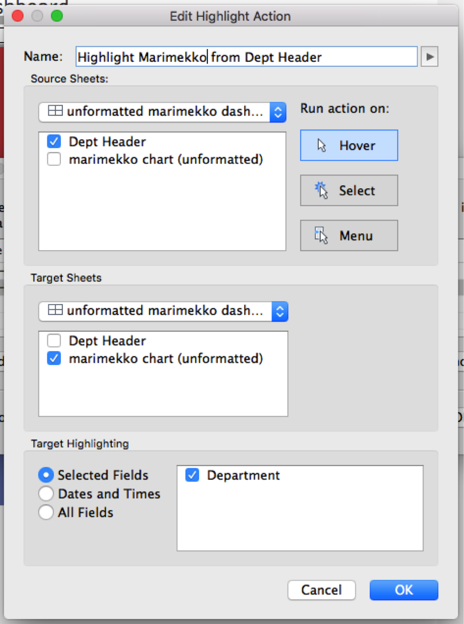
12. Add a highlight action on hover with the origin of the header sheet and target of the Marimekko sheet using the header dimension (Department here).
13. Add a highlight action on hover with the origin of the Marimekko sheet and target of the header sheet using the header dimension (Department here).
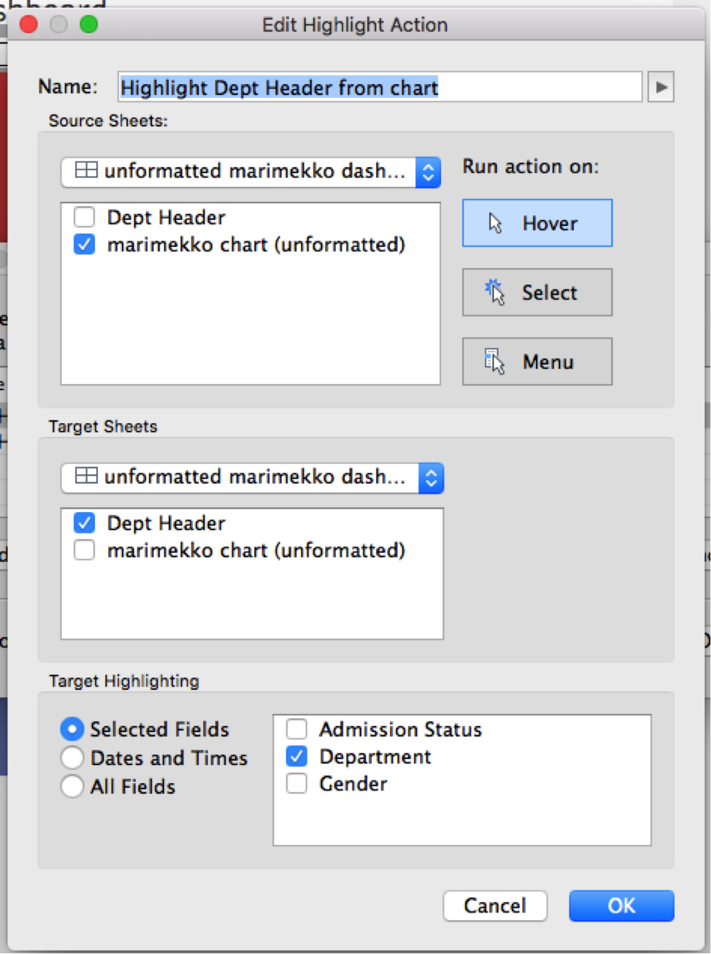
Note that we need two separate highlight actions here to prevent Tableau from highlighting all four marks in a Department every time we hover over any bar.
Here’s the dashboard:
Related stories

Visualizing Women's Impact to History Through Data Visualization
 18 March, 2024

Behind the Viz: Adrian Zinovei Helps You Design Your Next Dashboard
1 March, 2024

Charting the Heart: Data Visualizations on Love
 14 February, 2024
Subscribe to our blog
Get the latest Tableau updates in your inbox.