Tableau 8.1: Sophisticated Analytics for Sophisticated People


This is the first in a series of blog posts on the Tableau 8.1 release.
With every release we try to provide features that help people answer more questions. Tableau 8.1 is now in beta with a host of new analytical capabilities, from boxplots to one-click percentiles and ranking.
Boxplots
Let’s look at boxplots first, also called box-and-whiskers plots. Boxplots are a common statistical tool that depict the distribution of a set of data. There is a line at the median of the data, a box above and below the median for the nearest quartiles, and a set of “whiskers” that can extend to the entire data range or the nearest data points within 1.5 times the interquartile range (IQR, or distance between the upper and lower quartiles.)
In the box plot above, we are looking at one week of home sales in five cities. You can see that the median and upper quartile prices are higher in San Francisco than in Los Angeles, but the highest price home is in L.A.
Boxplots are a new view type in Show Me. You can change the range of the whiskers and apply several formatting options. People have been doing boxplots in Tableau for years, but it’s been an advanced view to create. With Tableau 8.1 this useful statistical method is now available in one click.
Two other powerful operations have also gotten much simpler: percentiles and ranking.
Percentiles
Percentiles show you how much of a group falls within a certain measurement. For example, The World Health Organization provides growth charts for length, weight, BMI and head circumference.
Percentiles are now a 1-click operation with Quick Table Calcs in Tableau 8.1, as well as a new option for aggregation. Here's another look at home sales. The 5th percentile and 95th percentile are shown, along with the median (technically the 50th percentile) of home prices per square foot.
Ranking
Ranking got easier as well in Tableau 8.1. It's now a table calc as well, with the option to change from competition to dense ranking. This time we're looking at sales over several years in three San Francisco neighborhoods. The most expensive homes are ranked independently in each neighborhood. In Cow Hollow, the 9th most expensive home was tied with another-- so both get the rank of 9 and the next home is ranked #11, according to the competition ranking system.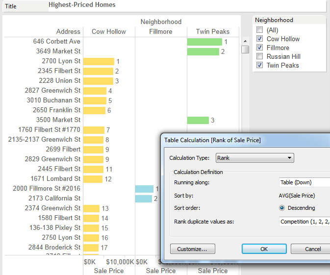
There's more
There are several more analytical features coming with Tableau 8.1, including integration with R.
Learn how Tableau tackles other Advanced Analytics tasks.
Related stories

How Team USA uses data to build a digital HQ
 8 February, 2022
Data trends that will impact you in 2022

Healthcare Analytics Hub Starter Kit: Get the data you need faster
 18 October, 2019
The purpose of the Healthcare Analytics Hub Starter Kit is to provide a sample of what your healthcare app could look like. It’s not a complete solution; instead, it’s focused on what’s possible. Please contact your Tableau Account Manager to get started today!
Subscribe to our blog
Get the latest Tableau updates in your inbox.