Behind the Viz: Why Sue Grist thinks vizzing is better together


Get to know your fellow Tableau Public authors with Behind the Viz, a blog series where we explore the people and processes behind our featured vizzes.
Meet Sue Grist! Sue is a Tableau Developer at Accenture Federal Services (AFS) and is co-lead of the DC Defense and National Security Tableau User Group. She’s been using Tableau for about 10 years. Sue started using Tableau Public to see what others were creating with Tableau, then began publishing her own vizzes in 2017. Thanks to the Tableau community, she’s learned more in a few years than she’d learned in her seven years of client work. Sue is originally from Maine and loves finding data sets related to her home state. You can find her on LinkedIn or follow her on Twitter.
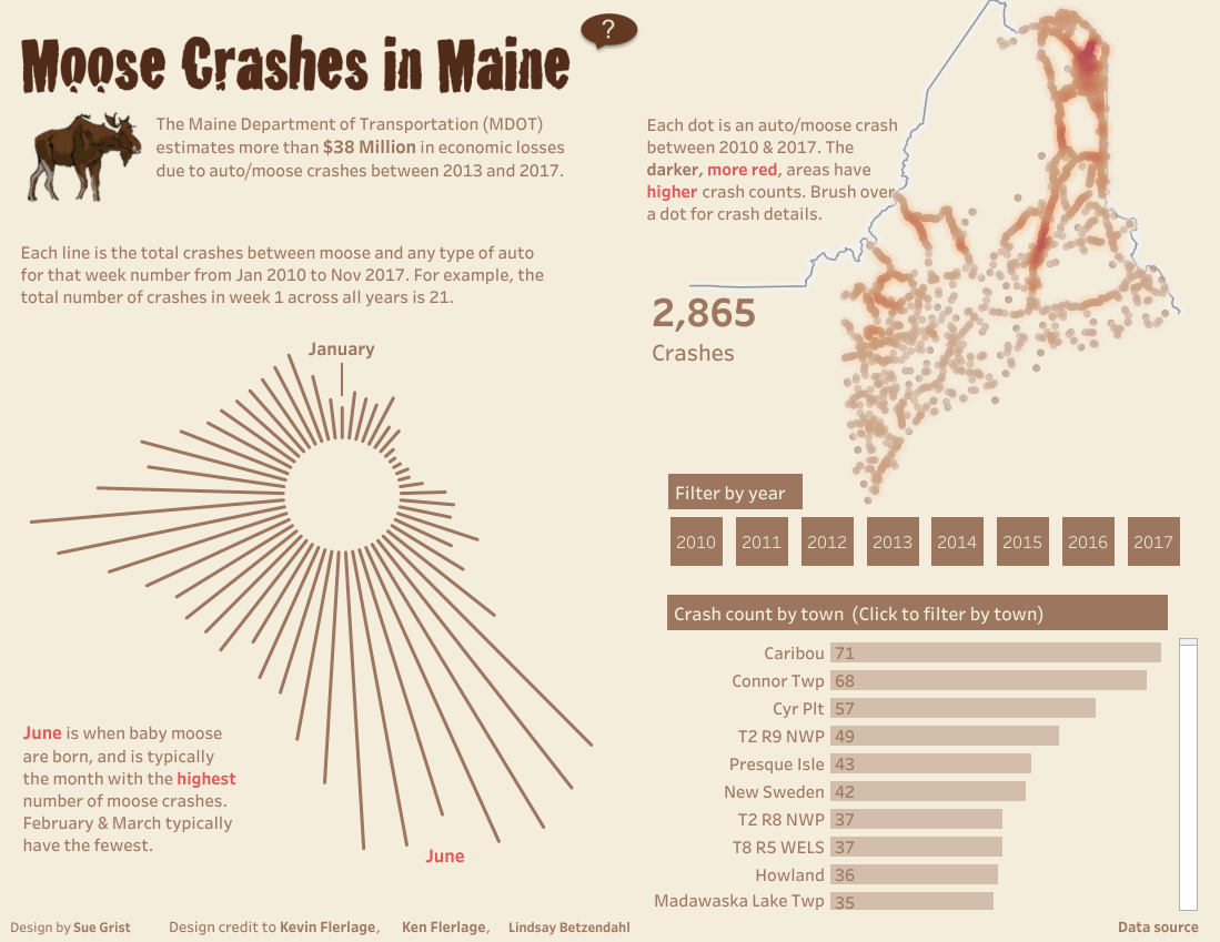
Sue’s Tableau Public profile is filled with fantastic data stories. She vizzes on topics ranging from solar eclipses to flight delays, and she is constantly pushing herself to try out new chart types and techniques. Her latest challenge? To build and publish a radial chart. The resulting viz transforms data about auto crashes into insights about moose breeding patterns.
With multiple chart types and succinct storytelling, Sue’s viz was an easy choice for Viz of the Day. Her viz even attracted attention from the source of her data, the Maine Department of Transportation!
Check out this interesting & interactive graph showing #moose collision statistics in Maine! Click the link for more information.
Credit: @sue_grist https://t.co/PrbyLT4JmH pic.twitter.com/pco5wK3VZv— MaineDOT (@MaineDOT1) February 27, 2019
How did she do it? Sue complemented her own data savvy with resources and feedback from around the Tableau community. We talked to Sue to learn more about her process and why, in her words, “This viz is without question not really my viz, but my entire #datafam’s viz.” Read on to learn how the Tableau community came together to support Sue’s moose-tacular work!
Let's take a look Behind The Viz!
How long have you been using Tableau Public?
How long have you been using Tableau Public?
I joined Tableau Public over five years ago to seek inspiration and learn how others were using Tableau. I started publishing to Tableau Public two years ago when I started participating in #MakeoverMonday. Tableau Public has been at the heart of my growth, showing me possibilities I had never dreamed of! Tableau Public also led me to authors who could teach me new tricks and techniques.
Why did you choose this topic?
I chose the topic of moose crashes in Maine because the strong seasonality shown in the data was perfect for my first try at building a radial chart— plus, who doesn’t want to know more about moose!
What was the hardest decision you made when creating this viz?
One decision I struggled with on this viz was whether to show all of the towns in the bar chart in the lower right corner or only the towns with the highest number of crashes. Typically I’d only show the data with the highest counts, but I decided to show all of the towns so the people in those towns can still see the counts in their area.
What is your favorite new Tableau trick? How can others use it?
My favorite “trick” is to seek feedback from the Tableau community! When I worked on this viz, I received overwhelming support from each and every one of the Tableau community superstars I reached out to on Twitter. Each provided advice and techniques that helped improve my viz.
- Mike Cisneros suggested I overlay a base density map and a transparent layer on top of it that includes each individual dot so each dot can be interacted with, while still showing the larger pattern via the density map. That was great advice and I’ll definitely continue to use that approach in spatial visuals and I encourage others to use this technique too.
- Sarah Bartlett challenged me to provide some context for the data. As a result, I added the text about moose crashes causing Maine more than $38 million in economic losses.
- Ken Flerlage is simply brilliant, especially with radial charts! He also helped me with the calculations to place the January data at the top center of the chart.
- Kevin Flerlage recommended I find a more interesting font for the title, and I found great pointers in one of his blogs to accomplish that. He also has great resources for building radial charts.
- Brittany Fong suggested I expand the radial chart tooltips to identify the month, and increase the font size of the BAN for total crashes.
- Lindsay Betzendahl challenged me on the overall layout and color choices I originally had, and the current layout is a great improvement due to her feedback.
Follow these authors on Tableau Public! And if you’re inspired by a viz they’ve posted and want to learn more, reach out! Almost all Tableau Public authors (myself included!) will have a link to their Twitter, LinkedIn, or Facebook— send a message and get connected!
What is the best music to listen to while vizzing?
I love vizzing to contemporary Christian music— all of its joy and passion is inspiring!
Are you following Sue’s Tableau Public profile yet? Her vizzes will surely spark new visualization ideas— and who knows, maybe Sue could be your next collaborator!
Zugehörige Storys

Meet Iron Viz 2024 Finalist Jessica Moon
 15 April, 2024

Meet Iron Viz 2024 Finalist Pata Gogová
8 April, 2024

Student to BI Analyst, How Tableau Can Lead to a Successful Data Career
 20 März, 2024
Blog abonnieren
Rufen Sie die neuesten Tableau-Updates in Ihrem Posteingang ab.