It's Action Month!


"It's not just what it looks like and feels like. Design is how it works.”
- Steve Jobs
At Tableau we take design very seriously, both in the narrow sense of the word – we sure like pretty vizzes – and in the larger sense of the word – how the end result works. We think about it all the time. And we like to write about it. This month we share our thoughts about how dashboard actions can help make a viz “work”, and look forward to hearing your views too.
When designing data visualizations for the web, as opposed to for print, there is an added benefit that one can make them interactive for the user. However, as always, with more opportunities comes more responsibilities: we have to make sure that the overall experience works for the end user. Adding simple interactivity is straightforward in Tableau. In fact, tool tips that allow users to find out more about individual data points when hovering over them are usually activated by default in Tableau charts. Tableau maps come with a lot of interactive features built in that allow people to pan, zoom, and search. And with just two clicks, one can add a quick filter to a chart that will give the end user the ability to select different sub-categories of the data.
But then there are dashboard actions. These open up a whole new dimension to interactivity, because they allow you to link up individual elements on a dashboard, so that a click or a hover over in one chart, causes the view of another chart to change. Dashboard actions are very powerful, but they can also be slightly more complicated to set up. If you are new to Tableau, we hope that this blog series will help you get excited about dashboard actions and their functionality. If you have already been using them in your vizzes, no worries, we will also try to get into both more sophisticated use cases as well.
There are three different types of dashboard actions in Tableau: (i) filter actions, (ii) highlight actions, and (iii) URL actions. This month we will look at each of these detail; today, let’s step back and look at the bigger picture first.
Why interaction?
"Design needs to be plugged into human behaviour. Design dissolves in behaviour."
- Naoto Fukasawa
Good data visualization is, arguably, the art of making comparisons possible. Is this year’s GDP higher than last year’s? Is my country doing better or worse than our neighbors in the Eurovision contest? Is Jessica a more popular baby name than Jennifer? It is also about enabling further questions, inspiring the reader to be curious and ask, why does this difference show up in the data?
A good static data visualization can achieve this without any interactivity. But interactivity can help. Why? The simple answer is: because we like to play with things. It draws our attention, it helps us better comprehend what we are looking at and makes us feel engaged. Do you recognize that itchy feeling when you stand in front of a piece of art and you are not allowed to touch it? If you are like me, you will probably move on to the next exhibit more quickly. Consider this brilliant viz by Mark Jackson about urbanization and migration in China:
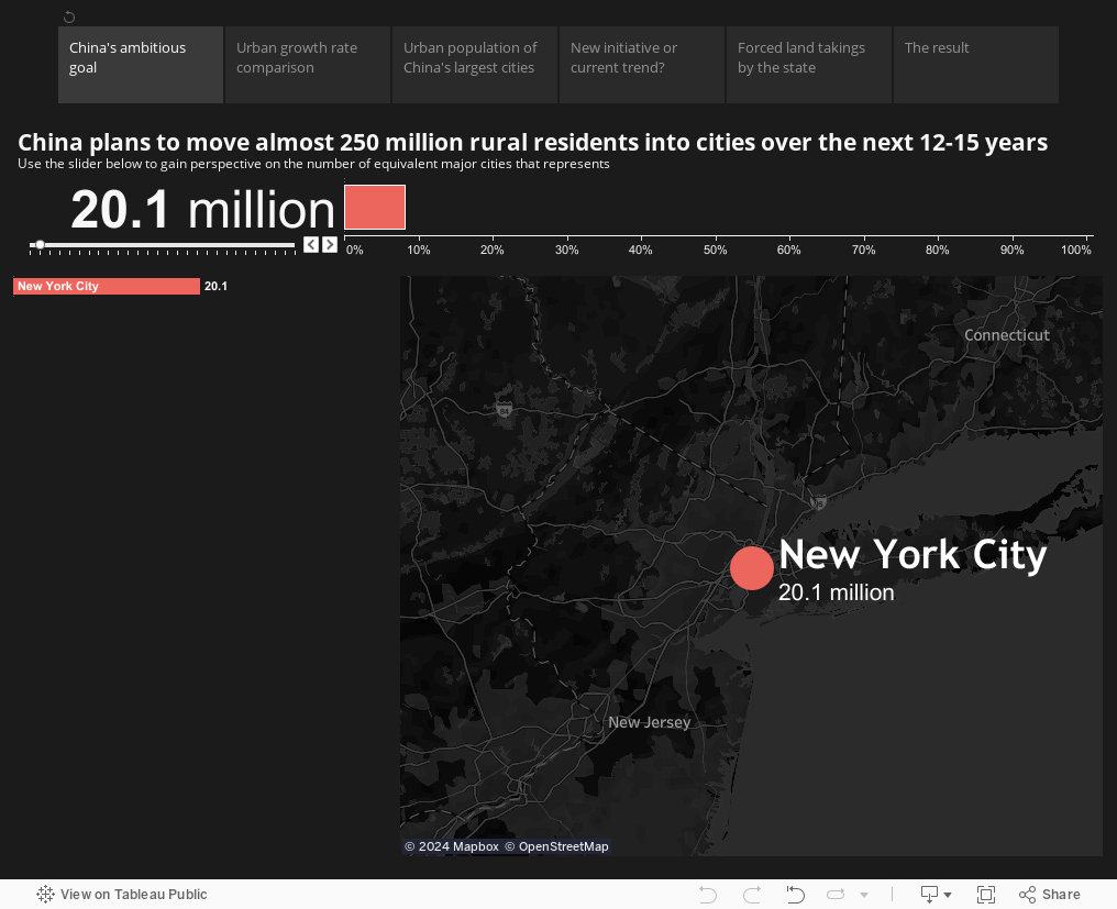
To make you understand how many rural Chinese will move into cities over the next 15 years, it not only shows you the number (250 million) or how many world cities that represents (the equivalent of 26 major cities), but it makes you build up the visualization yourself. By moving the slider to the right, you add one city at the time, until it really sinks in that the migration involves a very large number of people.
But there is more. Users tend to get really engaged when they feel that the story that you are trying to tell with your visualization is relevant to them. And it hugely helps our understanding when we can compare something new to something more familiar, which we can immediately relate to. If you are lucky then your visualization does that straight away – and a good data visualization is always built with the audience in mind. But you can never be sure you reach each and every individual’s expectations, especially when you are publishing your viz to a larger audience on the web. After all, different people relate differently to things. By letting the audience interact freely with a data visualization, people can intuitively gravitate towards data points that are most familiar or relevant to them. From there, they can then extrapolate comparisons, using their personalized reference points as benchmark.
Here is an example, where I went through this process myself recently. Before the Champions League final between Juventus and FC Barcelona there was a lot of talk about how it would be a clash of styles: defensive Catenaccio vs offensive Tiki-Taka, respectively. But was the Catenaccio label a sound assessment of Juventus’ playing style based on available data? Looking at the numbers - average possessions (as shown on the horizontal axis in the viz below) from this season’s UCL matches leading up to the final – I learnt that Juve had possessions of 55% on average.
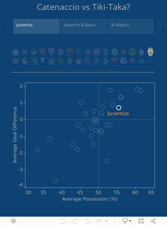
But what does this number mean? Initially I had no idea. To place it in context, I looked for some familiar reference points, drawing on my own prior knowledge of different teams’ tactical styles. First, obviously Barcelona, one of the most offensive teams out there. As was expected, Barcelona is way above average in terms of possessions, only surpassed by Bayern, who are now coached by ex-Barca coach Pep Guardiola, but Juve is not that far behind. Then I looked for a top team on the other extreme. I chose Atlético Madrid, which played very well as of lately (as can be inferred from the high goal difference on the vertical axis), even reaching the UCL final last year. Atlético is also known to be playing a very defensive type of football/soccer). Comparing Juventus to those two reference points that were more familiar to me, I reached the conclusion that with 55% possession, Juventus falls somewhere in the middle, even closer to Barcelona, in terms of possessions. So, no, the portrayal that all Italian teams play defensive football was media-perpetuated, but not very fair. (Note: I didn’t choose any of the teams in the bottom left as comparison points, because these were the weaker teams that dropped out very early in the tournament.)
Besides enabling comparisons, interactivity in general and dashboard actions in particular can also help the reader along when it comes to the next aim of a good data visualization: catalyzing follow-up questions. Whenever you see an interesting comparison in a chart, your brain might enquire “Ah, but why is that?”. It is a common misconception that empirical evidence should be able to answer all questions. More often than not, interesting questions will spur more interesting questions. But through the act of pursuing these questions we start to grasp a subject. And data visualizations can facilitate this process. Again, with good design one can achieve some of this in static visualizations. But user interactivity takes us further, because it encourages each user to pose unique questions that the author hasn’t even thought of.
When not to use interactions
"A designer knows he has achieved perfection not when there is nothing left to add, but when there is nothing left to take away."
- Antoine de Saint-Exupery
Sometimes we see people who are new to designing vizzes overload their visualizations with all sorts of interactive elements: tool tips, filters, highlights, etc. Truth is, we have all been there at one point when we started out with Tableau. Try to resist the temptation. Think about the purpose of each interactive element.
And if you think it has a purpose, make it easy for the user. Marissa Mayer puts it well, when she says that good user interface design should be like a Xerox machine. You can do a lot of things with it – scan, fax, staple, and all these features are hidden away in menus – but the core feature that lets you photocopy paper is easily accessible via a big green button. Give the reader more options to compare things, and to find relevant comparisons, but don’t overwhelm them. Give them a green button.
Secondly, avoid using interactive elements for the purpose of toggling between individual data points that are meaningful to compare. When one has to switch back and forth between two different views, it becomes difficult to compare the individual data points, because your brain has to retain some of the screen information in memory, while it is looking at another toggle view. Instead, always show all the relevant data points that are to be compared in one view. Use interactive elements only to allow the user to create new pairs of data points for comparisons.
Our call to action - Try it out!
"Design is content with intent. Content without intent is noise. Intent without content is decoration."
- Joe Sparano
We hope that despite the cautionary example at the end, you have been inspired by this philosophical treatise to try out dashboard actions in your vizzes. Stay tuned for the next couple of blog posts, which will help you along with concrete examples and step-by-step instructions. Blog posts by the Tableau Public team and by guest bloggers will cover the standard use cases of highlight, filter and URL actions, as well as some more creative examples.
Also, the guidelines presented here are just that – guidelines. Use them if you find them useful, ignore them if you feel they box you in. Indeed, you might find that some of the best examples that we will show you are real out-of-the box use cases of dashboard actions. Design is any content with intent. As long as it works for the user.
Zugehörige Storys

Meet Iron Viz 2024 Finalist Jessica Moon
 15 April, 2024

Meet Iron Viz 2024 Finalist Pata Gogová
8 April, 2024

Student to BI Analyst, How Tableau Can Lead to a Successful Data Career
 20 März, 2024
Blog abonnieren
Rufen Sie die neuesten Tableau-Updates in Ihrem Posteingang ab.