Best of Tableau Web: July 2022


Happy Dog Days of Summer, DataFam!
I recently learned that the phrase Dog Days of Summer has nothing to do with dogs, rather, it’s a reference to the celestial bodies above. In particular, it refers to Sirius, the dog star, and how it remains relatively stationary in the same region of the sky from July 7 to August 11. Who knew? Speaking of space …
If you are anything like me, you’ve been gazing at the James Webb Space Telescope (JWST) images with nothing but wonder! It’s amazing to compare those images to the Hubble telescope and see just how far the technology has come. Yet we wouldn’t have JWST without Hubble—it paved the way for deep space exploration, just as other telescopes and probes have done since we started to explore space.

It’s moments like these that cause me to reflect. Similar to the advancements in telescope technology, data visualizations 10 years ago were no where near the art they’ve become today. Vizzes advance as the industry learns more about accessibility and human cognition, and as improved data literacy pushes the world to be more data driven. Consider every day things like television and print media—more data visualizations are seeping into the mainstream. For example, analytics was front and center during the Winter Olympic Games. Broadcasters discussed and displayed analytics in sports like figure skating, speed skating, and bobsled. Go TEAM DATA!
The Tableau Community has accelerated how it continues to push the tool as well. In 2013 (and still today) Kelly Martin blew us away with her Bird Strikes Redoux. A mere four years later, Chantilly Jagggernauth dropped beautiful work like the Top 3 Restricted Dietary Requirements Around the Globe. And this year, work from Brian Moore like the 2022 NFL Player Movement Tracker pushed the medium further still.
The beautiful thing about all this advancement is that we stand on the shoulders of those early data viz giants. Each step forward is aided by those who blazed earlier trails. In moments of reflection like these, there’s gratitude.
So thank you to all who have contributed to the Tableau Community and the data community at large. Without your willingness to share, experiment, and push the acceptable “best practices” we would not be where we are today. And a special thank you to those who have had work featured in Best of the Tableau Web over the years.
With that, let’s keep forging ahead. Let’s see what the community is laying down with this month’s Best of the Tableau Web.
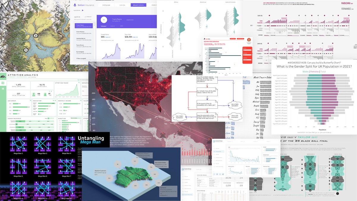
Calculations
- Using a parameter to filter for specific records in a Tableau dashboard or worksheet
Darragh Murray
- How to Concatenate Text Values in Tableau
Eric Parker, OneNumber
- ATTR - The Most Confusing Aggregation in Tableau
Andy Kriebel, VizWiz
- How to do Dynamic Date Selections in Tableau
Maddie Dierkes, Playfair Data
- Charting "Top N and Others" via Table Calculations in Tableau
Alexander Mou, Vizible Differencce
Formatting, Design, Storytelling
- How to Add Custom Shapes to Tableau
Andy Kriebel, VizWiz
- How to build and interpret an index chart using Tableau
Darragh Murray
- Build Better Sparklines in Tableau
Anthony Smoak, Smoak Signals
- “Prettify” Your Dashboard Background
Jimrey Benos, The Data School Australia
- Learn to build a Butterfly Chart in Tableau
Sean Miller, HipsterVizNinja
- All The Right Notes
CJ Mayes
- What are functional aesthetics?
Neil Richards, Questions in Dataviz
Inspiration
- What’s Good? Developing Skills Through Having Fun – Adam Green.
CJ Mayes and Adam Green
- Kicking It Up A Notch
Autumn Battani, Make it Make Sense
- UX x Dataviz: Mental Models
Nicole Lillian Mark, SELECT * FROM data;
- Chart Chat Live — Round 32
Steve Wexler, Data Revelations
- New Viz: Hello Newman: Seinfeld Recurring Characters
Kevin Flerlage, The Flerlage Twins
- How to Become a Data Analyst
Anthony Smoak, Smoak Signals
- The Women in Dataviz Discord Community
Nicole Lillian Mark, SELECT * FROM data;
Server
- What is view acceleration?
Mark Wu, Scaling Tableau to Enterprise
Set and Parameter Actions
- How to Drill into a Bar Chart Using Sets in Tableau
Ethan Lang, Playfair Data
Tips and Tricks
- Create stories with Data – The 5 Why’s
Thanh Ho, The Data School Australia
- Context Filters: What Are They?
Gerda Staurylaite, The Data School UK
- Dynamic Dates in a Heat Map
Donna Cole, Donna + DataViz
- Excel SUMIF and COUNTIF in Tableau
Eric Parker, OneNumber
- How to Remove the Blue Box for KPI's
Dawn Harrington, Tech Tips Girl
Visualizations
View last month’s Viz of the Day on Tableau Public gallery.
Zugehörige Storys

Meet Iron Viz 2024 Finalist Jessica Moon
 15 April, 2024
DataFam Roundup: April 8–12, 2024
 12 April, 2024

Meet Iron Viz 2024 Finalist Pata Gogová
8 April, 2024
Blog abonnieren
Rufen Sie die neuesten Tableau-Updates in Ihrem Posteingang ab.