Bringing the power of Explain Data to all Tableau users


Since its initial launch in 2019.3, Explain Data has offered analysts a jumping-off point for deeper data exploration. With a single click, Explain Data runs statistical models to find insights and relationships hidden within your data source—including analyzing data that's not in the current view—and surfaces possible explanations for the value of the selected mark.
Now, with the Tableau 2021.2 release, we are excited to deliver a reimagined Explain Data experience available to all licensed Tableau users. Analysts and authors with Creator or Explorer licenses can now enable Explain Data for all viewers of their published workbooks, allowing more people across the business to leverage AI-driven explanations in the place they already go for business insight: their dashboards.
Many of our customers have been eager to empower more of their users across the organization with augmented analytics capabilities like Explain Data. To help our customers expand Explain Data across their organizations, we knew we had to maintain enough power to serve data professionals, while introducing an approachable, easy-to-use experience for business users. I’m excited to take you through the details.
Customize the Explain Data experience to help users in their analysis
Let’s suppose I’m the head analyst for a bike rental company, responsible for creating the operational dashboards which the broader team uses to understand the relevant areas of their business. I have used Explain Data to successfully uncover insights in bike rental data, and now I would like to further empower other Tableau users with access to Explain Data.
I can explicitly enable Explain Data for my operational dashboard on a specific viz by going to the Explain Data settings dialog in the data source, from the Data menu.
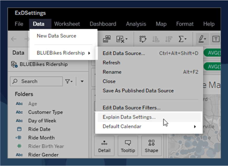
Here, I can customize aspects of the Explain Data experience and provide the necessary guardrails to promote positive and useful interactions for my users.
For example, as an experienced analyst, I know that certain fields in my data set should not be used as potential explanations. Perhaps they could introduce unwanted bias (like Rider Gender), or misleading explanations (like Rental Station Label). I can choose to have both of these fields excluded from the analysis so that my users don’t draw irrelevant or inaccurate conclusions from the data.
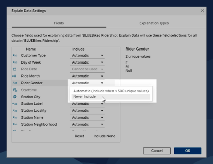
Additional settings allow more advanced users to select which explanation types to include.
Now anyone viewing the published dashboard can use Explain Data to surface explanations behind the value of specific data points and ultimately determine the drivers behind the business faster.
Empower anyone to explore the “why” behind their data
When users interact with Explain Data they will encounter a completely redesigned UI. This new Explain Data experience was carefully crafted to promote a fluid experience—approachable for all users and enriched to help guide and educate those less familiar with working with data.
Rather than displaying explanations in a dialog, Explain Data content now opens in a pane on the right side of the workspace. With this new design, Explain Data is a more integrated part of analysis, allowing people to easily explore their data and get AI-powered explanations to what might be driving unexpected mark values.
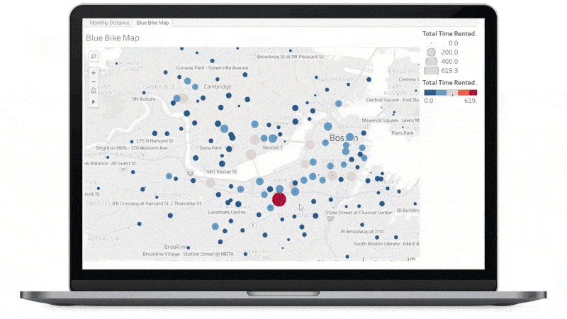
In this example, I noticed the suspiciously high Total Time Rented at the Prudential Center. When I right-click and then select the Explain Data lightbulb icon, Tableau runs advanced statistical models and confirms that Total Time Rented for this mark is in fact unusually high. Now I can drill into that and explore potential explanations in the new pane.
Explain Data draws my attention to the fact that this mark contains one extreme value. When I select this explanation and expand it, I get a guided and interactive experience that’s easy to follow.
The generated text explains that one record is responsible for increasing the sum of the Total Time Rented beyond what’s expected for this mark.
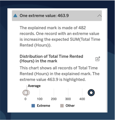
The next section shows me an interactive chart along with a generated caption. I can see the distribution of individual records with the extreme value highlighted in the chart. I can tell that a single bike ride of 463.9 hours is likely to be an error in the data.
Each of these sections can be expanded, offering the option for deeper analysis and explanations.
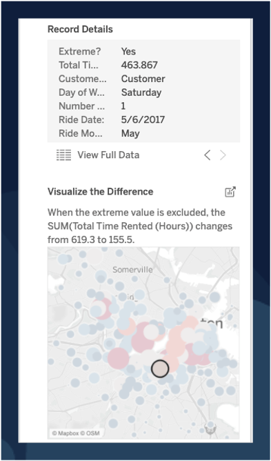
“Record Details” lets me quickly browse relevant record-level data.
Selecting “Visualize the Difference” shows me a chart where I can toggle between excluding or including the extreme value. Doing this allows me to see that without that extreme value, the hotspots are equally divided between stations at MIT, Harvard, Boston University, and downtown—which is more in line with what I would expect!
Explore the new Explain Data experience
With a few clicks, Explain Data guided me through an analysis that was both easy to follow and transparent! Thanks to the ability to configure this experience as an analyst, I have been able to empower all of my users to quickly discover additional hidden meaning in the data.
We’re excited for our customers to bring augmented analytics capabilities like Explain Data and Ask Data to more people in their organizations, enabling more powerful, confident analysis. We can’t wait to hear how these features help you uncover hidden insights and encourage more people to get answers from their data.
Try the new Explain Data experience for yourself—check out the interactive demo.
If you want to learn more, or you're ready to get started, see Explain Data in Tableau Help.
Zugehörige Storys
Who is Einstein Copilot for Tableau for?
 10 April, 2024

Securely Access and Analyze All of Your Data with Data Connect for Tableau Cloud
Tableau Prep Conductor Supports Custom Schedules
 15 März, 2024
Blog abonnieren
Rufen Sie die neuesten Tableau-Updates in Ihrem Posteingang ab.