State and local governments rely on Tableau for Covid-19 response


Unlike any other time in modern history, the Covid-19 health crisis is challenging governments to be a transparent and accurate source of critical public health information. In the US, state and local governments are looking to the power of data analytics to provide answers. We talked to Tableau’s David Kopniske, Senior Director, Solutions Engineering for state and local government and education in North America, to get a perspective on how data analytics plays a central role in helping agencies and other governmental organizations understand the crisis and make critical decisions in real time.
TABLEAU: Dave, let’s talk about the early days of the pandemic. What were you hearing from state and local governments? Did they have data systems, structures, and plans in place?
DAVE KOPNISKE: We have a lot of customers with great data strategies, and they're creating public-facing and transparent dashboards. They have well-structured environments to protect and provide security around sensitive data, while allowing the less sensitive data to be external-facing.
Overall, I think my high-level impression is that I don’t think state & local agencies were quite ready for the volume of website hits or information the public was going to want to view. That was a similar story across the country regardless of region or population.
So, I think most states had data strategy and some decent systems in place, but no one was prepared for something of this magnitude, with this volume of ongoing activity, to happen. I think that's probably the biggest challenge that everyone struggled with that early on.
TABLEAU: In preparation for the next crisis, what could they do better as far as their systems or infrastructure goes?
KOPNISKE: I think a lot of the states were not worried as much about things like consistent high availability. They weren't worried about what's called resiliency. They were just getting by with whatever was the most cost-effective solution for what they actually needed at that point in time.
They weren't worried about the extra things that really goes into highly sustainable and resilient environments.
I think this is really about planning ahead and finding that happy medium. Don't just size to the minimum of what you're running today, because the next big thing that hits, you're not going be ready for it. And we were scrambling. We were working nights, weekends, non-stop with all kinds of resources, our teams and theirs, to make that happen.
TABLEAU: What sort of things were the states more interested in? State-by-state numbers comparisons? What were they asking for?
DAVE KOPNISKE: I'm sure you've all heard about "the curve" by now, and they're all tracking the curve.
They also want to know, based on the spread, are we at the high point or the low point? Are we coming off the peak, or are we still building to the peak? They're really looking at the day-over-day trends, week-over-week trends primarily. They are worried if this is still getting worse, or are we are we getting better? And that would take a lot more of the trend analysis that they were really focused on.
At first, they weren't as worried about the neighboring states. So now that we have a little better handle on what's going on in our state, how are we looking compared to everybody else? That was really a secondary look.
TABLEAU: How do states rely on data? What were the things you were seeing that they were looking at as some of their parameters for when to reopen? How were they leveraging Tableau to also make those considerations?
DAVE KOPNISKE: There's a ton of work going into that. We've been working a lot with these states on putting out new dashboards that now show if they ready to reopen or not.
So, have we seen a 14-day decline in hospitalizations? Are we under 15 new hospitalizations each day? How many beds are we actually under our threshold? How many ICU beds are available? How many contact tracers have we hired, staffed up, trained, ready to do contact tracing? Are we prepared for that initiative? There's a series of different metrics that they go through, and then each county is basically responsible for telling the state, we meet these, or not. And then they could basically, then, consider, all right, these counties are ready to open versus not. Where are we at as far as a state? Do we think we're ready to fully open, or partially open? And so forth.
This dashboard shows all state & local government organizations that are leveraging Tableau for their public facing dashboards:
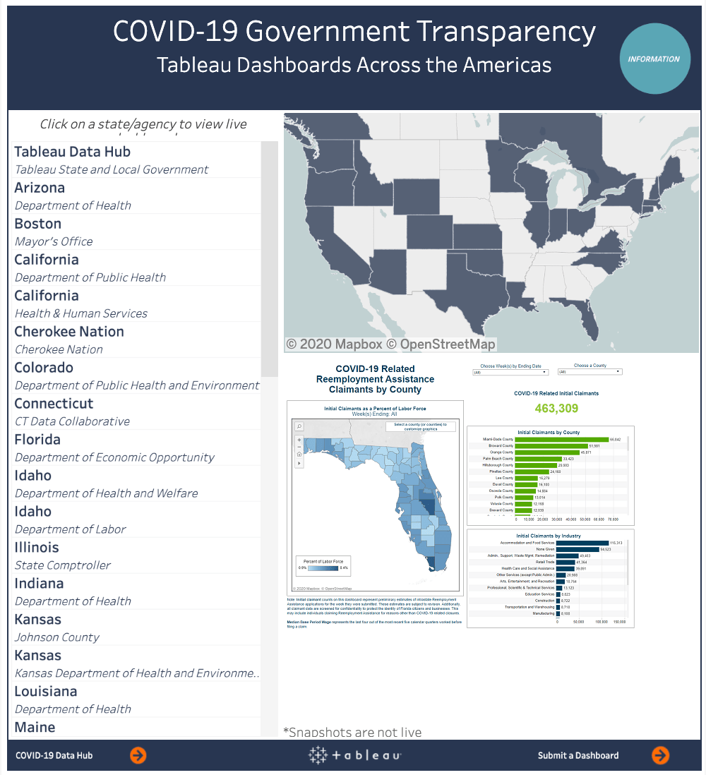
TABLEAU: The dashboards must make a tremendous difference. What sort of feedback are you getting?
DAVE KOPNISKE: We're seeing really amazing usage of the dashboards, and those states who are using them are certainly ahead in communicating both the impact and recovery in their states.
TABLEAU: When you're working with state and locals, do you create two different dashboards, one for internal use and one that’s public facing? How does that work?
DAVE KOPNISKE: It depends on what the state or local organization is trying to accomplish. Many public health departments have added case-level reporting dashboards to their sites to help inform the public of what’s going on. Those dashboards typically include daily as well as total numbers on case counts, hospitalizations and deaths. There are quite a few security and privacy considerations that these agencies need to consider when disclosing data to the public. There are certain levels of information that they want to keep private, for example information that can be tracked back to specific individuals especially when you’re disclosing information that can be broken out by age, gender and race demographics.
There's also probably a dashboard, in almost all these cases, that has more detail, for those who are actually managing the crisis more hands-on. That information will only be shared to the individuals who need access internally to make decisions about deploying resources.
TABLEAU: Is there anything else that you’d like to share about your work with public sector organizations during this crisis?
DAVE KOPNISKE: I think generally speaking, the importance that analytics brings is huge. Again, as we talked about, some of the most successful states were able to get their message out because they really made effective use of getting this data out there in a very consumable way that was very clear in its messaging.
And I think Tableau's solution really, really does that well with the speed at which we could deploy these solutions, first of all. We've stood up an entire server environment and built dashboards for some of these states in a couple days. I mean, it was definitely crisis mode, and we had all hands on deck, which is not something that's normally feasible on our side, or the customer's side.
But for this purpose, we deployed things so quickly, and our technology allowed us to do that so quickly, to get that message out so fast, and design things in such a way that the message was clear, the guidance was clear, the insights were clear. I think that was really where Tableau's technology was the most successful for our customers.
Read more about how public sector organizations are using analytics to answer their most important questions in our white paper, How Government Agencies Can Use Data to Manage Through a Crisis.
Zugehörige Storys

How Team USA uses data to build a digital HQ
 8 Februar, 2022
Wichtige Datentrends für Sie in 2022
 3 Februar, 2022

Healthcare Analytics Hub Starter Kit: Get the data you need faster
 18 Oktober, 2019
The purpose of the Healthcare Analytics Hub Starter Kit is to provide a sample of what your healthcare app could look like. It’s not a complete solution; instead, it’s focused on what’s possible. Please contact your Tableau Account Manager to get started today!
Blog abonnieren
Rufen Sie die neuesten Tableau-Updates in Ihrem Posteingang ab.