What I learned from recreating the Financial Times’ Visual Vocabulary in Tableau


Editor’s Note: Andy Kriebel is a member of the Tableau Zen Master Hall of Fame. He created vizwiz.com, which provides data viz best practices, methods to improve work, and Tableau tips and tricks. He also authors three (weekly) series: Makeover Monday, Tableau Tip Tuesday and Workout Wednesday.
As Head Coach at The Data School, I search for learning opportunities so I can pass knowledge onto trainees and encourage them to improve their data visualization skills. And at the end of the day, allowing others to learn from my learnings, maybe helping them discover the benefits of visual analytics faster so that they pass along their knowledge to someone else, means we’re paying it forward.
How should I visualize my data? This is a daily question for anyone working with data—and it extends across industries and use cases. It impacts students, teachers, and even journalists who present data alongside global news stories.
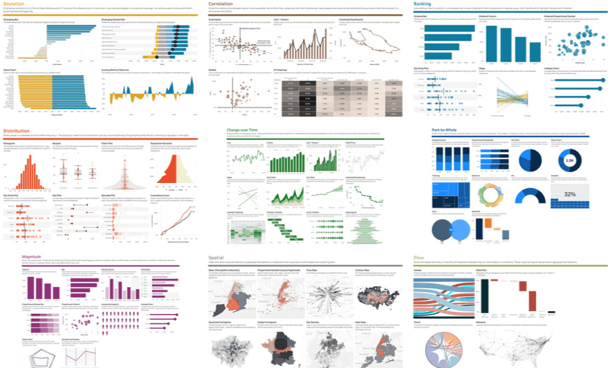
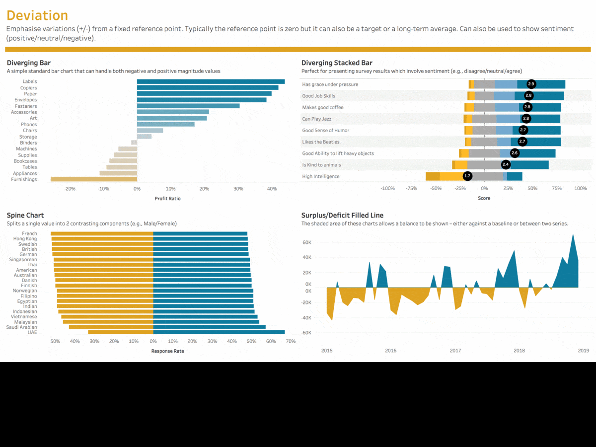
We're all in the never-ending search for resources that will help us pick the "best" chart for the situation. One of these resources is the Visual Vocabulary from the Financial Times’ Graphics team. The Visual Vocabulary was created “to assist designers and journalists to select the optimal symbology for data visualizations,” and used to train journalists in chart literacy—but it is universally applicable for anyone who regularly visualizes data. It outlines nine categories and more than 70 chart types along with descriptions on how and when to use the charts in practice. It organizes visualizations based on data relationships that will help tell your story best and provides a simple jump-off point for those with both basic and advanced analytics skills.
For more than a month, I used Tableau to recreate the guide so the Tableau Community could use these examples to learn and guide their work. Most of the charts in the Visual Vocabulary I built on my own or with tutorial help from Tableau community members. See a full list of all of the people who contributed to or helped inspire this project. Huge thanks to the The Information Lab who also offered their support and feedback during the process.
Explore the viz.
Charts I built before
I prefer simple charts like bars, lines, and scatter plots. But if I had to pick my favorites (based on look and feel), they would be:
- Circle timeline
- Contour map
- Equalized cartogram
- Parallel coordinates
- Population pyramid
Charts I built for the first time
One of greatest aspects of this project was learning to create charts that I had never created before. My favorite new charts are:
- Sankey
- Scaled cartogram
- Seismogram (so many use cases for this one!)
- Violin plot
To dig into the FT’s Visual Vocabulary, check out their Github page. And if you have more questions about my work, feel free to send me a DM on Twitter. For more information, check out my blog post.
Zugehörige Storys

Visualizing Women's Impact to History Through Data Visualization
 18 März, 2024

Behind the Viz: Adrian Zinovei Helps You Design Your Next Dashboard
1 März, 2024

Charting the Heart: Data Visualizations on Love
 14 Februar, 2024
Blog abonnieren
Rufen Sie die neuesten Tableau-Updates in Ihrem Posteingang ab.