How to add vertical lines to slope graphs with multiple measures


Note: The following is a guest post by Tableau Zen Master Matt Chambers.
Andy Kriebel recently posted a great tutorial on adding vertical lines to a slope graph using reference lines. This works great for slope graphs when you are comparing the same measure across dimensions, but what if you want to compare two measures across a dimension?
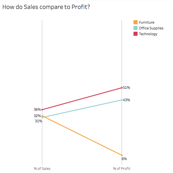
Using the Superstore data set, let's say we wanted to look at the percentage of Sales compared to the percentage of Profit across Categories. First let's build our slope chart.
1. Drag the Sales pill to Rows and Category to Color.
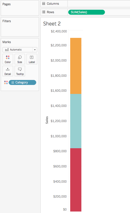
2. Drag the Profit pill to the left side of the stacked bar so that you see the side-by-side bars.
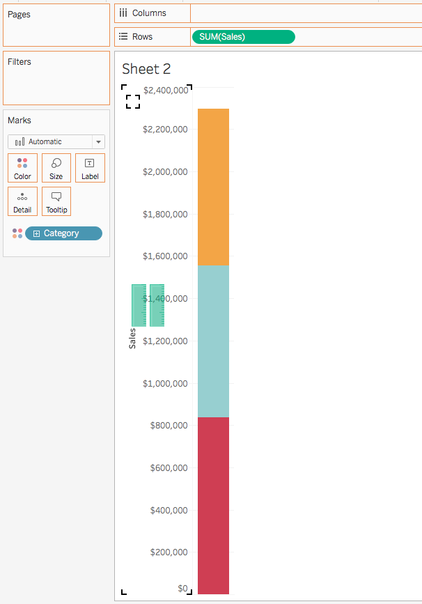
3. Change the mark type to line and create a percent-of-total table calculation on both measures.
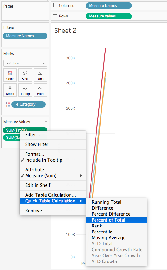
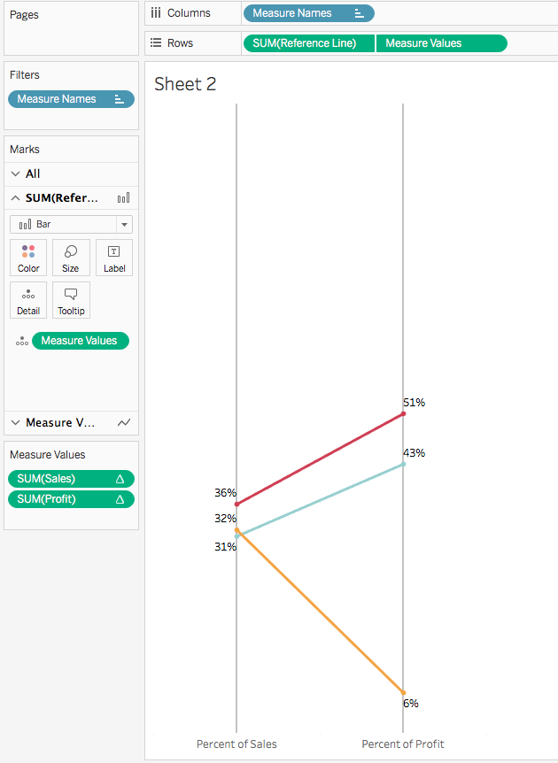
4. Drag Measure Values to the label, format the percentages, and order the Measure Value pills so that Sales is on top.
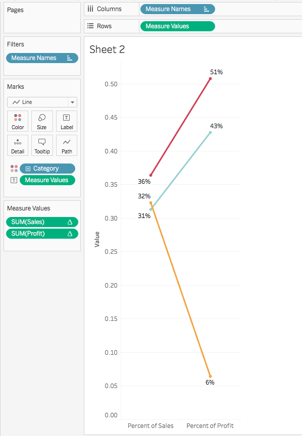
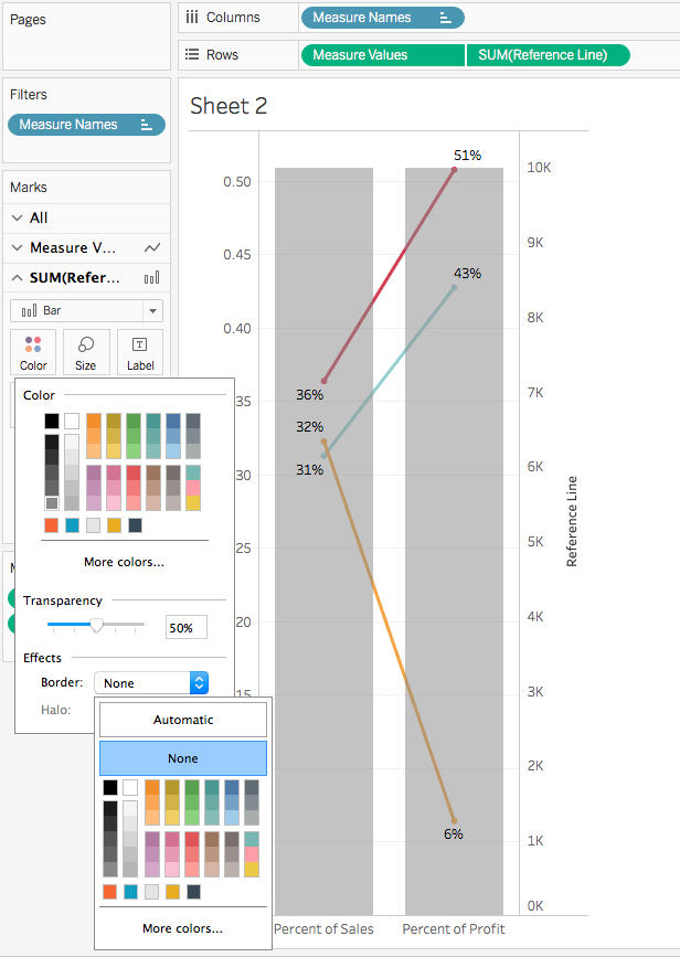
Now we can see how Percent of Sales relates to Percent of Profit by category. Now we want to be able to add those nice vertical lines to add structure and alignment to the visualization.
Since we are using different measures, we won't be able to use the calculations Andy used to create reference lines. However, we can create reference lines using bar charts.
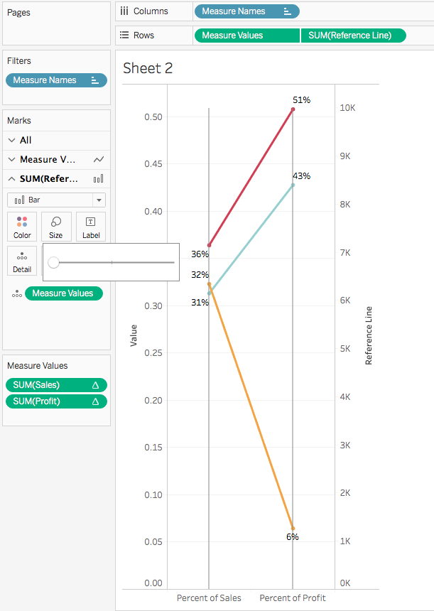
5. Create a calculated field with the value of 1.
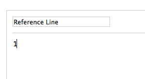
6. Drag the calculated field to the Rows. Move Measure Values to Detail and turn off the labels. Remove Category from Color.
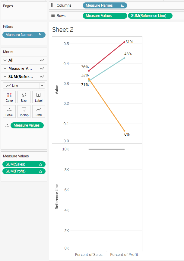
7. Create a dual axis.
8. Change the mark type to bar, reduce the transparency, change the color, and turn off borders.
9. Reduce the size of the bars.
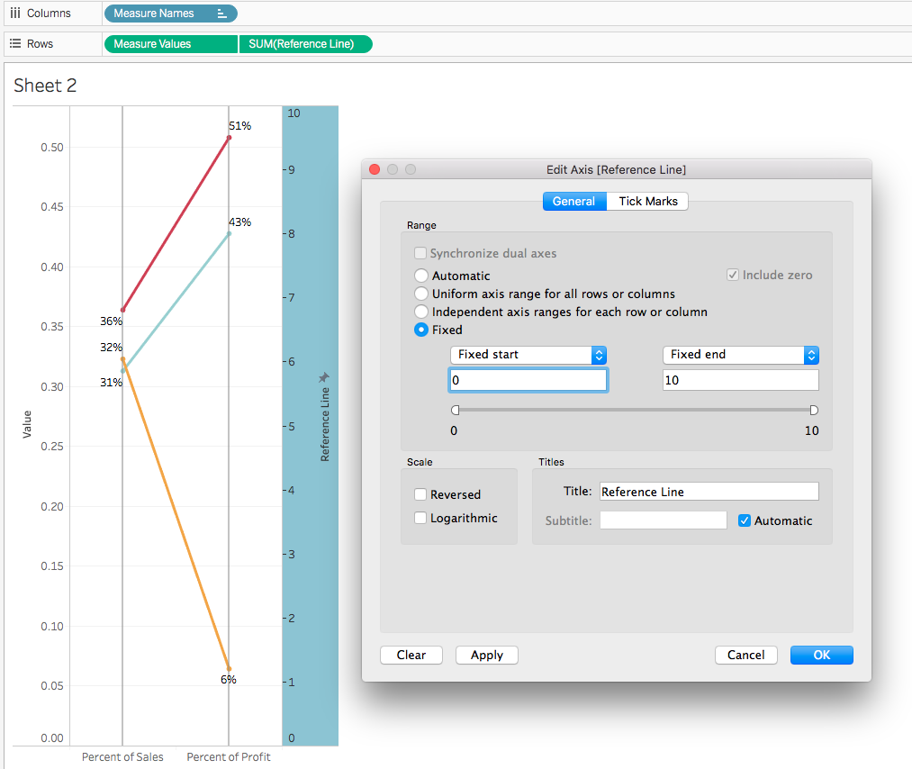
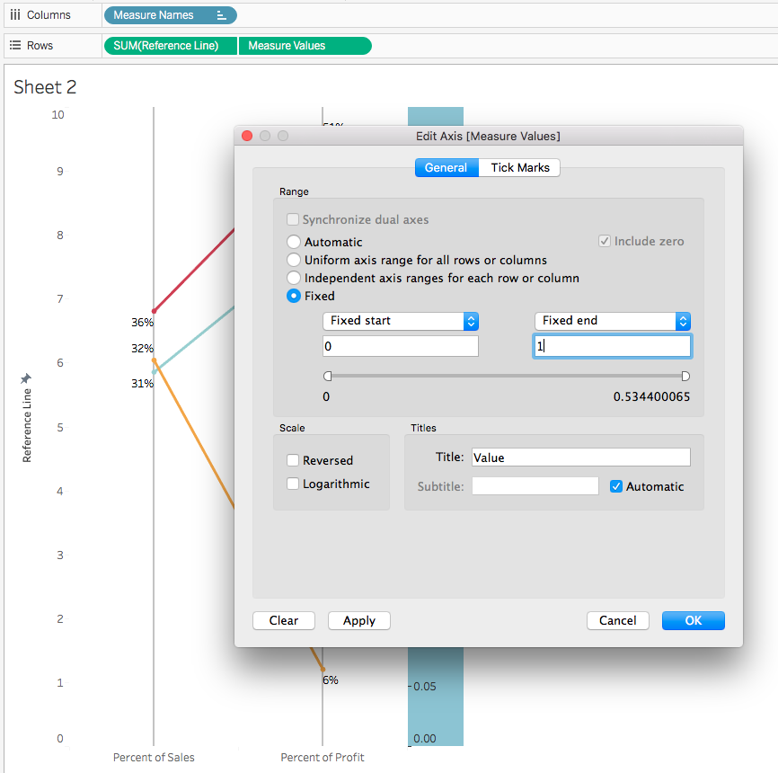
10. Edit the axis of the calculated field and set it to a fixed axis where the number is low enough for the vertical lines to extend to the top of the view. Also, edit the axis of the Measure Values so that it is fixed from 0 to 1.
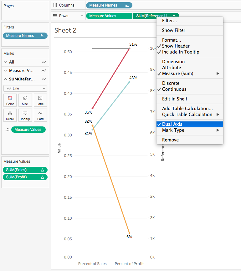
11. Switch the position of the pills on the Rows shelf so that the vertical lines move to the back. Hide the headers and clean up the chart.
That's it! Now you have a slope graph comparing two measures with vertical lines.
Feel free to download the workbook and comment with any questions.
For more tips, tricks, and ideas by Matt, check out his blog and his Tableau Public profile page. You can also connect with him on Twitter @sirvizalot.
Zugehörige Storys

Visualizing Women's Impact to History Through Data Visualization
 18 März, 2024

Behind the Viz: Adrian Zinovei Helps You Design Your Next Dashboard
1 März, 2024

Charting the Heart: Data Visualizations on Love
 14 Februar, 2024
Blog abonnieren
Rufen Sie die neuesten Tableau-Updates in Ihrem Posteingang ab.