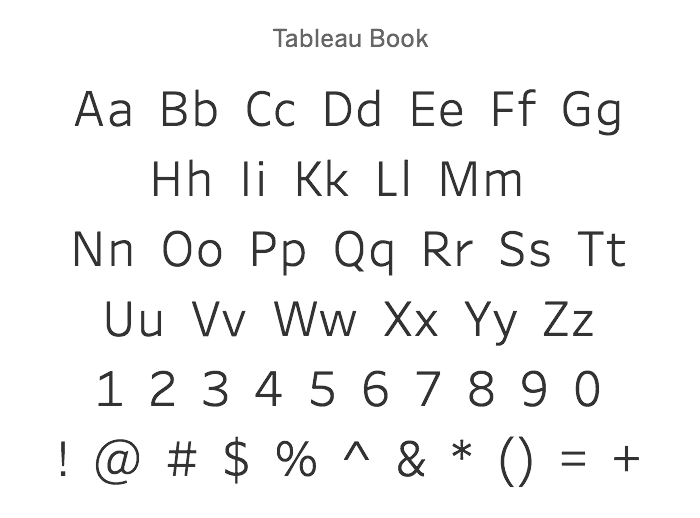
Tableau 10 includes a new typeface designed for data


Note: Cristy Miller, Tableau’s director of visual design, contributed to this piece.
Update: Tableau 10 is here! Download now to try out the feature outlined below.
When you think of data visualization, you might think of bars, lines, or shapes; they are the beating heart of interactive vizzes. Visual features like position, color, shape, and size create meaning we understand at a glance.
However, right alongside those classic, visual elements we find text—numbers, short labels, and runs of prose—to add context of quantity and story. This text is what takes our rapid, visual comprehension of data and connects it with meaning.
Last January, we decided it was time to move beyond the limited set of faces available to most users. While Helvetica is a beautiful, modern typeface, it was designed for large type and signage. In contrast, data visualization includes small type, set next to interactive visual elements, and often in strange, curvilinear places like meandering labels on a rural lane.
We knew it was time to give data visualization its own typeface. Without having to think about it, our users should create legible, meaningful text that informs and expands on the visual expression of their data.

Like with the new color palettes in Tableau 10, we wanted to go all-in to create the best typeface possible. This led us to partner with Tobias Frere-Jones, a world-class designer with over 700 typefaces to his name.
His work is part of the Museum of Modern Art’s permanent collection, spanning from the tiny type of Retina on the Wall Street Journal’s stock pages to his take on US highway signs in Interstate. We also adopted his Benton Sans fonts in the updated Tableau 10 user interface.
We asked Tobias to create a new classic. We wanted to mirror the elegance of typefaces like News Gothic and Frutiger while addressing the challenging digital landscape that spans from high-definition phone displays to conference room projectors.
We also had to look beyond the typical type environments, where text is set in static horizontal lines on an even background. With high densities, multiple layers of information, and subtle colors, a viz can overwhelm most conventional typefaces.
The outermost shape of each word has been made as strong as possible to stay coherent amidst strong visual activity. Letters like L, T, and Y are narrower than convention would suggest, to avoid introducing gaps that distract the eye and undermine continuity.
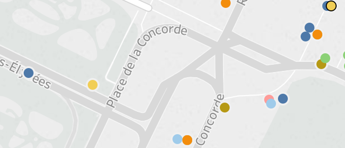
Of course, the horizontal spacing and kerning between pairs of letters has been carefully tuned. For example, a lowercase a will tuck itself gracefully under a capital T, and text gracefully arcs to follow this road in Paris:
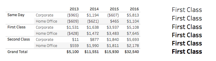
Expressiveness is also important with text, so instead of relying on just two font weights, Frere-Jones Type crafted a range of six weights from light to bold. Important information can come to the foreground while letting background information stay where it belongs, and your text can take advantage of the rich subtleties of modern displays.
Regardless of the weight of the font, each character maintains the same width across the weights. So, for example, in a text table, columns of numbers will line up regardless of their weights.
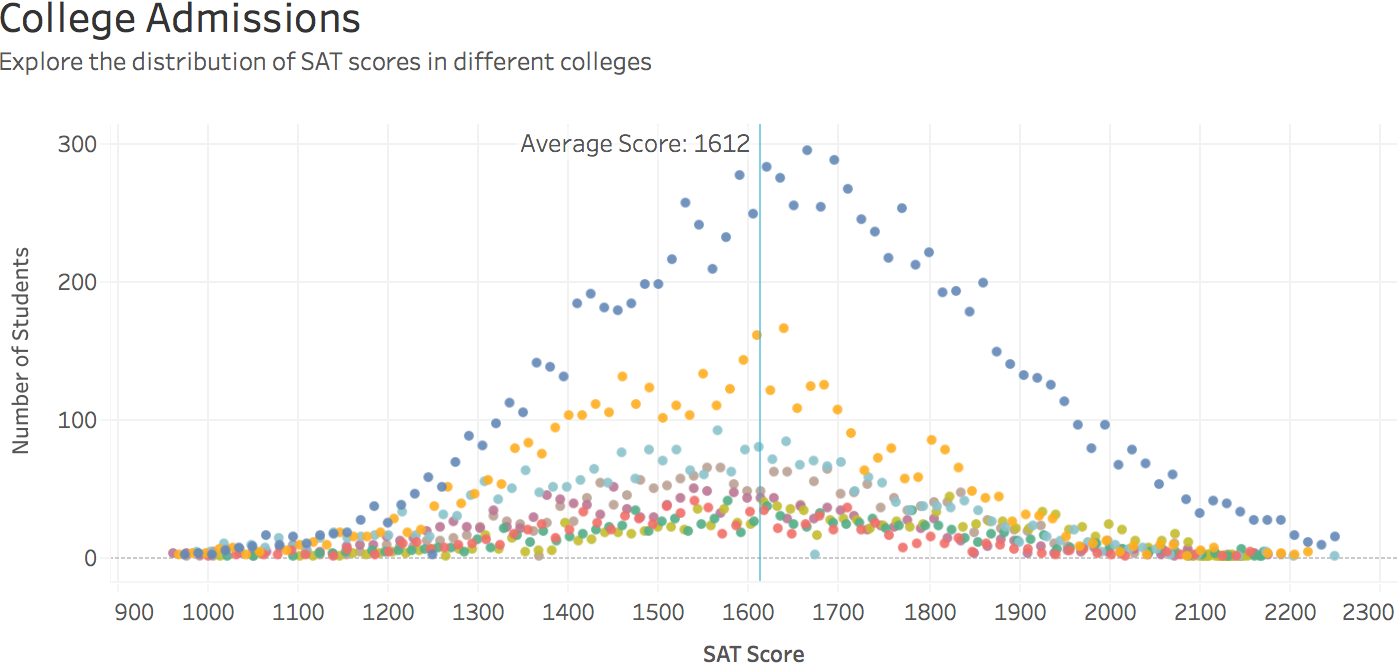
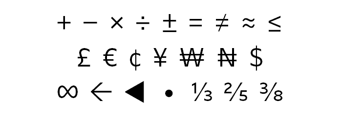
Text can also be a visual part of the story being told. Tableau users take advantage of a rich palette of symbols that convey scientific, statistical, financial, and other data. There are dozens of symbols across many different domains, including math, global currencies, pointers, bullets, fractions, and more.
Data knows no boundaries, so in addition to a full set of diacritical marks to support Latin languages, the complete Cyrillic and Greek alphabets are supported as well. While the Tableau fonts do not support other scripts, like those of East Asian languages, all our products continue to have rich Unicode and locale support.

Finally, to make distribution of this beautiful type easy, we’ve made it part of our full product line, including Tableau Desktop, Tableau Server, Tableau Online, Tableau Public, and our mobile applications. We've also carefully tuned the size of the fonts and optimized them to download to devices and browsers while other processing is happening, so you can use this typeface with minimal impact to page-load times and mobile bandwidth.
The Tableau typeface is just the next step on our journey with text in visualization. We hope to expand the palette of text expressiveness in Tableau by giving access to subtler features of type, like tuning our text rendering on maps to reduce gaps further and to use variable-width digits in runs of prose. We look forward to seeing what beautiful things you build with the new fonts.
Learn More about Tableau 10
Tableau 10 includes a brand new look and feel, and a host of new features to help you prep, analyze, and share your insights even faster. Check out our Coming Soon page for details.
- Uncover patterns in your data with Tableau 10’s clustering feature
- Quickly find marks in context with Tableau 10's new highlighter
- Build your own custom territories in Tableau 10
- Do more with bar charts in Tableau 10
- Tableau 10 includes more maps data, multilingual auto detection
Answers through analytics
- Integrate your data with cross-database joins in Tableau 10
- As requested, you can filter across data sources in Tableau 10
- Do more with APIs in Tableau 10
- Tableau 10 includes even more data-source options
- Connect directly to Google Sheets in Tableau 10
- (Finally!) see and understand your IoT data with our Google Sheets connector
- Connect directly to your QuickBooks online data in Tableau 10
- Favorite your data sources in Tableau 10
- Tableau 10 includes even more data-source options
Data breakthroughs
- Check out the beautiful look and feel of Tableau 10
- Format your workbook with just a few clicks in Tableau 10
- How we designed the new color palettes
Beautiful by design
- Design dashboards that shine on any device in Tableau 10
- Tips for designing device-specific dashboards that make everyone happy
- Manage your Tableau Mobile deployment with AirWatch or MobileIron
Delightfully mobile
- Author dashboards from scratch on the web in Tableau 10
- Do more while publishing workbooks in Tableau 10
- See a history of your revisions in Tableau 10
- What's new in Tableau Online
Do more on the web
Zugehörige Storys
Who is Einstein Copilot for Tableau for?
 10 April, 2024

Securely Access and Analyze All of Your Data with Data Connect for Tableau Cloud
Tableau Prep Conductor Supports Custom Schedules
 15 März, 2024
Blog abonnieren
Rufen Sie die neuesten Tableau-Updates in Ihrem Posteingang ab.