Why a mobile data visualization isn't just a small viz


Got a hankering to get your data out on mobile devices? Since Tableau launched support for device layouts with Tableau 10, the viz community has turned out some great posts on authoring for mobile (here, here, here, and here).
You should read those for tips on mobile dashboard design. But in this post, we’re not going to talk mobile dashboards; we’re talking about mobile users and how to design for them.
Here are three things to keep in mind about mobile users.
1. They’re in the wild
When users are looking at mobile viz, it’s a safe assumption that those people are out in the world somewhere, “in the wild” versus at a desk. Why not use that location as an input, to help them find most relevant information? Here’s how it works:
Geolocation is an overlooked capability. Most of the entries for the recent Iron Viz: Mobile Edition feeder contest didn’t use maps, and I couldn’t find any that used user location to drive interaction. This is because maps with data on them are notoriously hard to use on mobile devices. Dash Davidson advises locking pan & zoom if you use a map. Some people will tell you not to use maps at all in small formats.
But by using them thoughtfully, and including location as a primary interaction method, you can Make Maps Great Again (couldn’t resist).
2. Your users’ fingers are big
It’s well known in interaction design that touch targets need to be bigger than mouse targets. This, of course, creates tasks for those of us who design the software to make it touch-friendly (there is a team at Tableau called the Touch Center of Excellence that focuses solely on touch across the product.)
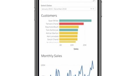
Authors of data visualization need to pay attention as well. For example, think of the master-detail pattern for drilling into data by using direct interaction on the master view.
Direct interaction can make it much easier for users to find the data they want. But of course, there are better and worse ways to do this. Think about how big the data will be that the user is selecting. Selecting from a treemap can be harder than selecting from a bar, and selecting from targets like big, evenly sized circles can be easiest.
3. They’re distracted
Finally, lots has been said in the mobile UX community about how much more distracted mobile users are than users in an office. Mobile isn’t just a form factor; it’s a context.
While it’s a good idea to link to next steps in any data viz, it’s even more important on mobile. Find your data, and take the next step directly from the data.
Now, I’m not trying to say mean things about your wild, big-fingered, distracted users. We’re all like that sometimes: namely, when we’re out on our mobile devices. Picture them in your mind when you’re designing your dashboard, and then go to the park and test your own dashboard with your own big, distracted fingers. It’ll make your data much more useful.
Learn more about mobile design
Zugehörige Storys
Introducing improved online/offline flows in Tableau Mobile
 17 November, 2020
Metrics, headlines for your data
 28 Mai, 2020
Learn about Metrics for Tableau—Optimized for mobile, track all your KPIs from various dashboards at a glance, all in one place—anytime, anywhere.
Blog abonnieren
Rufen Sie die neuesten Tableau-Updates in Ihrem Posteingang ab.